Daily insights for city builders, delivered every morning at 6 AM ET. I’m Brandon Donnelly — a Toronto-based real estate developer and founder of Globizen. I’ve been writing here since 2013.

Tag: mexico city

  • The longest cable car line in the world is in Mexico City

    Mexico City is all kinds of big. It is the largest metropolitan area in North America, the largest Spanish-speaking city, and broadly one of the largest megacities in the world. Because of this, it can be, you know, hard to move around.

    I remember visiting the city for the first time when I was in elementary school, and it standing out to me that everyone had one day of the week when they were simply not allowed to drive their car. It was/is a form of load balancing. Imagine that. (I don’t know if this is still the case, or if it’s even more stringent today.)

    I also remember visiting the city later on, when I was in grad school, and it standing out to me that their metro had women-only cars. This was and continues to be an attempt to try and minimize the amount of sexual harassment that takes place on transit. Again, it can be hard to move around Mexico City.

    The city’s latest solution is one that has found success in other Latin American cities, such as Medellin, and that is: cable cars. Relative to subway or light rail, they’re inexpensive. They’re also good at navigating steep terrain, and their stations can be inserted into dense urban areas. This includes working-class neighborhoods who might otherwise have very limited mobility options.

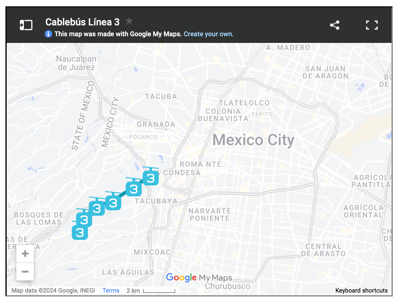
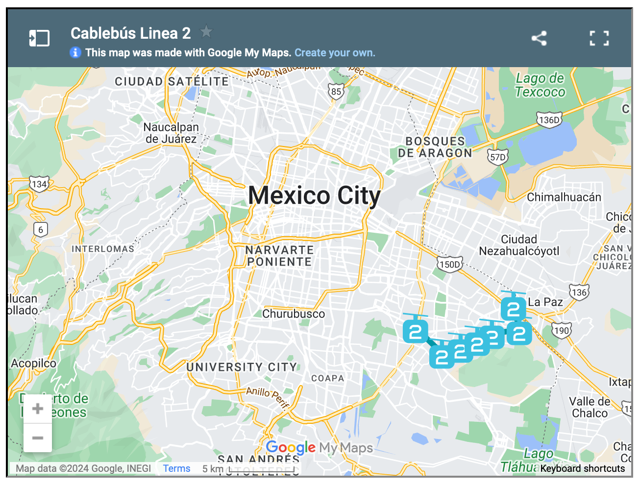
    For reasons like these, Mexico City has spent the last three years building three new cable car lines, the most recent of which opened just last month. The city now has the longest cable car line in the world. But more importantly, it has a new transit add-on that is moving up to 80,000 people per day.

    This isn’t as much as rail. But that’s okay. The point of these lines is to bring more people closer in so that they can then connect to more services and other mobility options. And to do it quickly. Three new lines in three years is impressive. And from the sounds of it, it has transformed many people’s lives for the better.

    Here are maps of the 3 lines, zoomed out a bit so that you can see how they fit into the city’s broader urban context:

  • The banana test

    One of the reasons why “new small-scale retail, service, and office uses” are now permitted in low-rise neighborhoods of Toronto — and why many are on to talking about these uses in our laneways — is because it’s a way to serve the “needs of residents” and “reduce local automobile trips”. But what are these needs exactly? And if you had to choose only one, what would it be?

    Let me provide some further background.

    According to this mapping, 94% of Parisians live within a 5-minute walk of a bakery. And according to this mapping, 94% of people in Mexico City live within a 5-minute walk of a taqueria. So in other words, these two cities seem to have the kind of “small-scale retail, service, and office uses” that satisfy at least some of the needs of their residents.

    People in Paris need bread. And people in Mexico City need tacos. But what do people in Toronto need? I’m not sure we have a perfectly parallel thing. But according to Instacart, the top-selling grocery item last year across both the US and Canada was — bananas. One and four carts typically contain them, and apparently this number has remained fairly consistent.

    So maybe this should be our small-scale retail and walkability test metric: What % of the population lives within a 5-minute walk of fresh bananas? (I’m open to other food suggestions here.)

  • Bright Moments should come to Toronto

    I love what Bright Moments is doing. And Fred Wilson’s post this morning — about their latest event in Mexico City — reminded me of that.

    Bright Moments describes themselves as “an NFT art collective on a mission to create environments where artists and collectors witness the birth of generative art together.”

    What this means is that they are working to move the experience of NFT art away from individual computer screens toward physical events where the art can be consumed and also created (i.e. minted) in a group setting.

    For a taste of what this actually means, check out their website and then hang out for a bit with their homepage video.

    So far they have hosted an event in the following 5 cities: Venice Beach (okay, actually a neighborhood), New York, Berlin, London, and Mexico City. And at each stop on their tour of what will be 10 places, they have done an in-person minting of their official collection, called CryptoCitizens.

    I haven’t been to one of them, but I can see how it would be a lot of fun and how it might change your perception of NFTs. So I am hoping that for one of their last 4 stops (the first stop was in the “Galaxy”), they’ll come to Toronto. Ethereum was pretty much created in this city, so I think it only makes sense for there to be Toronto CryptoCitizens.

    If you too would like to see this happen, make sure you tweet at Bright Moments and tell them that they should come to the greatest city in the world.

  • Largest cities in the world from 100 to 2015 CE

    I just discovered this set of maps (via Brian Potter) looking at the largest cities in the world from 100 CE all the way through to today (well 2015 CE). Here are what the two bookends of this map series look like:

    It is an interesting reminder of just how centralized the world was around the Mediterranean and parts of Asia, and also how nothing is guaranteed. As recent as 1900, cities like Manchester and Philadelphia were among the top 10 largest cities. Today they aren’t even close.

    For the full map collection, click here.

    UPDATE: The data behind these maps has been called into question. Look out for a follow-up post.

  • #BestStreetInTheWorld

    The below Twitter thread, initiated by Brent Toderian, is a great collection of some of the “best streets in the world.”

    I would encourage you to click through and have a scroll. The one thing that you’ll likely notice about almost all of the contributions is that the streets tend to be fairly dense/urban and they tend to be oriented around the pedestrian. No surprise there.

    My only qualm with some, but not all, of these streets is that — while beautiful from an urban design standpoint — many of them can feel quite touristy and/or commercially generic. They are the street you go to when you’re visiting the place, but they are perhaps lacking in urban authenticity.

    I don’t mean to take anything away from the beautifully designed streets in the above thread. In fact, some of them aren’t at all commercial and are simply magical places to be — period, full stop. See, for example, La Condensa (neighborhood) in Mexico City.

    My argument is simply that the natural cycle of cities and neighborhoods sometimes means that the best streets for new ideas and small businesses are maybe not the most beautiful ones. Part of this is a function of rents and part of this is function of the fact that the best cities are constantly reinventing themselves.

  • Cities with perfect climates

    Last year Nolan Gray mapped out “the cities of the world where you don’t need AC or heat.” And just recently he updated his data with the help of Guardian Cities for their “sweltering cities” series. As part of the study, they projected out average temperatures, in both the summer and winter, to 2059, showing which cities may become more dependent on air conditioning. The answer looks to be many.

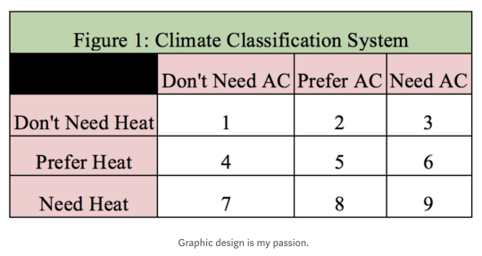
    In his original study, Gray had 9 climatic categories, all of which were based on average high and low temperatures throughout the year. Category 1 was you definitely don’t need AC or heat. These cities are essentially perfect year round. And category 9 was you definitely need heat and AC. These cities are basically the worst places on earth to occupy from a climate perspective.

    Here is that climate classification system in lovely chart form (note his caption):

    The climatic utopias ended up being places like Bogotá, Guatemala City, Lima, Mexico City, San Diego, São Paulo, and Sydney. The worst places were the southeastern United States, Central Asia, and northern East Asia.

    But one factor that is not included in the study is humidity, which Gray rightly points out has a meaningful impact on comfort. Toronto, for example, is classified in his system as category 7. Heat needed. But AC definitely not needed. Personally, I would bump us up to category 8: AC preferred, but not needed.

    Still, this is an interesting study. There are relatively few cities with so-called perfect climates. And I have always found these sorts of climates fascinating because they empower a very different kind of relationship to outside spaces.

  • Spaces between buildings

    Doug Saunders recently published a great piece in the Globe and Mail about the “the dead spaces between buildings” and the architectural revolution that is taking place from Mexico City to Toronto to solve this underappreciated problem.

    The example in Mexico City is that of the San Pablo Xalpa public housing complex where architect Rozana Montiel transformed the underutilized spaces between the apartment buildings into vibrant “common-unity” spaces. 

    This meant removing 95% of the fences and gates that had previously been erected as safeguard against the unsavory people and acts that were taking place in these open spaces.

    The underlying goal was to try and address the socioeconomic decline that had taken root in Mexico’s public housing complexes. And there was a sense that part of the problem was simply their physical design.

    Of course, this is partially about trying to correct the failures of post-war planning. But I think this conversation around the “spaces between buildings” shouldn’t just be a corrective one. It can be broader than that.

  • Residential population densities compared

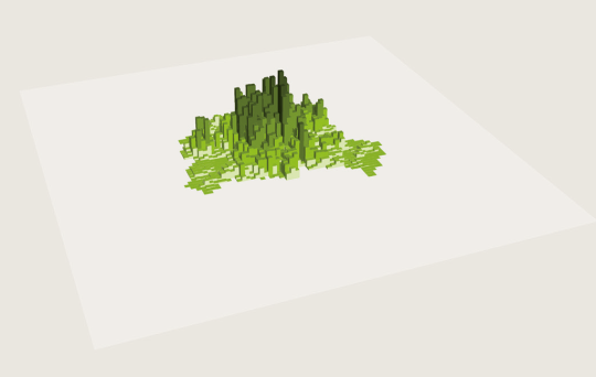
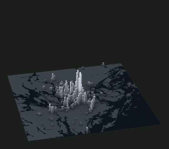
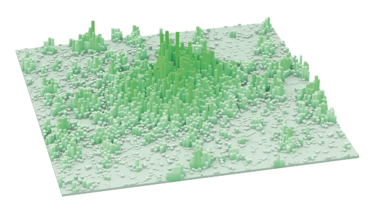
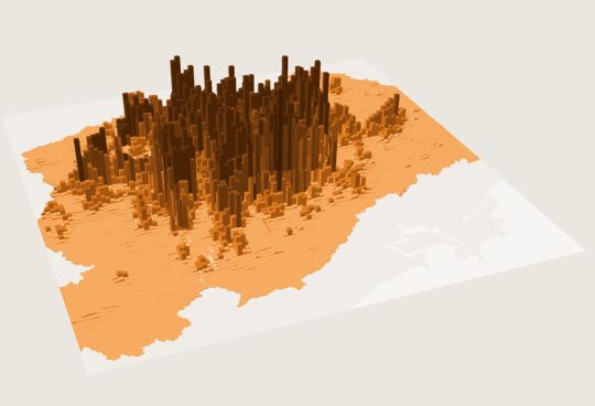
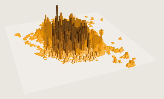
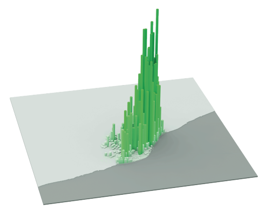
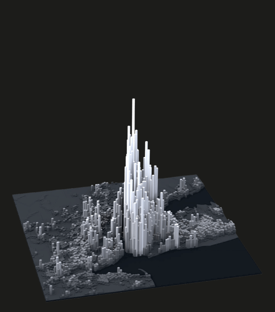
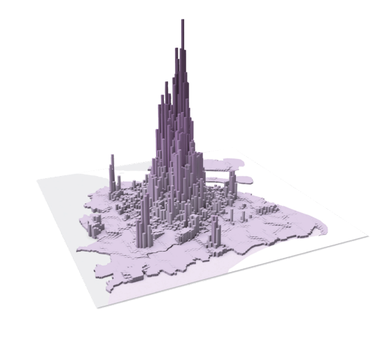
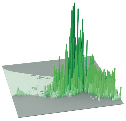
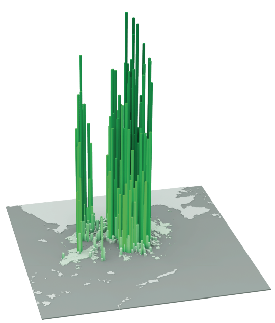
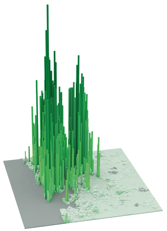
    The following diagrams were taken from LSE’s Urban Age website. I’ve sorted them from lowest to highest peak residential population density. In each case I’ve also included the year of the dataset. 

    It’s amazing how much these simple extrusion diagrams can tell you about the city. It also shows you that high population densities don’t necessarily need to equate to tall buildings. Barcelona, in particular, stands out for me.

    Berlin (Peak residential density: 21,700 people/km2, 2009)

    image

    Stockholm (Peak residential density: 24,900 people/km2, 2012)

    image

    London (Peak residential density: 27,100 people/km2, 2013)

    image

    São Paulo (Peak residential density: 29,380 people/km2, 2009)

    image

    Mexico City (Peak residential density: 48,300 people/km2, 2009)

    image

    Barcelona (Peak residential density: 56,800 people/km2, 2013)

    image

    New York (Peak residential density: 59,150 people/km2, 2012)

    image

    Shanghai (Peak residential density: 74,370 people/km2, 2011)

    image

    Istanbul (Peak residential density: 77,300 people/km2, 2013)

    image

    Hong Kong (Peak residential density: 111,100 people/km2, 2013)

    image

    Mumbai (Peak residential density: 121,300 people/km2, 2013)

    image

  • The global pyramid of wealth

    Every year the London-based property consultancy Knight Frank publishes something called The Wealth Report. And it’s one of those reports that I could go through for hours. 

    It includes a ton of really fascinating stats that speak volumes about where in the world wealth is being created and how it’s moving around. And of course there are a lot of connections between wealth, real estate, and city building.

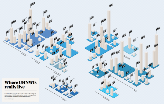
    Below are 3 diagrams that really stood out for me in the 2015 version. 

    The first diagram shows which cities have the most Ultra High Net Worth Individuals (UHNWIs). An UHNWI is defined as an individual with assets exceeding US$30 million, but excluding personal assets and property (such as one’s principal residence). Click here to see the full size image (I know the numbers are small).

    image

    Not surprisingly, London (4,364), Tokyo (3,575), Singapore (3,227), New York (3,008), and Hong Kong (2,690) are at the top of the list. But I was a little surprised – albeit happily surprised – to see Toronto (1,216) come in at #2 in North America, beating out Mexico City (1,116), Los Angeles (969), and Chicago (827). 

    The second diagram shows you how many square meters of luxury property (apartment) you can buy for US$1 million in a bunch of different cities around the world. 

    In Monaco (top end), that’ll buy you 17 square meters (183 square feet) and in Cape Town (bottom end), that’ll buy you 208 square meters (2,196 square feet).

    image

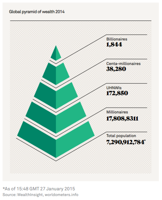
    The third and last diagram is what they call the global pyramid of wealth. It’s a pyramid of everyone in the world and then the number of millionaires, UHNWIs (see above), centa-millionaires, and billionaires. And if you do the math, the top of this pyramid comes nowhere close to 1% of the global population.

    image

    It’s fascinating (and exciting) to see where and how global wealth is concentrating. But it should also make you think about rising income inequality. I know it does for me.

  • Learning from, but not copying, New York’s High Line

    image

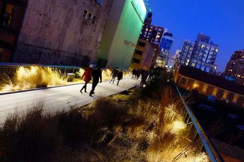
    In 1980, the last train ran on an elevated corridor on the west side of Manhattan known as the High Line. Originally built in the 1930s, the trucking industry had made these trains obsolete and service was halted.

    At this point, neighboring property owners began to lobby for the demolition of the High Line, as they no doubt saw it as an opportunity to increase the value of their land holdings. But thanks to local residents – most notably a man by the name of Peter Obletz – the 1.45 mile-long elevated rail corridor was saved from demolition.

    In 1999, Joshua David and Robert Hammond then decided to form a non-profit with the goal of both preserving and reusing this unused rail corridor. The group was called Friends of the High Line.

    By the early 2000s, Friends of the High Line had successfully made an economic case for transforming the rail line into a public open space and things started moving forward. Initially, it was thought that a public park of this sorts would attract about 400,000 people annually and generate upwards of $286 million in new tax revenues over the following 2 decades (Globe and Mail).

    With these expectations in mind, construction on the new High Line Park began in 2006. The first section opened in 2009 – a decade after Friends of the High Line was formed. And the third, and last section, opened just two weekends ago at the end of September.

    Today the High Line Park attracts 5 million visitors a year and is believed to be directly responsible for about $2.2 billion in new economic activity. The increased tax revenues over the next 2 decades are expected to reach about $980 million. Without a doubt, the High Line has been a huge success. It has become the 2nd most visited cultural attraction in New York (Globe and Mail).

    Which is why every city now wants their own High Line. Philadelphia wants one. Chicago wants one. Mexico City wants one. Seoul wants one. And the list goes on. Here in Toronto, we’ve recently proposed one called the King High Line, which will connect the Liberty Village and West Queen West neighborhoods across a rail corridor.

    While I do believe that this is an important connectivity problem to be solved, I worry about how explicit the references are to the actual High Line. Even the street furniture is the same in their promotional video.

    I worry not only because it means we’re clearly taking on the role of follower, as opposed to leader, but because an elevated park isn’t going to work in all urban contexts the same way that the High Line worked in Chelsea. This is similar to how Frank Gehry can’t magically turn your city into the next Bilbao

    So while I have shown my support by becoming a “Friend of the King High Line” (and I would encourage you to do so as well), it’s important to keep in mind that the problems we’re trying to solve here aren’t necessarily the same ones that New York had to deal with.

    The High Line – from the start – was designed to have an intimate relationship with its surrounding buildings. The tracks rain directly through them so that the trains could easily load and unload their cargo – that was the whole point. So when the High Line was redone, all of a sudden these buildings were able to reconnect themselves to the park in a way that they were already accustomed to doing.

    But in Toronto’s situation, and perhaps in your city, that’s not the case. We’re talking about stitching together two completely disconnected neighborhoods. It’s a noble goal and certainly one that I wholeheartedly believe we should pursue. But I don’t think we should assume that it’s a problem that has already been completely solved for us.

    Image: Flickr