Daily insights for city builders, delivered every morning at 6 AM ET. I’m Brandon Donnelly — a Toronto-based real estate developer and founder of Globizen. I’ve been writing here since 2013.

Tag: philadelphia

  • Doom loop or boom loop?

    One of the interesting things about return-to-office trends is that there’s a meaningful difference between smaller and larger cities. In smaller cities, most people have returned to working in their offices. But in larger cities, this hasn’t been the case. This makes intuitive sense. Larger cities tend to have more expensive real estate (which forces people to decentralize) and, in turn, longer and more punishing commutes. So in a larger city, the individual benefits of WFH (i.e. having zero commute costs) tend to be far greater.

    However, in-person interactions are critical to what are known as agglomeration economies. This is why we have things like financial districts — because there are real economic benefits to even competing firms locating proximate to each other. WFH arguably reduces these benefits. And in this recent report called, Doom Loop or Boom Loop: Work from Home and the Challenges Facing America’s Big Cities, the authors, Richard Voith, David Stanek, and Hyojin Lee, have tried to estimate what these agglomeration losses might be for cities like New York, San Francisco, and Philadelphia.

    Here’s New York City:

    If you agree with their assumptions, then you might also agree with their policy recommendations. Among other things, the report argues that larger cities, like New York City, should be focused on promoting themselves to industries/jobs that benefit the most from in-person interactions, recognizing that WFH isn’t going away. At the same time, cities should understand that reducing the cost and increasing the pace of housing production also helps to reduce agglomeration losses. It keeps more people centralizing around a particular place.

    To download the full report, click here. It’s an interesting read.

  • Homes per acre

    I spent three years living in Philadelphia for grad school and one of the things that I appreciated the most was its walkability. I walked and took transit everywhere. Much of this has to do with the grid system that was laid out for the city in the 17th century. But there are also lots of more recent developments that help to reinforce this fabric.

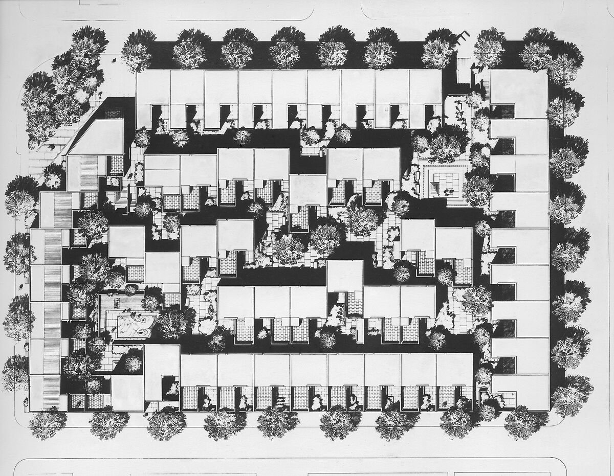
    CityLab, for example, just published this article on Penn’s Landing Square, which is a housing complex in Philadelphia’s Society Hill neighborhood. Built in 1970 and designed by Canadian-American architect Louis Sauer, the modernist complex occupies an entire 2.37-acre block and contains an assortment of 118 low-rise homes, many of which are connected through small interior laneways.

    Here’s the site plan:

    In addition to its handsome architecture, what is noteworthy about Penn’s Landing Square is that its site plan makes it quite a dense low-rise development. At 118 homes, this translates into just under 50 units per acre. CityLab estimates that this means the development holds about 174 people per acre (~412 people total), which would make it more dense than Stuyvesant Town in New York (~158 persons per acre).

    However, this is based on the assumption that there are almost 3.5 people living in each of these homes. While generally large, I don’t know if this is the case. It would be higher than the average US household size. But regardless, from a unit per acre standpoint, it remains a great example of dense, family-oriented, and grade-related housing.

    For fun, let’s compare this to a more intense form of infill development. Our Junction House project, for instance, contains 151 homes and sits on a 0.48-acre piece of land. This translates into about 315 units per acre. I don’t know off hand the average number of occupants per household, but I reckon that, given our larger average suite size, we should be on the higher end compared to most mid-rise condominiums. So I would say that we are probably 400+ people per acre.

    It’s unfair to compare a single development to an entire neighborhood, such as Stuyvesant Town. Circulation and other open spaces will necessarily pull down your average density. But these individual development examples do speak for themselves. There are many parts of North America where you might find 1 home or a handful of homes per acre of land. At Penn’s Landing Square, this number is 50 units per acre. And at Junction House, it’s 315 units per acre.

  • XS in Philadelphia, not Tokyo

    This is the sort of housing project that you’d fully expect to find in Tokyo. Seven homes built on a small urban lot measuring only 11 feet wide by 93 feet deep. But in this case, it’s not Tokyo; it’s Chinatown, Philadelphia, where a residual lot that was created when the sunken Vine Street Expressway was carved through the middle of the city in the 1950s.

    Designed by Philadelphia-based Interface Studio Architects (ISA), the project contains 7 levels of livable space. What’s interesting, though, is that from a building code perspective this is still a 4-story building. There are two mezzanine levels that don’t get counted (and that create some great double-height spaces). This also seems to be what allowed them to get away with a single egress stair in the middle of the building.

    The other technique that was used to maximum density is facade projections. Philadelphia’s zoning code allows for projections up to 3 feet in the horizontal dimension. And if you look at the above plans, you’ll see that these were used to “top up” or extend the site’s 11 foot width to 14 feet, when it made sense to do so from a programming standpoint. The result is some very livable spaces.

    I am endlessly fascinated by these sorts of projects because they demand creativity and because you ultimately end up unlocking something that the market had been overlooking. Here is an example of a small leftover urban parcel that was previously used as surface parking for two cars. Now it’s seven beautiful homes.

    Photos/drawings: ISA

  • More food trucks, please

    There’s no real secret to having a vibrant food truck and street vendor ecosystem. You basically just need to allow it, and then get out of the way and let entrepreneurs do what they do best.

    When I went to grad school in Philly, I used to eat from food trucks all the time. I could get a breakfast sandwich and coffee in the morning. I could get a burrito for lunch. And I could get a vegetarian lasagna for dinner. There was no shortage of options.

    This same kind of ecosystem does not exist in Toronto, but it’s only because we’ve decided we don’t want it to.

    Images: New York City

  • The accents of North America

    Yesterday I watched this three-part series on the accents of English-speaking North America:

    The videos are by dialect coach Erik Singer and, I must say, his ability to fluidly move through all of North America’s accents is incredibly impressive. As I was watching the videos, I kept thinking to myself, “I don’t know what this guy actually sounds like when he’s not putting on an accent.”

    The interesting thing about accents is that they really speak to settlement and migration patterns. In other words, who came in contact with who, and who didn’t come in contact with others? Geographic isolation also leads to unique accents.

    The other ingredient is time. The reason the UK, for example, has so any regional accents is that it had the time for them to develop. On the other hand, if you look to most of the southwestern United States, there is broadly a kind of generic American accent (with the exception of some California and Utah nuances according to Erik). This is because these settlements are relatively young compared to say the northeastern US.

    For Canada, the defining feature is “Canadian raising“. It is what leads to the stereotype of us saying things like “aboot” and “hoose”. It doesn’t sound exactly like this, but there is a way in which we tend to pronounce diphthongs (two adjacent vowel sounds) with open-vowel starting points.

    Open-vowels are sounds where our tongue is positioned as far as possible from the roof of our mouth. If you try saying “about” to yourself out loud right now you’ll notice that this is what happens. Your tongue drops. And it is these instances that lead to “Canadian raising”.

    The other thing that I find fascinating is how quickly language convergence can happen. I lived in Philadelphia for 3 years (for grad school) and when I would come home my parents used to tell me that I sounded fully American. I guess subconsciously we feel a need to assimilate.

    If you’re also fascinated by accents, I highly recommend you check out Erik’s videos.

  • How to create narrow European-style streets

    If you’re a regular reader of this blog, you’ll know that I have a thing for narrow streets. Which is why when I travel I sometimes (okay, oftentimes) bring a laser distance measuring device with me. I like measuring things so that I have dimensions that I can feed back into our own development projects. But perhaps most importantly, it allows me to appear as nerdy as humanly possible while traveling. Walking around with just a camera in hand isn’t enough. You need to try harder than that. And so far the narrowest street that I have come across was in Noto, Sicily at just over 1.3m wide.

    If you also like to fawn over narrow European streets, you may enjoy this recent video by City Beautiful. In it, Dave Amos compares European cities, like Rome, to US cities, like Salt Lake City and Philadelphia, and then asks: Can the US build European-style street networks? His immediate answer is, “probably not.” And this is something that we have talked about before on the blog. Street networks tend to be really sticky. They’re hard to change. However, there is another possible solution: create new smaller mid-block streets. And that’s the focus of Dave’s video:

    But if you think about it, this condition already exists in a number of cities. Here in Toronto, we have somewhere around 300 kilometers of laneways, which tend to range in width from 4 to 6m. These are European-scaled streets and amazingly they’re already in place! The only difference is that, today, they mostly serve a back-of-house function. They provide access to garages. However, that is quickly changing with the introduction of laneway suites. And so over a long enough time horizon, our laneways are going to inevitably flip from back-of-house to primarily residential.

    Though maybe there’s even more we could do with this asset. European cities manage to fit retail, restaurants, patios, and more within 6m. Why not do the same with some of our narrowest streets?

  • US public transit ridership since March 2020

    Consider the following stat: 65% of all transit trips across the US in 2019 came from just 6 metro areas: New York, Boston, Chicago, San Francisco, Washington, DC, and Philadelphia. Not surprisingly, these are all places with dense and walkable urban centers. In other words, they have built environments that are conducive to the use of public transportation.

    While we know that more people working from home has been bad for transit and that agencies across the world are facing deep holes in their budget, I continue to come back to two things. One, we have not yet reached a post-pandemic equilibrium. We are still making our way back to the office. And two, the single most important thing when it comes to transit ridership is land use.

    If we want more people to take transit, then we need to build our cities accordingly. That means streets people actually want to walk on, and a lot more density.

  • Bad and good street networks

    Let’s add some historical context to yesterday’s post about autonomous vehicles. As the regular non-autonomous version of cars started to infiltrate our cities in the early 20th century, largely following the creation of the mass-produced Ford Model T, there was a general view that cars were dangerous and a menace to cities. Arguably, not much has changed.

    So in the 1930s, the Federal Housing Authority decided to publish a pamphlet explaining what street networks it thought were suitable for this new emerging car world and which street networks were not. The exact terms that they used were “bad” and “good”, and here’s what that looked like (taken from this CNU article):

    The “bad” ones are largely how the US liked to design its cities before the arrival of the car. Some historic settlements, like Boston and Manhattan south of 14th street were based on different street logics, but as far back as the 1680s, William Penn had already started laying out a grid iron plan for Philadelphia. And in reality, this kind of street pattern goes all the way back to ancient cities.

    However, when the car arrived, these grid iron plans were thought to offer an inadequate amount of separation between people and machine. The solution was to optimize around the car and introduce a clear hierarchy of different streets. Big streets for moving cars quickly, and smaller streets, like cul-de-sacs, for people to live on.

    These “good” examples, of course, represent the modern suburb. But we now recognize that these types of street networks are unequivocally terrible for walkability, the environment, public health, social equity, and a whole host of other things. I mean, look at this extreme example of two suburban homes in Orlando whose backyards adjoin but are technically separated by 7 miles and a 20-minute drive!

    My point with all of this is that, for many/most at the time, this was progress. Cars were the future and there was optimism about the kind of freedoms and other benefits that they would bring to people. And this optimism is perhaps not all that different from what many people feel today, myself included, when it comes to autonomous vehicles.

    So on the one hand, you could point to the car and say, “look at all the damage that this thing did to our cities. Let’s not do that again. Autonomous vehicles must be stopped.” But that’s akin to wishing the car was never invented. Another option is to point to the negative externalities associated with the car and say, “look at what we’ve done. We can do better. Let’s make our cities better.”

    Positive change, no matter how late, is always a possibility.

  • Modular construction appears to be on the rise in Philadelphia

    This Philadelphia Inquirer article is behind a paywall, but I can tell you that it speaks to the city’s increasing use of modular construction for infill apartment buildings:

    Building modularly can save 20% on total construction costs, he said. Projects can be constructed in half the time, and rental revenue comes in sooner. Workers build apartments in pieces in a factory as others lay the foundation. Factory work doesn’t have to pause for inclement weather.

    Alterra Property Group has found that modular construction is cost- and time-effective when it builds between 100 and 500 units and between four and six stories. Under that, building on-site is more efficient, Addimando said. Above that, builders can run up against building code restrictions.

    Consider this recently completed project, called LVL North:

    • 1.5 acre site
    • Site acquired in February 2020
    • Construction commenced in June 2020 (was it already entitled?)
    • Over 500,000 square feet
    • 7 storeys
    • 410 market-rate apartments
    • Two levels of commercial spaces
    • Over 300 parking spaces in a two-level below-grade parking structure
    • Construction completed in 24 months (it’s currently being leased up)

    I am impressed by how quickly this was erected. Here in Toronto, it would likely take more than 24 months just to get through the rezoning process. Granted, a site this big in a central location next to transit would also likely beget multiple tall buildings.

    But this form and scale of housing seems to be working for Philly. It is allowing the city to both build quickly and to experiment with emerging construction methods.

  • Consumption-based carbon accounting

    The typical way to measure carbon emissions is to think about it in terms of geography. You pick a particular place, such as a country or a city. You add up all the emissions that are taking place within its boundaries. And you’re then left with a territorial carbon footprint. If you’ve done any research on carbon emissions or climate change, you’ve likely encountered this method of accounting for carbon.

    But there’s a flaw with this logic.

    The problem with this method is that it considers each geography to being more or less independent. For example, let’s say you live in Philadelphia and you happen to be the owner of something called a computer. With territorial accounting, the carbon emissions associated with you powering your computer would get attributed to Philadelphia and the emissions associated with the actual production of the computer would get attributed to wherever it was made. Let’s say it was China.

    One of the problems with this approach is that it penalizes the places that make a lot of stuff and it privileges the places that don’t make as much stuff, even if they may actually be the consumers of far more stuff. This might make you feel better about your life decisions if you happen to live in a dense urban knowledge economy that doesn’t really make anything physical — but is it entirely accurate?

    An alternative measurement approach is consumption-based carbon accounting. The goal here is to capture all lifecycle emissions associated with a particular good or service, and then attribute it back to the consumer that arguably triggered the emissions. In the case of our Philadelphia computer example, the emissions associated with the production, transportation, and consumption of the computer would also get attributed locally to Philadelphia, instead of to China.

    This more complex method of carbon accounting — which is something that the University of Pennsylvania has been working on over here (hence the Philadelphia computer example) — can be instructive for a whole host of reasons. It also has some relevance to city building.

    It is widely understood that building up is more sustainable than building out. Because when you build out, you end up doing things like forcing people into cars. But the other side of this equation is that cities tend to also house a lot of rich people, and household wealth is a massive driver of carbon emissions when you account for them based on consumption. Some would argue it is more important than urban density.

    In my opinion, none of this is to suggest that dense urban environments are bad. The point here is that territorial carbon emissions don’t fully capture the emissions caused by high consumers who might happen to live in an otherwise efficient urban environment. You can live in a compact apartment and walk to work, but what else are you consuming? And how might these consumption patterns change based on built form?

    For more on this topic, check out this report by Daniel Cohen and Kevin Ummel (of the University of Pennsylvania) called, “The case for neighborhood-level carbon footprints.”

    Photo by Chris Henry on Unsplash