Daily insights for city builders, delivered every morning at 6 AM ET. I’m Brandon Donnelly — a Toronto-based real estate developer and founder of Globizen. I’ve been writing here since 2013.

Tag: brookings

  • An overview of rental housing in France

    Rental housing in France is both heavily regulated and supported through dedicated public funds. Here’s a high-level overview of what that means (via this 2021 Brookings case study by Arthur Acolin):

    • Homeownership rates in France went from 35% in 1954 to 56% in 2001
    • As of 2018, 58% of French households own, 40% rent, and the remaining 2% supposedly get free housing from either their employer or a family member
    • Not surprisingly, younger households are most likely to rent (the figure is > 60% for people aged 18-29)
    • Household size seems to play a major factor in how likely people are to live in public housing
    • France has some 4.5 million public housing units and 17% of all households live in them (which represents about 43% of all renter households)
    • Within the unsubsidized rental market, 93.5% of households live in homes owned by individual investors (this is as of 2013) and only about 3.5% live in homes owned by institutional investors
    • This is pretty typical of Europe, where multi-family isn’t an established real estate asset class like it is in North America; so for those of you who like to hate on individual condo investors, check out France
    • In the decade between 2010 and 2020, 28 metro regions in France adopted some form of rent control and, in a few markets, like Paris and Lille, there are also maximum rents that can be charged for specific housing types

    If you’re interested in rental housing, Brookings also has articles covering the US, Germany, Spain, Japan, and the UK. They can be found here.

  • Another look at downtown recoveries

    Back in the spring, I wrote about a study that was done by the University of Toronto and the University of California, Berkeley that measured “downtown recoveries” using mobile phone data.

    In other words, it looked at where people’s phones were lingering to try and determine if they were back in the office and doing things downtown.

    The headline finding was that San Francisco had the lowest recovery quotient (RT) and that Salt Lake City had the highest, alongside cities like San Diego, Baltimore, and Bakersfield.

    But why was there such a spread in recoveries?

    One possible explanation was commute times. The cities with the lowest average commute times seemed to generally perform better in this study and have higher recovery quotients. But it’s maybe more nuanced than this.

    Here is a recent Brookings article by Tracy Hadden Loh that looks at this same study. And to give just one example, she notes that San Diego’s airport happens to fall within the same zip code as its downtown. Meaning, airport traffic would have been picked up as downtown traffic.

    The article also includes the above chart, showing the amount of downtown apartments built since 2019. I don’t think I knew that Chicago was so prolific.

  • Geography of activity centers

    We need more “activity centers”. That is my takeaway from this report by Brookings.

    Activity centers are exactly what they sound like. But to be more specific, the definition used in the report is based on five categories of assets: community, tourism, consumption, institutional, and economic. And what the authors did was look at the relative concentration of each across the 110 metropolitan statistical areas (MSAs) in the US with at least 500,000 residents.

    They then came up with 3 different kinds of activity centers. Monocenters (blue in the above map), secondary centers (yellow), and primary centers (orange). Monocenters have, as you’d probably expect, a lot of one kind of asset. Secondary centers, on the other hand, have “some of at least two kinds of assets.” And primary centers have “a lot of at least two kinds of assets.”

    Looking at the above map, it is pretty clear — and not at all surprising — that Manhattan is, for the most part, one giant activity center. There is a lot going on. But this is not the typical condition. In the 110 metro areas looked at in the study, activity centers only occupy about 3% of land on average. The remaining 97% of land is, based on the above definition, a non-activity center.

    Why this matters is that activity centers punch above their weight. Despite representing a small land area, activity centers are home to 40% of all private sector jobs in the US. Supposedly, they also increase productivity (by an additional ~$1,723 per worker), yield higher property values (+26%), increase inclusivity, and reduce vehicle miles travelled.

    So yeah, more activity centers sounds like a good thing for our cities. Though as we have learned in recent years, we need to be careful with monocenters.

    Map: Brookings

  • “Offices are over”

    This is an interesting article from Brookings that talks about the “myths of converting offices into housing.” What I especially like about the article is that it’s nuanced, and it directly addresses many of the myths that currently surround offices. The first one is that “offices are over.”

    Regular readers of this blog will know that I don’t agree with this. And the article provides some good data points to support this:

    • Office utilization may be below pre-pandemic levels in many cities, but the data suggests that we have not yet hit a plateau. Utilization rates continue to increase, albeit gradually. So if we are to be more precise here, it’s not that some people will never return to the office, it’s just that it’s taking longer than I think many people expected.
    • That said, this is not the case in all cities. Downtown Salt Lake City, as we have talked about before, is the busiest it has ever been. Similarly, ridership on the Utah Transit Authority network is up 26% from pre-pandemic levels.
    • Europe is generally ahead of North America with utilization rates in the 70-90% range, according to JLL. And Asia is even further ahead with rates in the 80-110% range. Meaning that, similar to downtown Salt Lake City, there are (many?) cities in Asia where more people are in the office today compared to in 2019.

    So I would not be so quick to claim that “offices are over.”

    For the full article, click here.

  • How to repair America’s broken housing systems

    As a general rule I don’t like to recommend books that I haven’t read yet. And so I’m not here today to recommend Jenny Schuetz’s new book about how to repair America’s crumbling housing policies. Instead, I’m just telling you all about it. You can then do your own research and decide if it’s worthy of your time. The premise sounds good though:

    Unequal housing systems didn’t just emerge from natural economic and social forces. Public policies enacted by federal, state, and local governments helped create and reinforce the bad housing outcomes endured by too many people. Taxes, zoning, institutional discrimination, and the location and quality of schools, roads, public transit, and other public services are among the policies that created inequalities in the nation’s housing patterns.

    This may be confirmation bias at work but I continue to feel like there’s a groundswell of interest in housing reform. In particular, there seems to be a growing interest in rethinking the privileges that we have decided to bestow upon low-rise housing (at least in this part of the world). But of course, that’s only one part of what is ultimately a complex set of systems.

  • Toward more multi-family housing

    This recent article by Brookings is a good reminder of the all too important link between land use policies/patterns and GHG emissions. Because electric vehicles are cool and all, but they’re still not as efficient as just walking around and/or taking transit.

    As has been argued before on this blog, we need to not only electrify our transport network, but we also need to change how we get around. And probably the best way to encourage a modal shift, is to plan and build our cities differently. Something that is simple, but not easy.

    It also turns out that people who live in multi-family buildings tend to consume less energy (on a per capita basis) than those in single-family houses. So there are numerous benefits to encouraging denser housing on top of transit and within mixed-used communities.

    With all of this in mind, here are some interesting charts from the above Brookings article.

    This first one shows new housing permits in the metro areas of Atlanta, Chicago, and Washington DC, according to their urban, suburban, or exurban status. Here, Chicago is an outlier, with the “urban core” (defined as Cook County) now making up about half of all new housing.

    If you look at the entire study period, the number is less. The urban core accounted for about one-third of new housing permits in Chicago, and only 15% of permits in Atlanta and DC. But in all cases, housing permits in the urban core have been increasing since the 2008 financial crisis.

    But here’s the other thing. Looking at these next two charts, there appears to be a clear trendline toward more urban housing typologies. The first of these next two is showing single-family housing permits as a percentage of all new housing. And the second is structure type over time.

    Atlanta is still building mostly single-family housing, but less of it. And based on these charts, Chicago has already passed its inflection point. DC is not far off. Every city region is of course going to be different, but it does look like there is some kind of broader housing shift underway.

  • Largest US cities grew faster and became more diverse over the last decade

    The last decade has been pretty good for many cities. Recent 2020 Census data tells us that of the 50 largest cities in the US, 46 of them grew their population over the last 10 years. On average, these 50 cities grew by about 8.5%, compared to 5.6% for the decade between 2000-2010.

    As you might expect, the fastest growing cities tended to be in the south and the west. The top 3 fastest growing cities over the last decade were Fort Worth (24%), Austin (21.7%), and Seattle (21.1%). The cities with the biggest population declines were Detroit (-10.5%), Baltimore (-5.7%), Milwaukee (-3%).

    It’s important to keep in mind that city boundaries can skew these numbers depending on how they are drawn. A declining “city” population doesn’t necessarily mean that the broader urban area is losing people. Though it does still tell you something about the “city.”

    Another thing that happened over the last decade is that most of the largest US cities continued to become more diverse. In 2000, white populations were a majority (>50%) in 25 of the 50 largest cities. This dropped to 17 cities in 2010 and then 14 cities last year (2020). Meaning that 36 of the largest cities are now “white minority” cities.

    For more data check out this recent article from Brookings.

  • A crisis of regional imbalance

    Last week’s general election in the UK was yet another example of the urban-rural divide that we are all seeing emerge around the world. Taking a look at this chart from the Centre for Towns, it’s pretty clear that the type of community someone lives in (i.e. how urban), says a lot about the way in which they probably voted. In big cities, the vote share was 49% Labour. And in villages, communities, and small towns, the vote share was about 48-58% Conservative.

    But what does this stem from? According to John Burns Murdoch of the Financial Times, the biggest predictor (for constituencies) of a swing vote over to the Conservatives during this last election was the share of the population in a blue collar job. Here is a graph from John’s article. Circles with a black outline are constituencies that changed hands last week. Note Great Grimsby, which I wrote about here, in the top right corner.

    These facts probably aren’t all that surprising to most of you. But it is an important reminder of how concentrated the new economy is becoming in big — or perhaps I should say, certain — cities. The Brookings Institution recently referred to this as “a crisis of regional imbalance.” Because it’s not just a case of urban vs. rural. Brookings found that from 2005 to 2017, more than 90% of innovation sector growth in the US could be traced back to just five metro areas. (You’ll be able to guess most of the five. Only one stood out for me.)

    This is the world we live in.

  • How large metro areas are driving the global economy

    “The concentration of economic growth and prosperity in large metro areas defines the modern global economy, creating both opportunities and challenges in an era in which national political, economic, and societal trends are increasingly influenced by subnational dynamics.” -Brookings Institute

    The Metropolitan Policy Program at the Brookings Institute has a new report out for 2018 called the Global Metro Monitor.

    Here are some of the highlights (data is from 2014 to 2016):

    – The 300 largest metro areas in the world accounted for 36% of employment growth and 67% of GDP growth.

    – Metro areas in China and the Asia-Pacific region outperformed, whereas Latin American cities, and in particular the largest Brazilian cities, were weaker performers.

    – The majority of large metro areas had growth rates that exceeded that of their respective regions. So again, cities are the driver.

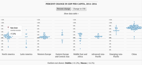
    And here is an interesting interactive chart (better to click through) that shows the % change in GDP per capita. 

    image

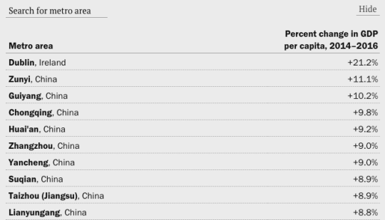
    Look at how much of an outlier San Jose is. Though, check out Dublin in the footnote. And if you look at the actual data table, it is all China, except for Dublin at the top.

    image

    For the rest of the charts, click here. And to download the full Global Metro Monitor report, click here.

  • The Great Recession only paused suburbanization

    According to newly released US census data for 2010-2017 – which Brookings analyzed here – the “back to the city” movement appears to have peaked in 2012. (This is something that we’ve looked at before on the blog.)

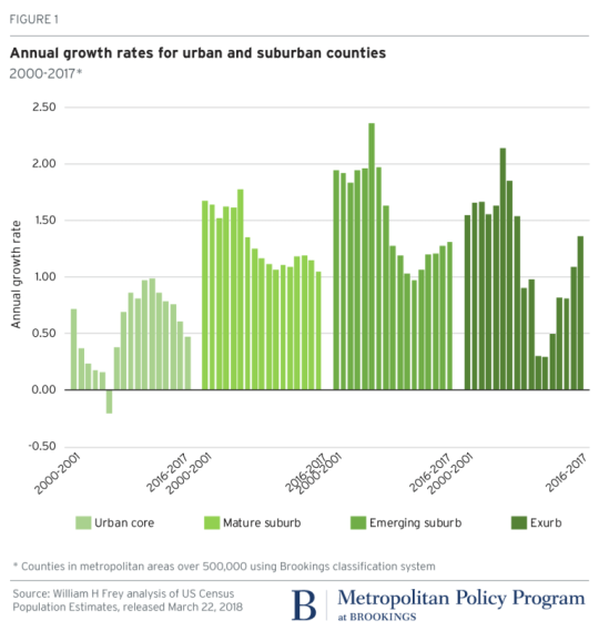
    Here is a graph from Brookings showing the annual growth rate for urban and suburban counties. Note how growth in the “urban core” peaked in 2012 and how growth in both the “emerging suburb” and “exurb” have increased since then.

    image

    The other finings from Brookings are that growth has slowed in large metropolitan areas (small metro areas and non metro areas, on the other hand are up) and that people are continuing to move from the Snow Belt to the Sun Belt.

    If you look at population gains and losses from 2016-2017 for the 100 largest US metro areas, the only Snow Belt gainers within the top 20 are New York (15th), Columbus (19th), and Boston (20th). Dallas, a Sun Belt city, was first with a gain of 146,000 people.

    So what’s going on? The narrative is that soon as the US economy and housing market recovered from the Great Recession of 2008, the trend lines simply reverted back to business as usual: sun and sprawl.