Daily insights for city builders, delivered every morning at 6 AM ET. I’m Brandon Donnelly — a Toronto-based real estate developer and founder of Globizen. I’ve been writing here since 2013.

Tag: economics

  • The Big Mac theory of housing costs

    Forty years ago, The Economist introduced its now-famous Big Mac Index. It was based on the simple idea that a Big Mac is a damn near perfect universal commodity, and so if you methodically compare its price across countries, it should give you an approximation of the purchasing power parity across a basket of currencies.

    For example, a Big Mac currently costs US$6.22 in the US (as of July 2026 and according to The Economist). But in Switzerland, it works out to US$9.04, and in Taiwan, it’s US$2.42. This suggests that the Swiss franc is overvalued and that the Taiwan dollar is undervalued because, in theory, their currencies should adjust over time to correct such a large variation.
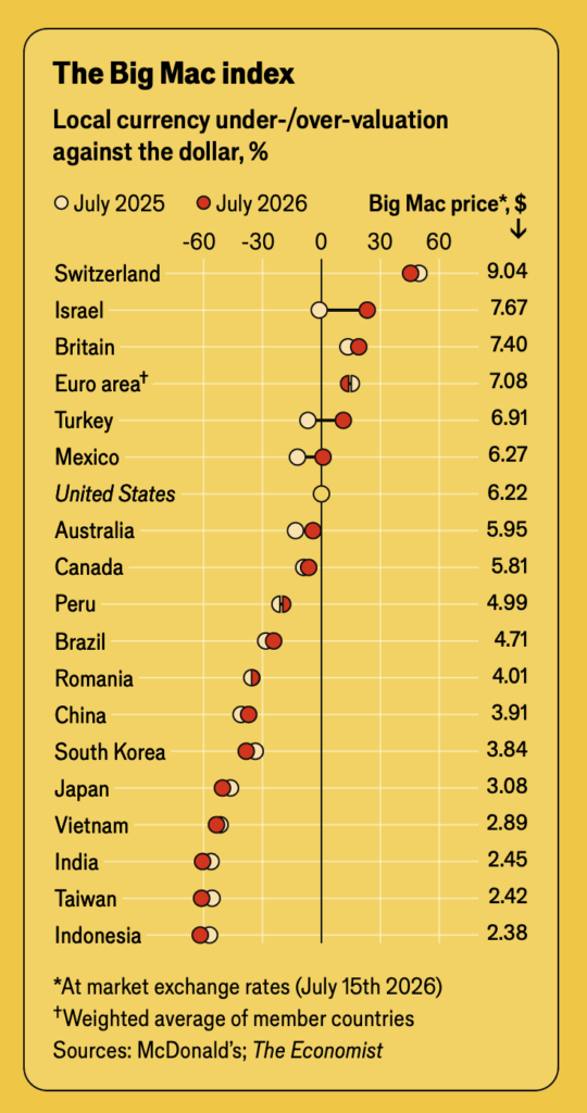
    Now, I’m not an economist, but supposedly there is some directional validity to this line of thinking. However, it’s not entirely accurate. If you look at the various inputs that make up the price of a Big Mac, there are over 60 ingredients, including local real estate prices, the cost of labour, and utility costs.

    Some countries may also have tariffs on certain ingredients, which would drive up the price for local consumers (yes, that’s how tariffs work), and some countries may have a higher willingness to pay for American fast food. If there’s a higher perceived value, McDonald’s can simply charge more.

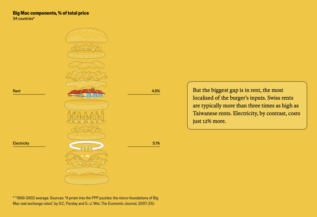
    So, the fact that a Big Mac costs significantly more in Switzerland does say something about the CHF, but it’s also an indicator that retail rents are somewhere around 3x what they are in Taiwan, among many other factors.

    Now let’s consider a product that, unlike the Big Mac, can vary a great deal across countries: housing. A new home requires far more than 60 ingredients, but it similarly reflects local cost structures, including material inputs, labour rates, and any tariffs and taxes that might be levied on the product.

    Every input, from time to development charges, gets factored into its end price, which is why, when a politician claims that something like inclusionary zoning represents a “no-cost affordable housing” solution, I wonder if they’re simply unclear on the economics or if they’re trying to deliberately misrepresent the situation.

    At McDonald’s, the equivalent policy would be to require that every time someone buys a Big Mac, the restaurant must simultaneously offer 20% of a new Big Mac to another customer, below the cost of production. It should be obvious that this practice would require the original customer to pay more for that same Big Mac.


    Images from The Economist

  • This is how many more people Toronto could house if it increased its population density

    As a follow-up to yesterday’s post about infill housing and overall urban densities, let’s look at some basic math.

    The City of Toronto has an estimated population of 3,025,647 (as of June 2023) and a land area of 630 square meters. That means that its average population density is about 4,803 people per km2. Obviously this number will be higher in some locations, and lower in others. But overall, this is the average.

    Now let’s consider how many people we could actually fit within the existing boundaries of the city (city proper not the metro area) if we were to simply match the average population densities of some other global cities around the world.

    Again, what this chart is saying is that if we took the same physical area (Toronto’s 630 square meters) and just increased the population density to that of, say, Paris, we would then have a total population of over 13 million people and we’d be housing an additional 10,011,573 humans on the same footprint.

    I am not suggesting that this is exactly what should be done. (Though, you all know how much I love Paris.) What I’m suggesting is that calling a place “full” isn’t exactly accurate. How would you even measure that? What someone is really saying is that they are content with the status quo in terms of built form and density.

    Note: The above population densities were all taken from Wikipedia, except for Toronto’s figures, which were taken from here.

  • Why is housing viewed so differently?

    Here is a study by three researchers out of California that asked Americans to predict the impact of a supply shock on various things, such as durable goods, commodities, labor, trade, and yes, housing.

    For basically all of these items, people tended to answer correctly. Usually by a factor of at least two to one. In other words, when asked what reducing the supply of new cars would do to the prices of used cars, the majority of people responded saying that it would lead to an increase in prices.

    However, when asked about the impact of a 10% increase in housing supply, about 40% said that it would cause prices and rents to rise. Only about a third believed they would fall (the correct answer). This is fascinating because it shows that housing seems to be an outlier. Most people don’t have the same intuitive sense.

    Why is this? Well, one commonly held belief is that building market-rate housing leads to gentrification, and that this ultimately leads to the displacement of existing residents. This might have been why some people responded saying that new housing will cause an increase in prices and rents. It’ll lead to all housing going up.

    However, there’s research to support that this isn’t the case. The problem isn’t outward displacement following new market-rate housing. The greatest driver of gentrification is actually “exclusionary displacement”, which is the inability of people to move into areas because of a lack of housing. (This study was based on 2010-2014 housing data from the UK.)

    The thing about housing supply is that it relieves pressure across the entire market. Instead of a high-income person buying an old home to renovate (and causing outward displacement), they can instead choose to buy a new home (and not cause any outward displacement).

    By doing this, they also leave behind a home that can then be absorbed by lower earners. One US study found that for every 100 new market-rate homes that are built, somewhere between 45 and 70 people move out of a below-median income neighborhood.

    It is for reasons like these that, time and time again, increased housing supply has been shown to moderate home prices and rents (see above regarding Minneapolis and the Midwest as a whole). So if you’re worried about the cost of housing, the answer is to build more. And if you’re worried about gentrification, the answer is also to build more.

    Our intuitions are telling us that this is true for most things. But for whatever reason, housing feels different. It’s not, though.

    Source: The charts and studies in this post are from this great FT article by John Burn-Murdoch.

  • Doing stuff vs. owning stuff

    “People get income for doing stuff, and they get income for owning stuff. Increasingly the latter. And the ownership share of income goes to a small slice of households that own almost all the stuff.”

    This is a quote from a recent article by Steve Roth over at Evonomics, where he breaks down the share of US household income that is derived from “labor” vs. “capital.” In other words, how much money do households make from working (trading their time for money) and how much do they make from their existing wealth (that is, owning stuff)?

    If I were to oversimplify how he calculates this (you can read all of the details, here), it is: (Income – Labor Compensation) / Income. Take all of the household income. Subtract the money made from doing stuff. And then divide it by total income to get the percentage made from “unearned property income.” There are gray areas and others things to consider, but that’s the gist of it.

    What he discovers and argues is that basically 50% of household income comes from simply being wealthy and owning stuff. He also reminds us that approximately 60% of US wealth is… “earned the old-fashioned away: it’s inherited.”

  • Income sorting by city

    This is a fascinating study by Issi Romem about the characteristics of cross-metropolitan migration in the United States. The key findings are that in-migrants to expensive coastal cities tend to have higher incomes and more education than the out-migrants, and that the opposite is true for the less expensive cities in the US. “Expensive” means expensive housing.

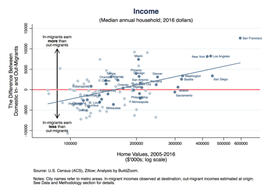
    Here is the income chart:

    Let’s use San Francisco as the example since it’s the most expensive metro (all the way to the right on the x-axis). The way to read this is that on average, from 2005 to 2016, in-migrants to the San Francisco metro area earned $12,640 a year more per household (y-axis) after they arrived compared to out-migrants before they left. This chart shows the difference between in and out incomes.

    Take note of Miami which is sitting at a similar place to New York and Los Angeles on the horizontal income line, but has home values similar to Phoenix, Chicago, and Philadelphia.

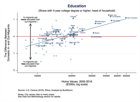
    Now here’s the education chart:

    Similarly, it is showing the difference in educational attainment between in and out migrants.

    So what does all of this tell us? 

    Well, it tells us, among other things, that US metros are continuing to sort based on income and that this process of polarization is probably contributing to home price appreciation. Because even if the incomes of current residents aren’t growing, these “expensive cities” are effectively swapping out poorer residents for richer ones. That, alone, would mean more money for expensive homes.

    For Issi Romem’s full article, click here.

  • Secrets of the German economy

    I just got off a flight where I spent an hour listening to this podcast: What Are the Secrets of the German Economy — and Should We Steal Them?

    One of the key themes is that Germany has a “stakeholder economy”, rather than a “shareholder economy”, which is one way to describe the Anglo-Saxon model.

    There’s also a lot of discussion around cities and spatial economics. 

    For instance, there’s an argument that WW2 forced a decentralization of the German economy. Germany is one of the rare examples where a country’s busiest airport (Frankfurt) is not located in the country’s biggest city (Berlin).

    Thanks Daniel for passing this podcast along. I enjoyed it.

  • We are all being manipulated by behavioral economics

    Ever notice how whenever you’re taking an Uber the driver usually gets another fare just before he (Uber drivers are overwhelmingly male) is about to drop you off? That’s on purpose.

    Earlier this month the New York Times published an interactive feature describing how Uber uses behavioral economics (or psychological tricks) to encourage its drivers to work longer, take more fares, and so on.

    Here’s a quick sidebar note about behavioral economics from Francesca Gino of Harvard Business School:

    According to the traditional view in economics, we are rational agents, well informed with stable preferences, self-controlled, self-interested, and optimizing. The behavioral perspective takes issue with this view and suggests that we are characterized by fallible judgment and malleable preferences and behaviors, can make mistakes calculating risks, can be impulsive or myopic, and are driven by social desires (e.g., looking good in the eyes of others). In other words, we are simply human.

    And now back to Uber. One tactic they use is goal setting. People are drawn to goals. This translates into driver messages like this one: “You’re $10 away from making $330 in net earnings. Are you sure you want to go offline?”

    But the experiment I found most interesting from the NY Times piece is the one that Lyft completed where it discovered that showing drivers lost/dropped fares was a far more powerful motivator than showing completed rides. In other words: Look at all this money you’re losing out on by not driving!

    This finding is in line with something I’ve written about a few times before on this blog: prospect theory. One of the tenets of this theory is that “losses hurt more than gains feel good.” We, humans, tend to focus more on the former.

    Of course, Uber is not alone in employing behavioral economics. Every app on your phone is being continuously optimized so that it gets as much of your attention as possible. But where is the line between encouragement and manipulation?

    If you’re interested in this topic, check out this HBR article called, Uber Shows How Not to Apply Behavioral Economics.

  • Home prices and negative interest rates

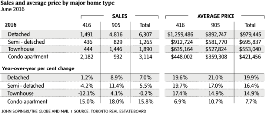
    This morning, I am looking at the following chart of average home prices in the Greater Toronto Area:

    It’s from this Globe and Mail article.

    These are staggering numbers. The average price of a detached home in the suburbs (905 area code) increased 21% year-over-year. In the city (416 area code), the increase was 19.6% YOY. These numbers are almost unbelievable.

    The article focuses on low supply (decrease in listings) and high demand. And that is certainly a big part of what’s going on here in this city, as well as in many others.

    But of course, the backdrop to all of this is our low / zero / negative interest rate environment.

    Larry Summers has a great post on his blog (which I discovered this morning via Fred Wilson) that talks about this “remarkable financial moment.” In some instances, real interest rates are actually negative! (You should read his post.)

    There are always people threatening that interests rates just have to go up. But Larry, as well as others, continue to argue that natural real interest rates are likely to remain close to zero going forward.

    Fred mentions Albert Wenger on his blog this morning and I have written about him before as well, here. In his book World After Capital, Albert argues that capital is no longer the scarce resource of our time. Instead, it has become attention.

    If you believe all of this to be true, then perhaps the numbers at the top of this post aren’t so unbelievable after all.

  • The urban wealth pendulum

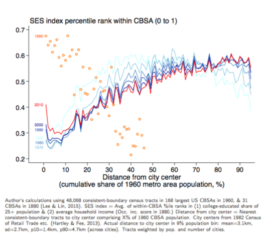
    Jeffrey Lin, who is an economist at the Federal Reserve Bank of Philadelphia, recently published the following chart:

    image

    I found it in this Washington Post article. And it’s packed full of fascinating information.

    The chart compares the socioeconomic status in US cities (y-axis) against “distance from city center” (x-axis) in 1880 and then in recent years (1960 to 2010 census data). The orange circles represent the 1880 data and the red and blue lines represent the recent census data.

    What this chart and research tells us is that in 1880, rich people overwhelmingly lived in the center of cities. And as you moved further away from the city center, socioeconomic status fell off pretty precipitously. This makes sense given that, at the time, it was hard to get around and travel long distances.

    However, in the post-war years, the exact opposite became true. We began driving and wealth decentralized. This should surprise no one. 

    But what’s interesting is how this appears to be reversing. In 2010 (the red line), there’s a sharp increase in socioeconomic status for people living basically right in the center of cities. And for the 30 – 60 km range, there has been a decrease in socioeconomic status essentially from the 1960s onwards. 

    The important takeaway here – which is spelled out in the Washington Post article – is that the neighborhoods which appear to be in high demand today are also in very short supply:

    “We have 80 years of essentially zero production of neighborhoods with these qualities,” Grant says. “We’ve spent the last 80 years building car-oriented suburbs. Then when the elites decide they want to go back into the city, there’s not enough city to go around.”

    This is one reason why supply matters.

  • What is this a building for ants?

    One of the things you’ll often hear people deride at cocktail parties is the trend toward smaller urban dwellings. They get called “shoeboxes” and “cubby holes in the sky.” So let’s unpack that a bit today and try and better understand the economics behind it all.

    When a new building is being developed, pretty much everything gets normalized to a per square foot (or square meter) number. 

    This is important because saying that building X cost $50 million to build and building Y cost $100 million to build doesn’t tell you much if the buildings are completely different. 

    However, saying that building X cost $500 per square foot to build and building Y cost $475 per square foot to build, tells you that building Y, despite being more expensive in absolute terms, was actually cheaper and/or more efficient.

    The same is true on the revenue side. And typically, developers are looking (struggling) to meet a certain per square foot number in order to make the project financially feasible. 

    For instance, let’s say you’re building a 100,000 sf condo building. Once you subtract the non revenue generating spaces, you might determine that you need 85,000 sf x $600 per square foot in revenue in order to make the project feasible.

    But there’s a back and forth game that needs to be played here. You have to ask yourself: for the product that I’m hoping to build, does $600 psf translate into something that people can actually afford?

    You might think: everyone keeps telling me at cocktail parties that condos in this city are too small. So I’m going to build a bunch of 1,800 sf, 3 bedroom condos. Based on the above, these homes would be priced at around $1.08 million (1,800 sf x $600 psf). Your on-site signage would read: “Condos coming soon. From the low $1 millions.”

    But wait a minute, how many families can afford a condo north of $1 million? Some could, but definitely not the majority. So then you determine through rigorous market analysis that $600,000 would be a better number. That is something that is within reach of more families.

    But then you look at the math and realize that if you build that same 1,800 sf home, your per square foot revenue number now drops to $333 psf ($600,000 / 1,800 sf). 

    Given that you bought the land for $100 psf buildable (market price in the area) and that your construction costs alone are going to be $250 psf, you realize that you’re now underwater ($100 + $250 psf > $333 psf) without even adding in any soft costs (consultant fees, city fees, and so on). If you showed this to your investors on the project, they would throw you out of the room.

    So instead of building that 3 bedroom condo at 1,800 sf, you say to yourself: what if I made it 1,000 sf? You’re confident that your architect could lay out a terrific condo at that size and it now magically gets your per square foot revenue number back up to $600 psf. 

    This solves two problems: it returns the project to positive feasibility and it keeps the total sale price within reach of more people. It promotes greater affordability. So you go ahead and do it. Boom – shrinking urban dwelling.

    All of this is not to say that this is fair or unfair, good or bad. It is simply to say that this is the way it often is.