
I just came across the following chart via City Clock:
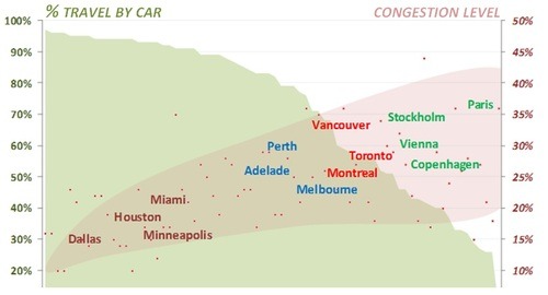
It came from a study that looked at 74 cities in terms of two measures: the percentage of people that travel by car and the traffic congestion levels within those cities.
The way to read the chart is to first look at the red dots. Each dot represents one of the cities studied. The position of the red dot corresponds to that city’s congestion levels. So for example, if we were to take Toronto, the congestion level is 27%.
If you then take that same dot and draw a vertical line to the top of the green shaded area, you get the percentage of people who travel by car. In the case of Toronto, it is 56%.
What’s interesting about this chart is that as congestion levels rise, it forces people out of their cars. In other words, the cities with the highest congestion levels also have the lowest auto share percentages.
But the other way I interpret this chart is that the decision is almost binary: you’re either planning for cars or you’re planning for people. Based on this data, it’s hard to have both.
