Daily insights for city builders, delivered every morning at 6 AM ET. I’m Brandon Donnelly — a Toronto-based real estate developer and founder of Globizen. I’ve been writing here since 2013.

Tag: urban sprawl

  • Urbanism versus architecture

    Good morning from rainy New Hampshire.

    It’s been raining all morning, but apparently there is an ocean hidden in the above picture. We also got in after dark and so all I really saw was what I could see on the drive from the airport.

    Whenever I am reminded that the vast majority of built form in North America is car-oriented in nature, I can’t help but think of how sticky all of this is going to be.

    Witold Rybczynski put it accurately when he said, “urbanism and architecture observe different time lines.” Buildings may take forever to build, but relative to urban form, they actually change pretty quickly.

    New materials and styles emerge, and so do new buildings. But the streets that surround them change so slowly, that for all intents and purposes, they mostly don’t change.

    What that means is that, for better or for worse, most of what we see is likely to persist. No wonder there is an arms race going on with autonomous vehicles.

  • Most of Europe is getting denser

    Here is an interesting set of maps (from this study) showing density trends, population trends, and residential area trends (i.e. sprawl), across Europe between 2006-2012 and 2012-2018:

    The key takeaway is that, broadly speaking, there is — or at least there was five years ago — a new density trend across most European cities. From 2006 to 2012, the prevailing trend was de-densification. That is, fewer people per hectare. However, from 2012 to 2018, that trend largely reversed. With the exception of the Iberian Peninsula and Eastern Europe, the majority of cities flipped to densification.

    The study tells us that there are two main reasons for this switch. The first is that more cities started growing again. During the first period, about 60% of cities in the sample size of 300+ cities, were adding people. In the second period, this figure increased to 75%. It’s also worth noting that this growth is being largely driven by immigration, and increasingly so. The number of cities with positive natural growth diminished from 67% to 51% between the two study periods.

    The second driver is a reduction in sprawl. Though almost every city in the study continued to expand outward, the rate of expansion was much lower between 2012 and 2018. So less land consumption, and more people. That’s how you increase your urban density. Of course, it would be interesting to see if any of this has changed or reversed (again) as a result of the pandemic. 2018 kind of feels like eons ago, doesn’t it?

  • New land development across the US between 2001-2019

    The Washington Post just published this interactive feature showing new developed land (i.e. urban sprawl) across the US between 2001 and 2019.

    It is based on these land cover maps which were published by the US Geological Survey earlier in the summer. Their findings show that between 2001 and 2019, more than 10% of the land cover in the lower 48 states changed during this time period. Mostly in forested areas.

    The WP feature allows you to search by city/address and I would encourage all of you to try it out. As an example, here is Salt Lake City. The gray areas represent land that was already developed in 2001. The purple areas represent land that was developed sometime between 2001 and 2019.

    Images: Washington Post

  • Intraprovincial migration across the Greater Toronto Area

    This is a chart from a recent blog post by Ryerson University’s Centre for Urban Research and Land Development. It shows net intraprovincial migration across the regions of the Greater Toronto Area. And what you are seeing here is people moving from expensive and built-up areas like the City of Toronto and the Region of Peel to lower cost areas further outside of the city.

    This is interesting for a couple of reasons. One, it’s very much a natural market outcome. Many people tend to “vote with their feet” and look for greater housing affordability. And two, this is a trend that existed prior to COVID-19. It is not the death of cities. In the words of Ryerson’s CUR, it’s about people looking for more affordable lower-density housing.

    But to what extent is “lower density” the key deciding factor? In other words, how much of this is consumer preference and how much of this is people being forced out by a lack of infill housing supply?

  • Neighborhood depopulation

    Recently we’ve been talking about California’s Proposition 13 and how it may be creating a disincentive for longtime homeowners to move. They’re enjoying below market property taxes, and so they stay put, even if they may have too much house.

    But this concept of “overhousing” isn’t unique to California. The Globe and Mail just ran a piece talking about how Toronto’s designated “Neighborhoods” are losing people as the nests empty out, seniors remain put, and the broader city booms.

    The rate of depopulation that created the spare bedrooms in Toronto’s low-rise neighbourhoods is stark: “Since 2001, about 52 per cent of the land mass of Toronto has reduced in density of population by about 201,000 people,” Mr. Smetanin says. “Other parts of Toronto have grown by 492,000.”

    The irony of this phenomenon is that the city’s Official Plan considers these Neighborhoods to be “physically stable”, as well as “one of the keys to Toronto’s success.” However, things are clearly changing behind that physical stability.

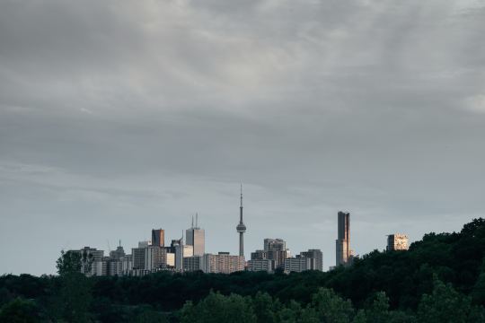
    Photo by Verne Ho on Unsplash

  • Is sprawl to blame (at least partially) for the flooding in Houston?

    What’s happening in Houston right now is devastating. Ian Bogost of The Atlantic is calling the flood a “disaster of biblical proportions.” Harvey has unloaded 9 trillion gallons of water.

    It is once again reminding us of the importance of resiliency when it comes to our cities.

    One emerging argument is that this is an almost inevitable outcome for Houston, brought on by the multiplicative effects of climate change, unfettered urban sprawl, and poor design decisions.

    The barriers to development are famously low in Houston, which allows the city to quickly add housing and people. There are many benefits to this. 

    But it also means that there has been, among other things, a dramatic increase in the amount of impervious surface.

    This matters because impervious surface creates runoff.

    According to The Texas Tribune, impervious surface in Harris County (third most populous county in the U.S.) increased by 25% between 1996 and 2011. 

    And it replaced things like the below prairie grass (switchgrass), which are highly absorbent as a result of their deep root system. 

    But much like climate change, not everyone believes this is to be blamed. 

    For more on this, check out The Texas Tribune’s full interactive piece. It’s called “Boomtown, Flood Town” and it’s worth a read.

    Image from The Texas Tribune

  • The cost of saying “no”

    https://500px.com/embed.js

    When you rezone a property to build something new, pretty much every city will ask you to provide reports and studies that assess the potential impacts of that something new. 

    They’ll ask you to look at the impact on traffic, the impact on storm water, the impact on shadows in the area, and the list goes. This, of course, is fair and reasonable. It makes sense to measure the impact of the proposed changes to see if it will work in the given context. 

    But those are not the only impacts to consider. I think that many of us underestimate the flip side, which is the impact of doing nothing, or in this case, building nothing. Here’s a recent quote from an excellent interview with urban economist Edward Glaeser:

    Personally, I believe there are always huge costs to saying “no” to people who want to create space for new families that want to live in the city; who want to make the city more affordable. There are always costs – I believe that very, very strongly – but, sure, there are also benefits to saying “no” at certain times.

    Glaeser is, of course, not saying that we should allow unfettered development. He is saying that there are costs (or impacts) to building and costs to not building. The challenge is that we assume, often incorrectly, that saying “no” simply means the status quo will prevail. And we do not consider the impacts.

    So what does that mean? Here’s an example.

    The Neptis Foundation, which is a nonpartisan and charitable urban research group, just published an interesting report called, Growing Pains: Understanding the new reality of population and dwelling patterns in the Toronto and Vancouver regions

    What the report did was compare growth and settlement patterns in both the Greater Toronto (and Hamilton) Area and Metro Vancouver between 2001 and 2011. And what they found was two different stories.

    Of the one million people that moved to the Toronto region between this period, roughly 80% of them settled in new greenfield housing subdivisions at the urban edge. And only 18% of people moved to areas that were well serviced by public transit.

    By contrast, only 31% of Metro Vancouver’s population growth went to greenfield areas and 69% went to urban intensification areas. Nearly half of these new residents ended up settling next to high frequency transit.

    From an environmental standpoint, Vancouver’s settlement pattern is obviously preferable. But it takes hard work to achieve that. The barriers to infill development are more formidable than the barriers to greenfield development. This is despite the fact that there are well documented social, economic, and environmental costs associated with urban sprawl.

    My point with this example is that growth and demand will find somewhere to settle. Some locations make more sense than others, but sometimes there’s no choice when we have decided to say “no.” So what we ought to be doing is measuring both the impact of building, as well as the impact of not building.

  • Measuring urban form

    Last night the Toronto Transit Commission offered free service starting at 7pm. This is typical of Toronto on New Year’s Eve, as it is with many other cities. I think it’s great thing to do and I love seeing so many people taking transit to get around. I took it everywhere last night.

    Since I knew I would be doing a lot of walking, I charged up my Fitbit Flex and strapped it on around lunch time. Here is my New Year’s Eve according to Fitbit. I took 11,239 steps yesterday afternoon/evening.

    Activity tracking and health monitoring devices have really taken off over the past year. And I absolutely do think they help motivate. But beyond an individual level, I also think this data could be really interesting in aggregate and overlaid with other data points, such as where people live, where they work, how they travel/commute, and so on.

    Many have speculated that urban sprawl makes people fat since it privileges driving over walking. But with all the data that companies such as Fitbit and Nike are collecting, it would be interesting to see some hard data on how much more urbanites really walk compared to suburbanites.

    One idea would be to use Walk Score and examine the correlation between the walkability of a person’s neighbourhood and the average number of steps they take everyday. Intuitively, it seems like there would be a strong one. But it would be cool to see it quantified. I’d happily share my data if somebody would like to take this on.

    Happy New Year, everyone. Welcome to 2014.