Daily insights for city builders, delivered every morning at 6 AM ET. I’m Brandon Donnelly — a Toronto-based real estate developer and founder of Globizen. I’ve been writing here since 2013.
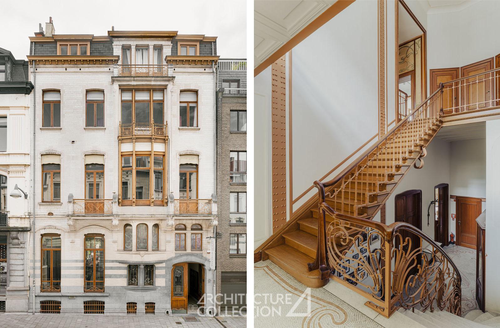
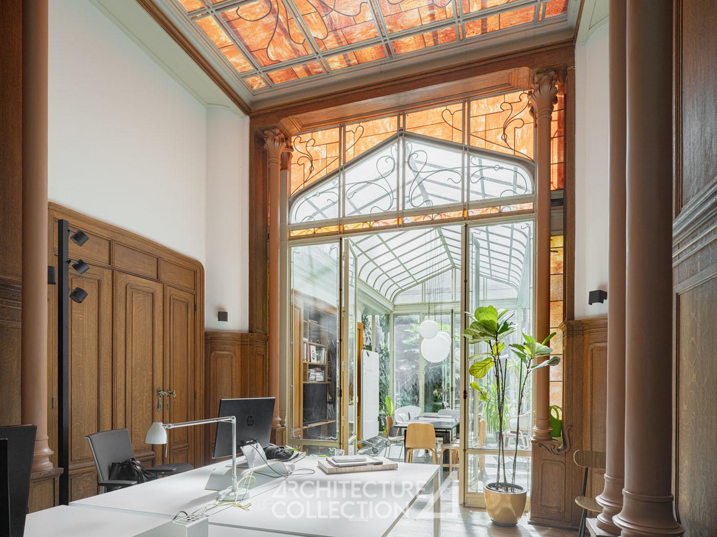
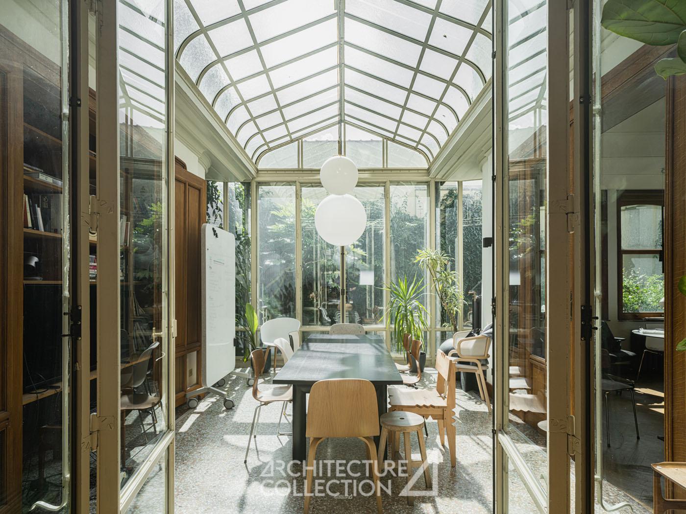
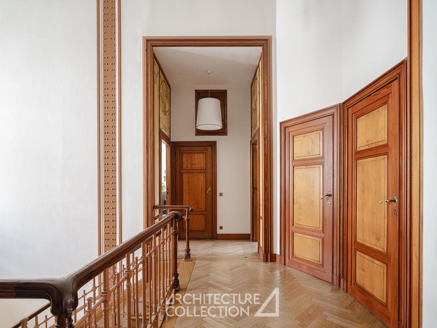
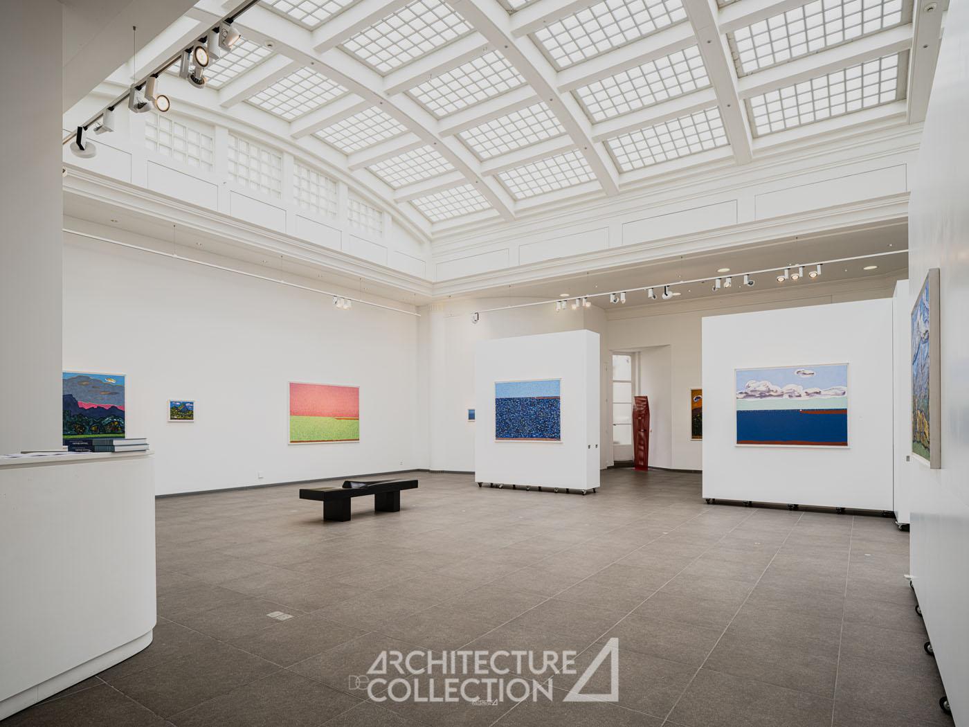
If you happen to be in the market for an Art Nouveau building near the center of Brussels, then you may want to check out this listing from Architecture de Collection. Built in 1897 and designed by architect Victor Horta — one of the founders of the Art Nouveau movement — the property consists of three distinct units, including multiple office spaces and a large art gallery.
It’s listed for €3,900,000 and has a total of 930 m2. That works out to about €4,194 per square meter or about €390 per square foot (inclusive of 6 parking spaces located in a neighboring building). I’ve never been to Brussels, nor do I need an office and art gallery there, but this is a beautiful building. If you’d like to learn more, click here.
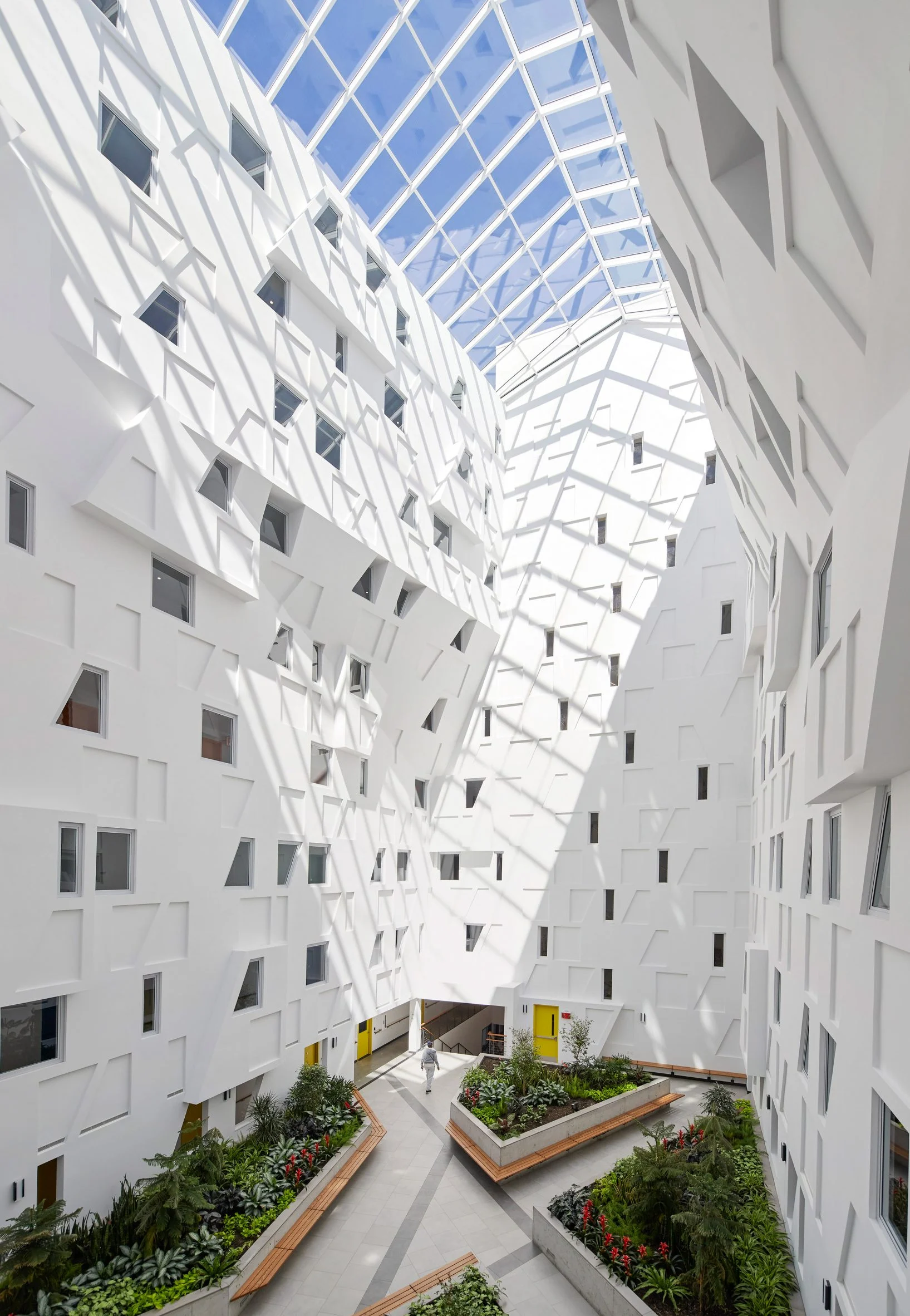
Studio Libeskind has a recently completed project in Brooklyn that looks like it was designed by Studio Libeskind. It has angled facades and, judging by the comments on Dezeen, its design is polarizing. But it is an affordable housing project for seniors, and it does have a large atrium in the middle of it.
Atria are a bit of a unique feature in multi-family housing (at least in this part of the world). For better or for worse, the gold standard has become the double-loaded corridor. And that’s because it’s “efficient.” It helps you maximize the amount of rentable or saleable area to gross construction area.
Here in Toronto, a typical efficiency — calculated as the net saleable/rentable area divided by the gross construction area — would be somewhere between 75-80%. Though many factors can affect this percentage, such as the amount of amenity space in the building.
There is certainly the option of just building a less efficient building, but then it means you’ll likely need to increase the price of the homes to compensate for this loss in efficiency.
This is the trade-off that is often made with smaller suites. More and smaller suites usually translate into more corridor space (i.e. a lower overall efficiency). But it may make sense to do this if you think your smaller suites will generate more revenue on a per square foot basis.
Off the top of my head, I can only think of two residential building in Toronto with an atrium. And that’s 71 Front Street East in the St. Lawrence and “The Atrium” at 650 Queens Quay West. The latter is pretty neat inside. The last time I checked, it even had fake palms.
In the case of both The Atrium and Libeskind’s Brooklyn project, the atria result in single-loaded corridors. (I’m not sure how 71 Front was designed.) Here’s what Libeskind’s project looks like:
The obvious advantage of this condition is that you get natural light into the corridors, whereas with a typical double-loaded corridor you don’t. But again, the disadvantage of this design is that you only have apartments on one side, instead of both sides.
In this case, the thermal envelope of the building is the outside face of each corridor (atrium side). This means the corridors are interior or conditioned spaces.
Another option would be to create open-air corridors, like in this example from Montreal. This creates corridors exposed to the elements, but now you’ve reduced your overall energy consumption (less space to heat/cool) and you’ve created the possibility of double-aspect units.
Personally, I’m a fan of atria and courtyards in residential buildings. But for the reasons we just talked about, they’re not that common. My sense is that they’re far more common in commercial buildings. John Portman, for instance, made a name for himself designing and developing hotels around them.
What are your thoughts, though? Would you pay a premium to live in a residential building with a nice atrium? I bet some of you would if it meant an improved suite design, such as more windows and more natural light.
I spent three years living in Philadelphia for grad school and one of the things that I appreciated the most was its walkability. I walked and took transit everywhere. Much of this has to do with the grid system that was laid out for the city in the 17th century. But there are also lots of more recent developments that help to reinforce this fabric.
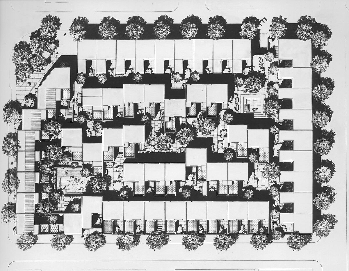
CityLab, for example, just published this article on Penn’s Landing Square, which is a housing complex in Philadelphia’s Society Hill neighborhood. Built in 1970 and designed by Canadian-American architect Louis Sauer, the modernist complex occupies an entire 2.37-acre block and contains an assortment of 118 low-rise homes, many of which are connected through small interior laneways.
In addition to its handsome architecture, what is noteworthy about Penn’s Landing Square is that its site plan makes it quite a dense low-rise development. At 118 homes, this translates into just under 50 units per acre. CityLab estimates that this means the development holds about 174 people per acre (~412 people total), which would make it more dense than Stuyvesant Town in New York (~158 persons per acre).
However, this is based on the assumption that there are almost 3.5 people living in each of these homes. While generally large, I don’t know if this is the case. It would be higher than the average US household size. But regardless, from a unit per acre standpoint, it remains a great example of dense, family-oriented, and grade-related housing.
For fun, let’s compare this to a more intense form of infill development. Our Junction House project, for instance, contains 151 homes and sits on a 0.48-acre piece of land. This translates into about 315 units per acre. I don’t know off hand the average number of occupants per household, but I reckon that, given our larger average suite size, we should be on the higher end compared to most mid-rise condominiums. So I would say that we are probably 400+ people per acre.
It’s unfair to compare a single development to an entire neighborhood, such as Stuyvesant Town. Circulation and other open spaces will necessarily pull down your average density. But these individual development examples do speak for themselves. There are many parts of North America where you might find 1 home or a handful of homes per acre of land. At Penn’s Landing Square, this number is 50 units per acre. And at Junction House, it’s 315 units per acre.
Constructed between 1967 and 1972, the elaborate structure sits atop a strip of land measuring 50 m x 1.2 km, which had been flatted during the Second World War as a way to contain the spread of fire in the event of an air raid and to act as an evacuation corridor.
It’s a modernist development that is very much of this period. It’s massive, complicated in section and, in many ways, completely disconnected from its surrounding urban context. Flanking the various buildings are elevated and covered walkways.
So it is perhaps not surprising that this development has followed a similar fate to many others of this era. While it was initially viewed as being quite modern and desirable — it was one of the first buildings in Seoul to have elevators — Seun Sangga was quick to start showing signs of decline.
In fact, by as early as the 1970s, the complex became known for its porn shops and a bunch of other informal economy-type activities.
I had coffee this morning with an engineer who is going back to business school in order to segue into real estate development. This is a fairly typical journey. Lots of people come into development from a related discipline. In my case, it was architecture (even though I never practiced architecture). It was also the case when I went to Rotman that something like a third of the class had a background in some sort of science or engineering field.
However, one thing I did mention this morning was that he will likely find that he will need to unlearn certain things as he moves forward. Every discipline tends to indoctrinate us with a certain way of thinking about the world. Lawyers tend to be a certain way. Engineers tend to be a certain way. And architects tend to be a certain way.
In my case, I found that architecture school taught me to be, among other things, an intense perfectionist. The modus operandi in design studios is that your project is never ever complete. The more you work on it, the better it will become. And as a result, you should feel a deep onus to work on it as much as humanly possible. But in business, this isn’t practical. In the vast majority of cases, speed over perfection will serve you better.
I believe wholeheartedly in multi-disciplinary backgrounds, and maybe this is one of the reasons why. It shows you what you should unlearn. What would you say your biases are?
Construction is generally considered to be the world’s largest industry, and yet, it is well known that its productivity levels suck. Over the last half century, the industry has experienced something in between meager and negative productivity growth.
It is for this reason that, for as long as I can remember, people have been trying to figure out how to turn development and construction into something more repeatable and less custom — something like a product.
Now, there can be a bit of a stigma associated with this moniker. Architects don’t often like to think of their work as being a product and references to modularity can sometimes evoke feelings of cheapness (think manufactured homes).
But I think all of this is quickly changing. And at the end of the day, we are going to need to start building like this if we have any hope of making housing more affordable within our cities.
Here’s an example.
Back in 2021, I wrote about a new modular housing company called Juno. They had just broken ground on their first project in Austin (a five-story 24-unit building), and they were in the media talking about how they had more or less reduced the building down to 33 standardized parts.
The multi-family space has since softened in Austin, and I don’t have any inside knowledge of how this project went, but the building is now complete and being leased up. And regardless, I think it’s an important case study to look to. This is where our industry is heading.
Montreal is, in many ways, a city of winding exterior stairs. If you’ve been there, then you know. The city is overwhelmingly a city of low-rise apartments (less than five storeys). And with these, comes lots of exterior circulation. But this tradition doesn’t just apply to older buildings. Here is a contemporary tall-building example which follows a similar approach.
Designed by MSDL Architects, the project, called The Laurent & Clark, consists of two tower volumes. They read as two separate towers, but they’re connected and share egress paths. On the east side is a conventional “scissor stair” tucked behind two elevators. And on the other end, connected by an open-air corridor, is an exterior exit stair that runs all the way up the tower.
This is novel (at least in this part of the world). The suites in the west tower are all dual aspect; meaning, they have windows on both ends.
They also have direct elevator access (see cores above), which means a lot less non-revenue generating circulation space. I mean, if you think about it, the open-air corridor on the north side of the west tower is akin to building a simple balcony. Extend the slab and add a guard rail. And so you could argue that this portion of the building has a near 100% efficiency factor.
However, the downside is that you need more elevators. Here, it looks like they have 6 for their 356 suites. That’s an overall ratio of just under 60 suites per elevator, which is lower (i.e. better) than what you’d typically find in a conventional tower. The crude rule of thumb is 1 elevator for every 100 suites. That said, these direct-access suites would be premium.
But perhaps the most important takeaway is this: If cold and snowy Montreal is cool with open-air corridors and exterior exit stairs, then maybe your city should be as well.
There is an ongoing architecture/development joke that the way you design a building is by first starting with the parking. Once you’ve figured out how the parking will work, you can then move on to, you know, the secondary stuff, like figuring out how actual humans will occupy your development. I’m calling it a joke, but there’s obviously some truth to this. Parking is almost always a challenge, especially if you’re developing in a city that still has parking minimums.
Previously, I’ve talked about the benefits of “unwrapped” above-grade parking. This is generally counter to how most cities like to think about parking. But for a few reasons, it can make a lot of sense. However, to be clear, I’m not advocating for more parking. My point was simply that — if you absolutely have to build parking — then maybe you should look at spaces that give you some flexibility in the future.
At the same time, there’s another more nuanced thing to consider: how big are your actual parking spaces? Here in Toronto, a standard parking space is 2.6m wide x 5.6m deep (about ~157 sf). This is larger than some apartments. But these minimum dimensions can vary greatly by municipality. Oftentimes you’ll hear planners say, “well, people here like their big cars.” The problem with this is that these dimensions will dramatically change your parking design.
So today I thought it would be interesting to gather a few data points from all of you. What are the minimum parking space dimensions in your city? Please leave a comment below so that everyone can see. As far as I know, there isn’t a globally accepted set of dimensions for parking spaces. Perhaps because some places like big cars and other places don’t care. But maybe there should be.
This is the sort of housing project that you’d fully expect to find in Tokyo. Seven homes built on a small urban lot measuring only 11 feet wide by 93 feet deep. But in this case, it’s not Tokyo; it’s Chinatown, Philadelphia, where a residual lot that was created when the sunken Vine Street Expressway was carved through the middle of the city in the 1950s.
Designed by Philadelphia-based Interface Studio Architects (ISA), the project contains 7 levels of livable space. What’s interesting, though, is that from a building code perspective this is still a 4-story building. There are two mezzanine levels that don’t get counted (and that create some great double-height spaces). This also seems to be what allowed them to get away with a single egress stair in the middle of the building.
The other technique that was used to maximum density is facade projections. Philadelphia’s zoning code allows for projections up to 3 feet in the horizontal dimension. And if you look at the above plans, you’ll see that these were used to “top up” or extend the site’s 11 foot width to 14 feet, when it made sense to do so from a programming standpoint. The result is some very livable spaces.
I am endlessly fascinated by these sorts of projects because they demand creativity and because you ultimately end up unlocking something that the market had been overlooking. Here is an example of a small leftover urban parcel that was previously used as surface parking for two cars. Now it’s seven beautiful homes.
The late fashion designer, Virgil Abloh, had a design rule for himself called the “3% approach.” Above is a slide from a presentation that he gave at Harvard back in 2013 where he listed it as item 3 of his “personal design language.” The idea behind this 3% rule is simple: you really only need to change something by 3% in order to create something new.
Case in point:
Given this, it should come as no surprise that Abloh had cited artist Marcel Duchamp as being a source of inspiration. (We’ve spoken about this before.) Duchamp is most famous for his “readymade” sculptures where he took existing objects — like urinals — and transformed them into art by signing them and curating them appropriately. This was obviously controversial, but it made Duchamp one of the most important artists of the 20th century.
Now, 3% seems like an oddly precise number. I don’t know how, for instance, you quantify the amount of change on the above shoe. Is it surface area? In any event, that’s beside the point. What’s most fascinating for me about this approach is that it suggests that small changes are enough to, not just create novelty, but actually establish authorship. Meaning, the shoe on the right is no longer a Converse shoe. It is now an “OFF-WHITE” shoe. They authored it.
Like the work of Duchamp, this was and is controversial. Lots of companies have sued Off-White for trademark infringement. We know, for example, where the above black stripes came from and we know that Off-White’s multi-directional arrow logo is borrowed from Glasgow Airport’s logo c.1960. But that’s clearly the point of readymade reworks. And it’s clearly enough for people to want to pay a lot more for the shoe on the right.
Fascinating.
Do you think that this 3% approach applies (or could apply) to other things outside of fashion, like architecture and buildings? I think so.