Daily insights for city builders, delivered every morning at 6 AM ET. I’m Brandon Donnelly — a Toronto-based real estate developer and founder of Globizen. I’ve been writing here since 2013.
I had lunch today with a friend (from school) who runs a multifamily development company in South Florida. His business is very similar to the apartment strategy that we are now working on in Toronto, in that he builds a repeatable apartment product (garden style apartments). In fact, he was telling me that he now has a dedicated design & QA/QC team within the company. Their job is to focus on continuous optimization and on reducing construction inefficiencies.
This is the way!
But each market is obviously unique. His rents are in the US$3 – 3.25 psf range (call it ~C$4.15 – 4.50 psf), whereas in Toronto you need something closer to C$5 psf to have a feasible project. Our yields are also lower on average. It’s hard work to get to an untrended yield-to-cost of 5% here. But for him, he can’t raise capital with anything less than 6.5%, which represents a development spread of at least 150 bps over where multifamily cap rates are today in his market (~5%).
Let’s check in on office utilization (in Toronto). The last time we talked about this was in April. At that time, the average weekly utilization figure was 63%. The peak day — Wednesday — was 73%. And the low day — Friday — was 40%. Today, well as of September 15, these numbers are now 69%, 79%, and 39%, respectively (see above chart). So we continue to climb. The only slight downward trend is Fridays. People don’t like coming into the office on Fridays. Still, the average is up 6% over the span of about 6 months. This makes you continue to wonder: When does this level off? I also don’t know what this index looked like before 2020. Are we back, or not yet?
“Complete streets” are streets that are designed to be safe for all users: people who walk, bicycle, take transit or drive, and people of varying ages and levels of ability. They also consider other uses like sidewalk cafés, street furniture, street trees, utilities, and stormwater management.
Right now, the city is in the public consultation phase. If you’d like to provide your feedback, you can do that here. You have until October 30th. The online tool is also pretty neat. You can drop comments on specific areas of the street. And already the map has been totally filled up.
This is an important and busy artery in midtown. I use it all the time as a pedestrian, cyclist, and driver. It’s not the best street, though. Yesterday it took me 45 minutes to drive from one end of it to the other. Along with better street design, this part of the city could use better transit.
I’m looking forward to seeing how Dupont ultimately gets designed.
On Saturday, I went on a bike ride all around Toronto. We cut across midtown (checking in on One Delisle), stopped at the Chester Hill Lookout (which if you grew up in the east end is where you probably went as a teenager to make out), shot down the Don Valley, and then turned west along the waterfront. The weather was perfect.
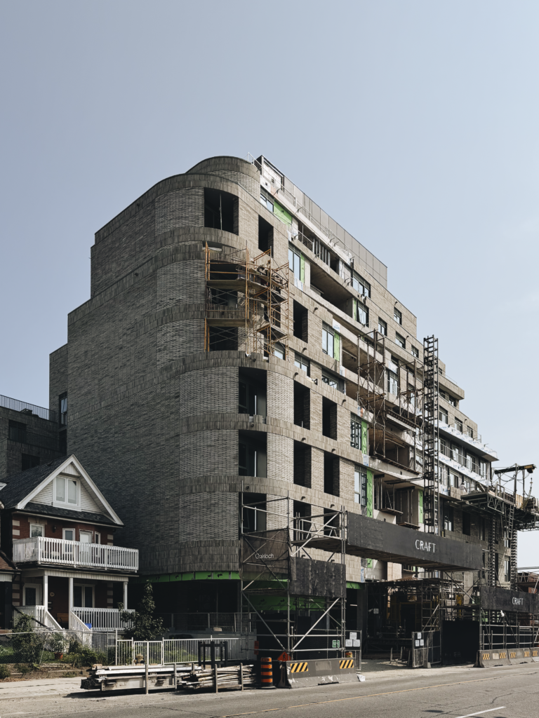
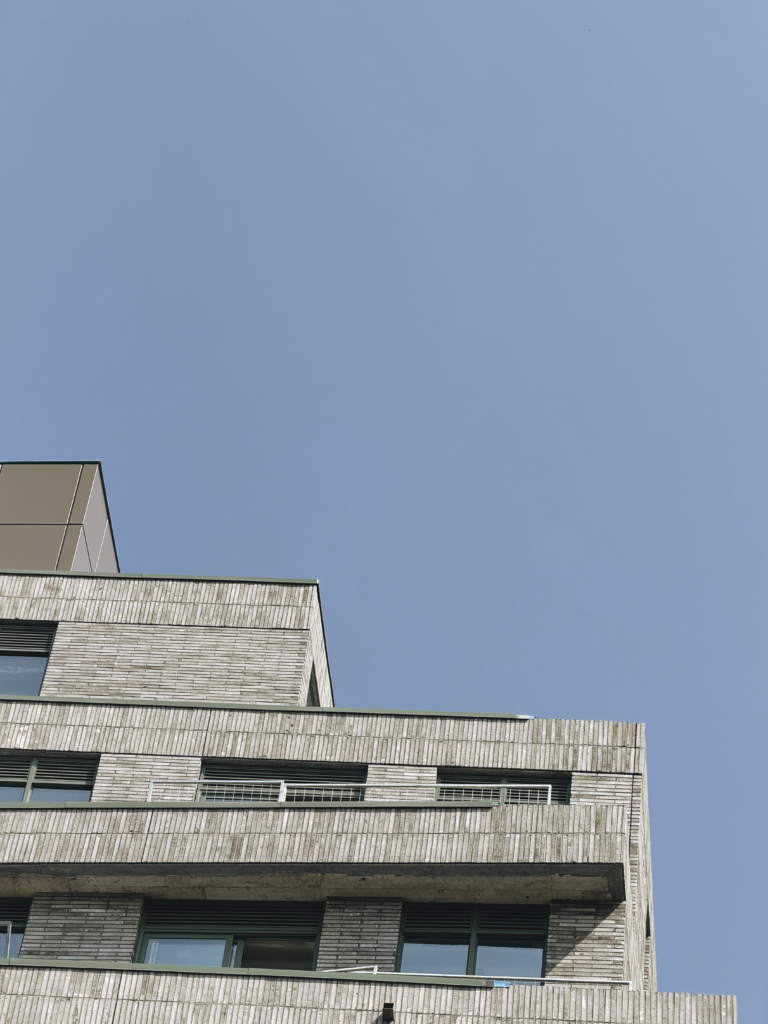
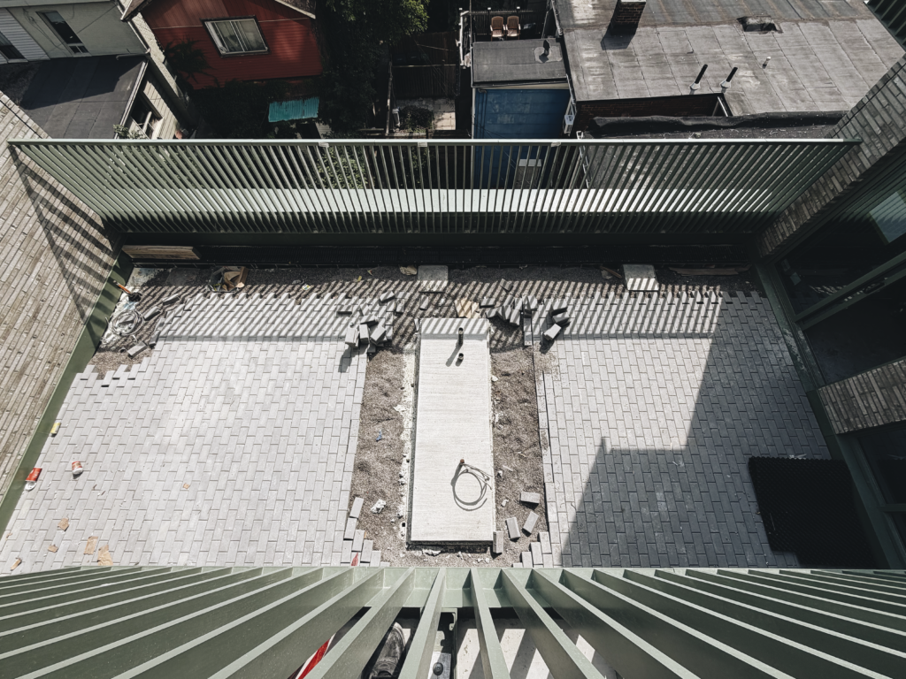
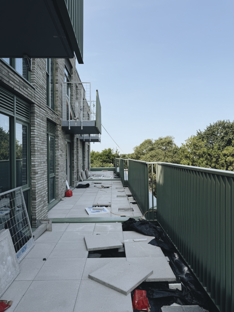
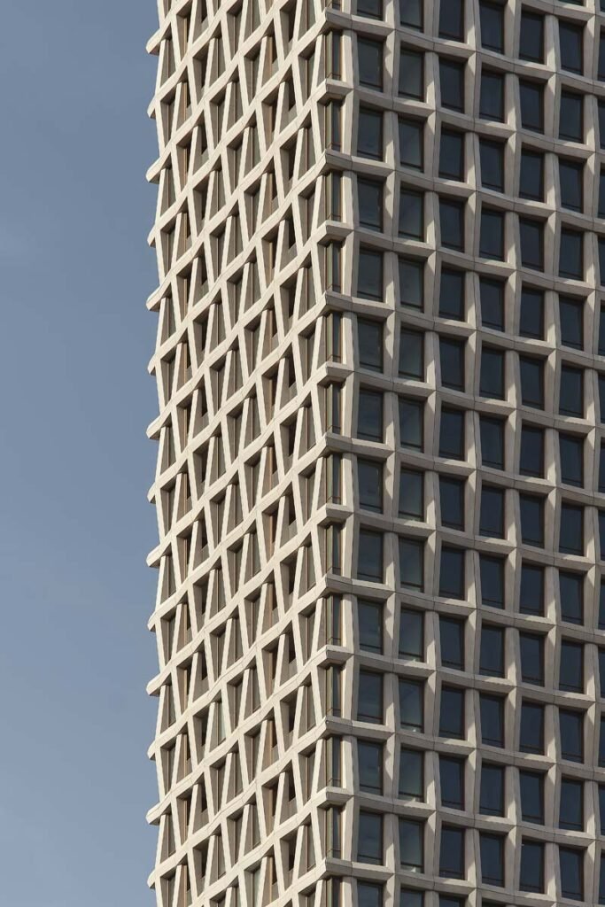
As we were going along the waterfront, we passed the new Aqualuna building that is under construction on Queens Quay East, near Parliament Street. Being the architecture nerd that I am, I immediately noticed that as you pass by — at the speed of a bike — the balconies create this really nice cinematic effect.
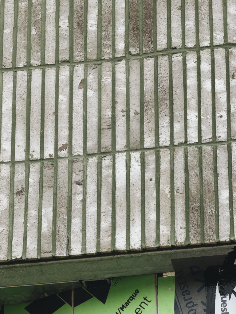
So I stopped to take these photos (I probably should have taken a video now that I think of it):
I then tweeted a tweet calling it one of the most beautiful buildings going up in Toronto today. Judging from the responses, most people seem to be in agreement, but a few people questioned the practicality of balconies like this. Namely how private and usable they will be. I don’t disagree, but I still think it’s fine looking building.
Statistics Canada recently published some data (from 2022) looking at investors in the condominium apartment market. Here is what they believe to be the share of condominium apartments used as investment properties in Ontario’s 10 largest census metropolitan areas:
It’s worth noting that this is afterexcluding condominium buildings where every single suite is owned by a single investor. This is/was most prevalent in London, and it’s the result of there being property tax benefits to registering a condominium (individual unit assessments), even though for all intents and purposes it’s a rental building (building in its entirety assessed).
The article goes on to rightly suggest that the prevalence of investors, and the way that condominiums are financed, could be leading to the construction of more buildings with smaller suites. Here’s the proportion of new condominium apartments under 600 square feet by period of construction:
The unsurprising takeaway is that condominium suites have gotten smaller. In the 1990s, the average condominium apartment built in the Toronto CMA was 947 square feet. This is compared to 640 square feet after 2016. And the same thing happened in Vancouver, which went from an average of 912 square feet to 790 square feet.
Investor preferences certainly have something to do with this. But what the article doesn’t specifically mention is that this phenomenon is also a direct response to rising build costs: making suites smaller was how the market tried to maintain some level of affordability. Put differently, imagine how expensive new condominiums would be if the average size was still 947 square feet.
But there are obviously limits to this. I was with one of our architects the other week and he made an interesting comment to me. He said, “Brandon, before when build costs used to go up and things got less affordable for consumers, we could just make the suites smaller to offset the impacts. But I don’t see how we can go any smaller now. We’ve reached the limit.”
This is one of the reasons why I think this downturn is going to ultimately be a good thing for Canada’s housing markets. It’s a reset. It’s forcing everyone out of complacency and, hopefully, it means that when the next cycle begins we’ll be starting from a better foundation.
It is maybe comforting to know that even Europe wrestles with the decision of whether a grand urban space should be used for pedestrians, or turned into a parking lot. Take, for example, the Grand-Place in Brussels (pictured above).
Today, it is a UNESCO World Heritage Site and one of the most important tourist destinations in the city. Perhaps its most famous. But during the 1960s, in what Wikipedia calls a “low period of appreciation,” it was a parking lot.
This lasted until 1972, when a bunch of people from the community got together and lobbied for it to, you know, not be a parking lot. Not surprisingly, local shop owners were worried, at the time, that this would hurt their businesses. This is often the concern.
Here in Toronto, where we continue to debate the pedestrianization of Kensington Market, we have surveys showing that 94% of visitors to the area support pedestrian-only zones, but that this number drops to 55% when you narrow to people who live/work/own stuff in the area.
But if your goal is to sell more things to people, then there’s something to be said about listening to what your visitors want. In the case of Grand-Place, pedestrianizing the square made it far more popular as a tourist destination. And I think the same would be true of Kensington Market.
The ease of installation and a potent mix of government policies to encourage adoption has made the wee arrays hugely popular. More than 550,000 of them dot cities and towns nationwide, half of which were installed in 2023. During the first half of this year, Germany added 200 megawatts of balcony solar. Regulations limit each system to just 800 watts, enough to power a small fridge or charge a laptop, but the cumulative effect is nudging the country toward its clean energy goals while giving apartment dwellers, who make up more than half of the population, an easy way to save money and address the climate crisis.
Of course, there’s only so much that panels like these can produce. By some estimates, a “large well-positioned balcony” might only produce 15% of a home’s electricity needs. But hey, that’s still something, and it seems like something that Toronto should be looking at.
In Google’s guide to its maps, there is a section on live traffic congestion, and in it, this image is used:
It is a map of the Toronto region, and not surprisingly, it is showing traffic congestion on the 401 highway. But what’s interesting about this image is that there’s no traffic at all on the 407 express toll route. (This is the green highway running generally parallel and north of the 401, for those of you who aren’t familiar with Toronto.)
This is, of course, accurate. A 2019 study by the Canadian Centre for Economic Analysis called the Economic Impacts of Highway 407 found that, at the time, an average of 413,000 drivers were using the 407 highway each weekday. And of these trips, more than 85% of vehicles were travelling at or above 100 km/h. This translates into a traffic congestion index of almost zero.
During this same time, the highway 401 through Toronto showed that about 85% of vehicles were travelling below 50 km/h. Meaning, lots of congestion. This also had a significant impact on collision and fatality rates. On the 407, both were about half of what they were on the 401. (I couldn’t find any more decent data, but if you have it, please share it in the comments.)
Naturally, there are people who think the 407 is too expensive and that it shouldn’t have been privatized. But the reality is that it works; really well in fact. And this is the only method that has been proven to reliably combat congestion. We can go ahead and spend a gazillion dollars building a new tunnel under the 401, and double the number of lanes (it’s already 18 lanes at its widest point), but we already know that it won’t solve our congestion problem.
Either we price roads and congestion, or we don’t. But if we don’t, then we need to be brutally honest with ourselves about the economic trade off that we are making: free/underpriced roads = traffic congestion, and accurately priced roads and congestion = less traffic. The choice is ours. But know, there’s no such thing as a free lunch.
As many of you know, Toronto has a highly successful public space underneath the Gardiner Expressway called The Bentway. I have ice skated in this space during the winter and I have listened to hard techno in this space during the summer. It has become a public space anchor in the city. Ilana Altman and the team are doing great work. And this week, they just announced that Field Operations (New York) and Brook McIlroy (Toronto) have been hired to design a major expansion. Called The Bentway Islands, this next phase consists of three “islands,” totalling 11,500 m2 (~125,000 ft2).
Here’s a map:
And here’s what the spaces look like today:
Both of these firms do fantastic work, and so I’m excited to see what they come up with. (Field Operations is the firm behind New York’s High Line.) But if I can offer two unsolicited (yet related) suggestions, they would be: 1) Let’s incorporate more commercial uses and 2) let’s aim for these three parcels to not actually feel like urban islands. Generally speaking, the spaces underneath highways aren’t the most desirable. They also tend to be surrounded by inhospitable urban environments. Stitching them in and creating continuity in the fabric of the city (existing example, here) is the best way to make the highway above more or less disappear.
This is an interesting map to play around with. It allows you to see how many 15-minute neighborhoods and cities there are around the world. And it works by calculating the average time it takes to walk or bike to the closest 20 points of interest in 10,000 cities. These points include all of the usual suspects like places of work, schools, healthcare institutions, grocery stores, and so on. A blue cell indicates an average walk time < 15 minutes, and a red cell indicates an average walk time > 15 minutes. The darker the color, the shorter or longer the average time in minutes.
By this measure, it’s hard to beat many/most European cities. Here are Paris and Barcelona:
The city propers are completely blue, and you have to go pretty far out (or up into mountains) to find areas that don’t have 15-minute conveniences.
Toronto has a strong core and isn’t terrible overall, but expectedly, we aren’t as uniform and as deep blue as Paris and Barcelona:
Where things get really interesting, though, is when you look at cities like Dallas and Houston:
It’s clear where these cities stand on walkability.