Daily insights for city builders, delivered every morning at 6 AM ET. I’m Brandon Donnelly — a Toronto-based real estate developer and founder of Globizen. I’ve been writing here since 2013.

Tag: toronto

  • The new Regent Park

    Yesterday morning I went for a swim at the new Regent Park Aquatic Centre. I used to swim regularly when I was in grad school in the US, but it fell off when I moved back to Toronto and there wasn’t a convenient place for me to walk to. Having to drive to a gym or to a pool can really cut hurt how often you’re able to go.

    In any case, the pool was fantastic. On the west side of it are glass sliding doors that face the park. And since yesterday was such a beautiful day, they were all open while everyone was swimming lanes. The wooden ceiling also gives the space a nice, warm feel.
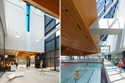
    The biggest surprise for me though was the universal change rooms. I had never been in a co-ed change room before – or one that was completely open and visible to the pool (there are small private rooms so you can actually change). For families, it makes a lot of sense. Everyone can go in together and it’s easy to watch your kids in the pool from within the change room.

    After my swim, I rode my bike around Regent Park and tweeted this out:

    What’s happening in Regent Park is incredibly exciting. To me, it feels like a return to the fundamentals of city building. They’ve reconnected the old street grid – which had previously been removed to create the old “towers in a park” scheme – and they’re clearly working towards a proper urban neighborhood with retail at grade and buildings pushed right up against the street.

    A big measure of success, though, will be how animated the streets become and how well the retail does. Because all of that isn’t quite there yet. But we’re on our way. And already I feel like we’re about to forget what the old Regent Park used to be like. Toronto may have lived with that neighborhood for over 60 years, but future generations will barely know it existed.

    Image: Shaigil
    //platform.twitter.com/widgets.js

  • The Laneway Project: Engaging In-Between Spaces

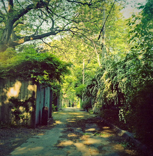
    A few months ago I was asked to join the advisory committee of a small Toronto-based non-profit called The Laneway Project. The goal of the organization is to create a network of vibrant, safe, and people-oriented public spaces throughout the city by leveraging our extensive, yet underutilized, network of existing laneways. 

    If you’re a regular reader of ATC, you’ll know that I have a huge interest in laneways and laneway housing. So not surprisingly, I was thrilled to be a part of the project.

    It’s still early days, but we are getting ready to actively fund raise. And we’ve also just announced our first event. It’s called Engaging In-Between Spaces, and it’s going to consist of 5 speakers giving super fast presentations on the potential of Toronto’s laneways (think 20 seconds a slide type of thing). There will also be a moderated discussion, and drinks, I’m sure. So mark your calendars for the evening of Thursday, November 20th – more details to follow.

    In the interim, you can show your love for Toronto’s laneways by subscribing to The Laneway Project. Happy Friday everyone!

    Image: Flickr

  • Ontario allows wood frame buildings up to 6 storeys

    Yesterday it was announced that, starting January 1, 2015, the Ontario Building Code would be changed to allow wood frame buildings up to six storeys. Previous to this, the highest you could go was 4 storeys. 

    This change has been in the works for a number of years. And it’s already allowed in most of Europe and in other places in Canada, such as British Columbia. So it’s nice to see this finally happen here in Toronto.

    The reason this is a big deal, and worthy of a blog post, is that it changes the cost structure for mid-rise buildings. Simply put, wood frame buildings are cheaper to construct compared to reinforced concrete and other buildings materials.

    Some people think this just means developers will make greater returns. But I don’t think that’s the case (see microeconomics). The real opportunity here is to spur mid-rise development on sites that – before this change – would have been previously un-developable. That is, you just couldn’t make the numbers work.

    As much as mid-rise buildings make a lot of sense from an urban design standpoint, it’s not always easy to find good mid-rise development sites. Mid-rise buildings are generally less efficient to build compared to towers and you have a lot of fixed costs that don’t scale down just because you’re doing a smaller project.

    So what this change in cost structure will, hopefully, do is allow more product to enter the market. And since many big urban centers operate with perpetual supply deficits – precisely because it’s often so hard to build – this should actually help with affordability.

  • Dimensioning pedestrian happiness

    The area that stretches between the property line on one side of a street and the property line on the other side of a street is called a public right-of-way here in Toronto. It may be called something different in other cities and countries.

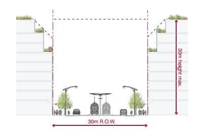
    In the example below (taken from Toronto’s Avenues & Mid-Rise Buildings Study), it includes the sidewalks, the car lanes, and the streetcar lanes. But it could also include other public elements. In this instance, the buildings on either side of the street are assumed to be built right up against their property lines.

    ROWs obviously serve an important public function. But their size also has important urban design implications. As a pedestrian, it feels different to walk on a narrow street than it does on a broad street.

    The width of a ROW can also be used to inform what the preferred height of the buildings along it should be. In the example above, they’re talking about a 1:1 relationship between the width of the ROW and the preferred height of the buildings.

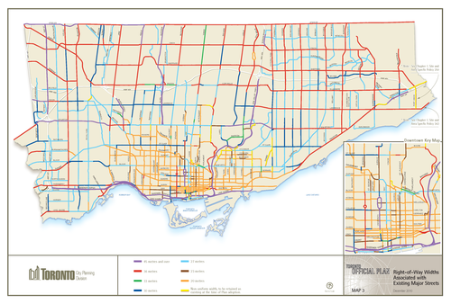
    Given their importance, I thought it would be interesting to share this map of Toronto (dated 2010) showing ROW sizing throughout the city. The mustard colored lines in the core of the city represent 20 metres, the red lines 36 metres, and the purple lines 45 metres or more. The rest of the colors fall somewhere in-between. For the most part, the purple lines represent highways, although there are a few other instances of purple.

    What’s interesting – but not surprising – to see is how we basically kept expanding the size of our ROWs as Toronto grew outwards. This was obviously to make more room for cars on the road.

    But the other, perhaps more interesting thing about this map, is that it could also serve as a guide to pedestrian happiness. The mustard/yellow lines are where it’s most enjoyable to walk. And the red and purple lines are where it’s least enjoyable to walk.

    If you’re from Toronto, give this framework a try and see if it holds true.

  • True Condos Podcast: Transparency in the Real Estate Industry

    A few weeks ago I was invited by Toronto realtor Andrew la Fleur to participate in his True Condos podcast series. I had actually never met Andrew before in person, but I knew of him because of Twitter, his blog, and because he was an early user of my past startup, Dirt.

    I was initially a bit apprehensive about being on a realtor podcast, because I thought it might end up as some sort of cheesy marketing piece. But I’ve come to learn that Andrew is not that kind of guy. He’s also interviewed some really great people in his podcast series (here’s the full list), so I feel honored to have been invited. 

    I’ve embedded the podcast below, but if for whatever reason you can’t see it, click here to be redirected to Andrew’s site. We talk for about 30 minutes, with a big focus on openness and transparency in the real estate industry. Thanks again for the invite Andrew. It was great to meet you in person.

    http://www.podbean.com/media/player/audio/postId/5289048?url=http%3A%2F%2Ftruecondos.podbean.com%2Fe%2Fbrandon%2F

  • A walk down memory lane in the St. Lawrence Market

    I recently got lost looking through the Toronto Archives for old photos of my neighborhood. I’ve blogged about what the St. Lawrence Market neighborhood looked like in the 70s, but I wanted to go back even further. I wanted to see what exactly had been demolished and lost over the years.

    But by the end of it, I was just sad. As a lover of cities, it always makes me upset to see great buildings disappear. I think you too will be surprised at what I found.

    The following picture depicts the north side of Front Street East, about 2 blocks east of Yonge Street. I don’t know what year it is, but look at how stunning these buildings are. It looks like Soho, New York meets some glamorous European capital.

    Can you imagine what we could do with these buildings today?

    image

    If there’s any doubt in your mind that this is Toronto or that it’s Front Street East, take a look at the spire in the far left hand side of the picture. It belongs to the Toronto Board of Trade Building, which used to sit at the north east corner of Yonge Street and Front Street. When it was built in the late 1800s, it was considered one of the first “skyscrapers” in Toronto. It was demolished in the 1950s.

    Here’s a picture of the Board of Trade Building so that you can compare. Again, take a look at the spire.

    image

    For those of you who might not be familiar with the area, here’s a map to help you out. The Board of Trade Building is shown on the bottom left hand corner. And the buildings in the first picture are in the triangular land area between Wellington and Front.

    image

    Now, let’s fast forward to the late 1960s. Those same buildings shown in picture number one have been demolished and in their place is the following parking lot. It’s a bit less glamorous looking. There are still heritage buildings on the south side of Front Street, but the balance of the area seems to have been blown out. What a shame.

    image

    Finally, here’s an aerial view of the area. It’s also from the late 1960s or early 1970s. You can see the same triangular land area, with only the Flatiron Building still standing at the very tip of it.

    image

    Obviously the St. Lawrence Market has come a long way since the 70s. That triangular area has since become Berczy Park, which is actually in the midst of being completely revitalized, and all of those parking lots have been filled in. But I still can’t help but wonder what the neighborhood would be like today had we preserved all of those heritage buildings. 

    I think cities work best when you can figure out that delicate balance between preservation and progress. It’s not always the simplest approach, but as most things in life, the right decisions are often the toughest ones to make.

  • How are you being shaped?

    image

    “We shape the cities, and then our cities shape us.” That’s one of my favorite lines from the documentary The Human Scale, featuring Danish architect and urban designer Jan Gehl. I like it because I don’t think many of us think enough about the way in which the built environment – that we create – ultimately goes on to influence the way we live our lives.

    One of the most interesting connections for me is the link between urban form and public health. There’s been a lot of talk over the years about how suburban sprawl is, or might be, making us fat (among other things). We’ve created environments that are only navigable by cars and that has forced many of us into sedentary lifestyles. We sit in our cars, and then we sit in our offices.

    So today I’d like to conduct a bit of a poll. If you’d like to participate, please share the following 3 things in the comment section below: 1) your city, 2) the type of neighborhood you live in (urban, suburban, rural, etc.), and 3) the amount of time you spend walking or doing something active on an average day.

    Here’s me:

    I live downtown Toronto in the St. Lawrence Market neighborhood (urban). I take the subway to work and the station is a 10 minute walk from my place. So as a bare minimum, I spend at least 20 minutes a day walking. But since I also walk to do most of my regular errands, and since my gym is another 10 minute walk from my place, I’d say I average a good 30-45 minutes of walking each day.

    Now it’s your turn 🙂

    This is a pretty crude survey, but with the advent of things like smartwatches and health monitors, I think we’ll soon have lots of great data on the ways in which our cities might shape our health.

    Image: The Economist

  • Rise of rental

    image

    Last month Oxford Properties submitted a site plan application for the redevelopment of the rundown Cumberland Terrace in Toronto’s Yorkville neighborhood. If you’d like to browse the full application (including all the drawings), you can do that here.

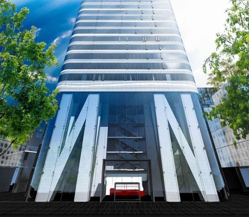
    The proposal is a departure from previous plans and now includes 3 buildings: a 4.5 storey building, a 2.5 storey building, and a midblock 54 storey residential tower (the lobby is shown above). There will be both retail and residential uses.

    For those of you familiar with the mall, it should go without saying that Cumberland Terrace is in desperate need of redevelopment. So I’m not going to talk about that today. Instead, I’d like to mention 2 other points that stood out to me about the application.

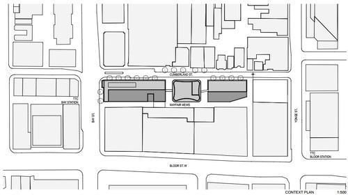
    The first is the 2 midblock connections on either side of the tower, running from Cumberland Street to Mayfair Mews in the rear (see below). Yorkville has a history of intimate laneways, and so it’s nice to see some of this being carried through in a new development. It also opens up the opportunity for an improved Mayfair Mews.

    image

    Secondly, it’s somewhat surprising to see that the 54 storey residential tower is being proposed as rental. Toronto doesn’t build a lot of purpose-built rental apartment buildings. There are some (from the likes of Morguard and Concert Properties), but we haven’t done it at scale for decades. And that’s largely because the demand for condos has been so great.

    But recently I’ve been noticing a renewed interest from the real estate community in multi-family rental assets. Cadillac Fairview also proposed a 65 storey rental building at the north west corner of Yonge Street & Queen Street last year – though they later withdrew their application.

    image

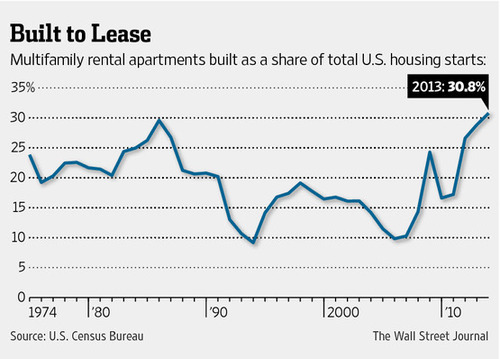
    In the US, rental apartments as a share of all new housing is also at record highs – over 30%. And that’s partly because credit remains tight (certainly compared to pre-2008) and economic growth has been tepid. But also because of demographic changes. People are having fewer children, later in life, and so many are putting off buying.

    So I think we’re going to see even more rental apartments being built in Toronto in the coming years.

  • The demand for character office space

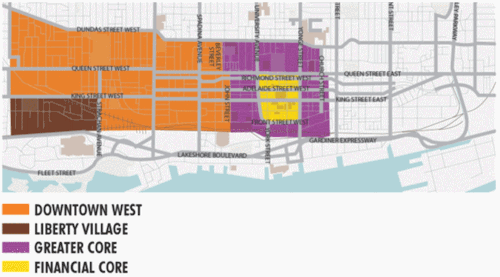
    Last Friday the Toronto Star published an article talking about the growing demand for character office buildings in submarkets outside of Toronto’s core. Specifically, it was talking about the Downtown West and Liberty Village submarkets (citing a report from CBRE).

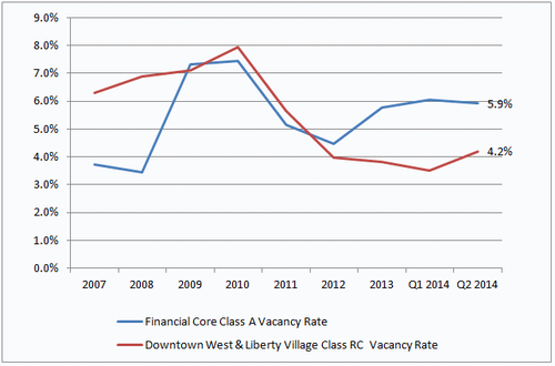
    I’m sure this isn’t news to most of you. Cool loft spaces have been popular for years. But it’s interesting to look at how rents and vacancy rates have changed for these submarkets and product types over time.

    Since 2002, average (net) asking rents for brick-and-beam buildings in the west end have gone from $16.12 to $22.23 per square foot. Almost a 38% increase. By comparison, office space in the core has gone from $28.40 to $32.38 per square foot. A 14% increase.

    And if you look at vacancy rates since 2007, you’ll see that the character office market has really tightened up over the past 4 years or so. There’s growing demand for a limited amount of supply.

    With the growth that the downtown core is seeing and with the rise of Toronto as a creative startup hub, I’m sure we’ll continue to see strong demand for this type of space. But there’s only so much of it to go around. So I think we’ll also end up seeing greater interest in the east side of downtown and also more interesting new builds.

    Images/Charts: CBRE

  • Taxis just got 40% cheaper in Toronto

    UberX officially launched in Toronto today. Which means that Toronto’s taxi and limousine industry is about to get a lot more grouchy. For those of you who may not be familiar, uberX is Uber’s low-cost car service. Just like the regular version, you hail a car using your mobile phone. But this option will cost you 40% less than a regular taxi!

    Here are sample rates from the Financial District to Yonge & Eglinton (midtown):

    And from the Financial District to Pearson International Airport:

    image

    This is pretty exciting. Because as much as I think it’s great to use Hailo or Uber to hail and then pay for a car, the big problem in my mind has always been that cabs in Toronto are just far too expensive. The meter starts at $4.25 and shoots up faster than you can take a selfie in the backseat.

    But obviously there’s an entrenched industry here that is not going to be happy about a startup eating into their fares. So I wouldn’t be surprised if we see a lot more backlash here in Toronto – as has been the case in many other cities. However I don’t think that’s a viable long term solution for the incumbents.

    Uber is thought to be worth $18.2 billion right now. It’s probably not going to go away.

    So instead of protesting and trying to ban it, we should be figuring out how to adjust to this changing reality. For the incumbents, this might mean lowering fares or figuring out a better way to differentiate themselves. A 40% discount is a pretty compelling value proposition. For me personally, I don’t know why I would ever pay more for a regular taxi, unless there was no other option.

    On a side note, it’s worth pointing out that an uberX trip from downtown to Pearson is estimated to cost around $33 – roughly the same as what some people think the Union Pearson Express train will cost. That’s further evidence that charging a lot and targeting business travelers may not be the best strategy.