Daily insights for city builders, delivered every morning at 6 AM ET. I’m Brandon Donnelly — a Toronto-based real estate developer and founder of Globizen. I’ve been writing here since 2013.

Tag: stockholm

  • Why do we choose traffic?

    Scott Stinson gets a lot right in this recent Toronto Star article about road pricing:

    There is a simple tool to combat traffic congestion that has been proven to be effective. There are real-world examples of where it has been deployed to great and long-lasting success. It’s called road pricing. And we seem to be deathly afraid of it.

    This is even if the benefits are real and measurable:

    Jonas Eliasson, director of travel accessibility at the Swedish Transport Administration, has first-hand experience with the effects of the congestion charge implemented in Stockholm in 2006. Public polling showed two-thirds of voters were against the road-pricing plan before it was introduced in a pilot program. A local politician called it the “most expensive way ever devised to commit political suicide.” But after it began, Stockholm traffic levels dropped by 25 per cent, more than double initial estimates. In a subsequent referendum, Stockholm residents voted to adopt the congestion charge permanently.

    There are lots of reasons why road pricing is commonly opposed, but at the end of the day, it works, and we know all too well — especially here in Toronto — that the status quo sucks:

    “Over the years, transportation economists and planners have pointed out that there really is no other solution to traffic congestion than more efficient pricing,” he said in an interview. “So every time somebody said ‘No, I don’t want road pricing or congestion pricing,’ they’re actually saying, ‘I want traffic congestion.’”

    I’ve been writing about this topic for almost as long as I’ve been writing this blog. So at this point, I think we just need to run a pilot. No more studies and reports. No more protracted debates.

    Let’s try it out and see how many people prefer (1) less traffic congestion and (2) more money for alternative modes of transport.

  • People prefer IKEA’s maze-like design

    IKEA opened its first permanent showroom in 1953. And by 1965, it had opened a 500,000 sf flagship store on the outskirts of Stockholm.

    Supposedly, the inspiration for this new store was Frank Lloyd Wright’s Guggenheim Museum in New York. Inspired by its continuous looping design, IKEA wanted to create a real-life version of its well-known catalog. This led to the current maze-like design where you wander through staged living spaces and get excited to buy lots of things.

    However, as IKEA began to open in more urban locations it actually started doing away with this prototypical design. The thinking, which seems perfectly reasonable, was that mazes weren’t appropriate for smaller and more urban locations. These customers would want to pop in, quickly get what they need, and then leave.

    But it turns out they were wrong. Their customers are telling them the opposite: they still want mazes. In other words, they want a curated experience that helps them figure out what to buy. According to IKEA: “People buy more when they are shown more.” Sounds right. And so IKEA is now working to make its urban stores more, you know, maze-like.

    The company has already done this in cities like Vienna and Paris, and apparently it consistently leads to higher sales. It’s a good reminder that (1) humans are still humans regardless of where they live and (2) if you want people to visit and linger in your physical store, it’s good practice to curate experiences.

    P.S. I love IKEA.

  • The average wait time for a rent-controlled apartment in Sweden is now over 9 years

    I’m not all that familiar with Stockholm’s housing market, but according to this recent article, it would appear that, like most big cities, there isn’t enough affordable housing to go around. This is despite the fact that everyone in Sweden is technically entitled to it.

    As of December 2021, there were 736,560 people (in Sweden) in the queue for a rent-controlled apartment, resulting in an average wait time of about 9.2 years. So basically what you want to do is put yourself on the list as soon as you turn 18. And then hope that at some point in the future you’ll be granted an affordable apartment.

    Given this dynamic, it makes sense there would be a long waitlist. If everyone is entitled to a rent-controlled apartment, you are effectively giving people two options: pay the market price or put yourself on this list, wait for a decade, and then pay less than the market price.

    Why wouldn’t you at least try to pay less?

    The problem with this approach is that supply will almost certainly never keep pace with demand. It also appears to be fuelling a robust (and I guess illegal) secondary sublet market. Because if you have a below-market contract that is yours to keep forever and that lots of other people want, you have a valuable asset.

    Getting housing right certainly isn’t easy.

  • Is better design the solution to NIMBYism?

    Alexis Self has an opinion piece in today’s Monocle Minute (email newsletter) that deals with development in London and NIMBYism. Here’s an excerpt:

    Affluent, socially liberal city dwellers can be the most extreme Nimbys. But perhaps their ire wouldn’t be so fierce if what was being built weren’t so aesthetically offensive. In the postwar era, London’s councils teemed with ambitious urban planners. The result: design classics such as Trellick Tower in Kensal Green, the Barbican Estate and Camden’s Alexandra Road Estate. While it’s true that these were labelled ugly at the time, they were undeniably the work of Europe’s best architects. Few, if any, of the city’s 21st-century edifices will enjoy a similar reappraisal.

    Alexis raises two interesting points: 1) Could better architecture and design actually help to quash NIMBY sentiment and 2) are we really not designing and building like we used to?

    I’ll start with number two.

    I am not that familiar with the “design classics” that Alexis mentions above, but it just so happens then when I was watching Never Too Small over the weekend I came across this studio apartment in the Barbican Estate.

    Designed by Chamberlin, Powell and Bon in the 1960s, the Barbican is a residential complex with somewhere around 2,000 apartments. It’s considered a prominent example of British brutalist architecture and so most of it is listed.

    While certainly noteworthy, it strikes me that it is likely one of those pieces of architecture that designers and architects love (I like it), but that the general public dislikes. In fact, architect Witold Rybczynski once argued that, “if people don’t hate it, it can’t be Brutalist.”

    Brutalism is having a bit of a renaissance. Kind of. But I don’t think we’re anywhere near universal appreciation. So I wonder if the general public really views these “design classics” as being some sort of golden era of British architecture and development.

    I also think, and I have argued this before on the blog, that buildings sometimes take time to settle in. From Montreal to Stockholm, our perceptions have been shown to change. The things we disliked before suddenly become desirable.

    Which means it can be hard to tell if we objectively dislike something (we’re not building like we used to) or if it’s simply not old enough for us to starting appreciating it. Beauty also happens to be a kind of subjective thing when it comes to buildings. Turns out we’re better at assessing whether people are good looking.

    This is probably a good time to come back to point number one: Could better architecture help quash NIMBYism?

    Not quite. I would argue that it certainly helps but it won’t completely quash it. I believe wholeheartedly in the power of great design. I want everything to be beautiful and considered. But the cynical developer in me knows that it will sadly only go so far.

    Béton brut (raw concrete) isn’t for everyone, I guess.

  • At what point does one start appreciating new housing?

    When you look at some of the most iconic home designs from around the world — which Bloomberg CityLab has been doing — there are some trends that emerge. One of them has to do with desirability. Whether we’re talking about Stockholm or Montreal, a lot of the housing that is today cherished, started out as fairly utilitarian. There was a need for housing and so governments and developers stepped up to build, often as cost effectively as possible. The result was housing that a lot of people seemed to dislike. At least initially.

    Here are a few excerpts from a recent post by CityLab talking about Montreal’s famous walk-up apartments:

    Their shape was dictated by the dimensions of the lots sold by developers: Narrow at the front, they run as deep as 120 feet and open onto an alley, leaving enough space for backyards and sheds behind. Inside, the units are not particularly big, with duplex apartments, often rectangular in shape, typically from 750 square feet to 1,000 square feet. Triplex apartments are a little larger and sometimes configured in an L-shape, a trick that builders used to make the most of the lot’s depth while getting some side light. Rooms unfold on one or either side of a corridor, with the kitchen at the back.

    Despite their reputation for charm today, the plexes were long criticized for their overcrowding and lack of light. Working-class homes were sometimes known as “the poor man’s coffin,” says Noppen. 

    “These are very narrow, dark, long buildings, which above all, were overcrowded,” he says. Today the apartments may be sought after, as “part of a considerable gentrification movement, but that’s because, two, three people live inside — that used to be 15.”

    I think most people forget that the housing we love today was probably built by a developer and almost certainly done in the pursuit of profit. Which begs the question: What has to happen before people suddenly start appreciating? Eliminating overcrowding certainly helps. But is it also a question of time? Do we just need time for the housing to settle in and get absorbed into the market? Or do we simply tend to dislike that which is new and so we need something even newer to hate before we can appreciate the now old?

  • From social housing to highly desirable in Stockholm

    Feargus O’Sullivan is back with another Bloomberg CityLab article about “the iconic home designs that define our global cities.” In this recent article he focuses on the Barnrikehus of Stockholm (and also talks about Sweden’s housing market in general). Originally built in the 1930s, the slab-like midrise buildings were largely intended to address two pressing problems: 1) the need for affordable housing and 2) Sweden’s incredibly low birthrate (supposedly the lowest in Europe at the time).

    The Barnrikehus template was deployed on the edges of Stockholm and other Swedish cities. The designs were/are fairly simple. Very little ornament (this is Scandinavia). Four or five storeys usually. And no more than about 12 meters deep. This allowed for better natural ventilation, which was important for stymying the spread of tuberculosis. The rents were also heavily subsidized and declined even further with every child in the family. In other words: the more kids you had, the less rent you had to pay.

    The suites were fairly compact, with many around the 430 square foot mark. This kind of space might have housed a family of six according to O’Sullivan. But compared to the other available housing options at the time, this was a significant improvement. Perhaps not surprisingly, these “child-rich houses” (which is how the name translates) developed the same kind of social housing stigma that was prevalent in many other countries and cities around the world.

    But that perception changed over time and, today, these rent-controlled apartments are apparently highly sought after. (Here’s a listing to give you a taste of what they’re like.) Originally on the fringe of cities like Stockholm, they are now very well located and offer a high standard of living. (You also can’t go wrong with white walls and pale woods.) To learn more about the evolution of Stockholm’s depression-era housing, click here.

    Photo by Jon Flobrant on Unsplash

  • Stockholm’s congestion charge reduced car traffic by 20%

    Stockholm has a congestion charge that is used to reduce traffic volumes in the center of the city. Toronto does not. We looked at it, actually fairly recently, but then we lost our nerve.

    Stockholm’s congestion charge was first implemented on a trial basis starting in January 2006. Trials and pilots have become a common way to actually create positive change. Otherwise the status quo bias may simply be too strong.

    When Stockholm started the trial back in 2006, public support was very low. Maybe 30%. But as soon as it was implemented, car trips dropped overnight by 20%. Once people saw the benefits, support grew – hitting around 70% by 2011.

    Here is a brief Street Films video with Stockholm’s Director of Transport, Jonas Eliasson, talking about their experience with congestion pricing. If you can’t see the video below, click here.

    [vimeo 244771087 w=640 h=360]

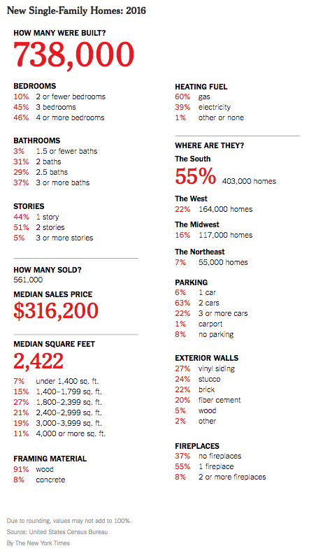
  • 738,000 single-family homes were built last year in the US

    The New York Times recently published “a portrait of new single-family homes” in the US in 2016. Here’s that portrait:

    For those of those living in dense urban centers, this portrait is perhaps a reminder that in many other places a large single-family home can be had for about the price of a studio apartment.

    Nothing in the above portrait likely surprised you, but it’s interesting to note that over half of all new single family homes delivered last year were in “The South.” Only 7% were built in the dense northeast.

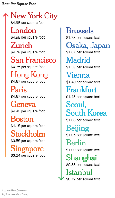
    The New York Times also recently looked at “international rents per square foot” using data from RentCafe. Here they are:

    New York City sits at the top with an average rent of $4.98 psf. This is across all boroughs. I am surprised by how low some of these international rents are. But averages rarely tell you the whole story.

    In any event, I do think that these two graphics start to speak to the economic spikiness that we are seeing across the US. 

  • Superstar or bubble?

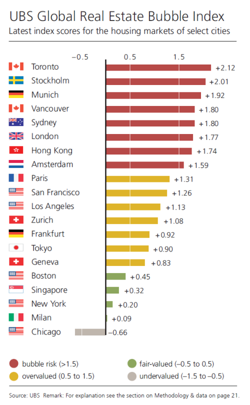
    “The term “bubble” refers to a substantial and sustained mispricing of an asset, the existence of which cannot be proved unless it bursts.” – UBS

    Last week UBS released its 2017 Global Real Estate Bubble Index. At the top of the list was none other than Toronto, followed by Stockholm, Munich, Vancouver and Sydney. And at the bottom of the list was Chicago – a city that UBS feels is undervalued.

    Here is the full list of index scores:

    image

    The UBS index is a weighted average of the following five sub-indices:

    1. Price-to-income
    2. Price-to-rent (fundamental valuation)
    3. Change in mortgage-to-GDP ratio
    4. Change in construction-to-GDP ratio (economic distortion)
    5. Relative price-city-to-country indicator

    If you look at their price-to-income benchmark in isolation, Toronto drops down to the middle of the pack along with Geneva and San Francisco. Hong Kong, London and Paris sit at the top with the most unaffordable housing. 

    Still, UBS credits “an overly loose monetary policy”, foreign demand, tight zoning, and rental market regulations for the eroding housing affordability in Toronto and Vancouver.

    One of the challenges, of course, is that the capital flowing into real estate is not all local – it’s also global. And many cities around the world are seeing high price-to-income multiples, perhaps because of that. 

    So exactly how much decoupling from local fundamentals should now be considered reasonable in our globalized world? And to what extent is this a result of “superstar economics?”

    Here’s an excerpt from the UBS report:

    The economics of Superstars explains why, in some professions, show business for instance, “small numbers of people earn enormous amounts of money and dominate the activities in which they engage.” By analogous reasoning, prices in the most attractive cities are expected to outperform average cities or rural areas in the long run. Hong Kong, London and San Francisco are exemplars of this theory.

    The intuition is that the national and global growth of high-wealth households creates continued excess demand for the best locations. So, as long as supply cannot increase rapidly, prices in the so-called “Superstar cities” are supposed to decouple from rents, incomes and the respective countrywide price level.

    I guess this is one of the reasons why bubbles are proven after the fact. If you would like to download a copy of the full UBS report, click here.

  • Residential population densities compared

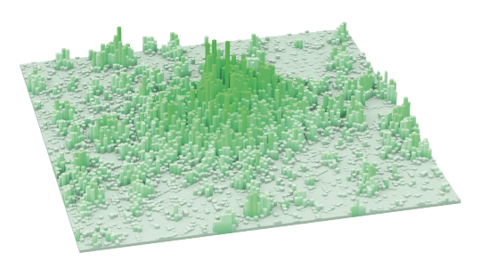
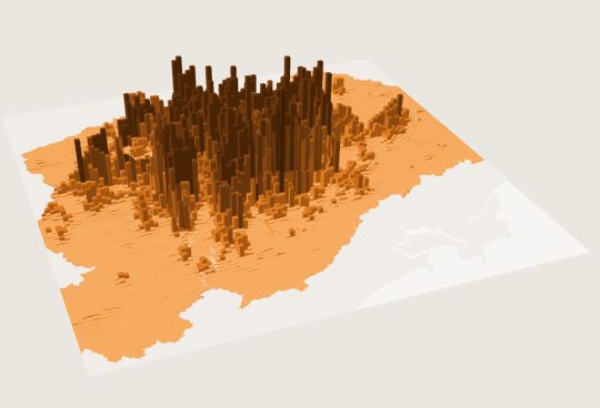
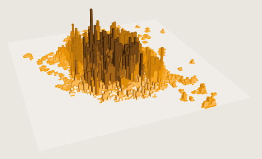
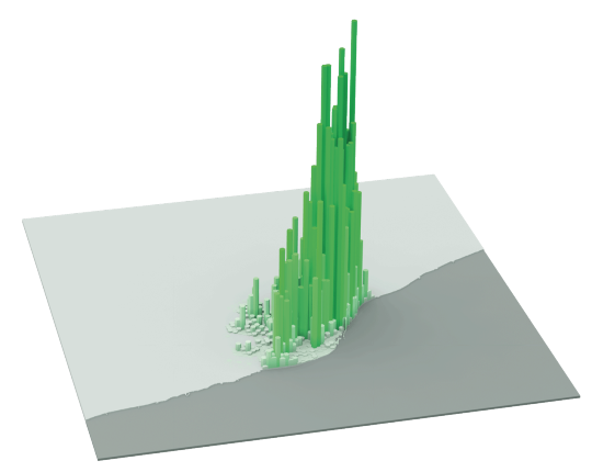
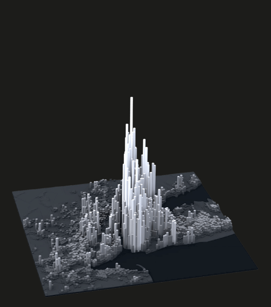
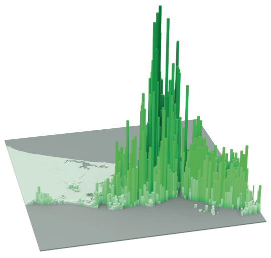
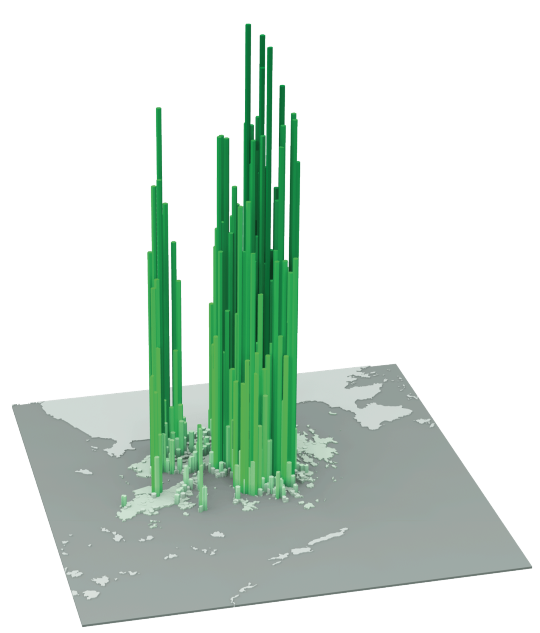
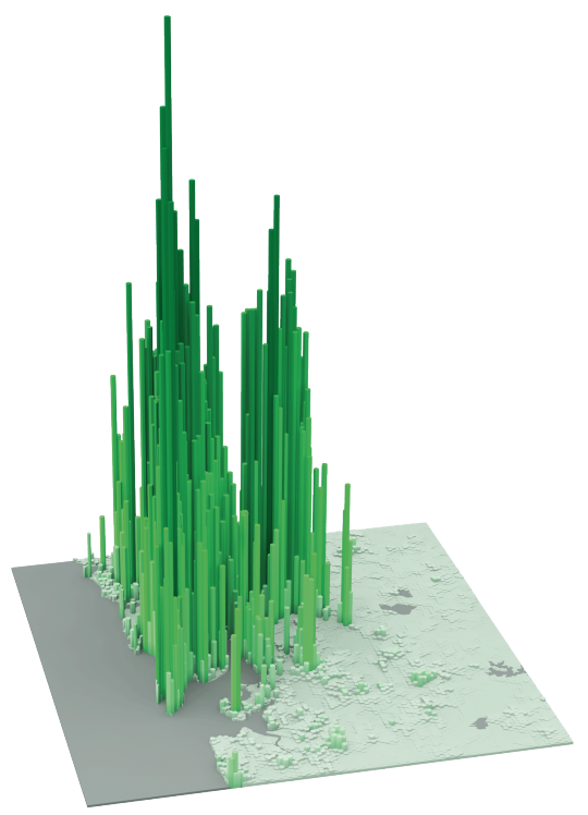
    The following diagrams were taken from LSE’s Urban Age website. I’ve sorted them from lowest to highest peak residential population density. In each case I’ve also included the year of the dataset. 

    It’s amazing how much these simple extrusion diagrams can tell you about the city. It also shows you that high population densities don’t necessarily need to equate to tall buildings. Barcelona, in particular, stands out for me.

    Berlin (Peak residential density: 21,700 people/km2, 2009)

    image

    Stockholm (Peak residential density: 24,900 people/km2, 2012)

    image

    London (Peak residential density: 27,100 people/km2, 2013)

    image

    São Paulo (Peak residential density: 29,380 people/km2, 2009)

    image

    Mexico City (Peak residential density: 48,300 people/km2, 2009)

    image

    Barcelona (Peak residential density: 56,800 people/km2, 2013)

    image

    New York (Peak residential density: 59,150 people/km2, 2012)

    image

    Shanghai (Peak residential density: 74,370 people/km2, 2011)

    image

    Istanbul (Peak residential density: 77,300 people/km2, 2013)

    image

    Hong Kong (Peak residential density: 111,100 people/km2, 2013)

    image

    Mumbai (Peak residential density: 121,300 people/km2, 2013)

    image