
Daily insights for city builders, delivered every morning at 6 AM ET. I’m Brandon Donnelly — a Toronto-based real estate developer and founder of Globizen. I’ve been writing here since 2013.

Tag: witold rybczynski

  • Opinionated design

    This is a longstanding joke / criticism among nerds:

    Namely, it is the fact that the charging port for Apple’s Magic Mouse is on its bottom, meaning, when it’s being charged, you can’t use it. This would be annoying if you ignored the low battery warnings and let it die in the middle of working on something critically important. And so lots of people think it’s a ridiculous design. But is it? Here’s an excerpt from a recent post by John Gruber of Daring Fireball:

    Yes, with the charging port on the mouse’s belly, you cannot use it while it charges. There are obvious downsides to that. But those positing the Magic Mouse as absurd act as though Apple doesn’t know this. Of course Apple knows this. Apple obviously just sees this as a trade-off worth making. Apple wants the mouse to be visually symmetric, and they want the top surface to slope all the way down to the desk or table top it rests upon. You can’t achieve that with an exposed port.

    This is an argument that feels right. Apple is not the kind of company that makes arbitrary design decisions. And the deliberate decision they have made is that a more perfect design is more important than solving for the few instances where a user was negligent and forgot to charge their mouse. Gruber goes on to say, the “charging port placement is an opinionated design, not an absurd design.”

    But this then raises another question: Is opinionated design the right approach?

    For well over a century, one of the maxims of good design has been that form should follow function. In other words, the shape and design of an object should relate to its intended use. And so, in this instance, if “function” involves using the mouse while it’s being charged then maybe, by this criteria, it isn’t a good design. Then again, it is a wireless mouse. Maybe Apple doesn’t want you to use it while it’s charging.

    Let’s consider another design object that you touch with your hand: Walter Gropius’ famous door handle.
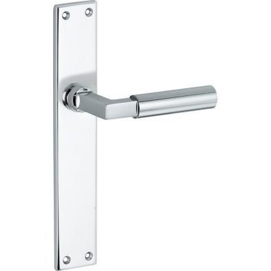
    Originally designed in 1922, the simple design consisted of a square bar and a cylinder. And its job was to communicate to you that, in order to use it, you should grab the cylindrical part, and not anywhere else. So on this level, the design was responding to its intended use, to our hands. Grab here. But is this truly an example of form following function? It’s debatable.

    Architect and professor Witold Rybczynski, who I would say generally isn’t a fan of modernism, has argued that it’s not. His critique of the overall Bauhaus movement — of which Gropius was the founder — was that it was actually a design school dedicated to “form follows predetermined aesthetics rather than form follows function.”

    In some ways, he’s right. You can tell when something came out of the Bauhaus, just as you can tell when something is from Apple. There’s a particular aesthetic and stubbornness to maintaining it. That’s why the Magic Mouse can’t be charged while in use and why Apple, equally famously, clung to the simplicity of a single-button mouse. Two just didn’t look as nice.

    But I see this as an honorable quality. Having an opinion is better than not having one. And there are lots of objects out there without one.

  • Multiple expression and our bias toward old architecture

    You may not have ever used this exact term before, but I’m sure that most of you know what it is. On his blog over the weekend, Witold Rybczynski wrote about a new architectural term he just learned called: “multiple expression.” What it refers to is the use of different architectural styles on a long facade in order for the building to appear as if it’s multiple smaller ones.

    And today, I would say that this is largely viewed as a positive thing. Typically it is done to “break up a massing” or create a “fine-grained retail experience.” In fact, you’ll find things like this in some design guidelines. Here’s one from Toronto’s mid-rise performance standards:

    This doesn’t explicitly stipulate that architects should use “multiple expressions”, but it does suggest that long repetitive facades are suboptimal, and that they should be broken up. But Witold’s view is the opposite. He argues that this “bespeaks a lack of confidence, a poverty of the imagination.” And he gives the example of Park Crescent in London, designed by architect John Nash.

    It’s long (well over 60m) and it’s repetitive:

    Perhaps a good counter example to this would be Mirvish Village in Toronto, which was designed by Henriquez Partners and which has been largely celebrated as a way of creating the feeling of fine-grained urbanism in a larger master-planned development. Here it is on Google, still under construction:

    So what is it that makes Mirvish Village a generally desirable outcome in today’s planning environment, even though I suspect that most people would still appreciate what John Nash did on Park Crescent back in the early 1800s? Are we saying — with our guidelines — that we like Park Crescent, but that we shouldn’t do that ever again today?

    And to what extent do age and architectural style play into these opinions? Are long repetitive facades over 60m acceptable as long as the architectural style is “Regency” and the buildings aren’t too tall? Is modernism the problem? Because here’s another example from London: The Alexandra and Ainsworth Estate.

    Built in the 1970s, it is a Brutalist housing estate with a largely repetitive design, and even a slight curve reminiscent of Park Crescent:

    Does this have confidence and imagination? Witold would probably say no.

    In the end, I guess the answer is that it all depends. Guidelines are just that — guides. They are not set in stone rules that must never be broken under any circumstances. That would be to reduce architecture to a strict science, and there’s clearly also an art component to building great cities.

    “Multiple expression” is usually done to create the feeling of finer-grained urbanism. But sometimes — if you’re old and regal-looking enough — the opposite can be okay too.

  • Consuming architecture

    Is this a true or false statement?

    “It is through media, of course, that we primarily consume architecture.”

    Witold Rybczynski recently spoke about this on his blog. Initially he thought it was a preposterous statement. But then he begrudgingly accepts that it is actually the case today. This in turn leads to an interesting distinction between what it means to experience architecture versus consume architecture.

    The former takes more time. You have to do laborious things like actually be in the space, walk around it, and generally just experience what it’s like to be there. Consuming, on the other hand, is much easier. Maybe it’s as simple as an image in your social feed that you forward to a friend so that they can in turn respond with a single fire emoji. Cool. Consumption done.

    Naturally this distinction translates into different ways of thinking about architecture. In the words of Witold, when you’re a consumer of architecture, you want to be “amused, titillated, and entertained.” You don’t have time for subtleties — things like tactile materials, historical references, light, and shadow. This is about consuming architecture.

    Now, I’m not sure if Witold has given any thought to what web3 and a mixed-reality future will mean for architecture, but it’s an obvious and interesting question. Intuitively, one would think that the more time we spend with digitally mediated experiences, the less time we will have to experience architecture the way nature intended it. Though maybe that’s not the way to think about this.

    I tend to be a bit more rosy about the current state of affairs and the future than Witold, but here are two points. One, consumption allows more people to interact with a piece of architecture. In fact, before writing this post I consumed Studio Gang’s recently completed project in Hawaii. It was nice, and maybe one day I will also experience it. That, I agree, would be even nicer.

    Two, architecture is always a product of the zeitgeist at the time. Part of its job is to reflect culture and, for better or for worse, speak to who we are as a society. And so if architecture has become effective at reflecting our current milieu, isn’t it doing exactly what it is supposed to be doing?

  • Architecture is a zero-sum game

    Witold Rybczysnki recently had this to say about the American Institute of Architect’s plans to ensure better equity across the profession:

    But the architectural profession is not the post office. It depends on the availability and preferences of clients, it depends on the swings of the economy, and success relies on individual drive and talent. Architecture is a zero-sum game, of course: there are a limited number of building commissions at any one time and if one architect gets the job, another doesn’t. Some of the most prominent commissions—the ones that build a reputation—are the result of architectural competitions. In these blind auditions, only the most talented have a chance to shine. And talent is not evenly distributed; “cream rises” as Stewart Brand memorably wrote in the Whole Earth Catalog. Hard to put your thumb on that scale.

    When I read this I couldn’t help but think of Malcolm Gladwell’s account of what happened when orchestras first started conducting blind auditions in the 1980s. I think he talks about this in his book Blink. As soon as selection committees could no longer see the sex of candidates — and could only hear their musical output — orchestras immediately started hiring more females.

    This is a neat and tidy example that seems to demonstrate that women are perhaps better classical musicians than men, even though the opposite was believed to be true before large screens started obfuscating our inherent biases.

    But the selections process for architects isn’t always as simple. This makes it a bit more difficult to determine if we truly have a meritocracy or if there are in fact some deep rooted prejudices that we maybe aren’t aware of.

    Of course, there is also the possibility that we have more or less a meritocracy, but that we have structural issues which are precluding certain people from fully developing their merits in quite the same way.

    Whatever the case may be, I agree with Witold that blind design competitions are probably a fairly reasonable way to level the playing field. The problem is that design competitions are not universally used. We have never done one when searching for an architect.

    I would like to think that we simply look at their portfolio (in search of both cool and relevant projects), objectively assess their abilities, and then consider their fees. But I also know that us humans are riddled with biases.

  • Is better design the solution to NIMBYism?

    Alexis Self has an opinion piece in today’s Monocle Minute (email newsletter) that deals with development in London and NIMBYism. Here’s an excerpt:

    Affluent, socially liberal city dwellers can be the most extreme Nimbys. But perhaps their ire wouldn’t be so fierce if what was being built weren’t so aesthetically offensive. In the postwar era, London’s councils teemed with ambitious urban planners. The result: design classics such as Trellick Tower in Kensal Green, the Barbican Estate and Camden’s Alexandra Road Estate. While it’s true that these were labelled ugly at the time, they were undeniably the work of Europe’s best architects. Few, if any, of the city’s 21st-century edifices will enjoy a similar reappraisal.

    Alexis raises two interesting points: 1) Could better architecture and design actually help to quash NIMBY sentiment and 2) are we really not designing and building like we used to?

    I’ll start with number two.

    I am not that familiar with the “design classics” that Alexis mentions above, but it just so happens then when I was watching Never Too Small over the weekend I came across this studio apartment in the Barbican Estate.

    Designed by Chamberlin, Powell and Bon in the 1960s, the Barbican is a residential complex with somewhere around 2,000 apartments. It’s considered a prominent example of British brutalist architecture and so most of it is listed.

    While certainly noteworthy, it strikes me that it is likely one of those pieces of architecture that designers and architects love (I like it), but that the general public dislikes. In fact, architect Witold Rybczynski once argued that, “if people don’t hate it, it can’t be Brutalist.”

    Brutalism is having a bit of a renaissance. Kind of. But I don’t think we’re anywhere near universal appreciation. So I wonder if the general public really views these “design classics” as being some sort of golden era of British architecture and development.

    I also think, and I have argued this before on the blog, that buildings sometimes take time to settle in. From Montreal to Stockholm, our perceptions have been shown to change. The things we disliked before suddenly become desirable.

    Which means it can be hard to tell if we objectively dislike something (we’re not building like we used to) or if it’s simply not old enough for us to starting appreciating it. Beauty also happens to be a kind of subjective thing when it comes to buildings. Turns out we’re better at assessing whether people are good looking.

    This is probably a good time to come back to point number one: Could better architecture help quash NIMBYism?

    Not quite. I would argue that it certainly helps but it won’t completely quash it. I believe wholeheartedly in the power of great design. I want everything to be beautiful and considered. But the cynical developer in me knows that it will sadly only go so far.

    Béton brut (raw concrete) isn’t for everyone, I guess.

  • How buildings convey meaning

    Witold Rybczynski and I clearly do not have the same taste in architecture. But he raises an interesting point about the relationship between architecture and art in this recent post. Here’s an excerpt:

    In the name of renouncing the past—and denouncing anything that smacks of decoration—modernism has largely done away with art, the lonely Henry Moore stranded on a plaza, notwithstanding. The problem is that when you strip away figural and allegorical ornament, what is left are mute building materials, mechanical-looking details, and abstract space.

    There is a long-standing tradition of integrating art, and other ornament, into architecture. But modernism viewed this sort of decoration as being superfluous. It wasn’t functionally necessary and so why include it?

    This has led us to today where there is a joke that investing in public art means investing in some sort of add-on that sits outside of your building and that can be classified as art. Perhaps something by Henry Moore.

    The result, Witold argues, is that we have lost something critically important in our buildings: meaning.

    But is allegorical ornament really all that different from a freestanding art piece? Don’t both tell a story? And don’t they both get applied, in a way, to a building that could surely continue on without it?

    At the same time, what is meaningful art? Does it need to include bas-relief and/or figural representations? Or could it be a signed urinal on a pedestal in the lobby with an accompanying digital NFT?

    There’s no question that buildings need meaning. We all crave stories. But sometimes they communicate in different ways.

    Photo by David Vives on Unsplash

  • What if versus should be city planning

    Witold Rybczynski makes an interesting comparison between military and civilian (city) planning in a recent blog post called, “The Fog of Life.” Here’s an excerpt:

    Good military planning, as I understand it, is based on preparing for “what if,” that is, developing different scenarios. What if this happens, or that happens? City planning is different, more like advocacy, that is, what should happen. This advocacy is based on certainties: open space is good, density is good—or bad, depending. The problem is that what planners think should happen—separation of pedestrians and cars, superblocks, megastructures—often runs into trouble when it hits the fog of life.

    These are two very different perspectives. “What if” planning responses assume that a thing has already happened. You’re not working to affect a particular outcome, you’re responding to one that already exists. Does this necessarily make this approach more reactive than proactive?

    Either way, what should happen implies that the thing isn’t currently happening, but that it should — presumably because the thing is nice and desirable. It could also imply that the thing is sort of happening, but just isn’t happening quite enough.

    Let’s use the example of 3-bedroom condominiums and apartments, which is a topic of discussion that has been circling in Toronto for as long as I’ve been in the business. Developers here, are generally encouraged or mandated to build a certain number of larger family-sized suites in every new housing project. Oftentimes this number is 10% of the total unit count.

    The reasoning behind this is sound. Cities should be inclusive and they should work for the young, the old, the single, and for families, among others. The problem is that, for a variety of reasons, the market, when left to do its own thing, tends to build more small units than large units. At least that’s the case here in Toronto. (I’ve talked about some of the reasons why in previous posts.)

    There is a view that if only developers built more large units that more families would choose to live in apartments. It’s an issue of supply and availability, and also a question of design. You need to design for families too. This you could say is a “what if” approach. Families want to live in multi-family buildings; so let’s build more and better family-sized housing.

    But is this really the case or is there some advocacy going on here? All things being equal, does the market want low-rise or does it prefer higher density? It’s a fascinating set of questions, but unfortunately all things aren’t equal. It’s not just a question of availability and design, it’s also a question of economics. Large family-sized units cost money.

    I suppose this is the fog of life.

  • It’s okay for urbanism to be a bit messy

    The urban-to-rural transect is a New Urbanist planning framework that prescribes a smooth continuum of settlements that go from least dense to most dense. The six zones are as follows: natural (T1), rural (T2), sub-urban (T3), general urban (T4), center (T5), and core (T6).

    Part of this framework is about rejecting single-use Euclidean zoning. Instead of segregating uses, New Urbanism looks to return to a mix of uses within close proximity of each other. This is a good thing.

    But the transect also advocates for a certain orderliness. There should be a smooth transition as you move outward from T6 toward T1. It is about placing things in their useful order and maintaining a certain kind of character.

    Witold Rybczynski makes an interesting observation about this in a recent post called “urban discontinuities.” The point he makes is that some of the most remarkable urban moments are the result not of smoothness, but of “odd juxtapositions.”

    Think:

    – Mount Royal (T1) in the middle of downtown Montreal (T6).

    – The North Shore Mountains (T1) that terminate views from within the building canyons of downtown Vancouver (T6)

    – The walls of tall buildings (T6) that frame Central Park (T1) in Manhattan

    – The wonderful ravines (T1) that cut through Toronto’s urban fabric (T6)

    These are contrasting zones in the transect bumping up against each other. And it turns out that most of us really like these moments. But I think that the bigger point to be made here is that urban environments aren’t always neat and tidy, and that’s because they are a constantly evolving organism.

    That’s not a bug. It’s actually a feature to be celebrated.

  • Form follows what?

    Late 19th century and early 20th century architecture and industrial design is known for the axiom, “form follows function.” I think of the German Bauhaus School when I hear this, but supposedly it can be attributed to American architect Louis Sullivan. Either way, it was meant to represent a functionalist approach to architecture and design, which was, as is often the case, a reaction to what had come before it.

    It was Modernist architects eschewing decorative elements or what was referred to at the time as “ornament.” If it didn’t serve a functional purpose, it was to be removed. Nothing was to be superfluous. And similarly, if the function of something didn’t change, there was no need to change its form.

    Of course, if it was truly all about function, one could argue that there should have been a great deal of variation in the resulting forms. But instead, the designs that emerged out of schools, such as the Bauhaus, are some of the most recognizable in the world. That is true even to this day.

    Which is why I think this is a great line from Witold Rybczynski (taken from a recent post about the book iBauhaus): “It is also a quintessentially Bauhaus example of form follows predetermined aesthetics rather than form follows function.” Ouch. The difference here is that Witold obviously isn’t a fan of the Bauhaus or of Modernism, whereas this period of time is what inspired me the most as a student of architecture.

    Photo by Marina Reich on Unsplash

  • What they don't teach you in architecture school

    When you go to architecture school, you are indoctrinated to appreciate certain projects, buildings, and houses. One of those pieces of architecture, at least for my generation, is the Farnsworth House in Plano, Illinois, by Mies van der Rohe.

    Completed in 1951 for Dr. Edith Farnsworth (a nephrologist), the house is one of the most celebrated midcentury modern houses in the United States. Today, the former weekend retreat is a museum owned by the National Trust for Historic Preservation. (Information on how to visit can be found, here.)

    But what they don’t teach you in architecture school is that the house never really worked all that well as, you know, an actual house. And that the client and architect ended up embroiled in legal battles toward the end of construction.

    This is part of the story that is told in Alex Beam’s new book, Broken Glass, which was recently reviewed by Witold Rybczynski in the Wall Street Journal. Now, Witold isn’t a fan of modern architecture to begin with and so the Farnsworth House never stood a chance:

    Despite the purposeful appearance of his architecture, Mies was not particularly interested in practical matters. The travertine on the terrace weathered badly, and a poorly designed heating system left sooty stains on the windows. The glass walls resulted in spectacular heating bills in the winter and hothouse temperatures in the summer—there were only two small openable windows. Then there was the problem of condensation on the glass in cold weather. “You feel as though you are in a car in the rain with a windshield wiper that doesn’t work,” Farnsworth complained. A film about the genesis of her house, starring Elizabeth Debicki and Ralph Fiennes, is currently in the works. It will be interesting to see if it will show the doctor squeegeeing her foggy windows.

    On his blog, Witold calls Mies an aesthete. Appearance was everything. My personal view is that it’s generally good practice to design houses so that they function properly. But icons are icons and the Farnsworth House is certainly an icon. Maybe we should just call it a prototype.

    Image: Farnsworth House (National Trust for Historic Preservation)