Daily insights for city builders, delivered every morning at 6 AM ET. I’m Brandon Donnelly — a Toronto-based real estate developer and founder of Globizen. I’ve been writing here since 2013.

Tag: united states

  • Mapping of global migration

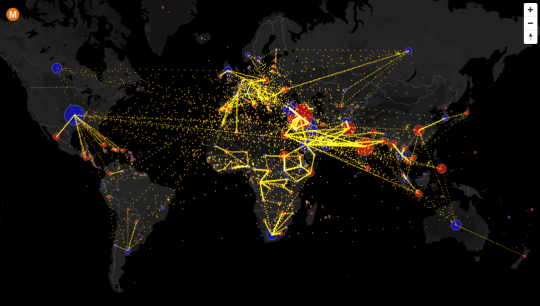
    Max Galka has created an incredible visualization of country-to-country net migration (from 2010 to 2015) on his blog, Metrocosm.

    Here’s a screenshot:
    image

    But you really need to view the full screen interactive version

    In that version, you can hover over a country to see the total net migration number (+/-) and you can click on a country to see where people are moving to and from. A blue circle indicates positive net migration (greater inflows) and a red circle indicates negative net migration (greater outflows).

    All of the data is from the United Nations Population Division. And though the numbers are estimates, it’s a fascinating look at global migration. For instance, look at the outflow from Syria.

    It would also be interesting to see these numbers on a per capita basis because some countries certainly punch above or below their weight in terms of migration. Off the top of my head, I’m thinking of Canada and Australia vis-à-vis the US.
  • Global home prices at the end of 2015

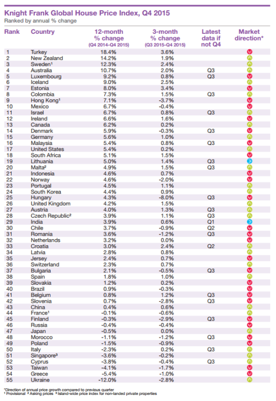
    Seeing how we’ve started looking at data from last year, I thought it would be interesting to look at global home prices as of Q4 2015. Here’s a chart from Knight Frank, which they refer to as their Global House Price Index:

    At the top of the list is Turkey, with an 18.4% increase from Q4 2014 to Q4 2015. (Supposedly this is because it has recently become easier for foreigners to buy property in the country.) Canada is 13th with a 6.2% increase (during this same time period) and the United States is 17th at 5.4%.

    This is obviously a high level analysis. There are lots of regional and local variations within each country. For instance in Canada right now, Calgary is a very different place than, say, Vancouver or Toronto.

    Nonetheless, it’s still valuable to see the relative performance of each country and see what their (Knight Frank’s) prediction is for 2016:

    “Our outlook for 2016 is muted. We expect the index’s overall rate of growth to be weaker in 2016 than 2015. The global economy is experiencing a potentially dangerous cocktail of low oil prices, a strong [US] dollar and a continued slowdown in China.”

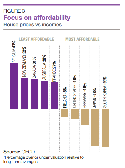
    It’s also interesting to see how the countries rank in terms of affordability:

    Once again, Canada ranks as being one of the least affordable countries in terms of home prices.

  • We’re driving again

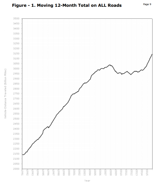
    For a number of years now, urbanists – including myself – have been thinking about “peak car.” And that’s because if you looked at vehicle miles traveled (VMT) in the United States since about 2007, the trend line was more or less flat. 

    This had us wondering whether or it was simply an outcome of the recession or some sort of broader shift.

    Well, if you look at the December 2015 numbers from the U.S. Department of Transportation, VMTs are once again growing. In fact, it’s now above the 2007 “peak.” Compared to December 2014, travel on all roads and streets in December 2015 was up by 4.2% or 10.6 billion vehicle miles traveled. 

    Here’s the chart:

    A lot of this could be because of lower gas prices. But I would be curious to hear your thoughts in the comments about whether or not you think 2007 to 2014 was (1) a recessionary blip or (2) a longer term trend in the making.

  • The decline of US homeownership

    Charlie Gardner (aka the Old Urbanist) recently published an interesting pair of posts (here and here) about the decline of homeownership in the United States.

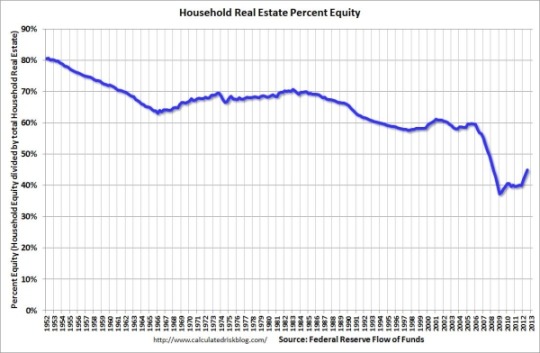
    What really stood out for me, though, was this chart (showing the percentage of household real estate equity):

    And this conclusion:

    “The implied conclusion here, that a dramatic expansion of debt has been necessary just to maintain the illusion of a stable homeownership rate (setting aside the explosion of debt in the 2000s necessary to support an increase in homeownership), puts an even more negative spin on the figures from the preceding post.  In short, a decline in homeownership has until the past few years been masked by shifting demographics and an increase in household debt.”

    What I would now be curious to see is the above chart in terms of household equity value. Because I wonder to what extent rapidly appreciating home prices (as a result of cheap credit) are having an offsetting affect on declining equity percentages.

  • 5 random charts related to cities and real estate

    I was reading through PwC and ULI’s 2016 Emerging Trends in Real Estate report this evening and a handful of charts stood out to me. They’re not all related to each other, which is why this blog post is called what it is. But I think you’ll find them relevant to many of the things we talk about on this blog.

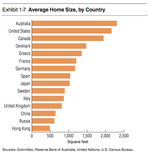
    1. Average home size by country

    With all the interest today in “small urban spaces” it’s interesting to see that the average home size for half the countries on this list is somewhere between 500 and ~1100 sf. It’s also amazing to see Hong Kong hovering just below 500 sf.

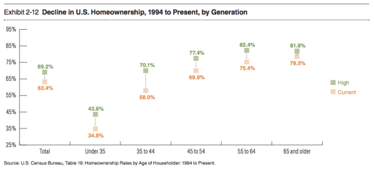
    2) The decline in homeownership in the US

    I like to follow home ownership rates because there’s a lot of debate around whether or not this obsession with homeownership – which has been so central to the ethos of countries like the US and Canada – is at all falling out of a favor. This chart shows some pretty significant drops from previous highs.

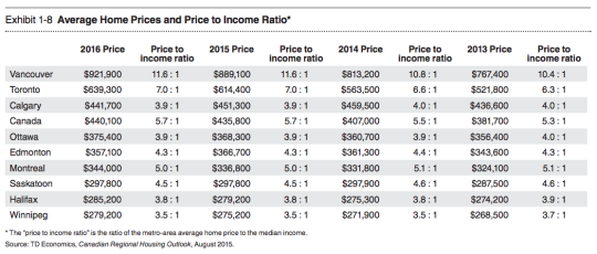
    3) Average home prices and the price to income ratio in major Canadian cities

    Not surprisingly, Vancouver and Toronto are the top of this list with the highest average home prices and the highest price to income ratios (i.e. the worst affordability).

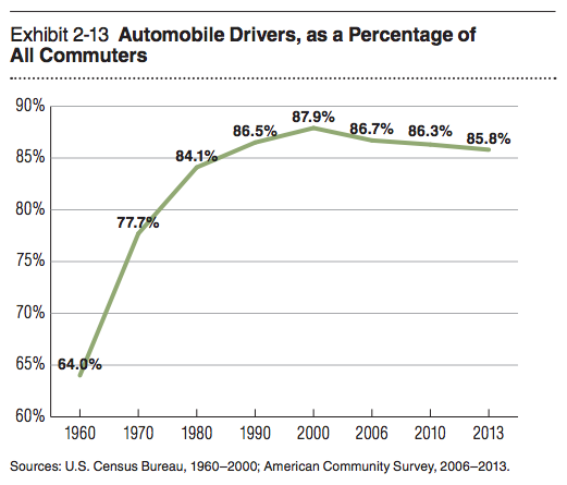
    4) Drivers as a percentage of all commuters in the US

    This chart is similar to what you would see if you looked at vehicle miles traveled. I’ve heard some people say that driving is now once again on the rise, but for the past decade and a half it’s been on a slow and steady decline.

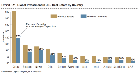
    5) Countries buying US real estate

    Canada is a big buyer of US real estate. But with the dollar where it is today, I am sure that number is headed downwards.

  • Why can’t cities reach equilibrium?

    The October issue of The New Yorker has an interesting piece called: Naked Cities – The death and life of urban America.

    I find the article ends up rambling a bit, but I like the idea presented right at the beginning. The idea that cities can never really find equilibrium. They’re either dying, or victims of their own success.

    Here’s that paragraph:

    Cities can’t win. When they do well, people resent them as citadels of inequality; when they do badly, they are cesspools of hopelessness. In the seventies and eighties, the seemingly permanent urban crisis became the verdict that American civilization had passed on itself. Forty years later, cities mostly thrive, crime has been in vertiginous decline, the young cluster together in old neighborhoods, drinking more espresso per capita in Seattle than in Naples, while in San Francisco the demand for inner-city housing is so keen that one-bedroom apartments become scenes of civic conflict—and so big cities turn into hateful centers of self-absorbed privilege. We oscillate between “Taxi Driver” and “The Bonfire of the Vanities” without arriving at a stable picture of something in between.

    I like this because there’s truth to it. But at the end of day, this is just one of the many challenges facing great city building. 

    To solve the problem of affordable housing you could just be a city in decline. But that’s not much fun. So the better option, however difficult it may be, is to figure out how to manage the negative externalities associated with winning.

  • From stuff to services

    This morning Fred Wilson linked to a Bloomberg article on his blog called, Maybe This Global Slowdown Is Different. There are a bunch of great charts throughout the piece and I’d like to share 3 of them here.

    The first chart shows how per capita energy consumption has dropped remarkably in the United States since the 1990s, but how, not surprisingly, China’s rate is increasing.

    The second chart shows car sales in the US. There was a big drop off during The Great Recession, and though sales have rebounded, they still haven’t reached their late 1990s peak. But that’s not to say that they won’t.

    And the third chart shows the tremendous shift in the US over the last 65 years from the consumption of stuff to services.

    This last one is fascinating. And it ties into the argument that the way value is created in our economy has shifted dramatically.

    But I wonder if this change is really as sharp as it seems. 

    If you look at what makes up “services”, you’ll see that housing (and utilities) and healthcare make up over 50% of what is considered to be personal spending on services. And if you look at housing and utilities spending since the 1960s in the US, it has increased dramatically. 

    So how much of this shift from stuff-to-services is actually being driven by housing?

  • The world in 2050

    The United Nations recently released its 2015 version of World Population Prospects. It looks as if they put out and revise this report every 5 years.

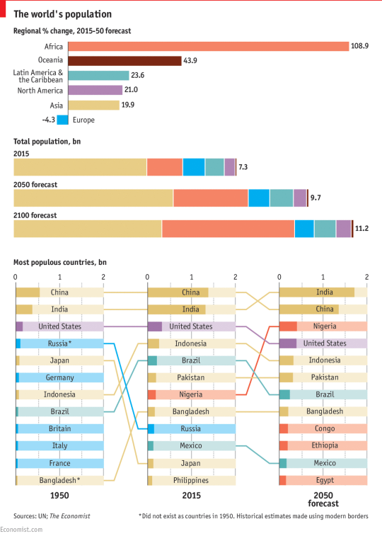
    The Economist then took some of their data and assembled it into the following charts:

    image

    It’s obviously extremely difficult to predict what will happen in the world by 2100, but to the extent that forecasting is possible, the world’s population is expected to reach somewhere around 11.2 billion people. Today it’s 7.3 billion.

    The bulk of this growth is expected to happen first in Africa, and then in Asia. By 2100, Africa’s share of the global population is expected to grow to 39% and Asia’s share is expected to decline to 44%.

    If you’ve been following population trends, most of this shouldn’t come as a surprise to you. The meaningful population growth happening in the world today is happening in the developing world. 

    That’s why architects, such as Rem Koolhaas, have been studying cities like Lagos (Nigeria) since the late 1990s and early 2000s. Below is a photo from a book/research project that I love called Mutations (2000). I pulled it from my bookshelf this morning.

    image

    It’s interesting to think about what all of this will mean for the global economy and for global governance. 

    The United States is about to be alone when it comes to advanced economies with a globally competitive population. Europe is shrinking, which leads me to believe that a strong EU is likely important. And we now have lots of megalopolises with big populations, but with very low income levels.

    Nigeria is the largest economy in Africa, but per capita income is somewhere around $3,000.

  • #LoveWins in the United States

    https://500px.com/embed.js

    By now, I am sure that all of you know that the U.S. Supreme Court made a landmark ruling yesterday (Friday, June 25, 2015). In a 5-to-4 vote, it was decided that the U.S. Constitution guarantees the right to same-sex marriage.

    Here is Justice Anthony Kennedy’s closing paragraph. What a great read.

    image

    With this decision, the United States joins the Netherlands, Belgium, Spain, Canada, Norway, Sweden, and many other countries who already allow same-sex marriages nationwide. And I am delighted to see that happen with Canada’s neighbor.

    I am also proud to say that it has already been a decade (2005) since Canada became the 4th country in the world – and the 1st country outside of Europe – to allow same-sex marriages. Not because it had a direct impact on my life, but because it is the right thing to do.

    It is the right thing to do because it creates “equal dignity” among all men and women (as Justice Kennedy states above) and because it’s the right thing to do for our economies.

    I believe that the strongest economies are the ones that can remain open and tolerant to new ideas and all kinds of people. 

    Cities like Toronto and New York (as I’ve argued before) became successful precisely because they opened themselves up to new ideas and new people (immigrants).

    But many studies show that as people age, “openness” declines. We become less intellectually curious and our preference for variety wanes. Perhaps this is where the expression “set in your ways” comes from and why political orientation often correlates with age.

    Thankfully the U.S. wasn’t so set in its ways that it couldn’t provide equal dignity to its citizens.

  • A look at homeownership rates

    The Old Urbanist (Charlie Gardner) recently published an interesting post talking about the origins of American zoning using the work of Professor Sonia Hirt and her new book, Zoned in the USA: The Origins and Implications of American Land-Use Regulation.

    One of the central themes in his post is the American (and Canadian) fixation on single-family homes:

    …the United States is the only developed country of those surveyed, apart from Canada, to widely employ single-family detached residential zones that bar all commercial and multifamily uses.

    And the reason for this is largely because of two longstanding beliefs in American (and again Canadian) culture: Your goal should be to become a homeowner, and that home should ideally be a single-family detached home.

    But there’s lots of evidence to suggest that these legal protections (and many of the other things being done to encourage/subsidize homeownership) aren’t actually that effective at driving up homeownership.

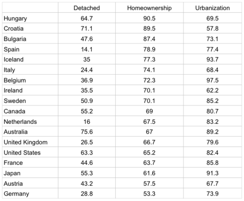
    In his post, Charlie includes a chart showing the percentage of detached homes and the homeownership rates for various countries (data is from 2013/2014). I sorted it based on homeownership and added urbanization rates to see if there was any correlation (doesn’t appear to be).

    Source: Charlie Gardner & Wikipedia

    The US and Canada are quite good at putting lots of people in detached housing (though not as good as Australia!), but the homeownership rates are nowhere near the top. In fact, the US falls in the lower half.

    Did you think the homeownership rate would be higher in the US?