Daily insights for city builders, delivered every morning at 6 AM ET. I’m Brandon Donnelly — a Toronto-based real estate developer and founder of Globizen. I’ve been writing here since 2013.

Tag: united states

  • Birth rates in the United States last year

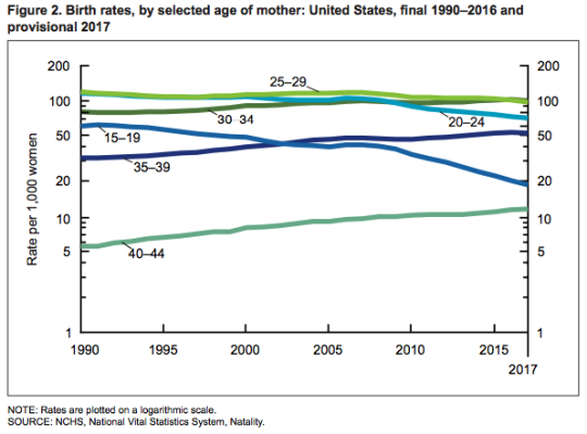
    The National Center of Health Statistics just released this update on births and birth rates for the United States in 2017. The provisional number of births last year was 3,853,472, which represents a 2% reduction from 2016 and the lowest number in 30 years. The general fertility rate was 60.2 births per 1,000 women aged 15-44, which represents a 3% reduction from 2016. Also a record low.

    Here is a chart from the report showing birth rates for selected age ranges from 1990 to 2016 (the 2017 numbers are provisional):

    image

    Many of the age ranges have remained stable. Notable are the decline in the teenage (15-19) birth rate and the increase in births to women aged 40-44. The teenage birth rate declined 7% from 2016 and has averaged a decline of nearly 8% a year since 2007. And the birth rate for women aged 40-44 has generally been rising since 1982.

    I am sure that you can all think of many explanations for the above phenomena without even diving into the report. I find all of this relevant because demographics obviously impact the real estate business and how we build cities.

  • The 2018 Henley Passport Index

    image

    I still have every passport that I have ever owned. The older ones are far more interesting because I was younger and always looking for creative ways to travel around the world. The older I get the less interesting my passports get. Now I find it difficult to travel away from my desk at lunch.

    Passports are highly symbolic to me. It equals a particular kind of freedom. But I suppose that’s because I have a pretty good passport. 

    According to the 2018 Henley Passport Index, the Canadian passport is tied for 5th – along with Switzerland, Ireland, and the United States – in terms of the number of countries you can access without a visa. 176 countries in total.

    The highest ranking countries this year are Japan and Singapore. With those passports you have visa-free access to 180 countries. The last place country, at 105th, is Afghanistan. You get 24 countries.

    Switching to design – because that matters – I think you would be hard-pressed to find better looking ones than the new Norwegian passport (pictured above and set to be put into circulation later this year) and the Swiss passport. The Swiss passport is allegedly the first to be professionally designed.

    How does your passport fare on the Passport Index?

    Image: Dezeen

  • South Korea buys 20% of its groceries online

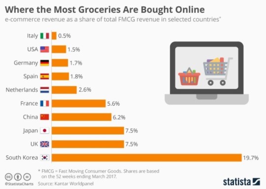
    The World Economic Forum recently posted the below chart showing that 1/5 of all grocery purchases in South Korea are done online. The calculation is e-commerce revenue as a percentage of total fast moving consumer goods revenue in the country.

    image

    The explanation they give for this high percentage is that South Korea has some of the fastest and most ubiquitous internet access in the world. 

    But as soon as I read this I thought to myself: This can’t be the only reason. When was the last time you really wanted to order groceries online but your internet connection was too slow? 

    Also, if you look at all online shopping (not just FMCG), South Korea no longer shows up as such an outlier. So what’s happening with grocery?

    Without actually knowing the market, I would imagine that there are companies in South Korea who have simply figured out how to offer a great online grocery shopping experience.

    South Korea is also one of the denser countries in the world at about 513 people per km2. That would help with distribution. 

    But then again, the Netherlands is also quite dense (414 people per km2). Why are they only at 2.6%? (For comparison, the US is about 33 people per km2.)

    If any of you are familiar with the South Korea market I would love to hear from you in the comments. If they really are at 20%, I am surprised more people aren’t talking about this.

  • Is Trump good for Canada?

    Richard Florida and Joshua Gans just published an article in Politico called: Trump Is Making Canada Great Again. The overarching argument is that as the US closes its borders, Canada benefits. The best and brightest from around the world are coming here.

    This fall, international student applications at the University of Toronto were up 70% compared to last year. And numerous companies in Toronto are reporting “steady, double-digit increases” in the number of job applications from Americans.

    This is exactly what I was getting at when I made the pithy prediction that Amazon is going to choose Toronto for HQ2. It’s about access to human capital (though I acknowledge the political reality of selecting a city outside of the US). 

    Perhaps here or here might work for a location.

    Here is an excerpt from the Politico article that starts to speak to the importance of foreign-born workers in the US:

    As of 2013, foreign-born workers in STEM fields—science, technology engineering and math—accounted for nearly a fifth of workers with bachelor’s degrees in the United States, 40 percent of those with master’s degrees and more than half of those with Ph.D.s. In the San Jose metro area, consisting largely of Silicon Valley, immigrants comprise more than 55 percent of adults who hold advanced degrees.

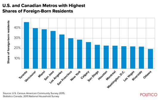
    Here is a chart showing the US and Canadian metros with the highest percentage of foreign-born residents:

    image

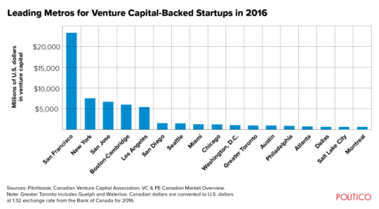
    And here is a chart showing which metro areas receive the most venture capital dollars (in millions of US dollars):

    image

    As to be expected, Toronto, Vancouver and Miami lead in terms of the percentage of foreign-born residents. Though, I would bet that Toronto’s foreign-born population is far more diverse than those of Vancouver and Miami.

    However, when you look at venture capital dollars invested, Toronto is nowhere near the top. Vancouver isn’t even on the list. And I suspect that some of you are surprised to see Miami sitting in between Chicago and Seattle (arguably a city that overperforms in tech relative to VC dollars invested). I was.

    Perhaps Trump will help with this by making Canada great again.

  • Our bias toward homeownership

    We have a cultural bias toward homeownership in this country. Other countries have it too. We believe that homeownership is what you should aspire to.

    In 2011, Statistics Canada pegged the homeownership rate at 69%. 9.2 million households out of a total of 13.3 million. Other more recent data suggests that it’s probably a bit lower, though still higher than that of the US since the financial crisis.

    Regardless, more owners than renters.

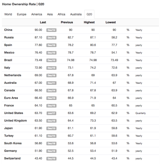
    I am not here to throw stones. I get it. I own my home. However, I do think it’s important to put this into perspective. Below is a chart from Trading Economics of homeownership rates in the G20:

    image

    At the bottom of the list – with the lowest homeownership rates – are Germany and Switzerland. Germany appears almost evenly split between owners and renters. And Switzerland is more renters than owners. 

    Both of these countries are wealthy. Both have a higher GDP per capita than that of Canada according to the World Bank and the International Monetary Fund. 

    Anecdotally, I can also say that some of the wealthiest people I know have made the decision to rent. They have simply decided to invest their capital elsewhere.

    I’m not trying to insinuate any sort of correlation with these statements, but I am trying to draw attention to a cultural bias.

  • The U.S. cities that gained the most workers over the last 12 months

    One of the great things about social media is that it gives us access to data that previously didn’t exist or was difficult to collect.

    Take, for example, LinkedIn’s monthly report on employment trends called the Workforce Report. They look at which industries are hiring, where people are moving for jobs, and so on. Click here for the June 2017 edition. 

    Note that architecture/engineering hiring appears to be up nationally, which is usually a positive leading indicator.

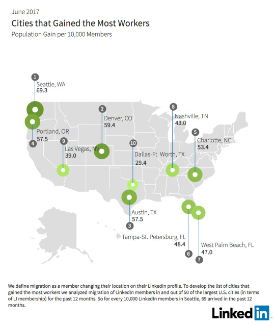
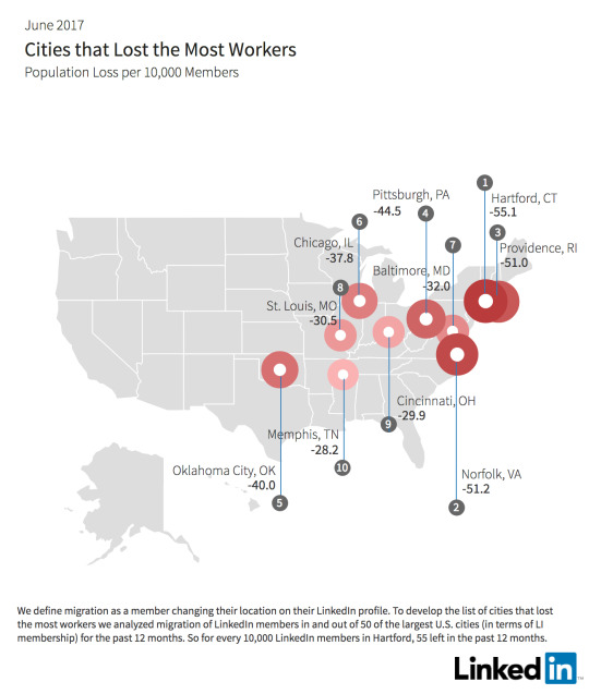
    I’ll leave you all to go through the report, but I did want to pull out a few of their maps and one of their takeaways. Below are maps of the cities that lost the most workers and gained the most workers over the last 12 months.

    The established trend of people moving from colder northern cities to warmer amenity-rich cities seem to play out here.

    That said, one of their “key insights” is that fewer workers today are moving to the San Francisco Bay Area. Since February 2017, there has been a 17% decline in the net number of workers.

    They blame housing affordability (ahem, lack of supply). People are simply turning to other great cities like Seattle, Portland, Denver, and Austin. They’re growing and cheaper.

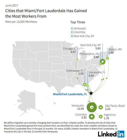
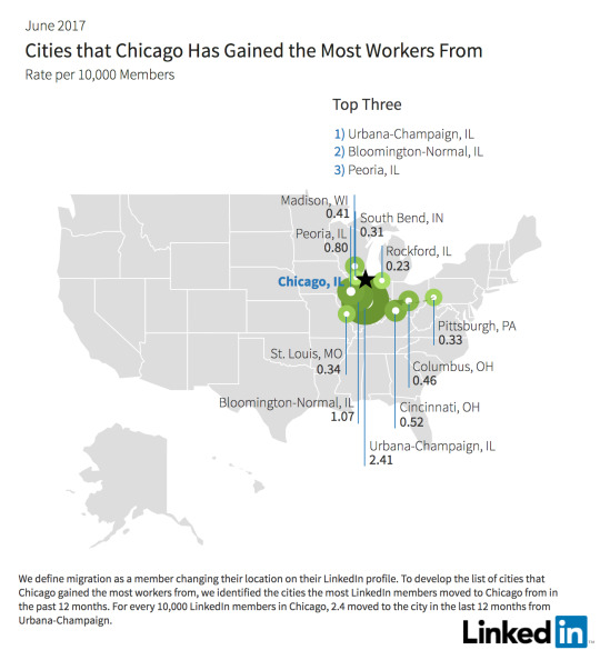
    One of the other cool things about the report is that you can drill down into individual cities to see where people are moving from. I looked up Miami and Chicago just to do a quick comparison. 

    Not surprisingly, Miami is seeing a significant contingent from South America. What’s interesting about this random comparison is how international Miami is and how regional Chicago is in terms of their draws.

    I would love to see similar data for Canada. This is valuable stuff.

  • This is not right

    I have largely avoided commenting on politics and Trump on this blog, but at this stage it is almost impossible to do that.

    Donations are starting to pile up for the American Civil Liberties Union (ACLU) as the tech community, and many others, begin to respond to Friday’s executive orders. Lyft announced a $1 million contribution to the non-profit group.

    Today, venture capitalist Fred Wilson wrote: Make America Hate Again. And yesterday, his business partner Albert Wenger wrote: Misleading the World on Immigration.

    At 6 AM this morning, Richard Florida started a tweet storm where he argued that “Trump’s immigration insanity” will fundamentally threaten the core of America’s innovation hegemony. 

    (He also argued that Canada, and more specifically Toronto, serve to “gain substantially”, as there will no doubt be a doubling down on tolerance to attract the best talent from around the world.)

    The Canadian tech community penned an open letter to reinforce the message that, here in Canada, diversity is our strength. This echoes similar messages from Prime Minister Justin Trudeau and Mayor John Tory.

    Mass protests have broken out at US airports (links to photos) spanning San Francisco to New York. 

    And I am seeing folks from Toronto offer up their homes (publicly on Twitter) to anyone who might be stranded at Pearson International Airport as a result of the orders. Many have even tweeted out their phone numbers.

    Everywhere I look this weekend I am seeing these sorts of messages. So while I could remain quiet, that doesn’t feel right. And that’s because what is happening is not right.

  • The Canadian Dream (and 5 things that hurt upward mobility)

    image

    About 7.5% of American children born into the bottom quintile of the income distribution will eventually make it into the top one fifth. In the UK this number is about 9%. And in Canada and Denmark, the numbers are 13% and 13.5%, respectively. (The upper bound for these numbers is 20% since you can’t have more than 20% in the top 20% of the income distribution.)

    Because of stats such as these, Freakeconomics recently asked: Is the American Dream really dead? And if so, should it instead be called the Canadian Dream, seeing how it’s more readily obtained.

    Of course, it’s not necessarily as simple as 7.5% vs. 13%. Upward mobility exhibits a lot of regional variation. In the American southeast, the number is closer to 4%. Whereas in the San Francisco Bay Area, the number is up there with Canada and Denmark. However, this phenomenon is so location-specific that even kids growing up in San Francisco are twice as likely to get to the top 20% compared to kids growing up across the bridge in Oakland.

    There’s also a question of spread. Canada and Denmark have less income inequality, meaning you don’t have to travel as far to get to the top of the income distribution. 

    Still, the reality is that it is becoming harder for Americans to climb the socioeconomic ladder. The number of 30-year old Americans who today earn more than their parents is dropping compared to previous decades. So what needs to be done? What is causing this erosion of the American Dream?

    It turns out that city builders have an important role to play in solving this problem. Because where you live – and in particular where you grow up as a kid – matters.

    The Freakeconomics episode examines a study that was done by Raj Chetty, Nathaniel Hendren, and Lawrence Katz, called: The Effects of Exposure to Better Neighborhoods on Children. And their findings were exactly that. Place matters. The study reexamines the findings of a program that was administered in the mid 1990′s in the US called Moving to Opportunity (MTO). This program randomly offered families living in high-poverty neighborhoods the opportunity to move to neighborhoods with far less poverty. 

    Upon initial review, the program was seen as a failure. There were some positive health outcomes, but no meaningful changes in income. But when Chetty and company took another look at the data – now with more time and IRS data on their side – they discovered that the impact was in fact dramatic. Relocated families raised children that earned 30% more, were 27% more likely to go to college, and 30% less likely to be a single parent. The key, however, was that the children had to relocate when they were young (< 13 year olds). The older they got, the less benefit they received from moving, eventually reaching a plateau where there was basically no benefit at all.

    Here are the 5 things that ended up having significance in their findings:

    1. Residential segregation by income and race is bad. Mixed neighborhoods are good. The southeast is filled with segregated cities and that’s one of the reasons why they underperform in this exercise. San Francisco, on the other hand, was far more mixed in the 80′s and 90′s when the kids belonging to this study were growing up. One could debate whether that’s still the case. I guess we’ll find out in a few decades.
    2. Income inequality negatively impacts upward mobility. See The Great Gatsby Curve.
    3. Single parent households seem to have an impact on upward mobility. However, the data suggests that it’s not just about whether the child in question grew up with married parents. The percentage of single parent households in the neighborhood also matters. Because even children in dual parent households in a neighborhood with lots of single parent households, showed muted upward mobility.
    4. Social fabric. Connections to family and friends matter. It’s about having a support network. (Freakeconomics mentions a book called Bowling Alone that is now on my reading list.)
    5. Not surprisingly, the quality of public schools matters.

    All of the stats for this post were taken from this Freakeconomics Radio episode. For me, it is such an important reminder that the way we plan and build our cities can have meaningful and longstanding impacts on the kinds of children we raise.

  • The functional economic geography of the US

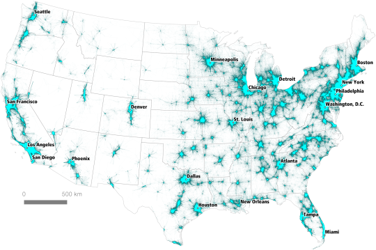
    PLOS One recently published a paper and a set of maps that looks at commuter flows across the United States (over 4 million data points). The objective was to identify all of the country’s “megaregions.”

    Here is one of those maps. I think it says a lot.

    We often think of cities as having discrete boundaries and population counts, but the reality is that studies and maps such as these provide a much better sense of the overall economic geography of a place.

    It’s worth noting that the commuter dataset used for this study is from 2006-2010. So things may look a bit different today. The full report can be found here.

  • The link between ancestry and foreign direct investment

    Below is an interesting example of how international migration – and being open to it – can have positive economic impacts by way of increased foreign direct investment (FDI). The excerpt is from the World Economic Forum.

    “…we document that FDI follows the paths of historical migrants as much as it follows differences in productivity, tax rates, education, and other conventional determinants of economic competitiveness – for the average US county, doubling the number of individuals with ancestry from a given origin country increases by 4 percentage points the probability that at least one firm from this US county engages in FDI with that origin country, and increases by 29% the number of local jobs at subsidiaries of firms headquartered in that origin country.”

    Their study also found that these ties are long lasting. That is, even after a few generations of assimilation, ancestry still has an effect on FDI patterns. 

    There are of course many other benefits to open borders. But our collective tolerance toward immigration has ebbed and flowed greatly over time. And my sense is that if often has a relationship with prosperity.

    As long as times are good and I – the incumbent – am winning, then immigration is accepted, if not welcome. But as soon as times become scarce, then I – the incumbent – need to start protecting my nest.

    This may be one of the reasons why Canada seems to fair so well when it comes to diversity. We optimize for the middle more than countries like the US.

    An example of this phenomenon can be found in the mid-19th century California Gold Rush. By 1876, the United States had approximately 151,000 people of Chinese ancestry and about 116,000 of them were in the state of California.

    In the early days of the rush, when gold was abundant, it has been said that the foreign Chinese laborers were well received. But as gold became more scarce and difficult to find, Californians began to believe that the Chinaman was stealing their wealth.

    In 1882, the US signed the Chinese Exclusion Act, which flat out prohibited the immigration of Chinese laborers. It was not repealed until 1943. However, the Chinese still found other creative ways to enter the country (see Lo Mein Loophole).

    I say all this simply to provide a bit more context. We can talk about how disruptive technologies are squeezing the middle class in new and profound ways. But in many ways, we’ve all heard this story before.