Daily insights for city builders, delivered every morning at 6 AM ET. I’m Brandon Donnelly — a Toronto-based real estate developer and founder of Globizen. I’ve been writing here since 2013.

Tag: transportation

  • How I moved over the last 3 weeks

    At the beginning of this year I wrote a post about a mobile tracking app called Moves that I had heard about through my friend Sachin Monga. He had just published a beautiful set maps showing where he physically spent his time in both Toronto and San Francisco.

    His post spurred me to download the app and at the end of my post I promised to share my own set of maps once I had collected enough data points. It’s only been about 3 weeks, but already my maps are starting to fill out, so I thought I would do a release.

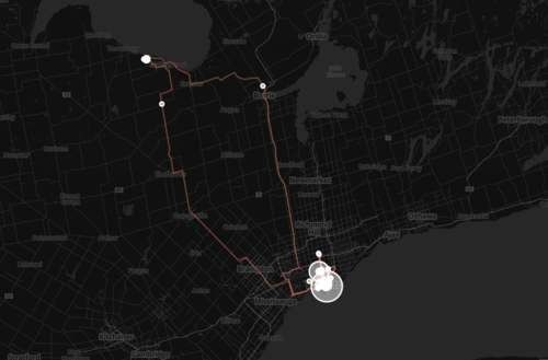
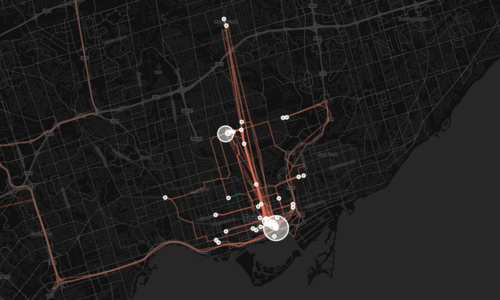
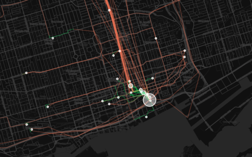
    The orange lines represent transport of some sort (car, subway, streetcar, and so on) and the green lines represent walking. I don’t cycle very often in the winter (I know, I’m a fair-weather cyclist), so you won’t see any of those lines just yet. However if I posted a map from the summer, I know it would look completely different.

    Here’s a first one showing a regional scale:
    image

    Here’s a second one showing the city of Toronto:
    image

    And here’s a third one showing mostly downtown:
    image

    What’s interesting about these maps is how much you can tell about me and the way I move around the city.

    For one, there’s a good chance I ski or snowboard given that I’m driving up to Collingwood, Ontario in the winter. You can also see how heavily dependent I am on the Yonge subway line, which is the thickest orange line in the middle of downtown. It’s also interesting to see how localized I am within my neighborhood (St. Lawrence Market). I walk to get groceries. I walk to the gym. I walk to coffee. And the list goes on.

    This is fairly typical for people living in urban neighborhoods, but it would be interesting to see where it applies in the city and where it begins to fall apart. I would also imagine that there’s a correlation to the area’s Walk Score, although this (Moves) might actually be a better measure since it’s usage data.

    Either way, imagine what cities could do if they had this sort of data for every resident. They would be able to see precise resident flows and then determine exactly where transit and infrastructure investments should be made instead of politicking to determine where they should be made.

    That time is coming.

  • Marginal cost = 0

    Earlier this week I wrote a post called: The pull from services to products. And in it I made mention of the fact that part of what’s driving this pull towards products is that the marginal cost of servicing additional users or customers is almost nothing in a world of internet services and products.

    Well the reality is that this phenomenon is driving a hell of a lot more. It could – and probably will – fundamentally change almost all aspects of the economy.

    I know that sounds like a pretty audacious statement, but if you watch the following 10 minute talk by Albert Wenger (Union Square Ventures) you might start to feel the same way. He outlines 5 changes being driven by the fact that in the digital world, marginal cost = 0. The impacts go well beyond tech, capturing sectors such as transportation and industrial real estate.

    [youtube https://www.youtube.com/watch?v=sVEtTzlqsoE?rel=0]

    If you can’t see the video, click here.

  • Why Bitcoin might still be a big deal

    Welcome to 2015!

    To start off the year, I thought I would talk about something pretty geeky, but very forward looking: Bitcoin.

    I wrote about Bitcoin just over a year ago when I was first starting to wrap my head around it, but a lot has happened since then. Many of you might know that 2014 was a terrible year for Bitcoin and that its price has declined significantly (chart from Coinbase):

    image

    But does that mean Bitcoin is a flop, or that the hype has just died down a bit?

    If you follow what’s being discussed within the tech community, you’ll know that there are still lots of people who are bullish on Bitcoin. But more precisely, they are bullish on the underlying architecture behind Bitcoin and something that is called the Blockchain.

    I’m not going to get too technical in this post (if you want that, go here), but I do want to talk about three things (that I’ve mostly learned from the folks over at Union Square Ventures): the Blockchain, why it matters, and what it could mean for specific industries such as transportation and real estate. I promise to make it relevant at the end.

    The way to think about all of this is in layers.

    The Blockchain is the foundation or base of Bitcoin. It’s essentially a decentralized public ledger that keeps track of all the Bitcoin transactions. Decentralized means that not one single person or company owns the database. It’s free for anyone and everyone to see. This structure is important because it enables peer-to-peer transactions across the internet, as opposed to going through a bank or other intermediary.

    But the key takeaway is that Bitcoin is simply one example of a “protocol” built on top of the Blockchain. And there are many others in the works, including a protocol for realtime ride sharing (Lazooz) and a protocol for a decentralized peer-to-peer marketplace (OpenBazaar). And so the real innovation is the Blockchain, not Bitcoin itself.

    Why does this matter?

    It matters because these protocols are, again, not owned by a single entity, which is remarkably different than the way most things work today. Take for example the residential real estate industry. In the Greater Toronto Area, the data that emerges from home listings and sales is owned by the Toronto Real Estate Board.

    And since this data is privately owned, a lot of it remains only accessible to “members” or real estate agents. The Competition Bureau has been fighting for more openness, but the Toronto Real Estate Board obviously wants to keep as much of this data as it can to itself. Who can blame them.

    But what if somebody came along and created a new protocol for a decentralized peer-to-peer home marketplace? In that case no one would own the data, which means everyone would have access to it. And that would completely change the landscape. I’m fuzzy on what this protocol would even look like, but it seems entirely possible given what else is in the works.

    And if this Bitcoin Blockchain revolution does actually take place, it wouldn’t be restricted to only non-tech legacy industries. Joel Monegro of Union Square Ventures believes that “decentralized protocols” such as Lazooz and OpenBazaar (mentioned above) could even have a big impact on companies such as Uber and eBay, respectively.

    I’m still trying to wrap my head around all of this, but I want to understand it and I thought you all might as well. Because even though it seems very tech right now, the implications would also be very non-tech if it turns out to be true.

  • Where Uber operates and where it’s banned

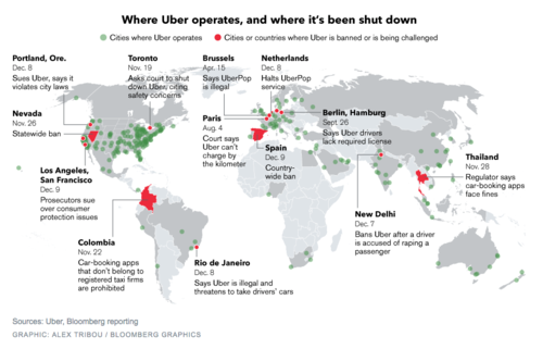
    Earlier this month, Bloomberg published this map showing where Uber operates and where it’s been banned (or is being challenged). You can click on the map for a larger version.

    image

    Uber operates in about 250 cities across the world. But it’s being challenged in a lot of them, including Portland, San Francisco, Los Angeles, Toronto, Rio de Janeiro, Paris, Berlin, as well as others.

    I don’t want to dismiss any of the safety concerns that have arisen lately, because those are very serious and they need to be addressed. Life safety is paramount. But I continue to believe that banning a service that many people clearly want to use isn’t the right solution.

    On top of that, I think it could lull many of the local taxi communities into a false sense of security about the future. Uber is moving incredibly quickly. UberX launched in Toronto in September of this year. And UberPOOL – their new carpool service – is likely next.

    With these releases, Uber is working towards a specific vision for the future: Their goal is to eliminate the need for private vehicle ownership. Should they be successful, this will not only impact taxis, but also car manufacturers and urban mobility in its entirety.

    So as difficult as it might seem right now, I think urban leaders would be better served trying to figure out how to harness these innovations. Cities have been trying for decades to get people out of their cars. Uber wants to do the same.

  • What happens when you demolish a highway

    Earlier today I tweeted this:

    //platform.twitter.com/widgets.js

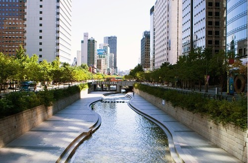
    It’s a link to an article talking about 5 cities – New York, Milwaukee, Seoul, Portland, and San Francisco – who all demolished an elevated highway that used to run through their downtowns.

    To be completely fair, some of these cities didn’t really have a choice. San Francisco’s Central Freeway was so badly damaged in an earthquake that it had to be closed. But it doesn’t make the lessons any less relevant.

    In all of these cases, the elevated highways were taken down and never replaced with another highway. Some were turned into large boulevards. Others were turned into parks. But in none of the cases was a new road of similar capacity built.

    Intuitively it might seem like this would cause utter chaos. I mean, where were all of these cars going to go? 

    But that didn’t happen. Instead, demand redistributed itself. Car volumes dropped dramatically. More people took transit. Some people took other routes. And some people traveled at different times. Oh, and nearby property values all went up.

    And the reason this happened is because of something that economists call induced demand (I’ve written about it before, here). What it means is that as you increase the supply of some valuable good (such as free highways), more of that good becomes demanded.

    In other words: more free highways = more cars on the road.

    So if you’re a city – like Toronto – with an elevated highway running through your downtown, you should give this some serious thought. The outcomes aren’t as bad as you might think. In fact, they’re quite good.

    Image: Seoul via D Magazine

  • The ultimate Toronto transit map

    image

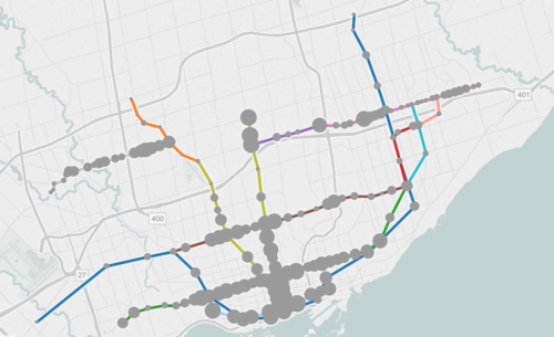
    If you live in Toronto and only give serious thought to one thing today, it should be to this interactive transit map created by Metro.

    The map shows all existing, planned, and proposed transit lines in the city, and then overlays population densities, commuting patterns, household income, and so on. It’s a super valuable map that I think reveals a lot about how we should be focusing our energies to get Toronto moving.

    So what sorts of things does it tell us? I’ll give 2 examples.

    If you look at commuting patterns across the Bloor-Danforth subway line, you’ll see that Runnymede station in the west is where people switch over from taking transit to driving. People west of that station tend to drive. Naturally, it also happens to coincide with where population densities start to fall off.

    By contrast, if you look at the east side of the city along the Danforth and beyond, the entire stretch more or less relies on transit to get around. Part of this likely has to do with income levels, but it’s also because of the availability of the Gardiner Expressway. There’s no equivalent in the east end. Dylan Reid of Spacing Magazine believes this makes a case for some sort of road pricing along the Gardiner, and I would agree.

    As a second example, look at the population densities along the proposed Downtown Relief Line, Finch LRT, and John Tory’s SmartTrack line. Outside of the core, the population densities are relatively low along the proposed SmartTrack line – which is never a good thing for rapid transit.

    There’s also no Sherbourne station on the SmartTrack line, which happens to have the highest population density across the entire Relief Line – 22,131 people per square kilometre! That’s more than any other stop along the Yonge-University subway line except for Wellesley station.

    I’ve written about this a lot before, but I think we need to do a better job of matching up transit investment with expected customer demand. Too often we let politics get in the way of rationale decision making. Maybe it’s time we did something like set minimum population densities. If you want a subway line in your area, you have to first bring the people.

    What else does this map tell you?

  • 8 standards for transit oriented development

    Recently in the comment section of ATC, Lloyd Alter of Treehugger shared a great article talking about the 8 principles of Transit Oriented Development (TOD). “TOD” is one of those buzzwords (or buzz acronyms?) that gets thrown around a lot in city building and real estate circles. But I suspect that most people don’t exactly know what it takes to design and build successful TOD projects and neighborhoods.

    Which is why the Institute for Transportation and Development Policy came up with these 8 standards:

    1. WALK: Develop neighborhoods that promote walking
    2. CYCLE: Prioritize non-motorized transport networks
    3. CONNECT: Create dense networks of streets and paths
    4. TRANSIT: Locate development near high-quality public transport
    5. MIX: Plan for mixed use
    6. DENSIFY: Optimize density and transit capacity
    7. COMPACT: Create regions with short commutes
    8. SHIFT: Increase mobility by regulating parking and road use

    What should be apparent from this list is that the standards are quite clearly stacked against cars. Number 2 is about prioritizing non-motorized transport networks. And number 8 is about regulating parking use and road use. It’s about making a decision who you are planning for and acknowledging that when you do all of the above, you largely eliminate the need for driving.

    If you’re a “war on the car” kind of person, this might offend you. But if you look at the data I shared about a week ago (forgive me, I know the chart is a pain to read), you’ll see that it’s seemingly pretty difficult to design a city that’s equally great for both cars and for people. The cities where people love to walk, cycle, and take transit are precisely the ones where few people drive.

    Image: Flickr

  • It’s voting day in Toronto

    Today is municipal election day in Toronto.

    About 8 months ago I publicly announced here on ATC who I would be supporting, and my position hasn’t changed. I was disappointed by the fact that he ended up backing away from his initial promise of a true downtown relief subway line (see blog post), but I nonetheless continue to support his candidacy.

    In the words of Mike “Pinball” Clemons, he’s “the right man at the right time.” Click here if you can’t see the video below.

    [youtube https://www.youtube.com/watch?v=ouqv782giyw]

    But I’m not here to try and sway your vote. That is ultimately your decision. However, I am here to encourage you to get out and vote. Regardless of who you might be supporting, I think it’s important that you get out and take a position. So I hope you do that today.

    Happy Monday!

  • Riding the new streetcar

    image

    This afternoon I rode Toronto’s new streetcar for the first time on my way home from Chinatown. I had been meaning to do it for weeks now, but this was my first opportunity.

    The experience was infinitely better than what you get today on our current streetcars. I felt like I was in a new city. The proof-of-payment system makes onboarding much faster and the 4 loading doors means you just get on the train where there’s the most room – instead of getting on at the front and fighting your way to the back.

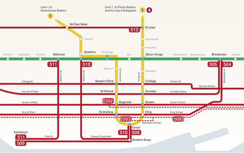
    The other thing I liked is that they now have a map of our streetcar network within the train (see above image). Toronto never used to do this. For whatever reason, we didn’t like mixing subway lines with streetcar lines on the same map. 

    But why be so pedantic?

    For one thing, our subway map looks pathetic without these additional streetcar lines on it. So for the sake of Torontonian morale, please fill it up with what you can.

    But the other reason why I think it’s important to include them is that we shouldn’t be thinking about our cities just in terms of specific technologies (subway, streetcar, and so on). Our cities are now multi-modal. Which means we navigate them using many different means, from subways and streetcars to bikes and Uber cars. What people care about is getting from A to B in the most efficient and enjoyable way possible.

    This may seem like a subtle distinction, but it’s an important one. And maybe, just maybe, these new maps will serve as an important reminder to us that there’s a lot of fixed rail in this city and that it could be far better optimized if we just tried a little harder.

  • Seattle’s first protected bike lane makes a quick adjustment

    Seattle recently installed its first protected downtown bike lane on Second Avenue. Here’s a short video of it in action (pay attention to the signalling setup and the pedestrians that walk into the bike lanes). Click here if you can’t see the video below.

    [youtube https://www.youtube.com/watch?v=x2iQCCHlR0s?rel=0]

    Shortly after it opened, they quickly discovered that the left green arrow and solid green circle (shown above) were confusing drivers. The intent was for the left green arrow to signal that you could turn and for the solid circle to signal that you could drive straight ahead.

    But even with the accompanying sign, drivers kept getting confused and thought a green circle meant you could go wherever you want.

    So the Seattle Department of Transportation quickly adjusted and changed the green circle to a north arrow. And it seems to have fixed the problem. I think it goes to show how important the details can be with these things.