Daily insights for city builders, delivered every morning at 6 AM ET. I’m Brandon Donnelly — a Toronto-based real estate developer and founder of Globizen. I’ve been writing here since 2013.

Tag: transit

  • The worst on-time performance of any major transit system in the world

    I was recently with some New Yorkers and we got on to the topic of their subway system. I made a comment about how extensive their network is and how their express trains work so well for traveling further distances. 

    They responded by basically saying: “Yeah, it’s great, when it works.” They then went on to tell me that most of the time they just use Uber to get around the city because the subway has become so unreliable.

    Admittedly, I don’t use the NYC subway system enough to comment on its declining performance. But this recent New York Times article describes it as an utterly failing system.

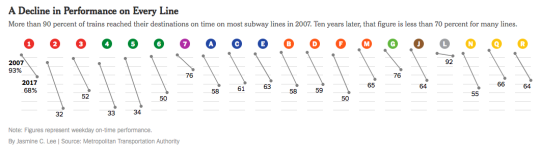
    Here is a diagram from the article that shows performance on every line (2007 to 2017), measured as a percentage of trains that reach their destinations on time (i.e. less than 5 minutes late):

    image

    In 2007, more than 90% of trains reached their destinations on time. Today, the weekday average is around 65% and some of the lines are in the 30s. This is the worst it has been since the 1970s when NYC was almost bankrupt.

    Apparently this also awards NYC’s subway the title of the worst on-time performance out of the world’s top 20 biggest systems.

    I suppose one of the lessons here is that subway lines on a map will always be far sexier than the nuts and bolts of maintenance, performance, and ridership. But we can’t forget the nuts and bolts. Maybe those are the most important parts.

  • Learning from King Street

    Toronto is now a week into the King Street Transit Pilot.

    It’s still early days and transit guru Steve Munro hasn’t yet published any before and after route performance. He will. But already the sentiment seems to be clear: This shit is working. There are many recounts of people’s commute times being more than cut in half. 

    As somebody who walks this stretch of King every day, this isn’t surprising to me. There has been a dramatic reduction in the number of cars on the street.

    What is perhaps surprising is that none of the surrounding streets seem to be any busier. I would like to see the data, but it feels as if most of the cars have simply disappeared. Are more people now taking transit? Has this been your impression?

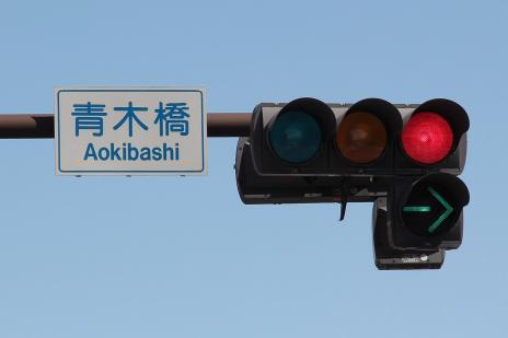
    Of course, the pilot isn’t perfect. What is not working are the signs that tell drivers they can’t drive through most of the intersections (only turn right). The circular green lights confuse them or they simply don’t care. 

    There have been suggestions for better signals, such as this one:

    image

    And if the pilot in its current incarnation does stick, I am sure there will be many additional improvements like this one made. But even at this early stage, Toronto is calling the pilot a “transit miracle.”

    When City Council approved the pilot in the summer it had a preliminary cost estimate of $1.5 million. (Figure excludes the lost parking revenue associated with removing approximately 180 on-street parking spaces).

    This is a relatively minuscule amount considering it has had an immediate impact, basically overnight, on the commute times of the 65,000 or so people who use this line every day.

    And it feels even more minuscule when you consider that our Scarborough Subway extension is expected to cost $3.35+ billion to build and only service around 64,000 people a day when you look far into the future – 2031 to be exact.

    The lesson here on King Street should be that light rail and surface transit routes can move lots of people very efficiently and cost effectively when you empower them to do precisely that.

  • The King Street Transit Pilot has started

    Back in January 2016, I wrote about Toronto’s ambition to transform King into a “transit first” street across the downtown core. 

    The King streetcar is the busiest surface transit route in the entire city (65,000 riders / day on average) and it was – and continues to be – my opinion that the route was broken. Something had to be done.

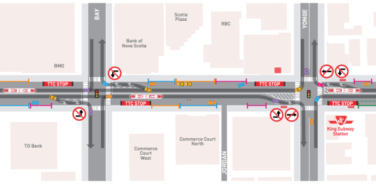
    Well, that something is now happening. The “King Street Transit Pilot” officially started on Sunday, November 12, 2017 at 7am. Here are some of the key changes, many of which are also depicted in the above image:

    – No more on-street parking in the pilot area.

    – Cars can no longer turn left or drive through the intersections of the pilot area (except for taxis picking up drunk people from 10pm to 5am).

    – Cars must now follow a right-in/right-out approach. They can turn right onto King, but then they have to turn right off of King at the next intersection.

    – Most of the streetcar stops have been moved to the “far side” of each intersection. That is, after the lights. Passenger waiting areas are now in the curbside lane and protected by jersey barriers.

    – Cyclists can go through the intersections of the pilot area. “Bike boxes” have been added to intersections where there are north-south bike lanes to help with turning left.

    As to be expected, some people are upset about the above changes. There are also concerns that drivers aren’t going to obey the rules and continue to drive through the intersections in the streetcar lane. But this is a pilot project. It’s about learning and adjusting.

    It’s also important to keep in mind that King has at least 3x more transit riders than cars. This pilot is about figuring out how to best optimize the street so that it moves the greatest number of people as efficiently as possible.

    I’ll report back here on the blog once the pilot has settled in and there is a better understanding of its impact.

  • Uber Express POOL is kind of like public transit

    Uber is currently testing a feature in a few neighborhoods in Boston and San Francisco called Uber Express POOL

    Like the regular version of Uber POOL, this is a shared ride. But with Express POOL the app now automatically generates “smart spots” that are easy to drive to and close to the origin and destination of multiple passengers.

    So instead of a direct pick-up and drop-off, you now need to walk a few blocks to one of these dynamically created “smart spots.” In exchange for the added inconvenience, you get 25% off your fare.

    What’s immediately fascinating about this feature is that it further blurs the line between Uber and public transit. These “smart spots” are effectively low-volume and ephemeral transit stops that pop-up based on demand and then disappear.

    It makes the notion of a fixed stop and transit schedule, particularly in low usage areas, seem inefficient. Now imagine if we created some sort of visual marker on the street every time a “smart spot” was emerging based on demand.

    It is clear that Uber is trying to price these rides so that they are competitive with conventional public transit. And there’s no reason that this technology couldn’t also be applied to larger vehicles, such as buses.

    I find this fascinating. And it’s a perfect example of what we talked about in yesterday’s post. This is software and networks being layered on top of the built environment.

  • Singapore just capped vehicle growth at 0%

    When I was in New York a few weeks ago, my friend (a New Yorker) said to me that he couldn’t imagine owning a car (he used to but got rid of it with zero remorse). He then elaborated on all of the nuisances that driving in the city produces.

    There are parts of Toronto where you can feel similarly. I feel fortunate to live in one of those parts. Of course, there are other parts of this city where the exact opposite is true. It’s inconvenient not to have a car. These are typically areas where lower land costs have been exchanged for higher transportation costs.

    The City of Toronto has a land area of approximately 630 square kilometers. If that’s all the land we had (the metro area is almost 6,000 square kilometers), you can bet we would think about land use and transportation a bit differently.

    Take for instance, Singapore, a city-state with an area of approximately 719 square kilometers. The Land Transport Authority estimates that 12% of the republic’s total land area is taken up by roads.

    Because of this, they just announced that they have lowered their vehicle growth rate (for cars and motorcycles) from 0.25% per annum to 0% effective February 2018. They can do this through their Certificate of Entitlement (COE) quota. And it won’t be revisited until 2020.

    Put differently: No more cars and motorcycles until, maybe, 2020.

  • The neighborhood of the future

    image

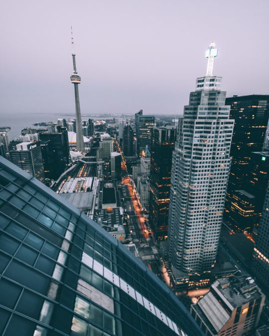
    Daniel Doctoroff (chairman and CEO of Sidewalk Labs and former deputy mayor of New York City) and Eric Schmidt (executive chairman of Alphabet and former CEO of Google) recently contributed a piece to the Globe and Mail about “why Toronto is the ideal place to build a neighborhood of the future.” 

    It’s about the partnership they working on with Waterfront Toronto. I wrote about that announcement, here.

    Here is an excerpt from the Globe article:

    “The eastern waterfront will be a place where residents, companies, startups and local organizations can advance new ideas for improving city life. It’s where a self-driving test shuttle will take its first steps toward becoming a next-generation transit system that’s cheaper, safer and more convenient than private car-ownership. It’s where new insights into advanced construction methods will start to reveal a path toward more affordable housing development. It’s where explorations into renewable energy and sustainable building designs will show promise toward becoming a climate-positive blueprint for cities around the world.”

    These are some of the first details that I have heard about their vision for Toronto’s eastern waterfront. 

    Some of you are probably worried – after reading the above excerpt – that by focusing on self-driving vehicles, we are setting ourselves up to repeat our previous mistakes. But if self-driving vehicles are destined to become a reality (and it certainly feels that way), it is critical that we understand their impact and how they might best dovetail with the public transit systems we already have in place.

    I am thrilled that all of this will be happening right here on our doorstep.

    Photo by Brxxto on Unsplash

  • The 10 most promising Hyperloop routes (and thoughts on the naysayers)

    image

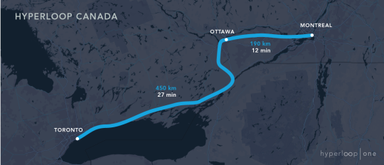
    On September 14, 2017, Hyperloop One announced the 10 winners of its Global Challenge. These are the world’s “most promising” Hyperloop routes; selected through a process that began in May 2016 and involved more than 2,600 registered teams.

    The winners:

    1. Canada | Toronto-Montreal
    2. India | Bengaluru-Chennai
    3. India | Mumbai-Chennai
    4. Mexico | Mexico City-Guadalajara
    5. UK | Edinburgh-London
    6. UK | Glasgow-Liverpool
    7. US | Chicago-Columbus-Pittsburgh
    8. US | Miami-Orlando
    9. US | Cheyenne-Denver-Pueblo
    10. US | Dallas-Laredo-Houston

    If you aren’t familiar with what Hyperloop One is trying to accomplish, here is a quick video explaining the basics. Their goal is to have the world’s first operating Hyperloop by 2021.

    If you happen to live in one of the above regions (about 148 million of us do), then you are probably already seeing the headlines in your feeds. For Canada, the promise is of connecting 25% of our country’s population with one single Hyperloop route.

    It would mean Toronto-Montreal in just 39 minutes:

    image

    This is shorter than many morning commutes. So it’s not hard to see why this is a tantalizing proposition. It would mean a union of our two biggest cities and our capital. More accessible Montreal bagels. And maybe, just maybe, a strengthened sense of bilingualism in this country. 

    But there are also critics who believe that all of this Hyperloop hype is simply a distraction. Why not focus on proven technologies as opposed to some fanciful pipe dream that may never materialize? This is about stroking political egos as opposed to real progress.

    My views are pretty simple on this one.

    Will Hyperloop Canada happen? Maybe. Maybe not. I sure hope it does. But it may not. It’s easy to draw lines on a map. It’s much harder to actually execute on those lines. And of course, logistics aside, the technology is still being developed.

    But if all we ever focused our energy on were things that have already been “proven”, we likely wouldn’t create many new things. Things that today are proven, were once unproven. But they became proven because there were folks who didn’t let that minor detail deter them from trying. They went for it.

    So if a private company would like to go out and raise $160 million from private investors to try and figure out how to sustainably connect Canada’s two largest cities in 39 minutes, I am more than happy to cheerlead. Because I’m not the one trying. Who am I to naysay? 

  • Transit advertising according to the numbers

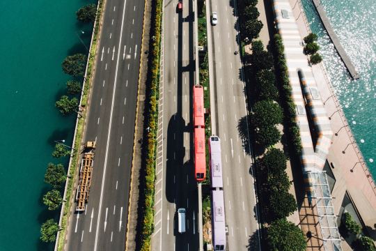
    This morning I saw this tweet about Toronto streetcar advertising. The author has a “big problem” with public transit being fully wrapped in ads and so she decided to tweet her local Councillor to see if these could be somehow limited in size.

    My first thought was: I wonder how many people would accept higher fares in exchange for fewer/no advertising. Is this something people care about? Because personally, I’ll take the lower fares in exchange for someone trying to monetize my attention. I mean, every social network I use is already selling my attention off as their product.

    But then this got me thinking about what the actual numbers look like. So let’s look at some of those for not only Toronto, but also for Hong Kong, since many people view that as the gold standard as far transit authorities go.

    For the year ending December 31, 2016, the Toronto Transit Commission (TTC) posted a total operating revenue of $1.204 billion. This represents about 41% of total revenue – the rest comes from subsidies.

    If you drill down into operating revenue, advertising makes up $28 million or about 2.33% of total operating revenue. So a pretty small number. If you tried to shift this number over to “passenger services” revenue (transit fares), it actually wouldn’t increase fares by that much. But presumably fares are already at some profit maximizing number.

    Switching to Hong Kong’s MTR Corporation, their numbers have to be unpacked a little differently because the group has a number of diverse business lines, including property development.

    For the year ending December 31, 2016, total revenue from Hong Kong Transport Operations was HK$17.655 billion (almost all fare revenue). Advertising falls within the Hong Kong Station Commercial Businesses group and that company posted revenues of HK$5.544 billion for the same time period.

    To try and create some sort of comparison, I’m ignoring all of the other segments within MTR.

    Within Station Commercial Businesses, advertising revenue alone makes up HK$1.09 billion or about 20% of that group’s total revenue. The rest comes from station retail rent (the biggest chunk), telecom, and some miscellaneous station income. 

    If you add up Transport Operations and Station Commercial Businesses, total revenue was HK$23,199 billion for the year ending 2016. Advertising comprises about 4.70% of this – so more than double that of Toronto.

    It’s also worth noting that MTR’s station retail rental revenue is about 3.4x that of its advertising revenue. In the case of Toronto, the TTC actually makes more money off advertising than it does from “Property Rental.” I’ve always thought this was a missed opportunity. Transit and land use go hand in hand.

    In any event, I’m far less fussed about advertising on transit. But what are your thoughts? Let me know in the comment section below.

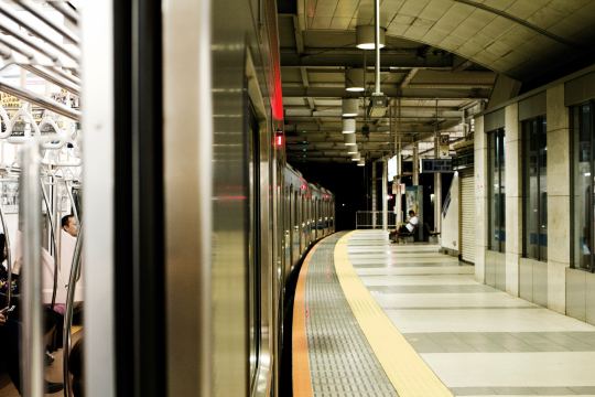
    Photo by Tomo Nogi on Unsplash

  • One hour drive

    I’m taking next week off so that I can respond to emails from various places in Ontario and Quebec instead of from my desk. The out of office messages really fly at this time of year, so it’s usually a pretty good time to try for a recharge.

    Because of that, this post feels appropriate. 

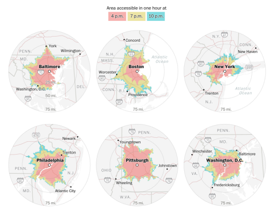
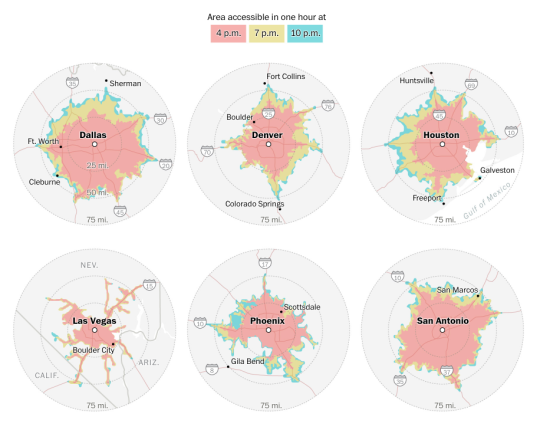
    Sahil Chinoy of the Washington Post recently looked at anonymous cell phone and vehicle data (from Here Technologies) to see how far you could drive in one hour if you were trying to escape the downtown of various U.S. cities on a Friday afternoon in the summer.

    This exercise was done for 3 departure times on July 28, 2017: 4pm, 7pm and 10pm. The mappings all leverage 3 years of historical speed data.

    Here is a first set of maps showing a few cities in the northeast and in the mid-atlantic. Every city is shown at the same scale so that they can be easily compared.

    image

    And here is a second set of maps showing a few, more car-oriented, cities.

    image

    Not surprisingly, older transit-oriented cities like New York don’t do well in this contest. No matter what time you leave, it’s hard to make it past 30 miles. Whereas in the case of Vegas, it doesn’t really matter what time you leave. You should be able to clear 50 miles.

    That’s the other interesting thing to note about these maps – the spread between distances at the various times.

    I’m sharing these because I’m a sucker for diagrams, but I don’t think they tell the whole story. The modal splits and the population and employment densities are all very different across these cities. New York’s core competency is in moving lots of people in trains, not in cars.

    Although, perhaps the ironic thing about these diagrams is that a tighter drive radius might actually say something about how efficiently land is being used.

  • Why dynamic road pricing is inevitable

    The Economist recently published an article called: How and why road-pricing will happen. If you’re a regular reader, you’ll know that there’s been lots of talk and support

    over the years

    on this blog for dynamic road pricing.

    It’s politically unpopular, but it’s an incredibly rationale way to deal with traffic congestion. 

    In Singapore – home of the world’s first congestion charge zone (1975) – they constantly monitor traffic congestion. As soon as average speeds drop over a three-month period, they simply raise the charge. Congestion gone.

    We know this works, but for many reasons road pricing is highly divisive. According to The Economist, there are a few reasons why this is going to become a bit more politically palatable.

    For one, the take from gas taxes and vehicle duties has been declining in Britain over the past couple of years. Electric vehicles will only exacerbate this trend. So governments are going to be forced to look elsewhere for money.

    Secondly, traditional tolls and congestion charges are becoming increasingly ineffective. Today in central London, private-hire vehicles are said to make up about 38% of all car traffic – almost double the share of traditional black taxis. 

    These are cars circling around the city, picking up passengers. Blunt charges based on suburbanites entering the city in the morning and leaving in the afternoon is simply not capturing the way that many of us move around our cities today.

    In other words, urban mobility is undergoing dramatic changes and the revenue and congestion management tools are going to need to adapt. If you’re interested in this topic, check out the full article here.

    Photo by chuttersnap on Unsplash