
Daily insights for city builders, delivered every morning at 6 AM ET. I’m Brandon Donnelly — a Toronto-based real estate developer and founder of Globizen. I’ve been writing here since 2013.

Tag: new york times

  • China is building two new hospitals in response to virus — should only take a few weeks

    This morning I got caught up on what’s happening with the coronavirus that emerged in Wuhan, China, but that is now spreading quickly across mainland China. It’s unsettling. As of Saturday, there were over 1,287 confirmed cases in mainland China and 41 deaths. Right now, the belief is that the virus emerged from a seafood and meat market in Wuhan.

    The Wuhan virus belongs to a family of viruses known as coronaviruses, which includes the severe acute respiratory syndrome (SARS) that broke out in 2003 and killed 44 people in Canada alone. Typically, these viruses have jumped from animals (such as bats and pigs) to humans. The WSJ has a good summary of what is currently known about this coronavirus strain.

    All of this has overwhelmed hospitals in Wuhan and the videos accounts are heartbreaking to watch. The government has responded by vowing to build two new hospitals in order to fight the outbreak. But get this: the projected completion times are 10 and 15 days, respectively. The second hospital, to be called Leishenshan Hospital, is expected to house about 1,300 beds.

    I can’t even get a government signature on a single legal document within 10 to 15 days, and so it’s unfathomable to imagine building an entire hospital within that same period of time. Some of the media is calling this “infrastructure propaganda.” i.e. Look over here at all we’re doing for you. But there’s clearly a need and, if ever there was a time to move with a sense of urgency, now would be it.
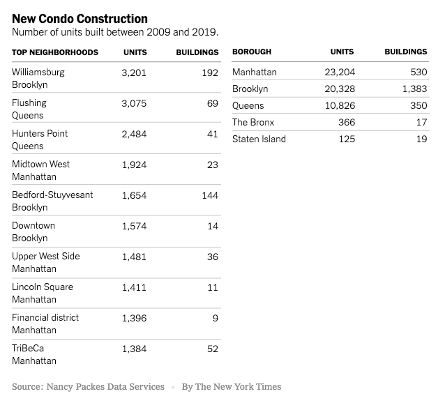
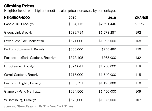
    Photo by 海超 刘 on Unsplash

  • Number of condo units built in New York City between 2009 and 2019

    A decade of ultra luxury condos. The New York Times published this story over the weekend talking about how the luxury condo boom of the 2010s transformed New York City, and in particular Brooklyn.

    Below are two tables from the article: (1) The number of units built between 2009 and 2019 across the five boroughs and the city’s top neighborhoods, and (2) the neighborhoods with the highest median sale price increase.

    The overarching theme is that New York built too many “super-high-end condos” geared toward global capital flows. According to one developer interviewed for the article (Gary Barnett of Extell Development), it was unprecedented.

    Apparently, the problem segment remains the $5 million to $10 million market. There’s simply too much inventory, and that has developers both delaying launches and going with much smaller (and hence more affordable) unit mixes.

    One stat that stood out for me was the new condo premium over resales. In 2011, the average sale price of a new condo in the city was about $1.15 million, which represented about a 9% premium over resale pricing.

    While it is typical to see a premium over resales (the same is true in Toronto), the average price of a new condo in 2019 rose to $3.77 million, representing a 118% premium over resales.

    For the rest of the article, click here.

  • 4 decades of inequality

    We all know the story: Much of the world is becoming increasingly less equal thanks to the new knowledge economy. Using data from the Federal Reserve Bank of New York, the NY Times (Emily Badger and Kevin Quealy) recently published this interesting piece on “4 decades of inequality” in American cities. This is what the findings look like:

    In 1980, the United States was relatively flat in terms of wage inequality (except for maybe Fairfield). In fact, inequality in a place like Binghamton, New York was about the same as in New York City. But thanks to decline in the former and growth in the latter, New York City is now a much more unequal place.

    Economic growth is usually considered a good thing, but inequality is not. Emily and Kevin rightly call attention to the fact that — according to the above charts — these two things seem to come together as one package. See New York, Chicago, San Francisco, San Jose, Washington, D.C., and so on.

    The other takeaway from these charts is the way in which inequality seems to correlate with metro area population. We know that as the population of a city increases it tends to also become more productive. And so what we are seeing here are those urban agglomeration benefits accruing to some, but not all.

    There’s a lot that can be inferred from these charts.

  • An all-women development team

    My good friend Taya Cook (of Urban Capital) and her development partner Sherry Larjani were featured in the New York Times today as a result of their Reina project and their remarkable efforts to gender balance the male-dominated commercial real estate industry. I am thrilled that their work is getting the attention that it deserves.

    Here’s an excerpt:

    That’s because, despite progress in many other professional realms, women remain severely underrepresented in real estate development and investment, particularly in senior roles.

    Women held just 4 percent of senior investment roles at major real estate firms, according to a widely circulated 2011 study, and their numbers have improved only “marginally” since, said the study’s author, Nori Gerardo Lietz, who is a senior lecturer at Harvard Business School and a longtime real estate investor.

    Ms. Lietz reviewed the senior ranks of 82 major real estate investment firms for the study, as well as many more private equity and venture capital firms, and found that women were noticeably absent from the most highly paid, “touch the money” jobs.

    For the full article, click here. And for more on Reina Condos, click here.

  • Rules for location data

    The CEO of Foursquare — Jeff Glueck — published an interesting op-ed in the New York Times today, calling on Congress to regulate the location data industry. Currently, there are no formal rules in place.

    In case you’re not aware, Foursquare is one of the largest independent companies operating in this space. I have written about them many times before on the blog.

    Here’s an excerpt from Jeff’s op-ed explaining why this matters:

    But location data can also be abused. Bounty hunters were able to buy the current location of a cellphone for $300, Vice reported, because telecom companies sold the real-time location of phones to shady companies. And apps that track location data may turn around and sell that data, revealing someone’s every movement — whether it is to a retail store, an abortion clinic or a gay bar. Bloomberg Businessweek recently reported on a company with thousands of cameras selling car locations to debt collectors and others; there is no “opt-in” involved, and it’s illegal in all states to cover your license plate.

    I am writing about this today because I think it’s relevant to city building. Location data is inherently spatial. It is how we exist in cities. So it shouldn’t come as a surprise to any of you that this is valuable information — hence why it is being abused.

    Here we have a company advocating for more, not less, regulation. They, of course, want it to be sensible. But I still think it says things about the current location data environment. To learn about the specifics of what Jeff is proposing, click here.

  • Mapping auto emissions in America

    This morning the New York Times published what they are calling the most detailed map of auto emissions in America. In it, they remind us that transportation is the largest source of greenhouse gases in the US today and that most of it comes from our driving habits within metro areas. See below charts.

    Not surprisingly, if you look at total on-road emissions, the biggest cities — New York and Los Angeles — are at the top of the list. But you also have car-dependant regions like Dallas-Fort Worth that punch above their (population) weight in terms of total emissions.

    Now, here’s where it gets interesting. The story flips as soon as you adjust for population.

    On a per capita basis, New York is pretty much at the bottom of the list. It is yet another reminder that one of the most sustainable ways to live is in a dense urban environment where it is possible to get around without the use of a car. New York is, of course, one of the best places in the US to do exactly that.

    Charts: New York Times

  • Fall architecture preview

    The New York Times’ fall architecture preview is centered around a pretty important and relevant theme, namely the relationship between the built environment and the natural one.

    Some of the projects that they profile include Dock 72 at the Brooklyn Navy Yard, which was raised up in order to lift it out of a floodplain; the “solar carve” tower by Studio Gang, which was designed to prevent shadows from casting along the adjacent High Line (pictured above); and the recently completed Casablanca Finance Tower by Morphosis.

    This last one, pictured below, uses thick aluminum beams to shade the building. That’s a pretty important feature in North Africa.

    Photos by Nic Lehoux and Hakim Wiseman Joundy (via the New York Times)

  • Equatorial Brutalism

    Generally speaking, architects are the only people I know who like Brutalist architecture. In fact, architect, professor and author Witold Rybczynski once proposed the following litmus test to determine whether a building is indeed an example of Brutalism: “If people don’t hate it, it can’t be Brutalist.”

    But as I have argued before, sometimes architectural styles take a bit of time to settle in and become fully appreciated. Consider how improbable it would seem to demolish a beautiful old Victorian home today. And yet Toronto, and countless other cities, did this on many occasions. Regent Park, Toronto was once Cabbagetown South.

    Brutalism also took on different sensibilities around the world.

    I love this recent piece in T (NY Times Style Magazine) by Michael Snyder called, “The Unexpectedly Tropical History of Brutalism.” In it he uses the term “Equatorial Brutalism” (a new one for me) and discusses the “surprising apotheosis” of Brutalism in equatorial countries (and in particular Brazil). It is a good follow-up to my recent post on Oscar Niemeyer’s work.

    So here’s an excerpt from Michael’s article. If you don’t already like Brutalism, maybe it’ll get you a little bit closer.

    What these buildings shared, beyond an aesthetic — though they shared that, too, with their radical porousness, their blunt geometric forms and their extensive use of raw concrete — was a commitment to architecture as an instigator of progress. But in the tropics, Brutalism reached an unexpected apotheosis: Infiltrated by lush plants and softened by humidity, buildings that looked cold and imposing against London’s constant drizzle or Boston’s icy slush were transformed into fecund, vital spaces. Concrete surfaces bloomed green with moss. The panels of glass necessary for sealing rooms against the northern chill either disappeared or receded from view, encouraging cross-ventilation while also protecting interior spaces from direct sun. The openness and transparency that the Smithsons had pronounced became a practical reality in these humid environments, both theoretically and literally: Built from inexpensive, readily available materials, equatorial Brutalism was as accessible and functional as it was symbolically potent, resulting in buildings that would define new societies growing around them like vines. Here, Brutalism wasn’t only an architecture that shaped the future or confronted the past — it was an architecture of freedom.

    Photo by Samuel Zeller on Unsplash

  • Immaculate construction

    Emily Badger’s recent piece on “how ‘developer’ became such a dirty word” has been getting passed around within the industry over the last few days. I had a chuckle when I read this bit:

    The notion that development is inherently bad, or that developers are inherently bad actors, seems to ignore that the communities residents want to protect from developers were once developed, too, and often by people who made money at it. (That is, unless you believe in “immaculate construction.”)

    The article hits on a number of points that are absolutely true. There’s generally a lack of understanding around the economics behind new housing. And the cost structures, today, are dramatically different compared to the suburban-industrial complex.

    To provide one example, our cost consultant, Finnegan Marshall, recently shared with me a chart (dated April 2019) that broke down the various government fees that typically make up every new condo suite in Toronto.

    What it showed is that between 20-24% of the price of a new condo is generally compromised of government fees and taxes that span all three levels of government. This includes everything from development charges (impact fees) to parkland dedication.

    Similarly, the article quotes one developer from Montgomery County who estimates that the impact fees alone for his projects are usually upwards of $60,000 per housing unit. (This is pretty cheap compared to Toronto.)

    I raise this as an example because development charges/impact fees have become an important source of revenue for cities across both Canada and the US. They often offset lower property taxes. (Whether this is appropriate is an entirely other debate.)

    And so I find it paradoxical that many homeowners would like to simultaneously see lower property taxes, no new development, and more public services and infrastructure.

    Photo by EJ Yao on Unsplash

  • The world’s top oil producers

    Using data from MarineTraffic (which is definitely worth a click through), the New York Times has created this terrific animation showing the flow of oil tankers from the Persian Gulf to the rest of the world from May 15 to June 15, 2019.

    Here’s a screenshot:

    About 20% of the world’s supply of oil flows through the Strait of Hormuz, a tiny passage located between Iran (north) and the UAE (south). See above.

    The article also has a number of other charts that speak to changing supply and demand patterns. Note the US, China, and Iran.

    Here are the top oil producers (total petroleum liquids) and the top crude oil exporters in 2018 (both are measured in millions of barrels a day):

    And here are the top oil consumers ranked by 2016 data (total consumption of petroleum and other liquids):

    Images/Charts: New York Times