Daily insights for city builders, delivered every morning at 6 AM ET. I’m Brandon Donnelly — a Toronto-based real estate developer and founder of Globizen. I’ve been writing here since 2013.

Tag: london

  • Hot to cold

    Architect Bjarke Ingels will be in Toronto next week to talk about how architecture can create communities and about a new project that he is working on with developers Westbank and Allied REIT here in the city.

    The last time I heard Bjarke speak was when I was in undergrad and he had recently started a firm called PLOT with Julien De Smedt. That was over 10 years ago. So I am looking forward to this talk. If you’re also going to be attending, tweet me and let’s try and connect at the event.

    In anticipation of that, I thought I would share a book that his firm published about a year ago called, BIG, HOT TO COLD: An Odyssey of Architectural Adaptation

    What’s interesting about the book is that all of the projects are organized according to climatic location – literally hot to cold. That’s why the pages themselves start as red and end up in dark blue.

    It’s a direct response to the fact that modern architecture and modern building systems largely did away with regional and climatic variations. Buildings were designed, no matter their location, to look exactly the same. 

    To a certain extent, globalization makes this somewhat inevitable. But climate is climate. And I believe that architecture is stronger when it responds to local context.

    If you were in Toronto this past weekend – perhaps for the NBA All Star Game – you’re probably well aware that Toronto sometimes gets cold. So it will be interesting to see what kind of strategies they employ for their upcoming project.

    If you want to hear Bjarke talk about this book and some of their projects, check out this video from the Architectural Association in London.

  • Pocket two bedroom

    I recently started reading the blog of Michael Mortensen. Michael is a real estate developer and urban planner based in the UK. And if you like my blog, I think you’ll also like his.

    Last week he published a post talking about a UK development company called Pocket and a recent design competition that they organized called “Pocket two bedroom.”

    Historically the firm has been focused on well-designed and compact one bedroom apartments (38 square meters) that they deliver at a minimum 20% discount relative to typical market rate housing in London.

    But over time, they found that they had to turn people away because they were looking for larger – yet still affordable – two bedroom apartments. So the firm decided to figure out how to scale their model to larger units.

    To do this, they went out and asked 19 architects to come up with ideas for a two bedroom Pocket apartment. They then published all of the ideas online.

    Firstly, I applaud them for making their competition results public. Most real estate companies wouldn’t do this.

    Secondly, it’s interesting to take note of the recurring design themes, as they have on page 24-25 of their competition book. 

    Some of the themes include “deep thresholds” that blur private and communal spaces; “thick walls” that allow for storage and servicing; flexible spaces and fewer dedicated spaces; and dual entry apartments.

    This last item was particularly interesting to me. It’s a simple idea – two separate doors leading into one apartment – but it can allow for a number of flexible sharing scenarios. I am already imagining somebody creating an Airbnb rental out of their second bedroom.

    Housing is certainly undergoing a transformation.

  • Top 20 cities for venture capital investment

    The Martin Prosperity Institute here in Toronto recently published a new report that looks at worldwide venture capital investment by city. The report is called Rise of the Global Startup City.

    The data is from 2012, because that’s what was available from Thomson Reuters, so keep in mind that there might be some variation in the rankings if we were to look at more recent data. Some of the cities sit fairly close.

    Nonetheless, here are a few of the broader takeaways (from the report page):

    “The United States accounts for nearly 70 percent (68.6 percent) of total global venture capital, followed by Asia (14.4 percent) and Europe (13.5 percent).”

    “Just two broad regions — the San Francisco Bay Area and the Boston-New York-Washington Corridor — account for more than 40 percent of global venture investment.”

    “Global venture investment is highly uneven and spiky — it is concentrated in a small number of large cities and metros around the world.”

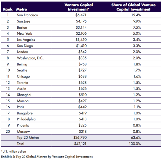
    Here are the top 20 cities by total venture capital investment (in USD millions):

    image

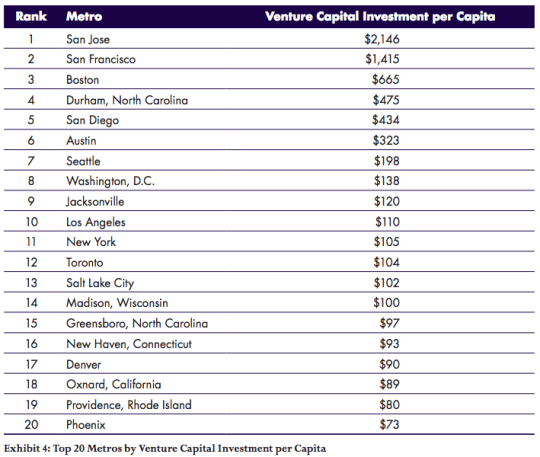
    And here are the top 20 cities according to venture capital investment per capita:

    image

    Given the variation in these two lists, you realize that some cities are largely benefitting from sheer size. London, for example, drops off the list when you look at venture capital investment per capita. 

    In fact, in this second list, 19 of the 20 cities are in the United States. The only non-American city that remains is Toronto.

  • British stock brick

    On Tuesday night architect Jamie Fobert spoke at the Daniels Faculty at the University of Toronto. Fobert’s practice is based in London, but he is a graduate of the Daniels Faculty well before it was called that.

    I unfortunately wasn’t able to attend, but I did get on to looking at his work. And I want to share two of his projects that stood out for me. Both are in London.

    The first is the Luker House:

    imageimage

    And the second is the Levring House:

    imageimage

    What I love is how subtle the detailing is in both projects. The Luker House uses a “British stock brick” to mimic its context. But at the same time, it is applied in such a minimal way that the project feels entirely contemporary.

    You can see that same philosophy in the Levring House, which was built to complete an historic mews house.

    Finding the right balance between old and new is not always easy. But I like how Jamie Fobert has done it with these two London homes.

  • Throwing butts

    For whatever reason, some of the people living in high-rise buildings believe that if you flick a cigarette butt off a balcony that it will magically disintegrate on the way down. It’s either that or they don’t give a shit about anyone else.

    Because if you happen to live in or manage a building which has patios or terraces at the base of tower, I bet you have this problem:

    image

    Above is a picture of a Belmont cigarette burning through the tarp covering the wooden harvest table on my patio. 

    It’s a destruction of property, an environmental concern (many butts end up in stormwater drains), and a pretty scary fire hazard. I know of many incidences where thrown cigarette butts have started fires in a high-rise building. It happened last year in my mother’s building.

    However, the frustrating thing about this problem is that it’s exceptionally difficult to stop. I know this because I sit on the board of my condo building. The typical response is for management to send out notices to all the residents asking them to stop doing this. But frankly, that does nothing.

    So if any of you know of a company or service (or have a product idea) that can help with this, please contact me. But if no such company or service exists, I am positive that you could create it today and sell to almost every condo corporation and property management company that have a condition where terraces or patios sit below a tower. Because inevitably, there will be someone upstairs throwing butts.

    Many buildings have a similar issue with dog poo. People simply don’t pick up after their dogs. So some property managers have started taking stool samples of every dog who lives in the building. That way they can easily determine which residents aren’t picking up after their dogs. I guess that’s what it takes to get some people to give a shit.

    Of course, this isn’t a problem just in buildings. Cities in general are always fighting litter. That’s why you see ideas like this pop-up:

    //platform.twitter.com/widgets.js

    This particular one (in London) was designed to stop people from throwing their cigarette butts on the street. Instead, you use your butt to vote. In this case: England vs. Australia.

    We talk a lot about big ideas here on Architect This City. What driverless cars will mean for cities, how laneway housing could help with housing affordability, and so on. But the smallest ideas can also matter a lot for city building. Sometimes we forget that.

  • The London Crossrail

    On Thursday afternoon the mayor of Toronto, John Tory, was in London meeting with their mayor, Boris Johnston, and talking about Toronto-London business relations, the economy, and transit.

    Here is the tweet:

    //platform.twitter.com/widgets.js

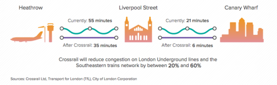
    On the topic of transit, the big item to see and discuss was The Crossrail. For those of you who might not be familiar with it, here are a few bullet points from their website:

    Crossrail is Europe’s largest construction project – work started in May 2009 and there are currently over 10,000 people working across over 40 construction sites.

    The Crossrail route will run over 100km from Reading and Heathrow in the west, through new tunnels under central London to Shenfield and Abbey Wood in the east.

    Crossrail will transform rail transport in London and the south east, increasing central London rail capacity by 10%, supporting regeneration and cutting journey times across the city.

    Crossrail will bring an extra 1.5 million people to within 45 minutes of central London and will link London’s key employment, leisure and business districts – Heathrow, West End, the City, Docklands – enabling further economic development.

    And below is a neat diagram that I found in this City of London report. I think it does a good job summarizing some of the spatial impacts of The Crossrail.

    image

    In the past I’ve been negative about John Tory’s SmartTrack proposal, which is clearly inspired by The London Crossrail. I had my reasons for that. But I want to be clear that I am not in any way negative on Regional Express Rail as a mobility solution.

    Toronto would benefit greatly from RER and Metrolinx is working diligently to deliver it to the region. I can’t wait for that to happen so I can drive even less than I already do.

  • The world’s top 23 financial centres (after London and New York, of course)

    The 2015 edition of The Global Financial Centres Index (GFCI) was just released last month. It is often used as one of the sources for ranking financial centres.

    The index – which is now in its 18th edition – is created using two main ingredients. The first is an analysis of 5 broad areas of competitiveness: 1) business environment, 2) financial sector development, 3) infrastructure, 4) human capital, and 5) reputational & general factors. And the second is an online survey given to financial services professionals. The 2015 edition includes responses from 3,194 professionals.

    Below are the top 25 financial centres in the world according to the GFCI (the full list has 84 cities).

    image

    Here are a couple of things to note from this year’s index: 

    London has overtaken New York for the top spot – but both remain more or less at parity if you dig into the numbers. 

    Dublin is performing particularly well in Western Europe.

    The leading centre in Eastern Europe is Warsaw (38th), with Istanbul just behind it.

    Toronto is now second in North America, only to New York.

    Sao Paulo remains the top Latin American centre.

    And, Los Angeles (49th) and Liechtenstein (60th) join as new entrants this year.

    If you’d like to see the full report and ranking, click here.

  • The global pyramid of wealth

    Every year the London-based property consultancy Knight Frank publishes something called The Wealth Report. And it’s one of those reports that I could go through for hours. 

    It includes a ton of really fascinating stats that speak volumes about where in the world wealth is being created and how it’s moving around. And of course there are a lot of connections between wealth, real estate, and city building.

    Below are 3 diagrams that really stood out for me in the 2015 version. 

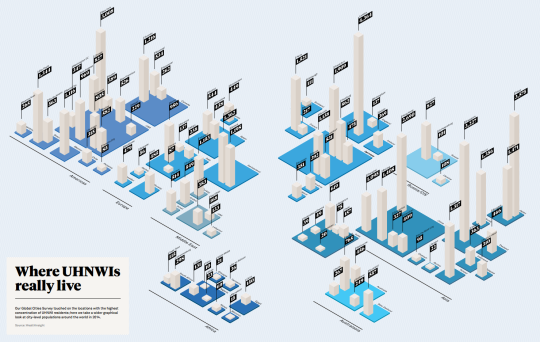
    The first diagram shows which cities have the most Ultra High Net Worth Individuals (UHNWIs). An UHNWI is defined as an individual with assets exceeding US$30 million, but excluding personal assets and property (such as one’s principal residence). Click here to see the full size image (I know the numbers are small).

    image

    Not surprisingly, London (4,364), Tokyo (3,575), Singapore (3,227), New York (3,008), and Hong Kong (2,690) are at the top of the list. But I was a little surprised – albeit happily surprised – to see Toronto (1,216) come in at #2 in North America, beating out Mexico City (1,116), Los Angeles (969), and Chicago (827). 

    The second diagram shows you how many square meters of luxury property (apartment) you can buy for US$1 million in a bunch of different cities around the world. 

    In Monaco (top end), that’ll buy you 17 square meters (183 square feet) and in Cape Town (bottom end), that’ll buy you 208 square meters (2,196 square feet).

    image

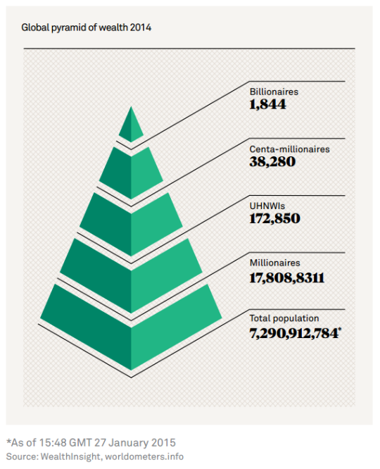
    The third and last diagram is what they call the global pyramid of wealth. It’s a pyramid of everyone in the world and then the number of millionaires, UHNWIs (see above), centa-millionaires, and billionaires. And if you do the math, the top of this pyramid comes nowhere close to 1% of the global population.

    image

    It’s fascinating (and exciting) to see where and how global wealth is concentrating. But it should also make you think about rising income inequality. I know it does for me.

  • Guest Post: For whom the road tolls?

    For those of who were following Architect This City during the Gardiner Expressway East debate here in Toronto, you might remember that Darren Davis (transport planner with Auckland Transport) wrote a guest post called, Three minutes that rule the world – Will demolishing the Gardiner East actually make traffic worse?

    It was an incredibly popular post at the time, so I’m thrilled that Darren volunteered to do another one on road tolls. This is a topic that I’m very interested in and have written about a few times. Road pricing, as you’ll see below, puts us in a bit of a chicken-and-egg situation. But sooner or later I think we will need to get our head around it, as will many other cities.

    I hope you enjoy today’s post. Thanks again Darren.

    ——————————-

    A recent post on Architect This City, The Tragedy of the Commons, raised a fundamental but all too often forgotten point about transportation: That in networks where the price of use doesn’t change when demand changes, there is no effective mechanism to manage that demand.

    Because there is no incentive to act in the public good, we often act in what we perceive to be our own personal interest, which is often the antithesis of the public interest. And remember that if we are driving, we are traffic. So often people will sit fuming in their cars in the midst of congestion with thoughts like in this cartoon. But of course with unpriced roads, there is no real price signal to these drivers to consider taking the bus.
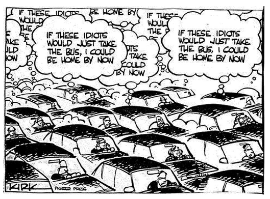
    In a world where time is money, we are constantly berated about the economic costs of congestion. In 2011, the Toronto Board of Trade estimated that congestion in the Toronto region alone cost the regional economy $6 billion a year, rising to an estimated $15 billion in 2031 should no action be taken. More recent research by the CD Howe Institute pegs this figure at up to $11 billion.

    Given these sorts of eye-watering figures, one might be tempted to think that car drivers, and in particular the goods industry, would be flinging their wallets open at the chance to buy their way out of congestion. And in fact Toronto has the 407 Express Toll Route which has elements of variable road pricing. However, while the 407 ETR carries around 350,000 vehicles per day, price increases have been matters of controversy. It provides some ability for those who can afford it to bypass Toronto’s notorious traffic congestion, but its fundamental weakness is that it’s just one road in one of North America’s largest city-regions.

    Similar stand-alone efforts to address congestion in Metro Vancouver with tolled routes, such as the Port Mann Bridge on the Trans-Canada Highway and the Golden Ears Bridge, have fallen well short of their projected traffic volumes, while nearby untolled bridges such as the Patullo Bridge are heavily congested. We have a similar experience in New Zealand where our two tolls roads, with car tolls of $2 and $2.20 respectively, experience diversion rates of up to 30% to the alternative but substantially longer and slower free routes.

    This brings up a fundamental paradox: Congestion costs the economy a fortune and congestion is a top-of-mind frustration, yet people seem reluctant to pay even comparatively small amounts to bypass congestion.

    For example, the City of Toronto’s Roundtable on Gridlock & Traffic Congestion in February 2014 came up with the usual shopping list of “transportation systems management” responses – improved management of curbside space and construction projects; synchronized traffic signal phasing; better traveller information and improved incident response. While these are all worthwhile responses, they only improve system operation at the margins. Encouraging greater use of public transit was the very last recommendation and there was not a single mention of charging or pricing as a tool to address congestion. And the feverish activity continues with a hackathon called TrafficJam on October 2 – 4, 2015 with the goal of fixing Toronto’s traffic woes.
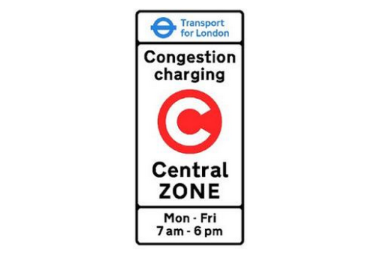
    The very few cities that have actually had significant success at reducing traffic congestion – notably Singapore, London and Stockholm – have done this through cordon-based congestion pricing wherein if you pass the cordon, you pay the congestion charge. Entering central London on a weekday between 7am and 6pm will set you back a cool £11.50 ($C23.30). From 2003 to 2013, about £1.2 billion ($C2.42 billion) of congestion charge revenue has been invested in public transport, road and bridge improvements and walking and cycling, of which £960 million ($C1.94 billion) was for bus improvements. These measures have included significant road space reallocation to improve conditions for pedestrians, cyclists, public transit and the urban realm.

    The latest Travel in London report states that “Over the 10-year period from 2003, total trips have increased by 11.4 per cent, with particularly notable increases of 52.3 per cent in rail trips and 32.0 per cent in Underground and DLR [Docklands Light Railway] trips, with cycle trips (as main mode) increasing by 53.9 per cent. Car driver trips decreased by 12.7 per cent over the same period” (my emphasis).

    One interesting insight is that Stockholm trialed congestion charging and then reverted to business as usual of unpriced roads in advance of a referendum on congestion pricing. This gave Stockholmers a clear sense of the difference in traffic congestion and was crucial in supporting a yes vote in the referendum.

    Stockholm has experienced a permanent reduction in traffic of about 20% across the toll cordon and congestion decreased by 30 – 50% – which demonstrates that traffic volume reductions have a disproportionately positive impact on congestion. About half of the “disappearing” drivers changed to transit, the rest to other alternatives such as different departure times and destinations and taking fewer trips.

    For more on Stockholm, I suggest reading the Tools of Change case study on Stockholm Congestion Pricing.
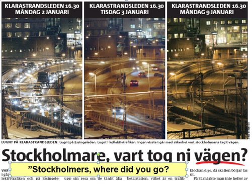
    Before and after congestion charge photos of traffic levels in Stockholm

    While this sounds very promising, congestion charging has significant equity implications and requires upfront investment to provide people who either choose to or can no longer afford to drive with transportation alternatives. Both Stockholm and London invested very heavily in public transit in advance of implementing congestion charging.

    And this brings up a big issue for Toronto. 

    For congestion charging to have a meaningful impact on congestion without stifling economic activity or impeding people’s ability to move around, the core capacity of Toronto’s transit system would need to be addressed first. In particular the Yonge Line capacity enhancements, Metrolinx’s Regional Express Rail and most likely the Downtown Relief Line would need to be in place to provide both capacity and choice for people who either needed or wanted a travel alternative to any congestion charge.  This would mean that Metrolinx’s Big Move might need to get even bigger.

    Disclaimer: The author of the above post is an employee of Auckland Transport, however, the views, or opinions expressed in this post are personal to the author and do not necessarily represent the views of Auckland Transport, its management or employees. Auckland Transport is not responsible for, and disclaims any and all liability for the content of the article.


  • The world’s top 10 cities for prime property

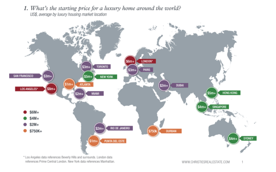
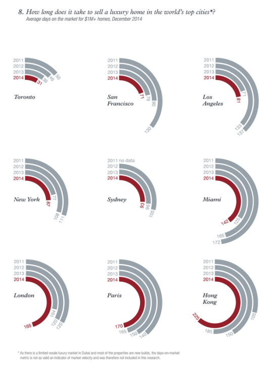
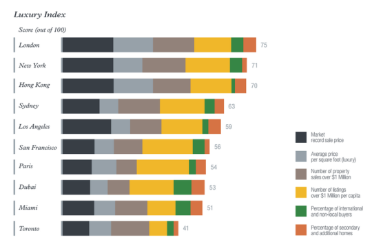
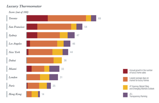
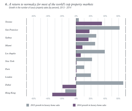
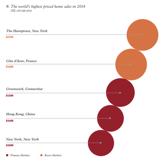
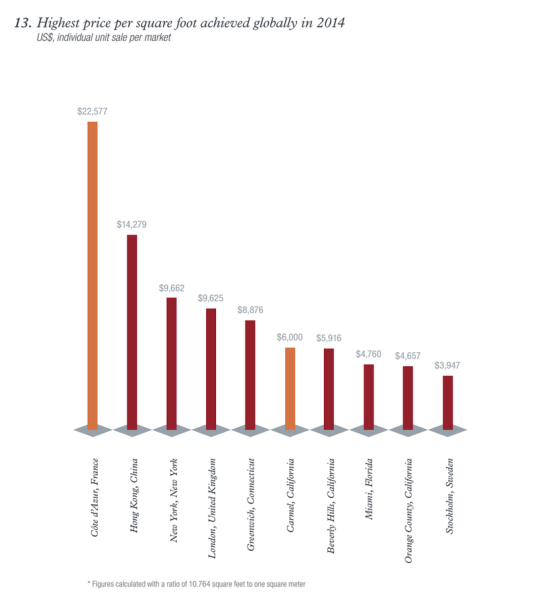
    This morning I read through a real estate report called Luxury Defined. It’s a look at the global luxury real estate market across “the world’s top 10 cities for prime property” and about 70 regional and resort destinations.

    It’s interesting to look at the trends and see how high-net-worth individuals (HNWIs) are choosing to allocate their funds in residential real estate. Here are some of the charts and diagrams that caught my eye as I was going through it (you may need to zoom your browser in):

    If you’d like to download the full report, click here. It’s free, but you’ll need to enter your name and email address.