Daily insights for city builders, delivered every morning at 6 AM ET. I’m Brandon Donnelly — a Toronto-based real estate developer and founder of Globizen. I’ve been writing here since 2013.

Tag: london

  • Switching to summer time

    Summer time starts this weekend, at least in this part of the world. Africa and Asia generally don’t observe daylight savings time (DST), so if you just switched your clocks forward an hour, know that you are in the global minority.

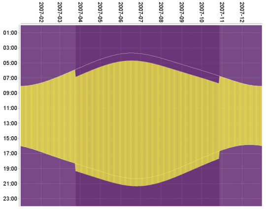
    The whole point of DST is that it gives us an extra hour of sunlight in the evenings during the summer months. The trade-off is a later sunrise, but since the days are longer to begin with, it’s something we have clearly come to accept.

    Here is a graph showing the impact of daylight savings time on sunrise and sunset times in Greenwich. It’s from Wikipedia and it’s the clearest diagram I could find that quickly explains the change.
    There’s a lot of debate around whether or not DST should be abolished or if we should simply adopt summer time, permanently. A bill is currently being reviewed that would allow Florida to observe DST year-round.

    Some groups, like retailers, seem to benefit from daylight savings time. More evening sunshine hours means we’re more likely to shop. But it has a negative impact on other things such as drive-ins. (Do people still go to drive-ins?)

    There are also arguments that it causes a decrease in economic output and an increase in traffic accidents – apparently we’re all groggy and accident-prone after having our sleep routines disrupted.

    So what would be your recommendation?

    1) Do nothing – status quo

    2) Abolish daylight savings time

    3) Observe daylight savings time year-round

  • Multi-Unit Housing in Urban Cities: From 1800 to Present Day

    I just ordered a copy of Multi-Unit Housing in Urban Cities: From 1800 to Present Day by Katy Chey. I figured this was a book that we should have hanging around our office. I also like to support the Daniels Faculty.

    The book covers the following multi-unit housing typologies:

    • Back-to-backs in Birmingham
    • Tenements in London
    • Haussmann apartments in Paris
    • Tenements in New York
    • Tong lau in Hong Kong
    • Perimeter block, linear block and block-edge in Berlin
    • Perimeter block and solitaire in Amsterdam
    • Space-enclosing structures in Beijing
    • Kyosho jutaku in Tokyo
    • High-rises in Toronto

    In addition to each typology, the book analyzes the connection between the housing type and the city. Why did certain typologies flourish where they did and how have they helped to define their city?

    It reminds me of what I was trying to do with some of my recent posts about Hong Kong’s typical tower plan, albeit with far less rigor than what I am sure has been applied to this book.

    I am also curious to read what has been written about high-rises in Toronto. It goes to show you just how defining the current real estate cycle has been for this city. That’s our multi-unit housing typology.

    Image: Daniels Faculty. My multi-unit home made the book.

  • Why east sides are often poorer than west sides

    In a recent Spacing article, called Pollution and the fall and rise of urbanism, Dylan Reid argues that one of the reasons why urbanism declined in the 20th century was because of industrial pollution. (There are, of course, other contributing factors beyond just pollution.)

    This article is the first time I have come across a study supporting the widely held belief that pollution and prevailing windows are the reasons for why the east sides of many former industrial cities are poorer than the west sides. Here is more on that from the article:

    People recognized and understood that pollution had an impact on them, and they tried to avoid it if they could afford to do so. Have you noticed, for example, how in so many cities (Toronto included), the east side is poorer than the west side? It’s because the prevailing winds in Europe and North America are west to east, and they blow pollution to the east side. A fascinating study by economists Stephan Heblich, Alex Trew and Yanos Zylbergerg quantified this effect, identifying how 19th century pollution was dispersed eastwards and showing that the most polluted areas were also the poorest. 

    What the authors discovered is that not only did pollution cause a geographic sorting based on wealth, but that there’s also a certain degree of persistence to it. This makes sense if you think about it. Pollution in our cities has waned significantly and yet here we are still remarking and talking about east vs. west.

    It goes to show you just how long lasting the impacts of our city building decisions can be.

  • 2017 year in review

    I just finished going through my list of 2017 goals. I didn’t accomplish everything I wanted to, but I did manage to check off a number of professional and personal goals.

    Some of the remaining goals have been pushed to 2018. But there are also items that I have since realized aren’t worth pursuing and so I have dropped them from the list.

    All that said, it was a great year. Here is a rapid-fire summary of 2017 told through posts from this blog.

    Thanks for reading. Onward my friends.

  • How’s your PTAL these days?

    image

    As I was going through the new London Plan yesterday I noticed a number of references to PTAL. I didn’t know what this was, so I obviously had to look it up.

    It stands for Public Transit Accessibility Level. It’s a methodology that was developed in London in the 90′s. And it’s a measure of access to public transit, or of the density of the public transport network at any given location.

    There are 6 levels, though two of the levels are further subdivided into 2 sub-levels for greater precision:

    • 1a and 1b
    • 2
    • 3
    • 4
    • 5
    • 6a and 6b

    1 is bad. 6 is good. 

    What’s captured in this measure are the walking times from a particular location to the nearest transit access points; the reliability of the available services; the number of services available; and the average wait times.

    Historically, this measure has helped to determine how much density could be built on a particular site, how much parking should be provided, and so on. 

    For example, in the new London Plan, PTAL 5 and 6, as well as Inner London PTAL 4, are expected to see development with no residential parking. Once you move to PTAL 3, the parking maximum moves up to 0.25 spaces per unit. 

    In the draft London Plan you’re also supposed to use the highest existing or planned PTAL. So if transit improvements are planned for the area, you factor those into the calculation.

    Seems quite rationale (though it’s probably not a perfect measure of access and connectivity).

    If you’d like to determine the PTAL for a particular address in Greater London, you can do that here. Unfortunately, I don’t have a calculator for you if you happen to live outside of London. But there is one simple check you can do.

    The PTAL methodology assumes an average walking speed of 4.8 kph. The maximum allowable walk time for buses is 8 minutes and the maximum walk time for subway and light rail is 12 minutes. These numbers translate into distances of 640m and 960m, respectively.

    How far do you have to walk to access good transit?

    Photo by Bruno Martins on Unsplash

  • New London Plan released today

    A draft version of the new London Plan was released today for public consultation. It is “the spatial development strategy for Greater London”. And you can download all 524 pages of it, here. A final copy of the Plan is expected to be published by fall 2019.

    Here is what mayor Sadiq Khan had to say about the Plan (quote from The Guardian):

    “I am using all of the powers at my disposal to tackle the housing crisis head on, removing ineffective constraints on homebuilders so we make the most of precious land in our capital.”

    And that tone comes through in the document. Here is an excerpt from the “optimising housing density” policy section:

    “For London to accommodate growth in an inclusive and responsible way every new development needs to make the most efficient use of land. This will mean developing at densities above those of the surrounding area on most sites. The design of the development must optimise housing density.” (Section 3.6.1)

    The Plan also contains a set of clear performance indicators. They cover things like the supply of new homes, the supply of affordable homes, modal share in the capital, and so on.

    The ambition is 66,000 net additional homes each year. And by 2041, the goal is that 80% of all trips in London will be by foot, cycle, or public transport. There simply isn’t road the capacity.

    Which is why the plan also specifies parking maximums, as opposed to parking minimums. The Plan wants the starting point for any development that is well-connected to transit – or to future transit – to be “car-free”.

    If you have a chance, the new London Plan is worth a scan. Maybe you don’t want to print it though.

    Photo by Rob Bye on Unsplash

  • Winner take all, or most, economy

    The world is increasingly spiky. Inequality is growing and it is increasingly geographic in nature. We know that people tend to make more money in urban areas compared to rural areas – even when they possess the exact same level of education. The returns to being smart and educated are simply greater in cities.

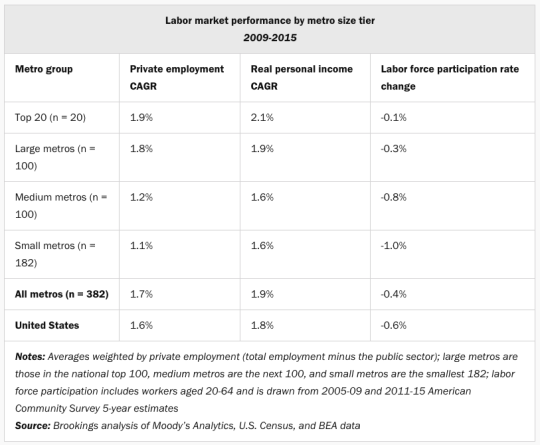
    But they also depend on the size of the city. Mark Muro and Jacob Whiton of Brookings recently published data looking at labor market performance – by metro size – from 2009-2015 (right after the financial crisis). What they found is that larger metropolitan areas simply performed better than smaller ones.

    image

    In summary:

    City size matters because it’s a major influence on city prosperity and adaptability as well as local worker fortunes. Bigger cities are more productive. They are more innovative. They draw better-educated workers by offering higher wages.

    The situation is even more pronounced across the pond. According to the New York Times (quote from Richard Florida), a third of Britain’s gross domestic product comes from London alone.

    What is far less clear is what should be done to address the decline of some of the smaller cities in America – cities that are stagnating and feeling left behind. But perhaps the first step is acknowledging what has happened and what remains feasible in today’s global economy.

    Here is another quote from the above NY Times article:

    Mr. Trump’s promise to relieve the pain by reviving the coal and steel industries, by keeping immigrants out of the country and by raising barriers against manufactured imports is only a rhetorical balm to satisfy an angry base seeking to reclaim a prosperous past that is no longer available.

    That rhetorical balm.

  • Kickstarter: Modern map art

    image

    It has been a while since I shared a Kickstarter campaign on the blog and this one caught my attention:

    https://www.kickstarter.com/projects/1505932940/map-art-prints/widget/card.html?v=2

    If you can’t see the project embedded above, click here.

    The project is colorful abstract art maps of anywhere in the world. You can also choose whatever color theme you want.

    I think these are beautiful. The print at the top of this post is Rome.

  • Why dynamic road pricing is inevitable

    The Economist recently published an article called: How and why road-pricing will happen. If you’re a regular reader, you’ll know that there’s been lots of talk and support

    over the years

    on this blog for dynamic road pricing.

    It’s politically unpopular, but it’s an incredibly rationale way to deal with traffic congestion. 

    In Singapore – home of the world’s first congestion charge zone (1975) – they constantly monitor traffic congestion. As soon as average speeds drop over a three-month period, they simply raise the charge. Congestion gone.

    We know this works, but for many reasons road pricing is highly divisive. According to The Economist, there are a few reasons why this is going to become a bit more politically palatable.

    For one, the take from gas taxes and vehicle duties has been declining in Britain over the past couple of years. Electric vehicles will only exacerbate this trend. So governments are going to be forced to look elsewhere for money.

    Secondly, traditional tolls and congestion charges are becoming increasingly ineffective. Today in central London, private-hire vehicles are said to make up about 38% of all car traffic – almost double the share of traditional black taxis. 

    These are cars circling around the city, picking up passengers. Blunt charges based on suburbanites entering the city in the morning and leaving in the afternoon is simply not capturing the way that many of us move around our cities today.

    In other words, urban mobility is undergoing dramatic changes and the revenue and congestion management tools are going to need to adapt. If you’re interested in this topic, check out the full article here.

    Photo by chuttersnap on Unsplash

  • North America’s second city?

    image

    Over the weekend Richard Florida sent out a tweetstorm that compared Toronto and New York City, and made the argument that Toronto’s “incredible diversity, density, and industry mix” is making the city feel a lot more like New York and London compared to any other North American city. 

    He even went so far as to say that, even though it may not be the bigger metro in terms of raw population, Toronto increasingly feels like North America’s second city after NYC. I’m obviously incredibly biased in this discussion, so I would be curious to get your thoughts in the comment section below.

    If you can’t see the embedded tweetstorm below, click here. Regardless, you’ll likely need to click through to see the entire thread.

    //platform.twitter.com/widgets.js