Daily insights for city builders, delivered every morning at 6 AM ET. I’m Brandon Donnelly — a Toronto-based real estate developer and founder of Globizen. I’ve been writing here since 2013.

Tag: high rise

  • Building height fallacy

    Studio Gang has a project currently under construction in New York City called 40 Tenth Avenue. It is also known as the “solar carve tower.” Here are a couple of progress photos taken by Timothy Schenck. The glass is beautiful. (If you can’t see the embedded tweet below, click here.)

    https://platform.twitter.com/widgets.js

    This is one of my favorite buildings by Studio Gang and one that we all studied when we were kicking off One Delisle

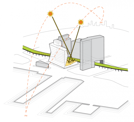
    The geometry of the building is a result of carve outs that maximize the amount of sunlight that is able to reach the adjacent High Line (public space). It is form driven by functional logic. Here is a diagram from Studio Gang showing the carve outs that result from the sun’s rays.
    image

    The other thing I like about this project is that it is a clear proof of something that I’m going to call the “building height fallacy.” There can be a tendency to overfocus on building height, which I have argued against before on this blog. 

    In this case, a shorter and squatter building without these solar carve outs, would have actually been worse for the High Line and the surrounding environment in terms of access to light and air.

    The building is responding to site-specific criteria – which is what great architecture should do.

  • An open house with Jeanne Gang

    image

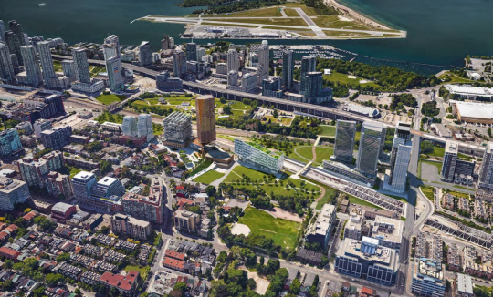
    On Thursday, July 5th, Slate Asset Management, Studio Gang, and the rest of the project team will be hosting a community open house where we will introduce designs for a new block plan and mixed-use building at Yonge + St. Clair. This will be Studio Gang’s first project in Canada. We’re pretty excited.

    It’s important to note that while the proposed design has been influenced by some of the early discussions we had with city staff and the local Councillor, we are still very much at the beginning of this process. Which is why alongside this community open house, we are also launching yongedelisle.ca.

    This will be our “neighbourhood engagement” website as we go through the planning process. You’ll find updates from the project team as they become available, and you’ll also have a direct way to get in touch. We’re also testing out this interactive page where you can vote on the city building principles that matter most to you.

    So hopefully we’ll see you on Thursday, July 5th. Invite details above. Please RSVP, here, if you can. But if you forget to do that, don’t worry, you can still just show up. For more on Jeanne Gang, click here.

  • An example of city building doublethink

    Earlier this month, Shane Dingman wrote a piece in the Globe and Mail talking about TAS’ proposed development for 2 Tecumseth Avenue here in Toronto – the former home of Quality Meat Packers, a slaughterhouse. In the article there’s a quote from Mazyar Mortazavi, which I posted to my Instagram (as a story), but that I have been meaning to also post to the blog. So here it is: 

    “It’s not a conversation about towers good, towers bad: Mid-rise is the most expensive construction typology and it delivers effectively luxury housing, so it doesn’t respond to the needs of affordability,” he said. “We didn’t buy Tecumseth to build a bunch of condos and move on. We bought it because we wanted to pursue a vision around city building. You need density … the question is how do we actually deliver density that’s relevant today and relevant 50 years from now?”

    He’s of course right about mid-rise construction costs. There are diseconomies of scale and other construction inefficiencies that we have talked about many times before on this blog. The result is one of the Catch-22s of city building. Mid-rise and small scale infill is often seen as desirable, but we also say that we need more affordable housing.

    It’s doublethink.

    Image: 2 Tecumseth by KPMB Architects for TAS

  • The Toronto and Vancouver housing markets

    CIBC World Markets recently published this report by Benjamin Tal talking about the Toronto and Vancouver housing markets. Here is an excerpt:

    “But when the fog
    clears it will become evident that the
    long-term trajectory of the market will
    show even tighter conditions. The supply
    issues facing centres such as Toronto and
    Vancouver will worsen and demand is
    routinely understated. Short of a significant
    change in housing policies and preferences,
    there is nothing in the pipeline to alleviate
    the pressure.”

    It’s a good read. Worth your time.

    One stat that stood out and directly relates to some of the topics that we frequently talk about on this blog is the shift in Toronto from low-rise to high-rise housing.

    In the report there’s a chart showing the “change in [housing unit] completions” in 2016 as compared to 2000. The switch from low-rise to high-rise is almost 1:1 in Toronto. In other words, we substituted high-rise housing for low-rise housing. 

    I think this speaks volumes about the fundamentals underpinning the Toronto condo/apartment market. We are continuing to build up because it is the future of housing in this city.

  • Locals hate you

    BlogTO recently reported that “snarky anti-condo signs” have been popping up around Toronto. Here is one of them via Instagram. It reads (in all caps): Dear Condo Dwellers: Locals Hate You Go Fuck Yourself

    I find these posters curious, though it is obvious that they are a reaction to growth, intensification, and general change in this city.

    For one, it implies that condo dwellers and locals are mutually exclusive. In other words, “locals” don’t live in condos. Presumably the implication is that they live in low-rise grade-related single-family housing. Or maybe they live in rental housing? Is it a tenure thing?

    According to the latest 2016 Census data, just over 26% of private dwellings in Toronto are condominiums. And about 30% of people live in a building that has 5 or more storeys. If you include “apartments” less than 5 storeys, this latter number jumps to 40%. So many potential non-locals.

    However, it could be that these posters are primarily directed toward new condos and new condo dwellers. This poster seems to have been plastered in front of this recently completed condo building on College Street.

    If that is the case, then I wonder if there is a temporal cut-off for the hate. For example, the condo building that houses (at its base) my regular grocery store was completed in 1983. 

    The units are large and the demographic seems to skew a bit older. Are these condo dwellers – some of which may have been there for over 3 decades – to be hated? Are they non-locals? Or does urban myopia set in after awhile and they become locals?

    At the same time, it wouldn’t be unusual for the residents of an older condo building to oppose a new proposed condo building. So perhaps “local” isn’t about building typology and it’s more about who came first. That’s certainly a tricky one. Better end here.

    A curious poster that could use a bit more specificity. What do you make of it?

  • The Hong Kong window ledge

    image

    My friends at the architecture practice Valente Rodgers told me something fascinating about the Hong Kong real estate market last night. Both partners worked as architects in Hong Kong for a number of years.

    In Hong Kong, you’re allowed to deduct certain projecting windows from your calculation of Gross Floor Area

    This is provided they’re a certain height above the finished floor level, they don’t project beyond certain distances from the outer face of the building’s structural elements, and so on. The precise measurements seem to vary depending on things like the building’s use.

    Since space is such a precious commodity in Hong Kong, it shouldn’t surprise you that lots of developers and architects take advantage of this. The result being a proliferation of these projecting window ledges all across the city. 

    It’s a phenomenon that happens in many cities when a perfectly legal loophole is found in the land use policies.

    In Toronto it used to be solariums. You could also deduct these from your overall GFA, which means a lot of them them got built in condos and apartments of a certain vintage.

    In New Orleans it was the camelback house. These were houses with a single storey toward the street and a second storey toward the rear of the property. This was done because property taxes were assessed based on the height of the house as it met the street. Pushing the density toward the rear of the lot meant homeowners weren’t taxed more. 

    I find these outcomes fascinating because they have absolutely nothing to do with architectural intent and everything to do with trying to optimize within a given framework.

    But what’s even more interesting about the Hong Kong example are some of the downstream externalities.

    Firstly, it sounds to me like these projecting windows have become a normal part of underwriting projects in Hong Kong. Meaning, if you don’t factor in these projections, you’re effectively giving up free GFA. (Can anyone familiar with the HK market confirm this?)

    However, building these projections also means you can’t do unmodulated and clean floor-to-ceiling windows. And if that’s the desired aesthetic, somebody has got to be willing to pay for that “luxury.” So arguably there’s a socioeconomic dimension to having and not having this ledge.

    Secondly, because space comes at such a premium, these ledges are fully taken advantage of and furniture makers have responded by designing pieces that can dovetail with them.

    Below is a photo of a bedroom in Hong Kong that I found on bohemia.life:

    image

    This may be a custom bed and I don’t know how deep that window projection is, but it begins to show you how valuable these ledges can be from a space perspective.

    I think we should try and come up with a name to describe these sorts of built form phenomena. If you have any ideas, please drop them in the comments below. And if any of you are familiar with the HK market, let me know if I’m off the mark with any of the above.

    Photo by Jason Wong on Unsplash

  • Only 9% of new homes sold last month were low-rise single-family

    BILD (the Building Industry and Land Development Association) just released its June 2017 data for the Greater Toronto Area’s new housing market. You can read the full release here. But I would like to point out a couple of things:

    About 91 percent of the 6,046 new homes sold last month were multi-family condo apartments in high-rise and mid-rise buildings and stacked townhomes, while only nine percent were low-rise single-family homes.

    The average price of available new condo apartments continued to rise with an increase of more than $22,000 from May. June’s $627,000 average price marked a 34 percent increase from a year ago. The average available unit was 845 square feet with an average price per square foot of $742. A year ago, the average price per square foot was $587.

    From this, it’s once again clear that Toronto is in the midst of an incredible transformation from a low-rise city to a more vertical city. New supply on the low-rise side of the market is heavily constrained.

    I get the sense sometimes that many people in this city, and others, believe that access to a low-rise detached house should be a right. Go to school. Get a good job. And then buy that house with a backyard. 

    The data speaks to a very different reality.

    Photo by Victoria Heath on Unsplash

  • Where the cranes are

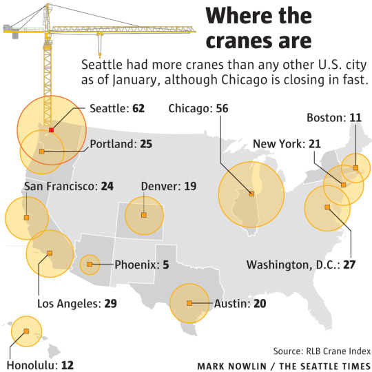
    Earlier this week the Seattle Times published the following graphic showing the US cities with the most (construction) cranes up in the air at the end of 2016:

    At the top of the list is Seattle with 62. And in second place is Chicago with 56. 

    You really need to see these numbers over time to get a better sense of activity. But supposedly, Seattle has been holding pretty steady. Also, these numbers only include cranes within each city proper. The suburbs don’t seem to be counted.

    To put these numbers into perspective, here’s a snippet from the article:

    “Seattle remains behind Toronto, which has 81 cranes, for the North American lead. In Australia, the Middle East, and elsewhere, there are cities where more than 100 cranes are at work.”

    I wonder which city has the global lead. Any guesses?

  • Low-rise vs. high-rise

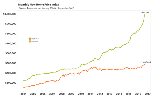
    Yesterday I sent out this tweet, which included this graph:

    The chart is from Altus Group and it is a monthly price index of new low-rise vs. high-rise housing in the Greater Toronto Area (GTA). I have posted similar charts in the past, but every time this chart gets updated the spread widens and the market looks even crazier.

    Some people responded on Twitter by saying that this is clearly an indication of a bubble. I don’t know if that is the case. 

    But, as I have said many times before, I do believe that it tells a vivid story around supply. Low-rise housing is severely supply constrained in the GTA and high-rise housing is less so. That has helped to stabilize pricing in the latter case.

    Now, you could look at this chart and say that the pace of low-rise price increases is simply unsustainable. The market must correct. 

    But you could also look at it and say that the market is going through a fundamental shift whereby more and more families will start living up, as opposed to out – which should then translate into high-rise pricing trending upwards as unit sizes increase. This is where I think we are headed. 

    What do you reckon is happening?

  • Timeline of tall buildings completed in New York since 1908

    The Council on Tall Buildings and Urban Habitat recently published an interesting report called, New York: The Ultimate Skyscraper Laboratory.

    The money shot is this image here:

    It is a timeline of all tall buildings (over 100 meters) completed in New York since 1908 when the Singer Building was completed. At the time, but only for a year, that was the tallest building in the world.

    The gray bars represent the total number of buildings completed each year. And the colored dots represent specific completed buildings and their asset class (office, residential, mixed-use, hotel, and so on). It’s interesting to see the dips. During World War II, high-rise construction basically stopped.

    Check out the full report if you’d like to see a bigger version of the graph.