Daily insights for city builders, delivered every morning at 6 AM ET. I’m Brandon Donnelly — a Toronto-based real estate developer and founder of Globizen. I’ve been writing here since 2013.

Tag: density

  • Net new housing units in New York City since 2010

    Here are a few interesting stats from a brief report that New York City published this month about their supply of new housing units:

    • From January 1, 2010 to June 30, 2020, New York City delivered 205,994 net new housing units across the five boroughs.
    • This total includes 202,956 units from new construction and 29,161 units from the alteration/conversion of existing buildings. However, it also factors units that were lost as a result of demolition (-17,400) or alteration (-8,723).
    • Brooklyn saw the most supply, followed by Manhattan. The four highest-growth Community Districts were responsible for 1/3 of all new housing additions. These CDs are all formerly non-residential areas that were rezoned to allow living.
    • Manhattan saw the greatest loss in housing units as a result of alterations (people combining units). This was most prevalent in wealthy neighborhoods such as the Upper East Side, Upper West Side, and Greenwich Village.

    What is interesting about this last point is that it shows you that cities are far from static. New York City lost 26,123 housing units during the above time period, with 8,723 units being lost to alterations and people combining units.

    The orange areas on the above map are neighborhoods which actually became less dense over the last decade. And of course, this phenomenon is not unique to New York City. We are seeing the same thing play out in some/many neighborhoods in Toronto.

    What this mean is that the role of new development is really twofold. It allows a city to grow (i.e. house new New Yorkers), but it also replaces lost housing and relieves some of the pressures on the existing housing stock. I don’t think many people appreciate this dynamic — or perhaps they don’t care.

    For a copy of the full report (it’s only two pages), click here.

  • Density is not destiny

    Back in March and April, there was a belief that big and dense cities were going to pose a serious problem in the fight against COVID-19. The narrative was that the benefits of urban density suddenly flip to glaring negatives during a pandemic. Elevators are a problem. Public transit is a problem. Busy streets and public spaces are a problem. Instead of density, you want dispersion. There was also some speculation that COVID-19 cases would be somewhat correlated with colder climates.

    The data that we are seeing today suggests the opposite. Note the above chart by Axios. On a per capita basis, COVID-19 cases are now the lowest — and below the national average — in large US cities with populations greater than 1 million people. Where cases are the highest, again on a per capita basis, is in rural areas. Non-metro areas less than 10,000 people. The county with the highest rate also isn’t the coldest of places. It’s Childress County, Texas, where the rate is about 1,265.3 cases per 100,000 people.

    I have a lot of questions about the most important factors affecting transmission rates. Is mask wearing, for example, more important than average temperatures? What is the impact of socio-economic status? I am seeing maps that, unfortunately, suggest this plays a meaningful role. What is really driving these so-called “hot spots?” But what seems clear to me is that density is not necessarily destiny during this pandemic.

    P.S. Here’s a related article on hospital capacities across the United States.

    Chart: Axios

  • Long live the megacity

    Azeem Azhar’s recent newsletter, titled “Don’t call time on the megacity: cities will learn and adapt,” is a reminder of the tensions that cities face. There are forces of attraction. And there are also forces of repulsion.

    Cities all around the world continue to create wealth and lift people out of poverty. But they also repulse people through traffic congestion, housing supply shortages, and overcrowding (which is distinct from density). Generally though, the forces of attraction have tended to outweigh the forces of repulsion, which is why the world continues to urbanize.

    As Azeem points out, the first city believed to have reached 1 million inhabitants was Rome. It happened some 2,000 years ago. In the 1930s, New York then became the first city to reach 10 million inhabitants. And today, the 10 largest urban agglomerations in the world look something like this:

    Outside of Japan, all of these city regions are expected to add many more people by 2030. Missing from this chart, however, are cities such as Lagos, Nigeria. Between 2018 and 2050, the UN estimates that 35% of the growth in the world’s urban population will come from just three countries: India (+416 million), China (+255 million), and Nigeria (+189 million).

    Long live the megacity.

  • Urbanization and its discontents

    Harvard economist Edward Glaeser has a new paper out talking about “urbanization and its discontents.” In it, he argues that while cities today are working remarkably well for highly skilled people, they don’t seem to be delivering the same upward mobility to lower skilled people. The “urban wage premium” for this segment of the population has seemingly disappeared.

    The posited causes of this discontent will likely resonate with many of you:

    Urban resurgence represents private sector success, and the public sector typically only catches up to urban change with a considerable lag. Moreover, as urban machines have been replaced by governments that are more accountable to empowered residents, urban governments do more to protect insiders and less to enable growth. The power of insiders can be seen in the regulatory limits on new construction and new businesses, the slow pace of school reform and the unwillingness to embrace congestion pricing.

    Unfortunately, this paper isn’t available for free online. If you’re interested, you’ll need to purchase a copy, here.

  • Living in a denser London

    LSE Cities has just published a new report called, Living in a denser London: How residents see their homes. The goal of the research project was to better understand how modern housing projects are working (or not working) for Londoners. And so they connected with over 500 residents from 14 completed housing projects and got their feedback on everything from built form to community engagement. Most of the housing projects were completed in the last ten years, but they also surveyed projects from 1980, 1947, and 1902. If you don’t feel like going through the full report, there is also this website and this short film.

    Image: LSE Cities

  • Two-up, two-down

    Feargus O’Sullivan is doing a series in CityLab right now on the “home designs” that define four European cities: London, Berlin, Amsterdam, and Paris. The first one is on London’s classic “two-up, two-down” design, which refers to a two storey home with a living room and kitchen on the ground floor and two bedrooms on the second. It’s a simple design, but one that has supposedly endured.

    O’Sullivan argues that for many, or perhaps most in Britain, this is what a “home” feels like. It’s grade-related and there are two floors. Indeed, only 14% of British people live in an apartment, compared to 57% in Germany (a majority). This percentage is much higher in London, with about 43% of people living in an apartment. But about 25% of the population still lives in some sort of attached house.

    Home equals house. And for us North Americans, this is of course relatable. But the Germany example is a reminder that this is not necessarily universal. Attitudes toward housing are cultural. And cultures can and do change. I am seeing that happen right now in Toronto. Some of us are becoming less like the British and more like the Germans.

  • The anatomy of density

    Urban environments can be dense in many different ways. This is a topic that we have discussed on several occasions here on the blog. But this working paper by Solly Angel, Patrick Lamson-Hall, and Zeltia Gonzales Blanco — called The Anatomy of Density — is a more scientific way of looking at it. They have come up with six measurable factors that, when combined, define urban density.

    What this means is that cities achieve urban density through different kinds of built form. Hong Kong, for example, gets its density from height, even though only about 4% of its land area is occupied by residential buildings. Dhaka, on the other hand, does it through low building heights and high residential coverage. Homes occupy about 20% of the city’s area. Another dimension is crowding.

    But here’s something that may surprise you. Most cities are actually becoming less densely populated. And, despite our best efforts to encourage more sustainable forms of development, sprawl has continued to outpace densification in the vast majority of the urban agglomerations that were studied as part of this working paper. The wealthier we become, the more space we want to consume.

    Here’s a graph from The Economist that speaks to this trend:

    To download a copy of the working paper, click here.

    Image: The Economist

  • Eliminating single-family zoning

    There is something happening in many North American cities right now. We are starting to question the supremacy of zoning for only single-family homes.

    This past summer, the state of Oregon passed policy requiring cities of 25,000 people or more to allow duplexes, triplexes, and fourplexes within their single-family home neighborhoods. Minneapolis is poised to do something similar with its Minneapolis 2040 plan (though it has been contentious). And, of course, here in Toronto we recently rolled out laneway suites all across the city. Small scale multi-family dwellings are also already permissible in some areas (though few are being built).

    Some are calling this a YIMBY movement. But however you want to define it, it’s an acknowledgement that, if the goal is to built up instead of out, perhaps it’s time we look at the parts of our cities with the lowest population densities. I would also add that following my recent post on Paris vs. Vancouver, many seemed to gravitate (in the comments) toward the Parisian model — even if it did result in over 50,000 people per square kilometer. Density, it would appear, is okay.

    While positive, it remains to be seen whether these policy changes will result in a meaningful increase in housing supply. And a lot of that will come down to the details. As I have said before on the blog, the math can be challenging on these sorts of smaller projects, which is why you have smart people proposing things like an “inverse density” rule to help encourage more smaller scale development.

    But as the saying goes, sometimes you need to crawl before you can walk. And, if nothing else, there’s certainly symbolic value to what seems to be taking hold across North America right now.

  • Paris and Vancouver population densities compared

    In this January 2018 report from the Fraser Institute, they pegged the average population density of Paris to be about 21,067 inhabitants per square kilometer (2014 population year). It is the second densest city in their report after Hong Kong, but the densest in Europe. By comparison, Vancouver sits at around 5,493 inhabitants per square kilometer (2016 population year).

    Now, these are of course city averages. Some neighborhoods will be higher and some will be lower. According to a January 2018 study by Alasdair Rae — who is a works in the Department of Urban Studies and Planning at the University of Sheffield — these are the most densely populated square kilometers across Europe (or at least within the 39 countries that he looked at).

    Paris, once again, comes in near the top with a peak density somewhere around 52,218 inhabitants per 1km square. The square in question is in the neighborhood of Goutte D’Or. And the only square within the study to come in denser is one from the L’Hospitalet de Llobegrat in Greater Barcelona (53,119 inhabitants per square kilometer).

    Now let’s take a look at how these sorts of densities actually manifest themselves. Below is an aerial capture from Google Maps showing a section of Goutte D’Or in Paris. The buildings are all pretty much 7 storeys (mid-rise), but the blocks are mostly filled in. Lots of interior courtyard apartments. This is one way to get to over 50,000 people per square kilometer.

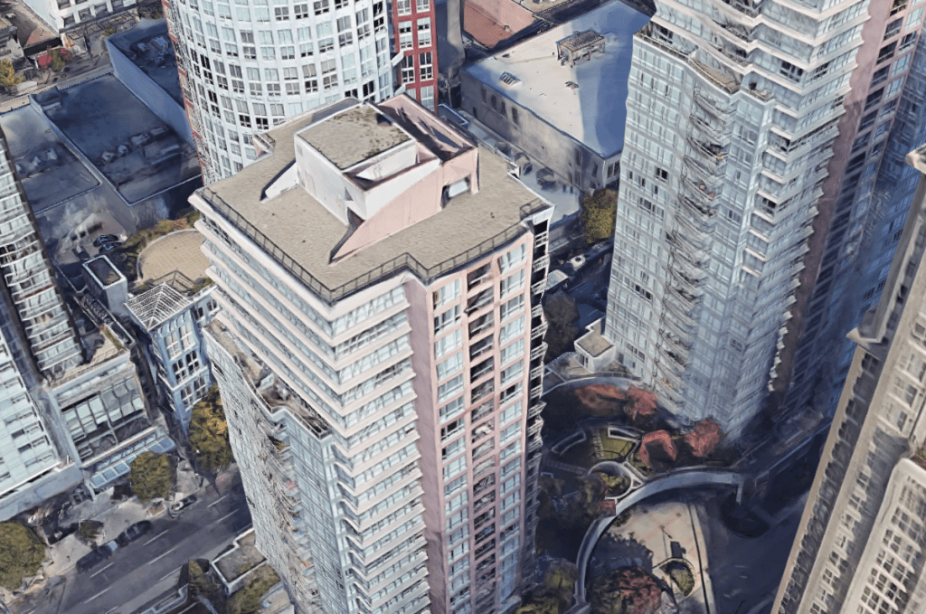
    Returning to Vancouver as a point of comparison, below is an aerial capture from downtown Vancouver at exactly the same scale as the Paris capture. I couldn’t find a density map of downtown, but it’s probably safe to assume that it’s greater than 5,493 and a lot less than 52,218 residents per square kilometer.

    What you see here is typical Vancouverism. Lots of slender point towers, careful tower positioning and spacing, and generally low podiums. It is a perfect demonstration that height and density do not necessarily correlate. It is possible to have low buildings and high density, which is something that Europe obviously does very well.

    But here’s the important question: In which of these two examples would you rather live? Please leave a comment below.

  • Transit investment & density (in San Francisco)

    This recent Streetsblog article about the possibility of turning the M Ocean View line in San Francisco into a kind of subway is a good reminder about the always important connection between transit investment and density. The question I always pose to myself is, “If I were a private company deciding where to spend the money on a new and expensive subway line, what would I look for?” Most of us recognize that population and employment densities would be near, if not at, the top of the list.

    Of course, if the company were fully private, then we would run the risk of low-density / unprofitable areas of the city not being serviced by transit. For a variety of reasons, that’s not an ideal outcome, which is why transit operators are mostly subsidized. The challenge is that the way we plan transit in most — or all? — cities has become so highly politicized today. That’s how we end up with the wrong transit technologies in areas that don’t have the density to properly support them.

    Now, I don’t know the specifics of the M Ocean View line. (Maybe some of you do and will provide those thoughts in the comments below.) So this is not a post about what may or may not be appropriate in this particular instance. But it is a commentary on the importance of fiscal prudence and sound transportation planning.

    Photo by Lance Anderson on Unsplash