Daily insights for city builders, delivered every morning at 6 AM ET. I’m Brandon Donnelly — a Toronto-based real estate developer and founder of Globizen. I’ve been writing here since 2013.

Tag: density

  • Density lowers infrastructure costs

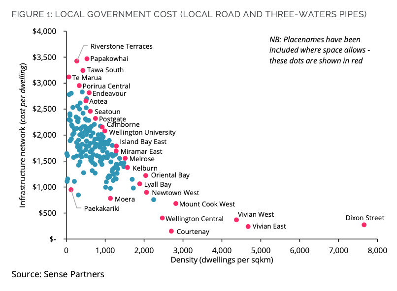
    This is an important chart from a recent study commissioned by Greater Wellington, New Zealand. The study looks at the cost benefits of urban intensification and the above chart shows the relationship been density and infrastructure costs. For this study, they specifically looked at the costs that local governments face in providing road, public bus transport, and “three-waters infrastructure.” I hadn’t heard this latter term before, but it refers to drinking water, wastewater, and stormwater.

    What they obviously found was that there are real economies to higher densities. More density lowers the per dwelling cost of delivering infrastructure. In the case of three-waters infrastructure, it doesn’t even really matter if you’re proximate to reservoirs or treatment plants. The bulk of the cost lies in the local connection pipes. So what matters most is how many dwellings you can service off of the main lines — even if these lines need to be upsized.

    The goal of this study is to enable more support for smart growth within the Wellington region:

    Regional councillor Thomas Nash says the report should give councils confidence to press on with plans that support compact mixed-use development in and around city centres and connected by high quality public transport. 

    “Regional growth needs to be smart growth. This report clearly shows that the best bang for our buck is to focus on upgrading existing water, public transport and local roading infrastructure so that we can build better quality, compact residential form, with improved amenities within our cities and towns,” Cr Nash says.

    Of course, this doesn’t just apply to Wellington. Every city should read the study.

  • This is how many more people Toronto could house if it increased its population density

    As a follow-up to yesterday’s post about infill housing and overall urban densities, let’s look at some basic math.

    The City of Toronto has an estimated population of 3,025,647 (as of June 2023) and a land area of 630 square meters. That means that its average population density is about 4,803 people per km2. Obviously this number will be higher in some locations, and lower in others. But overall, this is the average.

    Now let’s consider how many people we could actually fit within the existing boundaries of the city (city proper not the metro area) if we were to simply match the average population densities of some other global cities around the world.

    Again, what this chart is saying is that if we took the same physical area (Toronto’s 630 square meters) and just increased the population density to that of, say, Paris, we would then have a total population of over 13 million people and we’d be housing an additional 10,011,573 humans on the same footprint.

    I am not suggesting that this is exactly what should be done. (Though, you all know how much I love Paris.) What I’m suggesting is that calling a place “full” isn’t exactly accurate. How would you even measure that? What someone is really saying is that they are content with the status quo in terms of built form and density.

    Note: The above population densities were all taken from Wikipedia, except for Toronto’s figures, which were taken from here.

  • Density is good, but let me explain

    I tweeted this out last week:

    Not surprisingly, the responses were divided. Some responded saying that beauty is more important than density, and a lot of people were quick to point out that there’s good density and there’s bad density. And because I can appreciate both of these comments, it made me think that I should probably elaborate on my glib tweet.

    The points I was trying to vaguely imply are the following.

    More often than not (at least for North American cities), I think our problem is not too much density, it’s too little. This translates into cities that aren’t walkable, aren’t conducive to transit, and that are overall less sustainable. Right now, every mayoral candidate in Toronto is promising to fix our crippling traffic congestion. I don’t know how they’re going to do it, but they’re promising it because they know it’s something people are pissed off about.

    But here’s my take: counterintuitively, the problem is not enough density. The problem is that too many people in our region have no reasonable way to get around without a car. So they’re forced to drive. The way you fix this not as simple as more traffic enforcement or better signal timing. Good luck! You fix it through density, because density is what makes other forms of mobility suddenly possible.

    All of this is not to say that density alone will render you a great city. Obviously things like beauty also matter a great deal. But in my opinion, density is a fundamental component. Because what good is beauty if you don’t have any urban vibrancy? The answer is that you probably don’t have a real city.

    The other point I was trying to make is that space and density are both relative and oftentimes difficult to understand. We think building height and density are correlated, but that’s not always the case. Look at Paris or Barcelona. We also like to make a lot of spatial rules that we think are right and make our cities better: streets should be at least this wide, buildings should be no taller than the width of the street, and so on.

    But here (pictured above) is a street that narrows to around 6 meters and has buildings that are probably 2.5-3x the width of the right-of-way. Sure, it also happens to be beautiful, historic, and Italian. But what would happen if you maintained this same beauty and made the street 5x as wide and lined up parking in front of the stores?

    Somehow it wouldn’t be as enjoyable as what you see here.

  • Walkable areas are a scarce commodity in cities

    According to this recent report by Smart Growth America, which looked at “walkable urbanism” in the largest 35 metro areas in the US, only about 1.2% of land is, on average, built out in this way. Everything else needs to be driven.

    But here’s the thing. Humans seem to really enjoy walkable urbanism, and will usually pay more for it:

    City dwellers will pay to live in a walkable location. Real estate in these areas averages a 34% price premium per square foot in for-sale housing and 41% for multifamily rental apartments.

    It also, by definition, punches above its weight:

    Walkable neighborhoods in just those 35 metro areas account for 19.1% of the total US real GDP and 6.8% of the total US population, by the researchers’ calculations.

    That’s how density works. You get to do more, with less.

    At the same time, not every place should be Midtown Manhattan (which the report labels as the highest walkable urban place with a floor area ratio of 40). There are a wide range of densities that will work, including modest ones (FARs between 1-3).

    Here in Toronto, many of our single-family home neighborhoods have densities that are zoned for a maximum FAR of 0.6, which is quite restrictive if you’re hoping to build something like a multi-unit building.

    This is, of course, the point. But imagine what all could be done here with even an incremental change.

  • Density is good

    When it comes to greenhouse gas emissions, we know this:

    Households in denser neighborhoods close to city centers tend to be responsible for fewer planet-warming greenhouse gases, on average, than households in the rest of the country. Residents in these areas typically drive less because jobs and stores are nearby and they can more easily walk, bike or take public transit. And they’re more likely to live in smaller homes or apartments that require less energy to heat and cool.

    We also know this:

    Consider housing. For decades in the United States, the majority of new homes have been built in the suburbs and, increasingly, exurbs, where climate footprints are larger. As a result, for many people today, it is often easier and cheaper to find a home in a high-emissions community than a lower-emissions one.

    An important caveat to these points is that if you use consumption-based carbon accounting — that is, you consider all of the goods and services that people tend to consume — then other things like income also play a major factor. Wealthy households, for example, tend to fly more frequently, and that is bad for emissions.

    But even with this more accurate accounting, the two biggest contributors to a household’s carbon footprint still tend to be housing and driving. And that’s why when you look at emission maps, like these over here, the urban core still usually performs the best. Density, it turns out, is hard to beat.

  • The compactness of Paris

    This is a great diagram from Smart Density comparing the urban and regional rail networks of Toronto, London, and Paris. All are at the same scale.

    What immediately stands out to me — besides Toronto’s relatively miniscule network — is Paris’ compactness. I have said this before on the blog (here, here, and here), but I will say it again: There seems to be a tendency to fetishize the scale and height of Paris.

    But building height is only one component of its ubiquitous built form. Unlike Toronto, we’re not talking about midrises built up against single-family homes. Paris is far more dense and its buildings are far closer together (usually with interior courtyards)

    Are we also okay with these attributes?

  • An exciting new proposal for Toronto

    I love change.

    In fact, a big part of what I do for a living is imagining what things could be in the future. However, the bias that humans have toward the status quo has been well documented by people like Seth Godin, as well as many others. It is easier to defend that which already exists. Here’s how Seth puts it:

    All one has to do is take the thing we have now as a given (ignoring its real costs) and then challenge the defects and question the benefits of the new thing, while also maximizing the potential risk.

    So as I was reading this recent blogTO article about the work of Stephen Velasco, I wasn’t surprised to see some of the responses. Stephen has built an outstanding 3D model of all the towers that are currently planned or under construction in Toronto. Here’s what that looks like:

    For some of you, this is exciting. And for others, this may look like too much density. In both cases, we might think we are being fair and reasonable in our assessment, but the reality is that it’s actually quite difficult to be a neutral judge. We are all guilty of poor logic and too much emotion.

    But here’s a good mental exercise, put forward by Seth, to test your logic: flip the story and then see if you still feel the same way.

    In this particular case, imagine that all of the above proposed buildings are already built. This is the city that we all live, work, and play in. This is the status quo. Now consider an exciting new proposal being put forward to demolish many/most of these buildings, create more surface parking lots in the core, industrialize our waterfront, and reduce our overall population density.

    Photo from the 1940s:

    Photo from the 1960s:

    Is this a better proposal?

  • Workplace occupancy-sensor company raises $125 million funding round

    Density, which is a company that provides occupancy-tracking sensors, announced this week that it has just completed a $125 million funding round at a ~$1 billion valuation. This is their Series D. Official announcements, here and here.

    On a practical level, the company provides workplace space analytics. They offer sensors that allow companies to anonymously measure how people are using their offices.

    How long people are at their desks for (possibly weird), which conference rooms are most used, where people socialize, and so on. With the idea being that if you measure it, you can then optimize it. It’s about how to best use your real estate.

    But their overarching mission is “to measure and improve out footprint on the world.” Their ambitions seem to go beyond just office space. It’s about how we occupy our cities, and using analytics to more efficiently design and build them going forward. And that’s pretty interesting.

    I’m not intimately familiar with the company, but I thought I would share the news with all of you in case you’d also like to check them out.

  • Built form and climate impact

    Building height and density are not one and the same. You can have tall buildings configured in a low-density way (think post-war towers in the park). And you can have low/mid-rise buildings configured in a high-density way (think Paris and Barcelona). This is one of the reasons why it is important to decouple density and tallness when thinking about our cities.

    This line of thinking is the approach that a recent study took when trying to determine the optimal built form for minimizing climate impact. In the study they define four building typologies: 1) high density, high-rise, 2) low density, high-rise, 3) high density, low-rise, and 4) low density, low-rise.

    What they found was that taller environments tend to have higher life cycle GHG emissions, but that lower-density environments are (obviously) far more land consumptive. To determine life cycle GHG emissions they looked at both embodied and operating emissions, which is why the taller stuff didn’t score as well under their methodology. There’s typically a lot of concrete and steel in tall buildings.

    This lead the team to conclude that if you want to optimize around climate impact, you should probably aim for that perfect middle ground: dense, but not super tall.

    But as Joe Cortright (City Observatory) rightly pointed out in his email newsletter, one of the big limitations of this analysis is that it does not consider transportation-related impacts. And since we know that transportation is one of if not the largest source of GHG emissions and that how we get around is heavily dependent on land use patterns, it is probably an important piece to consider.

    Photo by Alfons Taekema on Unsplash

  • Why urban density is good for innovation

    One of the reasons why I remain so bullish on cities is because we know that new ideas disproportionately come from cities (typically big and dense ones). Matt Clancy does an excellent job of explaining this in a recent post. In it, he cites a number of studies that suggest density is pretty good. It’s good for not only increasing innovation, but also for increasing the diversity of innovation.

    One of the studies found that, all else being equal, doubling the number of jobs per square mile resulted in 20% more patents per capita. Matt argues that the reason for this is that density allows us to meet and collaborate with new people. With this is mind, what do you think that working from home (which is the opposite of job density) might do to innovation/patents?

    Another one of the studies that Matt cites in his article deals with the correlation between patents and street grids. Denser street networks seem to have a marginally positive relationship with innovation.

    But Matt surmises that this may not be because it means we’re all serendipitously bumping into each other all over the place; instead a denser street network is likely symptomatic of other things — namely an increase in “third places.” Because if you consider which census blocks have a concentration of restaurants, cafes, and bars, the number of patents then goes up meaningfully.

    As further evidence of this, Matt cites a fascinating paper from 2019 which looked at the effects of early 20th century prohibition on patents. Turns out that this is a pretty good experiment, because you can examine the impacts of prohibition, as well as compare counties that were already dry (i.e. unaffected by prohibition) against counties that were wet prior to prohibition.

    What the study found was that (1) prior to prohibition wet counties were producing more patents per capita (where they bigger and denser?) and (2) wet counties saw a meaningful drop in patents right after prohibition. Previously dry counties went unchanged in terms of innovation.

    If you’re skeptical of the relationship between bars and innovation, I would encourage you to check out Matt’s full post. But know that there is overwhelming research to suggest that new ideas tend to flourish in the big and dense places that we call cities.