Daily insights for city builders, delivered every morning at 6 AM ET. I’m Brandon Donnelly — a Toronto-based real estate developer and founder of Globizen. I’ve been writing here since 2013.

Tag: data

  • Where Canada’s immigrants have come from

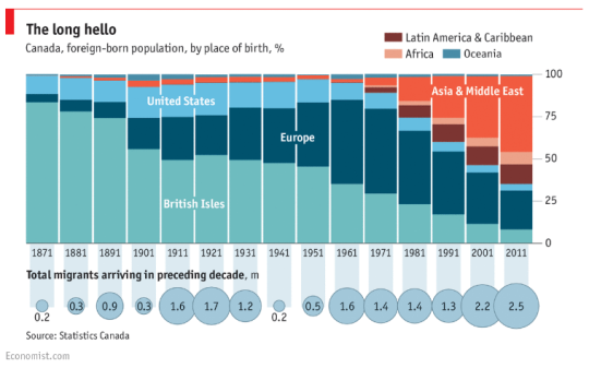
    Earlier today The Economist published the below chart showing where Canada’s immigrants have come from (place of birth) between 1871 and 2011. So basically from Confederation (1867) to today – almost.

    It’s a great chart. It really shows our evolution.

    Perhaps the most meaningful date to point out is 1962. That is the year Canada introduced new immigration regulations which effectively privileged skill and talent over race and national origin when it came to deciding who would be allowed to enter the country. 

    Look at the impact that had.

  • The urban wealth pendulum

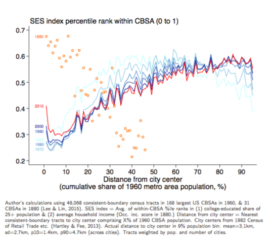
    Jeffrey Lin, who is an economist at the Federal Reserve Bank of Philadelphia, recently published the following chart:

    image

    I found it in this Washington Post article. And it’s packed full of fascinating information.

    The chart compares the socioeconomic status in US cities (y-axis) against “distance from city center” (x-axis) in 1880 and then in recent years (1960 to 2010 census data). The orange circles represent the 1880 data and the red and blue lines represent the recent census data.

    What this chart and research tells us is that in 1880, rich people overwhelmingly lived in the center of cities. And as you moved further away from the city center, socioeconomic status fell off pretty precipitously. This makes sense given that, at the time, it was hard to get around and travel long distances.

    However, in the post-war years, the exact opposite became true. We began driving and wealth decentralized. This should surprise no one. 

    But what’s interesting is how this appears to be reversing. In 2010 (the red line), there’s a sharp increase in socioeconomic status for people living basically right in the center of cities. And for the 30 – 60 km range, there has been a decrease in socioeconomic status essentially from the 1960s onwards. 

    The important takeaway here – which is spelled out in the Washington Post article – is that the neighborhoods which appear to be in high demand today are also in very short supply:

    “We have 80 years of essentially zero production of neighborhoods with these qualities,” Grant says. “We’ve spent the last 80 years building car-oriented suburbs. Then when the elites decide they want to go back into the city, there’s not enough city to go around.”

    This is one reason why supply matters.

  • The answer to San Francisco’s housing affordability problem

    Blogger and programmer Eric Fischer has an excellent post up on his site where he looks at: “Employment, construction, and the cost of San Francisco apartments.” It’s worth a good solid read.

    What he did was dig deep into whatever data he could find – the data goes back to the beginning of the 20th century in some cases – to try and figure out a solution to San Francisco’s housing affordability problem.

    Many (including myself) have argued that, at least part of the solution, is to build more, not less, housing. However, others, such as Tim Redmond of 48 Hills, have argued that building more market-rate housing would simply exacerbate the current situation.

    In Eric’s analysis, he looked at everything from median rents and new housing units constructed (above graph) to annual wage growth and income inequality. I particularly liked his summary of the city’s various building booms. 

    In the end, here’s the conclusion that he came to:

    “In the long run, San Francisco’s CPI-adjusted average income is growing by 1.72% per year, and the number of employed people is growing by 0.326% per year, which together (if you believe the first model) will raise CPI-adjusted housing costs by 3.8% per year. Therefore, if price stability is the goal, the city and its citizens should try to increase the housing supply by an average of 1.5% per year (which is about 3.75 times the general rate since 1975, and with the current inventory would mean 5700 units per year). If visual stability is the goal instead, prices will probably continue to rise uncontrollably.”

    By visual stability, he is referring to maintaining the current urban fabric of San Francisco just the way it is. In other words, he is making the link between preservation and affordability in a prosperous and growing city.

    Intuitively, this makes sense to me. It’s unrealistic to think that you can maintaining some level of housing affordability without allowing supply to increase alongside demand.

    At the same time, I do not believe that preservation needs to equate to no changes whatsoever. Urban preservation, to me, should be about dutifully respecting the past while still looking firmly towards the future. And that’s how I believe successful should be approaching this problem.

  • The Death and Life of Great Italian Cities

    image

    I am sure that a lot of you know where the title of this post comes from. It’s a riff on one of the most important and influential books in the world of city planning: The Death and Life of Great American Cities by Jane Jacobs (1961).

    But when Jane Jacobs first wrote this book, there was no such thing as smartphones and nobody was “checking-in” to hipster dive bars on Foursquare

    So instead of leveraging big data, her analyses and arguments were based on observation. She walked the streets of New York and Toronto and figured out what made cities thrive and what made cities die. That was her brilliance.

    Today, however, we have data – lots of it. And so recently, a group of researchers set out to test Jane Jacob’s theories using mobile phone data. The study was called, The Death and Life of Great Italian Cities:
    A Mobile Phone Data Perspective
    .

    More specifically, they set out to test the following 4 essential conditions:

    “She [Jane Jacobs] argued that, to promote urban life in large cities, the physical environment should be characterized by diversity at both the district and street level. Diversity, in turn, requires four essential conditions: (i) mixed land uses, that is, districts should serve more than two primary functions, and that would attract people who have different purposes; (ii) small blocks, which promote contact opportunities among people; (iii) buildings diverse in terms of age and form, which make it possible to mix high-rent and low-rent tenants; and (iv) sufficient dense concentration of people and buildings.”

    To accomplish this, the team assembled and studied data from the following sources:

    • Mobile phone activity (specifically internet activity)
    • OpenStreetsMap Data
    • Census Data
    • Land Use Information
    • Infrastructure Data
    • Foursquare Data (Venues API)

    Ultimately, they determined that Jane Jacobs knew what she was talking about. The above conditions are essential to urban vibrancy and they apply to Italian cities, just as they did and do to American cities. But this test was valuable, because the more that we can measure and quantify cities, the better I think we’ll get at creating and promoting urban vitality. 

    Now imagine if you overlaid the findings of their report with residential and commercial rents. I bet you’d also find that there’s a strong business case for urban vitality.

    I’ve heard a number of people say that, eventually, every company will be a software/technology company. And I don’t think we’re far off from that reality. To me, this study feels like an early example of what that might look like for city building.

    On a side note, the picture at the top of this post is of the Spanish Steps in Rome. I took it on a weekend trip in 2007. I was living in Dublin at the time.

  • A new era of (digital) globalization

    McKinsey recently published a report called Digital globalization: The new era of global flows.

    The overarching thesis is that we are transitioning to a data-driven global economy:

    “Flows of physical goods and finance were the hallmarks of the 20th-century global economy, but today those flows have flattened or declined. Twenty-first-century globalization is increasingly defined by flows of data and information. This phenomenon now underpins virtually all cross-border transactions within traditional flows while simultaneously transmitting a valuable stream of ideas and innovation around the world.”

    One of the benefits of this shift is that it has become easier for emerging economies and individuals from all around the world to participate.

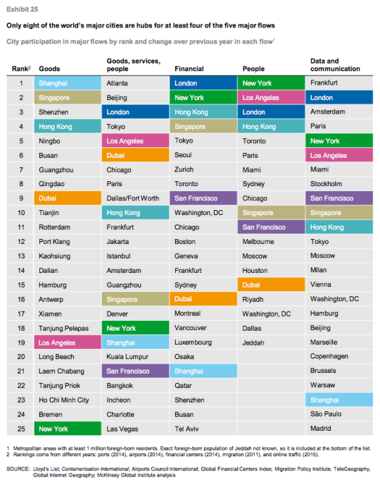
    Of course, not all countries and cities are participating equally. In their report, McKinsey ranks the top cities according to five global flows. In each case a proxy was used:

    “Unfortunately, data on global flows are not available at the city level. However, we have obtained data that serve as proxies for each of our five global flows. Container port volumes approximate goods flows; airport passenger volumes serve as a proxy for goods, service, and people flows; the ranking of cities in the Global Financial Centers Index by the Z/Yen Group provides an indication of financial flows; the number of foreign-born residents in a city measures people flows; and Internet bandwidth approximates data flows.” 

    Using this methodology, they believe that the world only has 8 truly global cities right now: New York, Los Angeles, San Francisco, London, Singapore, Shanghai, Hong Kong, and Dubai. They are the colored cities listed below:

    I always take these city rankings with a grain of salt. This stuff is not easy to quantify and a lot depends on the methodology that you use. 

    For instance, Atlanta sits on the top of “goods, services, and people” because it has the busiest airport in the world according to passenger volume. (It’s the primary hub of Delta Air Lines.) But is that enough to assert that Atlanta is #1? Maybe. Maybe not.

    In any case, the report is packed full of information. If you’d like to take a look, click here.

  • Housing completions in Toronto from 1996 to 2014

    Whenever I read studies that cite census data, I’m often left feeling like the data is out-of-date. 

    Five years – which is how often Canada conducts its national census – is a long time. Somebody could move to this country for school, complete a 4-year degree, and then leave, and we wouldn’t even pick it up in our data.

    Thankfully, we’ve at least reinstated the long-form census for next year. Here are the questions, if you’re curious.

    But all of this is a digression. 

    This morning I read through a housing report that the City of Toronto published in October of this year. It’s about housing trends. And I wanted to share the below chart that covers housing completions for the period of 1996 to 2014. Keep in mind that this is for the City of Toronto, and not the Greater Toronto Area.

    What it shows is that over this 18 year period, 78% of all housing completions in this city have been either low-rise or high-rise condominiums/apartments. The remaining 22% is a mix of detached and semi-detached houses and townhouses.

    However, this 22% is an average. 

    Detached and semi-detached housing completions declined from 22% in the 1996-2001 period to 10% a decade later. And row and townhouses declined from 16% to 6% during this same period.

    At the same time, “many” of the housing units in this 22% were actually replacing existing and older housing stock. That is, according to the report, many were “knock-downs” and rebuilds. In these cases, it means that the completions actually do not represent net new housing units. So in reality, the supply of new single-family housing is even lower than it appears in the chart above.

    When you look at all of this, it should come as no surprise to you that our current combination of low interest rates and low supply has been leading to huge price increases on the single-family side of the market.

    And it’s for this reason that I believe Toronto will eventually start to look towards allowing more low-rise intensification. Laneway housing, as one example, would represent virtually 100% new ground-related housing in already built up areas. Where else are we going to find that kind of housing opportunity?

    So in my view, it is a question of when, not if, this will happen.

  • This U.S. housing boom is different

    Just a few days ago, The Federal Reserve Bank of San Francisco published an interesting research study where they argue that this U.S. housing boom is different than that of the early 2000s.

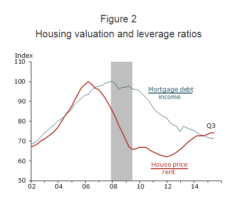
    During the last boom, U.S. home prices peaked in 2006 and then dropped about 30% in the wake of The Great Recession. Since then prices have rebounded – almost to their pre-recession levels. This has some people asking whether this story is headed towards the same ending.

    But the FRBSF is saying no:

    “We find that the increase in U.S. house prices since 2011 differs in significant ways from the mid-2000s housing boom. The prior episode can be described as a credit-fueled bubble in which housing valuation—as measured by the house price-to-rent ratio—and household leverage—as measured by the mortgage debt-to-income ratio—rose together in a self-reinforcing feedback loop. In contrast, the more recent episode exhibits a less-pronounced increase in housing valuation together with an outright decline in household leverage—a pattern that is not suggestive of a credit-fueled bubble.”

    And here’s the chart:

    Source: Flow of funds, Bureau of Economic Analysis (BEA), CoreLogic, and BLS. Data are seasonally adjusted and indexed to 100 at pre-recession peak.

  • Foursquare uses their global foot traffic data to accurately predict iPhone sales

    I am a fan and long time user of Foursquare – now known as both Foursquare and Swarm.

    Foursquare has struggled against competitors such as Yelp.com when it comes to local business recommendations. And I have less than 100 friends on my Swarm. It doesn’t seem to be that popular here in Toronto.

    But I’ve always loved the data collection aspect of Foursquare / Swarm. Even though most people don’t seem to care about that. When I check-in somewhere, such as the gym, it’ll tell me how many weeks in a row I’ve been there, whether it’s a new personal record, who else is nearby, and a host of other things.

    I’ve always felt like there was so much potential in all of the data it was collecting.

    Well the company is starting to make better use of that data. Recently they used their foot traffic data at Apple stores (I am assuming this goes beyond just check-in data) to predict the number of iPhones that Apple was going to sell globally following the launch of the 6s and 6s Plus.

    They predicted between 13 to 15 million handsets and it turns out they were right:

    This validates the accuracy of our prediction and while we’re proud of the result, we certainly aren’t surprised. Foursquare’s data is essentially the world’s biggest panel of foot traffic data — we have the best sense of the trends and patterns of the movement of people and their phones around the world.

    This is powerful stuff. If there were a way for me to be bullish on Foursquare beyond just writing this post, I would be.

  • Towards a post privacy world — what the Ashley Madison hack could mean for cities

    Blinded View by Markus Jentes on 500px.com

    https://500px.com/embed.js

    Ashley Madison is a website that helps married people have affairs. 

    Recently the website was hacked and over 33 million accounts were exposed. This included full names, email addresses, mailing addresses, and so on. Not surprisingly, this has gotten a lot of press. The site was/is marketed as being private and secure. And clearly that is not what it is right now.

    But there are people in the tech community, such as venture capitalist Albert Wenger, who believe that is merely a glimpse into the future – a “post privacy future.” He even argues on his blog that we as a society should be more accepting of the leak and that the release of this data could lead to a “more measured view of affairs.” (There are many who argue that humans are not intended to be monogamous.)

    For many, or probably most of you, I’m sure this position seems pretty radical. After all, this leak will likely destroy many marriages.

    But Wenger’s position on privacy is a fascinating one and he’s written a lot on the topic. The tension he sees is one between individual privacy vs. collective intelligence. In this part of the world, our society values the former over the latter. But he believes that we are headed towards a world where almost everything, yes everything, will eventually become public. Again, radical position. But consider how much we publicly share about our personal lives today versus 10 or even 5 years ago.

    What’s perhaps more relevant to the Architect This City audience though is what this could mean for many other industries beyond tech.

    I often think about what a “post privacy future” could mean for city building. Imagine if every architect, real estate developer, engineer, and other participant made public all of their work. This would mean that all designs, financial models, sales data, and so on were made widely available to anyone who wanted to see them.

    The thought probably scares many of you in the industry, but consider what it would mean for our collective intelligence. There’s a strong argument to be made that we would all be better off and that the process of building would become far more efficient. In fact, if truly everything were public, it could in theory eliminate most of the market’s concerns about overbuilding, a condo bubble, and all the other stuff that gets talked about.

    The reason people speculate on these market factors is because we don’t have all the data. We don’t actually know what’s going to happen. We have no idea. I know I certainly can’t predict the real estate market.

    So why aren’t we quickly becoming more public?

    Wenger raises the game theory principle known as the prisoner’s dilemma:

    “So one way to think about secrecy is that it leads to lots of prisoner’s dilemma style situations. Individuals (or companies) would be worse off if they were the only ones disclosing, but if everyone disclosed (or at least the majority), then everyone would be much better off. In the language of game theory, we are in a bad equilibrium.”

    In other words, if only one real estate developer disclosed her project’s financial information to the public, then she would probably be worse off against her competitors. But if every developer in the city did it, then the market as a whole would be better off because everyone would then benefit from collective intelligence.

    Using the example of infidelity, if one person is caught having an affair, then that person is more than likely worse off. But if over 33 million people are caught having an affair and it reinforces the statistic that between 30-60% of married people in the United States will have an affair at one point in their lives, then maybe it forces us as a society to rethink what marriage means today. And maybe that makes us all better off.

    This is a pretty far out there argument, though the city building example is probably more palatable than the Ashley Madison one. Regardless, I would love to hear your thoughts in the comment section below. 

    Are we heading towards a post privacy world?

  • Spring forward with Apple’s new watch

    image

    Today was Apple’s big “Spring Forward” event. We already knew the Watch was coming, but now we know that it’ll be available for sale on April 24, 2015 and that their high-end “Edition” line will start at just $10,000.

    Within the tech community, there are mixed opinions when it comes to the Apple Watch. Some think it’ll be a total flop. Some think it’ll be the next iPhone. And some think it’ll do reasonably well, but that it just won’t be the next category killer for Apple.

    I personally think it will do really well. 

    I think there are enough use cases for which looking at your wrist is a better experience than pulling out your phone – particularly for quick glance activities. Think payments, transit fares, airline tickets, location-based notifications, and so on. 

    However, one of the big challenges for Apple Watch will be that they’re trying to replace an entrenched fashion piece. So not only is Apple trying to solve a problem that most people didn’t know they had, but they’re also trying to get people to give up their Movado or Patek Philippe – which is why they created a super high-end line.

    Whatever the case may be, I plan to pre-order a Watch next month (just the regular one, not the $10,000 one).

    I’m excited to try the health features (it’s a passion of mine). I’m excited to see what kind of data this new device generates both for me personally and in aggregate. And I’m excited to see what clever software developers end up creating for this new platform. Because that’s where the real potential lies.

    It might not seem like a big deal to move a computer from your pocket to your wrist (assuming people are willing to do that). But I think we’ll all be surprised at what kind of new ideas that generates.

    Hopefully I’ll soon be able to board a Toronto streetcar and tap my wrist to pay the fare. That would certainly be a civilized way to travel.

    What about you? Do you plan on buying an Apple Watch?