Daily insights for city builders, delivered every morning at 6 AM ET. I’m Brandon Donnelly — a Toronto-based real estate developer and founder of Globizen. I’ve been writing here since 2013.

Tag: data

  • Our social connectedness

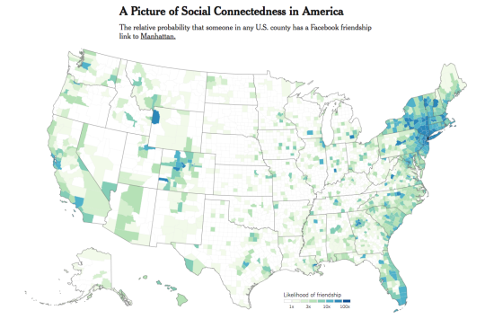
    Economists at Facebook, Harvard, Princeton and NYU recently analyzed anonymous Facebook data in order to study our social connectedness. The New York Times’ Upshot wrote about it here and it is a must read.

    There are a number of interesting takeaways from the study. One of them is that geography, distance, and political boundaries actually matter a great deal when it comes to our connectedness. 

    In other words, Americans are more like to be connected to someone nearby – within county or state boundaries – than they are to someone further away who may be infinitely more similar. This may seem somewhat intuitive.

    But at the same time, having a dispersed network also suggests certain things. Here’s the relationship that they discovered:

    These networks are important in part because of other patterns that are correlated with them. Counties with more dispersed networks — where a smaller share of Facebook friends are located nearby, or among the nearest 50 million people — are on average richer, more educated and have longer life expectancies. Places that are more closely connected to one another also have more migration, trade and patent citations between them.

    Counties that are more geographically isolated in the index are more likely to have lower labor force participation and economic mobility, and they have higher rates of teenage births. Some of the most economically distressed parts of the country appear to be the most disconnected: Among the 10 U.S. counties with the highest share of friends within 50 miles, six are in Kentucky.

    Again, it is worth checking out the full article. There’s also an interactive map to play around with.

  • Supreme Court dismisses TREB appeal

    Last Thursday the Supreme Court of Canada announced it would not hear an appeal from the Toronto Real Estate Board regarding a 2016 Competition Bureau decision aimed at giving consumers greater online access to information, such as historical (home) sale prices.

    I am not at all surprised by the Supreme Court’s decision and I have said pretty much all I want to say on this topic – over here. But since I believe this is a positive outcome for real estate consumers, I wanted to mention it on the blog because it appears to be a final decision.

    Some sites, such as Zoocasa, have already started publishing sold prices. Good.

  • Street-level intelligence and analytics

    I discovered a company yesterday called CARMERA, which just raised a $20 million Series B funding round. They call themselves a “real-time, street-level intelligence platform” and their flagship product, called Autonomous Map, provides HD maps and real-time navigation data to autonomous vehicles. That’s the way AVs work. They need maps like CARMERA’s to function. Here is an overview of what is supposedly the largest AV taxi service in the world. It is a partnership between CARMERA and Voyage.

    One of the interesting things about this product is that it is cleverly powered through another one of their products: a free fleet monitoring tool for commercial operators. So fleet managers use this service to keep track of their actual human drivers and, at the same time, CARMERA uses the vehicles to collect the data it needs for its Autonomous Map. They call it “pro-sourcing” the data (a play on crowdsourcing).

    It is perhaps a good example of “single user utility.” The product you’re making often has to be valuable to a single user before scale is reached. In this case, Autonomous Map would be a hard sell without a critical mass of pro-sourced data. It solves the perennial chicken-and-egg problem when creating new marketplaces.

    Finally, I think many of you will be interested to know that CARMERA has also announced a partnership with the New York City Department of Transportation. As part of this, the company will be handing over the data they have on pedestrian density analytics and real-time construction detection events. Part of their mission is to “automate cities” and better street analytics will certainly help to open up a new world of city building possibilities.

    Photo by Yeshi Kangrang on Unsplash

  • Condo rents in Toronto are up 11.2% from last year

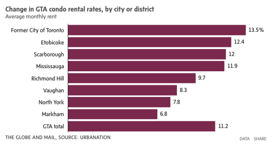
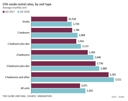
    Yesterday Urbanation released its Q2-2018 rental report for the Greater Toronto Area. It tracks both purpose-built rentals and condominium rentals, the latter being condominium units that are listed for rent on MLS. The average condo rent, for all unit types across the GTA, is up 11.2% year-over-year to a face rent of $2,302 per month.

    Here is a chart from the Globe and Mail:

    The former City of Toronto, which includes downtown, is actually up 13.5%:

    But here are the stats that I really wanted to draw your attention to today (figures from the Globe).

    According to Urbanation, there were some 384,000 condo apartments in the Greater Toronto Area in 2017 and nearly 1/3 of them were rented out. Given that the Canada Mortgage and Housing Corporation pegs the total number of rental apartments in the GTA at approximately 311,596, condo apartments represent about 40% of all our rental housing stock.

    So condo buildings are actually doing quite a bit of heavy lifting when it comes to providing rental housing in this region.

  • Fastest growing large cities in the US

    Last week the US Census Bureau released its 2017 population estimates for the largest cities in the country. All of the figures are for the city itself and not the broader MSA or some other boundary.

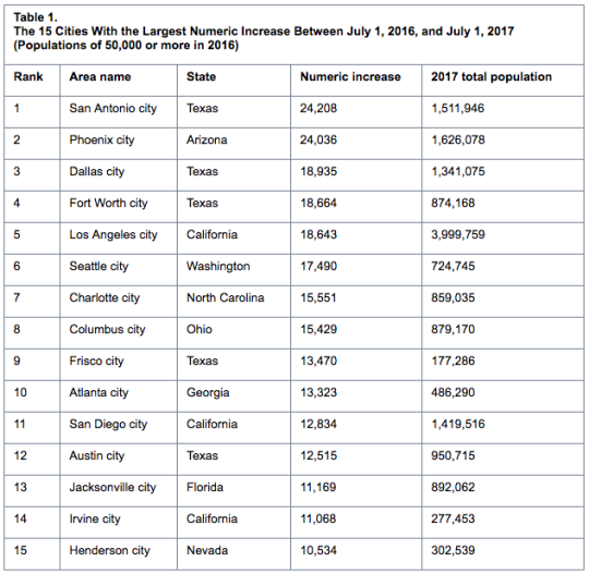
    Here are the top 15 cities with the largest numeric increases between July 1, 2016 and July 1, 2017:

    However, if we switch over to percentage increases, Frisco, Texas – which is part of the Dallas-Fort Worth metro area – jumps up to number one with an increase of 8.2%. 

    In fact, the top 3 cities (on percentage basis) are in Texas and 10 of the top 15 cities are located in the South. That shouldn’t come as a surprise to many of you. Related post: Follow the sun and sprawl.

    However, if we only consider the 25 largest cities in the US, the fastest growing city on a percentage basis was Seattle at 2.47%. Number two was Fort Worth at 2.18%. And number three was Charlotte at 1.84%.

    New York City sits at 0.08%. And Detroit lost people. But it’s not a horrible figure (-0.35%). For more tables and data, click here.

  • Puerto Rican migration during and following Maria

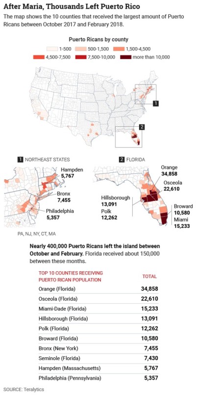
    Teralytics recently looked at data from 500,000 smartphone users to determine how, when, and where Puerto Ricans moved between August 2017 and February 2018 during and following Hurricane Maria – generally considered to be the worst natural disaster on record for the area. 

    CityLab published the data here and along with the following maps:

    image

    It shows the locations and the top 10 counties that received Puerto Rican population during the above time period. Florida and the Northeast are at the top of list, which isn’t all that surprising. Privacy concerns aside, it is once again an example of the kind of granular data that we now have access to. Prior to this data being available, all we apparently had was estimates.

  • A demand-driven apparel world

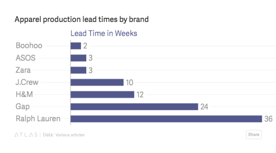
    Here is an interesting article from Loose Threads that talks about the profound impact that data and fast fashion are having on apparel brands, transforming them from supply-driven businesses to demand-driven ones. It adds a bit more nuance to the trope that tech is disrupting retail simply because people are choosing to buy online.

    The argument, here, is about a more fundamental shift in commerce. Brands are now forced to move faster than ever before. Product lead times are dropping (see below via LT). Customer feedback loops are almost instantaneous because of social. And the result is that customers are now the driver: Figure out what people want right now and then create that supply as quickly as possible.

    image

    Fast fashion certainly isn’t a new concept, but the data, algorithms and demand planning systems are only becoming more robust. Merchandise buying – historically the work intuitionists trying to predict what customers will want seasons into the future – is now an automated process that optimizes itself following every click, abandoned shopping cart, and social media like. 

  • Meet Replica

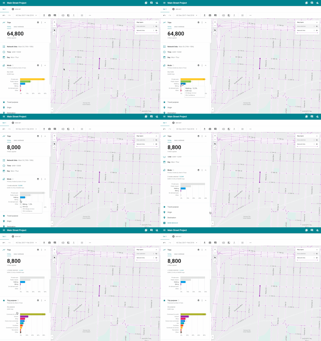
    Sidewalk Labs is currently building out a platform called Replica that will support them in their development plans here in Toronto. Replica is

    “a user-friendly modeling tool that uses anonymized mobile location data to give planning agencies a comprehensive portrait of how, when, and why people travel in urban areas.”

    Here is a preview of the Replica dashboard showing a section of Main Street in Kansas City. I hope the animated GIF shows up for you.

    The platform uses a combination of mobile location data (~5% of the population) and on-the-ground checks, typical stuff like manual traffic counts and transit boardings.

    The goal is to understand in real-time who is using a street, as well as how (driving? cycling?) and why (going to work?).

    Their introductory blog post obviously stresses the importance of personal privacy, but I am curious how they determine where people are going.

    I suppose if they pair journeys with destinations (and the durations at those destinations) they can make reasonable assumptions around the why.

    I think the benefits to all of this are clear. But does any or all of this worry you from a privacy standpoint?

  • Amazon’s cashier-less grocery store finally opens

    This morning the first Amazon Go store opened to the public in downtown Seattle. It’s more convenience store than grocery store, but the big deal is that there are no cashiers and no lines.

    You enter the store through a gate and with your phone and Amazon’s app. As you walk around the store and pick up items they get automatically added to your online cart on Amazon.

    So everything goes right into the offline bag you’ll be leaving the store with. Place an item back on the shelf and it is instantly removed from your “cart.” Walk out of the store and you’re automatically charged.

    It’s not yet clear how exactly the technology works, but Amazon says that all of this is accomplished through sophisticated computer vision (cameras), machine learning, and lots of sensors. 

    What’s really remarkable is that it doesn’t rely on every product having a special chip or sensor attached to it. I would think that was one of the biggest hurdles to overcome in order to remove the pain point of grocery store lines.

    Now that this is up and running, I can only imagine the customer behavior data that they must be collecting. Heat maps of every shelf showing conversion rates for every imaginable customer segment. (Are tall people more likely to buy products displayed higher up?) Correlating people’s food purchases to their broader Amazon shopping habits. And the list, I’m sure, goes on. 

    There is even speculation that Amazon will begin licensing this technology to other retailers, similar to what it does with Amazon Web Services. That seems like a reasonable assumption given the data play we just talked about. Assuming the tech works, it’ll get copied. So they may as well embed themselves.

    In case you were wondering, the Bureau of Labor Statistics pegs the number of cashiers in the US at about 3,555,500 (2016 number).

    And this number is projected to remain more or less flat until 2026.

    That doesn’t feel right to me.

  • The U.S. cities that gained the most workers over the last 12 months

    One of the great things about social media is that it gives us access to data that previously didn’t exist or was difficult to collect.

    Take, for example, LinkedIn’s monthly report on employment trends called the Workforce Report. They look at which industries are hiring, where people are moving for jobs, and so on. Click here for the June 2017 edition. 

    Note that architecture/engineering hiring appears to be up nationally, which is usually a positive leading indicator.

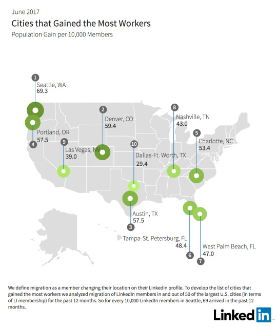
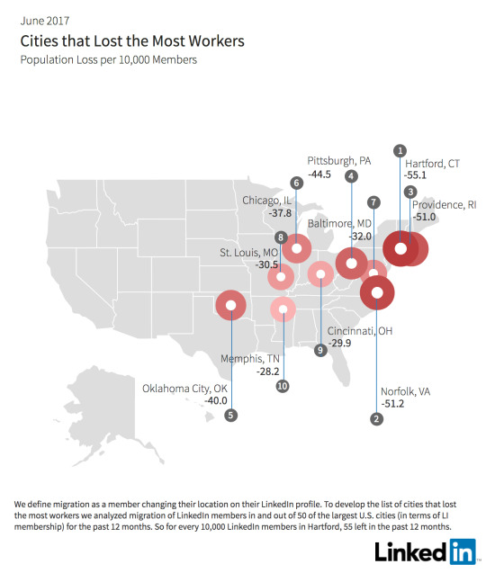
    I’ll leave you all to go through the report, but I did want to pull out a few of their maps and one of their takeaways. Below are maps of the cities that lost the most workers and gained the most workers over the last 12 months.

    The established trend of people moving from colder northern cities to warmer amenity-rich cities seem to play out here.

    That said, one of their “key insights” is that fewer workers today are moving to the San Francisco Bay Area. Since February 2017, there has been a 17% decline in the net number of workers.

    They blame housing affordability (ahem, lack of supply). People are simply turning to other great cities like Seattle, Portland, Denver, and Austin. They’re growing and cheaper.

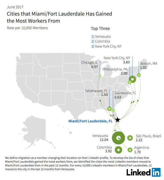
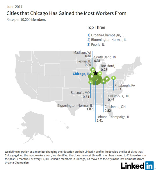
    One of the other cool things about the report is that you can drill down into individual cities to see where people are moving from. I looked up Miami and Chicago just to do a quick comparison. 

    Not surprisingly, Miami is seeing a significant contingent from South America. What’s interesting about this random comparison is how international Miami is and how regional Chicago is in terms of their draws.

    I would love to see similar data for Canada. This is valuable stuff.