Daily insights for city builders, delivered every morning at 6 AM ET. I’m Brandon Donnelly — a Toronto-based real estate developer and founder of Globizen. I’ve been writing here since 2013.

Tag: citylab

  • Homes per acre

    I spent three years living in Philadelphia for grad school and one of the things that I appreciated the most was its walkability. I walked and took transit everywhere. Much of this has to do with the grid system that was laid out for the city in the 17th century. But there are also lots of more recent developments that help to reinforce this fabric.

    CityLab, for example, just published this article on Penn’s Landing Square, which is a housing complex in Philadelphia’s Society Hill neighborhood. Built in 1970 and designed by Canadian-American architect Louis Sauer, the modernist complex occupies an entire 2.37-acre block and contains an assortment of 118 low-rise homes, many of which are connected through small interior laneways.
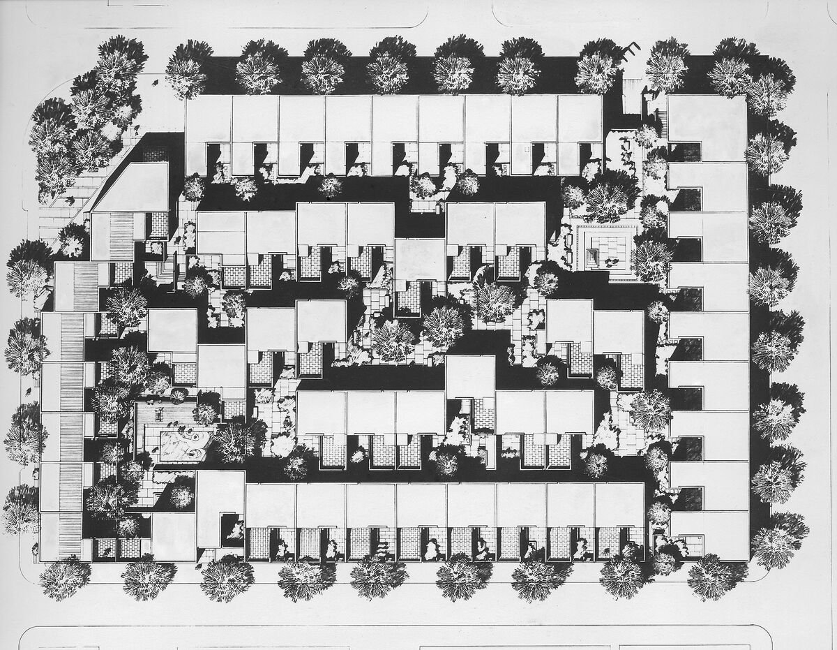
    Here’s the site plan:

    In addition to its handsome architecture, what is noteworthy about Penn’s Landing Square is that its site plan makes it quite a dense low-rise development. At 118 homes, this translates into just under 50 units per acre. CityLab estimates that this means the development holds about 174 people per acre (~412 people total), which would make it more dense than Stuyvesant Town in New York (~158 persons per acre).

    However, this is based on the assumption that there are almost 3.5 people living in each of these homes. While generally large, I don’t know if this is the case. It would be higher than the average US household size. But regardless, from a unit per acre standpoint, it remains a great example of dense, family-oriented, and grade-related housing.

    For fun, let’s compare this to a more intense form of infill development. Our Junction House project, for instance, contains 151 homes and sits on a 0.48-acre piece of land. This translates into about 315 units per acre. I don’t know off hand the average number of occupants per household, but I reckon that, given our larger average suite size, we should be on the higher end compared to most mid-rise condominiums. So I would say that we are probably 400+ people per acre.

    It’s unfair to compare a single development to an entire neighborhood, such as Stuyvesant Town. Circulation and other open spaces will necessarily pull down your average density. But these individual development examples do speak for themselves. There are many parts of North America where you might find 1 home or a handful of homes per acre of land. At Penn’s Landing Square, this number is 50 units per acre. And at Junction House, it’s 315 units per acre.

  • Is less people walking bad for traffic fatalities?

    Here’s some recent data, via CityLab, suggesting that Americans are walking less and driving less, but killing more people when they do drive around. (The report is based on data from 2019 to 2022.)

    My first reaction to these high-level findings is that they seem to make sense. This time period was the pandemic. And people were locked away at home (though I used to take some seriously long walks around downtown during this dark time).

    So I don’t know, I’m not sure we can conclude that walking less is truly a structural phenomenon. Similarly, I’m not sure that we can immediately conclude that cars are becoming increasingly more dangerous.

    According to Wikipedia, deaths per capita, deaths per billion vehicle miles traveled, and total deaths, have all been generally declining in the US since the 1960s.

    However, I do wonder if there’s some sort of correlation between people walking less and car-related fatalities. The most dangerous streets, in my mind, are often the ones that don’t have a lot of pedestrians.

    That’s why, broadly speaking, it feels safer walking around Manhattan than it does Los Angeles. So maybe less people walking is enough to trigger an increase in pedestrian fatalities.

  • Manhattan is still looking at a congestion charge for south of 60th Street

    We talk a lot about congestion charges and road pricing on this blog. Here’s a list of some of those posts. I found 46 that were tagged with “road pricing.”

    I continue to believe that it’s the only way that big cities can effectively solve the problem of traffic congestion. It’s not being caused by the bicycle lanes that were just added to your street. It’s not the new COVID street patios. And it’s not the new apartment that was just built with too many parking spots.

    The problem is mispricing.

    If you want free roads, then you don’t get free-flowing traffic. That’s how this equation works, which is why I have always thought it a good idea to dynamically price roads based on demand, and then to direct those funds toward more efficient forms of mobility — such as transit.

    Despite all this, it’s not a very popular approach in this part of the world. Toronto looked at road pricing back in 2016, but we got nervous and backed away from it. New York City has also been looking at a congestion charge for Manhattan south of 60th Street for at least 4-5 years. But this one appears to still be on the table.

    According to this recent CityLab article, New York’s congestion prices could look something like this (note that this chart includes other pre-existing tolls):

    But with some exceptions (I think this is an interesting approach):

    Primary residents of the Manhattan central business district, which is south of 60th Street, and New York State residents with adjusted gross income of less than $60,000 would be eligible for a state tax credit equal to the amount of the new tolls, paid during the taxable year.

    In total, this current pricing scheme is expected to generate an additional $1 billion in annual revenue for the city’s transportation authority. The MTA also plans to bond against this revenue and raise an additional $15 billion for new transit projects.

    This sounds like a reasonable approach to me.

  • Hong Kong needs bigger apartments

    CityLab recently published this article about “why Hong Kong is building apartments the size of parking spaces.” It’s about the city’s “microflats” which are typically in the range of 150 to 300 square feet. Supposedly there about 8,500 of these apartments across Hong Kong and in 2019 (this was apparently peak microflat) they represented about 7% of all new residential construction.

    Hong Kong is one of the densest and most supply constrained real estate markets on the planet. And so there are very good reasons for these affordability pressures and the push toward smaller apartments. The article gets into a number of them. The concern I have is that the article also seems to blame developers for a number of these problems, without a clear understanding of the economics behind new construction.

    It is not enough to simply say that developers need to be less greedy and build bigger apartments. If a 250 sf apartment currently costs $1 million and you think it should be twice as big, then the price is now also going to be somewhere around twice as big. Is the answer more $2 million apartments? Developers trade in space and more space costs more money to build.

    All of this is not to say that housing affordability isn’t a problem worth addressing. It of course is. I am simply saying that there is a cost structure behind every new development that is driving decision making and driving what ultimately gets built. Understanding it can be helpful when looking for solutions. Believe it or not, not all developers are bad. Some actually want to help build beautiful, sustainable, and prosperous cities.

  • Affordable housing for all?

    Bloomberg CityLab has a new video out talking about how Vienna has seemingly solved the housing unaffordability problem that is impacting most global cities around the world. Each year Vienna builds about 14,000 new housing units and about half of this is supply is “affordable.” Already over 60% of Viennese live in an affordable home. The title of the video suggests that their approach is radical, but is that really the case?

    What was clear to me when I watched the video is that there are perhaps two key differences in terms of how Vienna approaches this problem. One, they quite simply care about delivering high-quality affordable housing to the middle class. They think it’s culturally important and they believe that architecture and design matters. Two, they are willing to invest in it, both up front and over time (maintenance).

    In the video, the former Vice Mayor of Vienna talks about how the City will go out and buy land (or use already owned land) and then make it available (sale or lease) at discounted rates so that it makes economic sense for non-profit housing developers. If the math still doesn’t work for the private sector, then there are other subsidies available.

    I’m certainly not an expert on Vienna’s approach to housing delivery. And I’m not suggesting it’s perfect. My knowledge base comes largely from one 13 minute episode by CityLab. But I think it’s notable that I didn’t pickup anything in the video about inclusionary zoning leading the way (which I have argued before tends to shift the burden to the remaining market rate housing units). Instead, they value it and they invest in it. There’s no such thing as a free lunch.

    Image: CityLab

  • Where Americans moved over the last year

    According some recent data from the US Census Bureau and USPS (via this CityLab article), the number of Americans who registered (between March 2020 and February 2021) that they were making a permanent move somewhere else, only increased by about 3%. And the vast majority of people that did move tended to simply spread out and move within the same metro area — about 84%. About 7.5% moved within the same state. And about 6% moved to some other top 50 metro area in the US.

    Some are of the opinion that these moves to the outskirts of cities would have happened regardless. The pandemic simply sped things up. Perhaps. But whatever the case may be, CityLab and others have argued that an “urban exodus” is likely the wrong way to describe what is happening. Despite reports that everybody seems to be moving to Texas and Florida (yes, Miami saw a spike), most people are simply spreading out in geographies where they already happened to live.

    The notable exceptions are the Bay Area and New York. San Francisco and San Jose — both of which usually register as being two of the most expensive housing markets in the US — saw permanent moves increase by 23% and 17%, respectively. Compared to other metro areas in the US, these figures stand out. (I assume this data is collected after somebody goes to the post office and says that they want to change their address forever.)

    But we are already seeing net outflows from San Jose and San Francisco start to taper off (see above). It’s also important to keep in mind that these cities were losing people well before the pandemic started. They are expensive places. And the fastest growing cities tend to be ones that sprawl, have a more elastic housing supply, and are consequently more affordable. That said, I suspect we’ll see this tapering off continue. The “urban exodus” isn’t going to be what it’s cracked up to be.

    Images: CityLab

  • The many forces shaping our cities

    Richard Florida has a three-part essay over on Bloomberg CityLab about the forces that are currently shaping American cities. In part three, he argues that this pandemic will likely accelerate many of the trends that were already underway — families will continue to like the suburbs and young people and businesses will continue to cluster in dominant global cities. At the same time, he argues that we will see a kind of “urban reset.” A window of opportunity where we just might be able to rebuild our cities to be more affordable, more inclusive, and more productive. Could this be the moment where we commit to transforming our suburbs into more walkable mixed-use communities? Could this crisis actually strengthen our cities, as I have argued before on the blog? At this point in time, the only thing I really know for sure is that most of our predictions will be wrong.

  • New Yorkers are actually pretty healthy

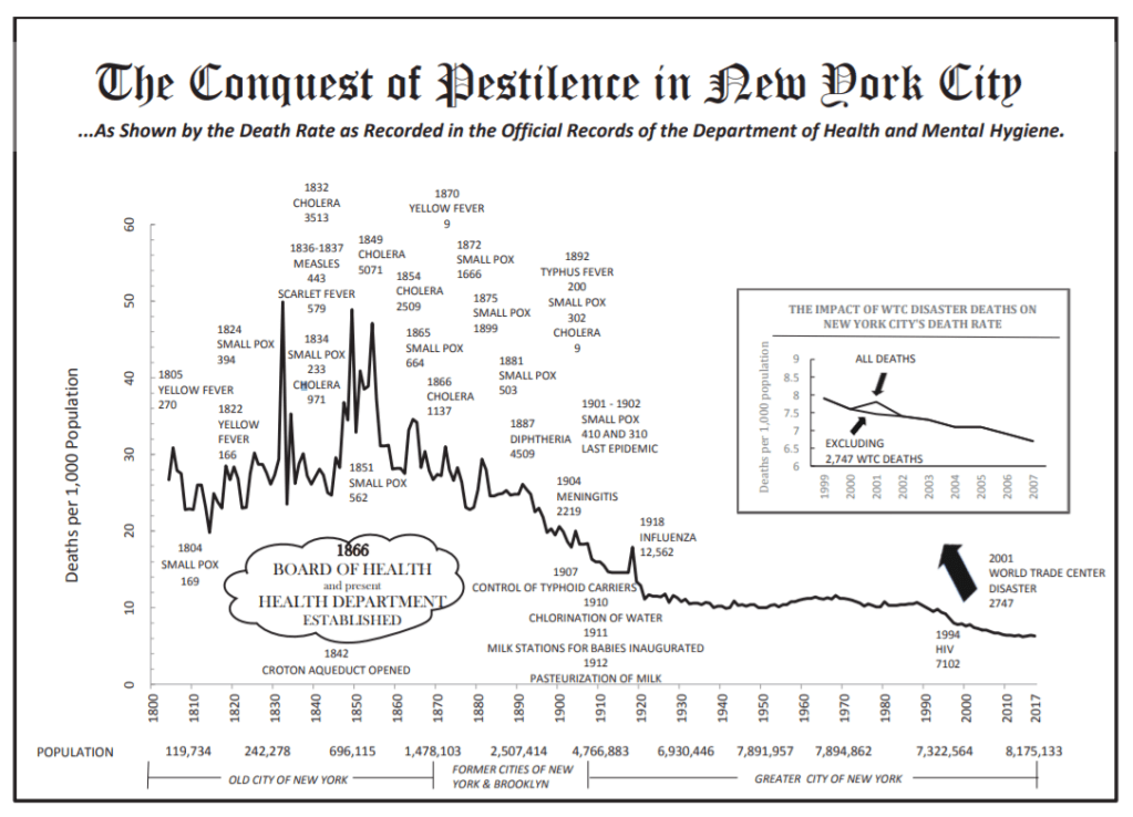
    Nicole Gelinas’ recent piece in CityLab is a good reminder that — despite all of the debates around COVID-19 and urban density — New York City is actually a really healthy place to live. Part of this obviously has to do with the city’s investments in public health. But the biggest factor, Nicole argues, is the city’s transit network. Six million people move around New York City each day without a car. That translates into a meaningfully lower traffic fatality rate. New York State’s rate is about 4.8 per 100,000, whereas Florida’s is 14.7 deaths per 100,000. Taking transit (and having an urban morphology that supports taking transit) also brings along with it other benefits, such as increased walking. And I have to believe that is an important factor. The obesity rate in New York City is thought to be about 22%, compared to a shocking 42% for the country. All of this rolls up into a life expectancy of about 81.2 years for New Yorkers, as of 2017. This is compared to 78.6 years for the US as a whole.

    For more on the health of New Yorkers, check out this 2017 Summary of Vital Statistics. (It’s the source of the above chart.)

  • Canal houses and rental barracks

    Feargus O’Sullivan’s CityLab series on European housing typologies started in London, but has since gone on to cover Berlin’s mid-rise tenements — called Mietskasernen — and Amsterdam’s canal houses. The series is exactly the sort of thing that I like to geek out about. In fact, I can see a book on this topic staring at me from my bookshelf.

    If you end up taking the time to read the articles, you’ll be reminded of a couple of things about the way cities work. One, the way we use buildings changes over time. Two, the kind of architecture we pursue is always a reflection of the socioeconomic milieu at that particular moment in time. And three, the way we perceive buildings also changes over time.

    In the case of Amsterdam’s canal houses, their original function was live/work. They were residences, but they were also warehouses. Amsterdam’s maritime dominance meant that it was more profitable to store things, instead of just house people. (Sometimes as much as half of the house was dedicated to storage.) Trade patterns had moved from the Mediterranean up to the North Atlantic, and that worked out pretty well for the Dutch in the 17th century.

    In the case of Berlin, their typical mid-rise “rental barracks” went from reviled to coveted as the buildings aged, elevators made the penthouses desirable, and people started to appreciate some of their idiosyncrasies. It’s an example of what I was getting at when I spoke to the CBC for this article about Toronto’s skyscraper boom. Some things, including buildings, take time. They need to settle in.

  • Using tweets to measure social connectedness in cities

    This recent study used geotagged tweets to measure social connectedness within American cities. There are two measures: (1) concentrated mobility and (2) equitable mobility. The first measures the extent to which social connections (geotagged tweets) are concentrated in a set of places within the city. And the second looks at the degree in which people move between neighborhoods in roughly similar proportions. These measures are the y-axis and the x-axis, respectively, in this graph:

    So how do you read this chart?

    Well if you look at New York, you’ll see that it is relatively high in concentrated mobility, but the lowest in terms of equitable mobility. This means that social connections are highly concentrated and that there’s low connectedness to other neighborhoods within the city. Miami, on the other hand, is the opposite. It’s also an outlier. Few hubs. But its social connections appear to cross neighborhoods and spread across the city.

    Perhaps not surprisingly, the study found that the size of a city seems to have the biggest impact on social connectedness. Which makes sense — it becomes harder to get around and so people start to localize. I am reminded of this whenever my friends in Los Angeles tell me they never go to the beach because it’s simply too difficult and too time consuming to get across the city.

    This also became clear to me after I started playing around with the Moves App back in 2015. The app no longer exists, but it was an activity tracker that allowed you to map where you, well, moved. And the more time you spent in one place, the more concentrated the activity would become. They depicted this through larger and larger circles. Example maps, here. My maps revealed that I need to branch out into different neighborhoods more often.

    To download a full copy of the study, click here.

    Chart: CityLab