Daily insights for city builders, delivered every morning at 6 AM ET. I’m Brandon Donnelly — a Toronto-based real estate developer and founder of Globizen. I’ve been writing here since 2013.

Tag: athiscity

  • Snowboarding, vlogs, Cape Town, and marketing

    This morning, instead of my usual routine of writing alongside a cup of coffee, I decided to finally edit all of the skiing and snowboarding footage that I took last month in Park City, Utah. Click here for the final cut.

    Compared to the video we did for Jackson Hole, I don’t like the selfie perspective as much. It doesn’t show enough of the person. This time we used the Go Pro 3-way arm, but in Jackson we used a plastic tube that I think was used for a beer funnel before that. Next year we’ll go back to that.

    Video is a lot of fun and I would love to figure out a way to incorporate more of it into this blog. But that’s a far bigger time commitment and I am not prepared to allocate resources to that. I write every day. That’s my thing.

    I am, however, not ignorant to what’s happening in the world of video blogging. And I think there are lots of opportunities for businesses who have the resources to allocate towards projects like this.

    Take for instance this vlog by New York video guy Casey Neistat. It’s probably the best piece of marketing that the Phantom 4 drone could have asked for. It’s authentic. I watched it and now I want one. Take my money. 

    (Note to city geeks: It’s worth watching just for the drone aerials of Cape Town, South Africa.)

    To my knowledge, I don’t think people are doing anything like this in the real estate business. But eventually it will happen. Because people are becoming increasingly immune to your typical marketing pieces.

  • Enhancement Zones: The mid-rise performance standard that didn’t make the cut

    I’ve written a lot about mid-rise development on this blog and elsewhere. 

    I recently wrote this post responding to a tweet by the Chief Planner of Toronto. And towards the end of last year, I wrote a longer piece for developer Urban Capital’s annual magazine. If you missed it, you should definitely download a copy. Not so much for my article, but because, overall, the UC magazines are excellent. (Credit to David Wex.)

    Today, I’d like to focus on one specific “performance standard” from Toronto’s mid-rise guidelines that I’ve been thinking about lately. But more specifically, I’d like to focus on a performance standard that was initially contemplated but never actually got adopted. 

    (I apologize in advance if this post gets a bit too geeky for some of you. It refers to a specific land use policy in Toronto, but it has much broader relevance.)

    If you take a look at the final Avenue & Mid-Rise Buildings Study and turn to page 56, you’ll see that Performance Standard #5B (Rear Transition to Neighbourhoods: Shallow Properties) was stricken from the report. It was never adopted as a standard.

    So what is this all about?

    This performance standard had to do with something called “Enhancement Zones”, which was proposed as a way to deal with shallow parcels of land on Toronto’s main avenues. You see, because of the other performance standards – namely the angular plane (see images below) – the depth of an avenue site is hugely important for determining what can ultimately be built on it.

    From the city’s perspective, this is a double edged sword. In the case of exceptionally deep lots, you can actually meet all of the performance standards while at the same time exceeding the recommended densities. But in the case of shallow lots, the performance standards sometimes/often make it so that you can’t even achieve the recommended densities. In fact, a lot of sites simply become un-developable.

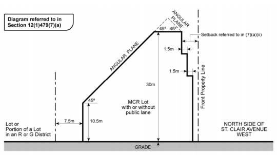
    To give you a visual for what I’m talking about, here’s a section drawing from a zoning by-law that was adopted by City Council for St. Clair Avenue West in midtown:
    image

    Here you can quickly see that if you were dealing with a shallow lot of, say, 25m in depth, you wouldn’t have much left over after taking into account the rear property line setback (7.5m above), the front property line setback, and the 45 degree angular plane. Now you’re beginning to see why I said that it is easier said than done to play creatively within the guidelines envelope (thick black line above). When you look at the feasibility of these projects, you quickly end up getting pushed right up against the glass.

    But this is where Enhancement Zones comes in. 

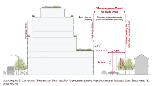
    The idea here is that an adjacent low-rise residential property (or pair of properties in the case of attached houses) could be included in mid-rise development proposals to create a deeper site that then meets the requisite separation distances between the mid-rise scale and the low-rise scale. To be clear, nothing would be built in the Enhancement Zones. They would just help to relieve some of the setback pressures from the original shallow lot and maybe even create a rear laneway system where one did not exist before.

    Below is a drawing from the Mid-Rise Buildings Study showing that new condition. The same 7.5m setback applies at the rear, but now it sits within an Enhancement Zone – formerly an adjacent and separate property. All the text is crossed out because, again, this standard was not adopted.
    image

    From a mid-rise development and feasibility standpoint, this makes a lot of sense. Sites that may have been un-developable before, now become developable. This makes it easier for us to achieve the European-scaled mid-rise vision that Toronto has for its avenues.

    But for reasons that I am sure you can guess, there are concerns with this performance standard. Probably the most obvious is that, to a certain extent, it destabilizes “neighbourhoods.” And they are intended to be completely stable entities that see little to no intensification. As soon as you allow this to happen, properties sitting in Enhancement Zones would become the prey of developers.

    However, there are counter arguments you could make. The owners of these properties would likely receive offers above market value. So maybe they end up better off. At the same time, you could also argue that the more development we unlock outside of “neighbourhoods”, the more stable they can actually remain.

    In any event, I’ve been thinking about this lately and I thought it would be interesting to debate the pros and cons of these magical-sounding Enhancement Zones. For those of you inclined to engage in geeky planning discussions, I’d love to hear from you in the comments.


  • Do you podcast?

    I have never really gotten into podcasts. 

    Sometimes I listen to The Urbanist on Monocle Radio when I’m puttering around my place, but generally speaking I don’t consume a lot of content in this format.

    Part of this might be because I don’t have a commute (commuting sucks) and I don’t drive enough that I feel the need to fill my time with stimulating things. 

    Sometimes I also find it hard to do other meaningful things at the same time. I just want to sit and listen attentively. (That probably speaks to my multitasking abilities.)

    But every now and then I feel like I should be taking more advantage of all the information embedded in podcasts.

    So below are three that I’m going to try and listen to more often and that you might also enjoy. If you know of any great podcasts, please share them in the comment section below.

    If you can’t see the embedded podcasts below, you’ll need to visit this blog post on the web.

    99% Invisible with Roman Mars

    [soundcloud url=”https://api.soundcloud.com/tracks/252094403″ params=”auto_play=false&hide_related=false&show_comments=true&show_user=true&show_reposts=false&visual=true” width=”100%” height=”450″ iframe=”true” /]

    The Urbanist on Monocle 24

    [soundcloud url=”https://api.soundcloud.com/users/25784122″ params=”auto_play=false&hide_related=false&show_comments=true&show_user=true&show_reposts=false&visual=true” width=”100%” height=”450″ iframe=”true” /]

    Unlisted with Brand Inman (Real Estate)

    [soundcloud url=”https://api.soundcloud.com/tracks/254352869″ params=”auto_play=false&hide_related=false&show_comments=true&show_user=true&show_reposts=false&visual=true” width=”100%” height=”450″ iframe=”true” /]

  • Everything you ever wanted to know about automated vehicles

    Last fall, David Ticoll (who is a research fellow at the Munk School of Global Affairs at the University of Toronto) published a thorough discussion paper called Driving Changes: Automated Vehicles in Toronto

    If you’re interested in driverless cars, and I know that a lot of you are, then it’s definitely worth a weekend read. It’s fairly long. He gets into the various automation levels, the transition period, the implications for policy makers, the benefits, and so on.

    Here’s a quick snippet on the topic of benefits:

    “This report provides bottom-up analysis based on Toronto-specific data. The result is a conservative estimate that were AVs to be at a 90% adoption rate in Toronto today, the result would be annual savings of $6 billion, or 4% of the City’s $150 billion gross
    domestic product. This includes $1.2 billion from reduced collisions, $2.7 billion out of congestion costs, $1.6 billion from insurance, and $0.5 billion from parking fees and fines. AVs will provide other quantifiable social and economic benefits that range from fewer deaths and hospitalizations thanks to lower particle emissions, to productivity gains in many business sectors.”

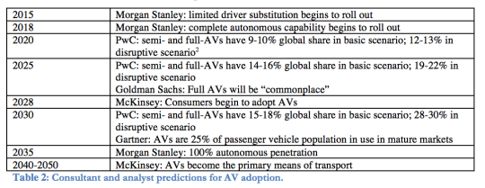
    But of course there’s the question of: when will this happen? Below is a chart from the paper that was assembled using various consultant/analyst predictions. Based on this, we’re still over a decade away from the consumer adoption of automated vehicles.

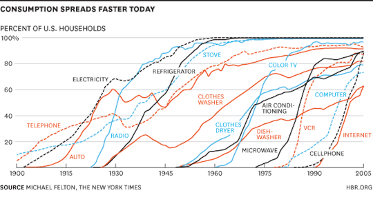
    However, these are just estimates and history has shown us that the adoption rate for new technologies has been increasing over time. Below is a chart by Michael Felton, which is also from the paper, that shows this phenomenon. Take a look at the telephone in comparison to the internet.

    Maybe I’m being overly optimistic (it wouldn’t be the first time), but consumer-facing driverless cars, at least to me, feel pretty close to the horizon.

  • Technology x Business x Design

    John Maeda – Design Partner at venture capital firm KPCB – recently
    published the second and 2016 edition of his #DesignInTech
    Report
    . I shared his first one almost exactly a year ago.

    His core thesis is that we are heading towards a world where technology,
    business, and design become closely integrated – in school, in business, and so
    on. Throughout the report he looks at the increasing impact that design and
    designers are having within the startup ecosystem.

    Here are a few verbatim bullet points:

    – Design isn’t just about beauty; it’s about market relevance and meaningful
    results.

    – 36% of the top 25 funded startups are co-founded by
    designers, up from 20% in 2015.

    – The general word “design” will come to mean less as we
    will start to qualify the specific kind of design we mean.

    – Currently design education lags the technology industry’s
    needs for data-oriented, coding enabled graduates with business acumen.

    – We must consciously invest in education to develop a
    more hybrid perspective on creativity in the 21st century:
    Technology x Business x Design.

    – President Obama’s signing of ESSA (Every Student
    Succeeds Act) into law in 2015 is a positive sign: by turning STEM into STEAM (adding Art) in K-12 education as a US priority.

    As somebody who studied design (architecture), business,
    and computer science (briefly, before switching to architecture), I probably
    have a bit of a biased view here. But to the extent that I can be objective, I
    really see this as the future. I am a big supporter of the transformation from STEM to STEAM.

    Below is a quote that Maeda uses to end his report, which I will also use to end this post:

    “Engineers are efficient problem solvers. Business people think short term. Designer want things to be elegant and beautiful. All three need to create collaboration and harmony, and honor the value each other brings. There needs to be a new kind of ‘multi-dimensional’ approach to design that is yet to be invented.” –Linda Holliday

  • A short history of redlining

    In 1933, the United States Congress created the Home Owners’ Loan Corporation (HOLC). With foreclosures rising as a result of The Great Depression, the task of the agency was to provide new low-interest mortgages to both homeowners and private mortgage lenders. Between 1993 and 1936, the agency served about one million households.

    By 1935, the parent company of the agency (the Federal Home Loan Bank Board) decided to initiate something called the “City Survey Program.” The idea was to look at local real estate trends – including the racial and ethnic composition of the country’s largest cities – in order to get a better understanding of how to manage all of these outstanding loans.

    One outcome of this program was the creation of the HOLC’s infamous “residential security maps.” (Philadelphia’s is shown at the top of this post.)

    These were maps that categorized city neighborhoods according to 4 grades. Grade A neighborhoods (green) were the best ones. They were ethnically homogenous and had room to be further developed. Grade B neighborhoods (blue) were the second-best ones. They were already completely developed, but were still considered desirable. Grade C neighborhoods (yellow) were starting to decline and showed an “infiltration of a lower grade population.” And finally, grade D neighborhoods were considered “hazardous” and colored in red. These neighborhoods had low homeownership rates, old crappy housing, and an “undesirable population”, which, at the time, largely referred to Jews and African Americans.

    Some have argued that the HOLC and their “residential security maps” are what kicked off systematic mortgage discrimination in America’s inner city neighborhoods – later referred to as “redlining.” This was the practice of denying credit to people who lived in these undesirable neighborhoods (and even to real estate developers who wanted to build in these undesirable neighborhoods).

    But University of Pennsylvania professor Amy Hillier has argued that these maps simply reflected the ethos of the time period. Using a sampling of HOLC mortgages, she found that 62% of them were issued to grade D (red) neighborhoods. The agency, itself, was not actually redlining in practice.

    Furthermore, she also looked at private mortgages issued in Philadelphia between 1937 and 1950 and found that security grade rating actually had no impact on the total number of loans issued. She did, however, discover slightly higher interest rates for properties located near and in the bottom security grades.

    All of this is to say that “redlining” is likely not the only culprit for inner city decay. There are other factors at play.

    To that end, the National Bureau of Economic Research recently published a working paper, which I discovered through CityLab, called, “Racial Sorting and the Emergence of Segregation in American Cities.” The key finding here is as follows:

    “Our preferred estimates suggest that white flight was responsible for 34 percent of the increase in segregation over the 1910s and 50 percent over the 1920s. Our analysis suggests that segregation would likely have arisen in American cities even without the presence of discriminatory institutions as a direct consequence of the widespread and decentralized relocation decisions of white urban residents.”

    In other words, it wasn’t just mortgage discrimination; it was also just general discrimination. That actually makes a lot of sense, because, if you think about it, the former couldn’t have occurred without the latter being present.

    Here’s how the research paper puts it (via CityLab):

    “Policies that reduce barriers faced by blacks in the housing market may thus not prevent or reverse segregation as long as white households have the ability and desire to avoid black neighbors.”

    (Note: Most of the information and data used in this post was sourced from the work and research of Amy Hillier.)

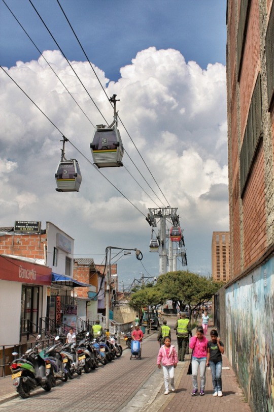
  • Medellín wins 2016 Lee Kuan Yew World City Prize

    image

    Thanks to my friend Darren Davis, I just recently learned about something called The Lee Kuan Yew World City Prize.

    Named after Singapore’s first Prime Minister, the prize is a biennial award that honors cities who have made, “outstanding achievements and contributions to the creation of liveable, vibrant and sustainable urban communities around the world.” Along with the prize comes $300,000 (Singapore Dollars), which is about $287,000 Canadian as of today.

    The 2016 Prize Laureate is Medellín, Colombia.

    Over the past two decades, the city has transformed itself from one of the most dangerous cities in the world to one that has become a model for social inclusion and urban innovation. Here is a video that talks about the transformation. It’s a bit cheesy, but it does provide a high-level overview of their urban initiatives. A lot of them will serve as a reminder about the importance of urban connectivity.

    If you’re a regular reader of this blog, you may also remember that my good friend Alex Feldman (VP at U3 Advisors) wrote a guest post about Medellín after he visited the city for the World Urban Forum almost two years ago. That post was called, What cities could learn from Medellín.

    It’s worth mentioning that the runners-up for this year’s World City Prize were Auckland, Sydney, Toronto, and Vienna. In the case of Toronto, our “far-from-ideal transit” was specifically called out as a negative. Thankfully we are now working on road pricing, which will provide additional funding for transit. 😉

    Image by Jorge Gobbi

  • Fun Friday: Saltz, Zurich

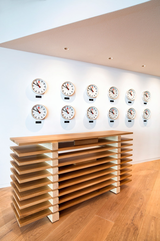
    Earlier this month a new restaurant – called Saltz – opened up in Zurich’s historic Dolder Grand Hotel. (The building was originally built in the late 19th century, but an extension was added in 2008 by architecture firm Foster + Partners.) 

    Designed by artist Rolf Sachs, the 280 square meter restaurant is fitted out with an eclectic mix of unusual materials: neon, salt, rock, climbing rope, felt, and so on. And everything is intended to relate back to Swiss culture in some way.

    The interiors caught my attention as I was browsing through the press release this morning, so I have decided to post a few photos. All of the photography is by Nico Schaerer, courtesy of The Dolder Grand and artist Rolf Sachs.

  • Thoughts on inclusionary zoning

    Ontario is looking to pass legislation that would allow municipalities in the province to implement something known as inclusionary zoning. If passed and should municipalities decide to use this tool (Toronto almost certainly would), developers would then be required and/or incentivized to include some percentage of affordable housing in their new market rate developments. 

    Politically, inclusionary zoning tends to be popular. It’s believed to be a way for governments to create new affordable housing using relatively small public subsidies. Not surprisingly though, the development industry generally hates IZ. It’s another cost that needs to be added to the development pro forma – though some municipalities rightly offset these additional costs with additional density, breaks on levies, and so on.

    What I always think about when this topic comes up is the broader economic impact of the land use policy. Because I’m suspect that it’s as simple as: mandate affordable housing; get more affordable housing for free. Generally there are always trade-offs.

    So here’s some reading material for you all this morning.

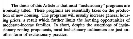
    In a classic paper (1981) by Yale Professor Robert C. Ellickson – called The Irony of Inclusionary Zoning – he argues that these practices can actually increase general house prices:

    image

    As a counterargument Owen Pickford over at The Urbanist argues that IZ simply reduces land prices as a result of the new tax. Land, after all, is the residual claimant. Therefore, he believes it’s an effective affordable housing policy. (I’m not so sure I believe that land prices would decrease in practice.)

    There’s also debate about the effectiveness of inclusionary zoning to actually deliver affordable housing at a meaningful scale. City Observatory wrote a post that looked at the total number of units produced (through IZ) across a number of American cities and the results were spotty. It should, however, be noted that not all inclusionary zoning policies are mandatory.

    Finally, the Furman Center for Real Estate & Urban Policy at New York University published a housing policy brief back in 2008 that looked at this exact topic. While they admit that the data is scarce, they come to the conclusion that IZ had no meaningful impact on the prices and production of single-family housing in San Francisco, but that IZ seems to have slightly decreased production and slightly increased pricing in the suburbs of Boston.

    What this last point suggests is that inclusionary zoning policies are not all created equal. So like all difficult questions, the answer to this one is likely: it depends. If anyone can point me to better data on inclusionary zoning, I would love to see it.

  • Toronto exploring road pricing on downtown highways

    Road pricing is on the table in Toronto. (Somebody has to fund the expensive Gardiner Expressway East rebuild.) On March 11, 2016, the City issued a Request for Proposal for: “Options for Establishment of Toll Facilities on F.G. Gardiner Expressway/Don Valley Parkway.”

    As a vocal supporter of road pricing, I am happy to see us headed in this direction. And I bet that today’s post will just be the beginning of my ruminations on this topic.

    Because naturally, it raises a lot of questions:

    Should the pricing be fixed or variable? Similar to how Uber’s surge pricing model is intended to ensure that there are always enough drivers on the road, should our road pricing model strive to eliminate traffic congestion by increasing the price of the road as demand rises beyond road capacity? I like the idea of a “congestion charge” rather than just a road toll. There’s something very efficient about it.

    Who should pay? Should anyone and everyone who uses the road pay? Or should it just be be non-Toronto residents who aren’t already paying property taxes in the city? I would imagine that this latter scenario would be easier for Toronto politicians to get behind, since there will obviously be a segment of people who flat out don’t want road tolls/pricing. But if we stick with the principle that it’s a “congestion charge”, then everyone should pay. It doesn’t matter where you live when you are demand trying to exceed the available supply of road.

    (I’m running a Twitter poll right now with this exact question. At the time of writing this post, “everyone should pay” is winning.)

    Should electric vehicles be exempt from the road tolls or congestion charges in order to help accelerate our transition away from fossil fuels? With Tesla getting ready to announce its mass market Model 3 (price $35,000), I’ve been thinking lately that the car I currently own may very well be the last gasoline car I ever own.

    It’s still early days for road pricing and our mayor doesn’t seem to be a fan. So who knows how far we’ll get with this RFP. But I for one hope that we find the courage to make the difficult decisions and that this new revenue stream is leveraged for the purpose of building more sustainable forms of urban transport in this city. 

    Let’s make a 50 year decision and not an election cycle decision.