Daily insights for city builders, delivered every morning at 6 AM ET. I’m Brandon Donnelly — a Toronto-based real estate developer and founder of Globizen. I’ve been writing here since 2013.

Search results for: “light rail”

  • How would you make this street better?

    Let’s resume looking at sidewalks and public spaces.

    If you look in the City of Toronto’s Official Plan for the stretch of Dundas Street West that runs between Dupont Street and Bloor Street West, you’ll find a map that looks like this:

    Red signifies “Mixed Use.” And so if you were to just look at this map, you might naturally assume that, in the real world, this is a continuous main street that connects The Junction neighborhood down to Bloor. But that’s not actually the case. Instead, it looks like this:

    Because of the rail corridor on the east side, it is a single-sided street. And generally speaking, these don’t make for the best retail streets. But it also has narrow sidewalks and a compromised public realm. If you go back to the map I shared yesterday, you get this:

    I don’t think 30cm is entirely accurate here, but that’s beside the point. What matters is that this is just one of many examples in the city of a discontinuous public realm. (Here’s another, undignified example, from Parkside Drive.)

    Over the years, there have been a number of design concepts proposed. Below is one by Brown + Storey Architects that was done I don’t know how many years ago. Their proposal widened the sidewalks along this stretch, and added bike lanes. They also proposed a roundabout at the intersection of Dundas, Dupont, and Annette, which is another matter that needs addressing.

    But none of this has been implemented and I don’t know of any plans to do it. When we were going through the rezoning process for Junction House, we were made aware of some transportation studies that had been done for the above intersection. But that’s about it. There wasn’t an actual ETA.

    However, now that my commute consists of walking up and down this part of Dundas, I’ve been thinking more about how it could be improved.

    I think there’s no question that the sidewalks need to be widened. It would also be helpful if there were crosswalks to facilitate getting off the south end of this exotic island:

    But equally important, I think that something should be done about the single-sided nature of the street. Given that there’s limited width, my mind immediately goes to shipping containers, or something similar, to start activating the east side of the street.

    This has already been done further south on Dundas (east of Bathurst):

    And it could work here too. Already there’s a Blondie’s Pizza anchoring the south end of this stretch (really fantastic pizza, by the way):

    But I would love to hear your ideas, as I’m currently in the market. I also don’t think that you necessarily need to be from Toronto in order to comment. Great streets are great streets. So if it were up to you, what would you change, if anything, about this part of Dundas Street West? Let me know in the comment section below.

  • Los Angeles and the automobile

    Oftentimes when I think about Los Angeles, I think about the fact that you generally have to drive everywhere. And since I have a personal preference for dense and walkable cities, this thought helps me feel slightly less envious about their perfect weather.

    Los Angeles is probably the original car city. Here is an excerpt from this excellent post by Brian Potter, where he summarizes a 1987 book by Scott Bottles called, “Los Angeles and the Automobile”:

    Los Angeles was especially quick to adopt the car. By 1920 Los Angeles had the highest per-capita rate of car ownership in the US, four times more automobiles per capita than the US average, and eight times more than the much-denser Chicago. In 1920, 9 times as many people entered downtown LA via streetcar as via automobile. By 1924, that had nearly equaled.

    And interestingly enough, people started using them, almost immediately, to create Uber-like services:

    A popular early use of the car for public transit was the jitney. Car owners would pick up passengers (often waiting at streetcar stops) and drive them to their destination for the same price as a streetcar ride (5 cents). Car owners would often simply put their destination in their windshields, and pick up anyone along the way who was headed in the same direction. Because jitney travel was much faster than streetcars, and wasn’t limited to the fixed streetcar routes, jitneys often had better service than streetcars.

    Jitney travel first appeared in Los Angeles in 1914, and by November of that year was being used for thousands of trips per day. The jitney quickly spread to other cities. By early 1915, an estimated 62,000 jitneys operated around the country in cities such as San Francisco, Seattle, Denver, and Birmingham. As jitney travel became more popular, electric rail companies found that they were losing significant ridership

    What this again underscores is just how disruptive the car was — right from the outset. It was quickly seen as being more convenient, especially in a city like Los Angeles, which wasn’t as dense as its counterparts on the east coast.

    Sadly, and as Potter suggests in his post, it is not clear that the headwinds facing public transit have changed all that much since the first jitneys started appearing on the streets of Los Angeles a century ago.

  • Houses with large yards and where you have to drive to places

    The National Association of Realtors in the US has a “Community and Transportation Preference Survey” that it conducts usually every two years. Last year (2020), wasn’t supposed to be a survey year, but given the pandemic, they decided to run it in June and see if people’s preferences had changed at all during that time.

    Last June feels like eons ago to me and I bet that if you asked people how they were feeling today it may be slightly different. Nonetheless, the survey asked 2,000 adults from the fifty-largest metro areas a bunch of questions about where and how they live and where and how they might want to live in the future.

    The topline results can be found over here. But for a bit of context, 58% of respondents were people who lived in a single-family detached house; 26% of respondents were people who lived in a building with two or more apartments and condos; and the rest of the respondents were split across townhouses, rowhouses, mobile homes, trailers, and other. (I’m kind of curious about the 2% who answered with other.)

    One of the questions that I thought might be interesting to this audience is this one here about housing preferences going forward:

    The question asks the respondents to imagine that they are moving into another home. It then asks about priorities and, more specifically, about their preferred trade-off between amenities and walkability versus a large detached house with a big yard.

    Overall the split in preferences has remained close to 50/50 over the last three surveys. But there appears to be a small uptick toward large homes and less amenities. I wouldn’t be surprised if the pandemic contributed to this thinking last summer. But who knows if this will persist. At the same time, actions speak louder than words.

    My response to the above question would be less space, greater walkability, and more amenities. I have no desire to live in a low-rise grade-related house, especially one that is disconnected from the city. I like urbanity. What about you?

  • Yvonne Farrell and Shelley McNamara receive the 2020 Pritzker Architecture Prize

    Yvonne Farrell and Shelley McNamara, co-founders of Grafton Architects, have just been named the 2020 laureates of the prestigious Pritzker Architecture Prize. They are the first recipients from Ireland. If you’d like to read the full press release, you can do that here. But here is a copy of the jury’s citation.

    Yvonne Farrell and Shelley McNamara have practiced architecture together for forty years in a way that clearly reflects the objectives of the Pritzker Prize: to recognize the art of architecture and consistent service to humanity as evidenced through a body of built work.

    Co-founding their professional practice, called Grafton Architects, in Dublin, Ireland in 1978, they have consistently and unhesitatingly pursued the highest quality of architecture for the specific location in which it was to be built, the functions it would house and especially for the people who would inhabit and use their buildings and spaces.

    They have an oeuvre that includes numerous educational buildings, housing and cultural and civic institutions. Pioneers in a field that has traditionally been and still is a male-dominated profession, they are also beacons to others as they forge their exemplary professional path.

    Many of their buildings are located in their home country of Ireland, but through competitions, they have won major commissions for other places around the world, such as Italy, France and Peru . With a profound understanding of place gained through their research, keen powers of observation, open and ever curious explorations and deep respect for culture and context, Farrell and McNamara are able to make their buildings respond to a setting and city most appropriately, while still being fresh and modern.

    This deep understanding of “spirit of place” means that their works enhance and improve the local community. Their buildings are “good neighbors” that seek to make a contribution beyond the boundaries of the building and to make a city work better. Their North King Street Housing in Dublin (2000) is one example of this: it creates an inner courtyard and a welcome respite from the adjacent busy streets.

    Their approach to architecture is always honest, revealing an understanding of the processes of design and construction from large scale structures to the smallest details . It is often in these details, especially in buildings with modest budgets, where a big impact can be felt . For example, the Urban Institute of Ireland (Dublin, 2002) employs what the architects call a “crafted skin” to create a visually interesting building through changes in materials responding to openings, folds, needs for shade and other concerns.

    At the same time, it employs common sense, good-practice environmental control methodologies for an efficient, sustainable building . On a particularly sensitive site in Dublin, the masterful Offices for the Department of Finance (2009) attests to their knowledge and care in the selection of materials and construction techniques with a carefully handcrafted bronze railing and gate and sanded limestone on the facades.

    The architects are skilled and successful working at many scales—from large institutional buildings to a house of only a little more than 100 square meters . Without grand or frivolous gestures, they have managed to create buildings that are monumental institutional presences when appropriate, but even so they are zoned and detailed in such a way as to produce more intimate spaces that create community within . In their large buildings such as the University Campus UTEC (2015) in Lima, Peru or the School of Economics Building (2008) at Universita Luigi Bocconi, they have achieved a human scale through the composition of spaces and volumes of different sizes . The dialogues they create between buildings and surroundings demonstrate a new appreciation of both their works and place.

    A constant in their approach, the architects have an understanding of how to design complex sections of buildings in such a way that views connect deep interior spaces with the larger exterior realm and allow natural light to penetrate and animate spaces deep inside a building . Often light streams from skylights or upper story windows throughout the interiors of their buildings, providing warmth and visual interest, helping the inhabitants easily orient themselves in the spaces, and providing the ever necessary connection to the exterior.

    For their integrity in their approach to both their buildings, as well as the way they conduct their practice, their belief in collaboration, their generosity towards their colleagues, especially as evidenced in such events as the 2018 Venice Biennale, their unceasing commitment to excellence in architecture, their responsible attitude toward the environment, their ability to be cosmopolitan while embracing the uniqueness of each place in which they work, for all these reasons and more, Yvonne Farrell and Shelley McNamara are awarded the 2020 Pritzker Architecture Prize.

    Photo: University Campus UTEC Lima, photo courtesy of Iwan Baan

  • Average household size in the US is now increasing

    Newly released data from the US Census Bureau has just revealed that the average household size is increasing for the first time in over 160 years. Put differently, the formation of new households has started to trail overall population growth. And that is causing the average number of people per household to increase.

    In 1790, there were about 5.79 people per household in the United States. That number has been in decline pretty much since then, though there was a slight increase in the decade that began in 1850. Last year (2018), the number grew to 2.63 people per household (2.71 for owner occupied households and 2.48 for renter occupied households).

    Here are two charts from Chris Fry’s recent piece at the Pew Research Center:

    So what is causing this?

    Well, we know that US fertility rates aren’t on the rise. In fact, they’re generally viewed as hitting record lows. I say “generally” because there are a number of different ways to measure fertility. There’s the general fertility rate, completed fertility, the total fertility rate, and others. But we are seeing some alignment here: fertility rates are down.

    One probable explanation is the fact that more Americans are living multi-generationally. According to the Pew Research Center, 1 out of every 5 Americans lived in such a household as of 2016. Part of this may be a result of immigration. Asian and hispanic populations are more likely to live in a multi-generational household compared to white people.

    Another demographic trend is the increase in people living in shared quarters, whether that might be with a roommate or someone else. This is interesting because it suggests that there’s an affordability constraint. Are people being forced to “double up?” The current co-living trend is at least partially because of this.

    These are all noteworthy trends because household formation is viewed as “the underlying driver of long-term demand for new housing.” I am assuming that more people per household also means less square footage per person.

    Graphs: Pew Research Center

  • How many people showed up to the Raptors’ championship parade? (Hint: We don’t know)

    Today was a historic day for Toronto, for Canada, and for the game of basketball in this country. The Toronto Raptors are world champions for the first time since their founding in 1995. Soak it in. Here is a photo that I took of the parade coming through the Financial District at around 2:30pm:

    Some of the estimates going around are that 1 to 2 million people attended today’s championship parade. But 2 million seems like a lot, even though today was frenetic (see above photo, again). I mean, that’s 1/3 of the population of the Greater Toronto Area.

    The fact that some of the “official” estimates also have a 1 million person spread tells me that, as of right now, we actually have no idea how many people were at today’s parade.

    So that got me thinking: How do people count crowds? And are we using drones to do it, yet? Subway and rail ridership for the day — which surely spiked — will give us some indication. But definitely not the full picture.

    It turns out that the typical approach to counting crowds is known as Jacobs’ Method. It was invented in the 1960s by a professor at UC, Berkeley, named Herbert Jacobs. He came up with the method while trying to count the number of students protesting the Vietnam War.

    The concept is simple: It’s area x density. And permutations of his method usually use this same principle. What you do is take the area filled with people, break it up into a smaller grid, and then come up with a population density estimate for each square.

    He had some rules of thumb for that. A light crowd was about 1 person per 10 square feet. And a dense crowd (such as a mosh pit or an NBA championship parade in Toronto) was about 1 person per 2.5 square feet.

    Using this method and aerial photos of today’s parade, I would imagine that we could eventually get to a more precise estimate than 1 to 2 million people. But surely somebody has figured out how to program a drone (or other UAV) and do this even more accurately.

    Crowd data is valuable information, particularly for political rallies and protests (I would imagine). If you know of a company doing this, please leave it in the comment section below. And if it doesn’t yet exist, well then, now you have a new business idea.

  • My Piece of the City

    A friend of mine just sent out a group city builder email about My Piece of the City, which is a new documentary that is screening all weekend here in Toronto at the TIFF Bell Lightbox.

    The film is a critique on the revitalization of Regent Park, told through local residents and their efforts to stage a community musical (which happened in real life).

    The Daniels Corporation, in partnership with Toronto Community Housing, is the developer and builder for the entire 69 acre community. The Daniels Foundation also funded the musical and this documentary.

    But, despite this backing, the Globe and Mail has said that it remains a “healthy critique” of this entire process. And the trailer certainly gives you that impression.

    I am sure that this documentary will be of interest to many of you, so if you would like to grab tickets for this weekend, you can do that here.

  • Manager vs. maker

    image

    I am a big believer in making things. 

    That could be writing a blog post, recording a podcast, coding an app, designing a building, making something tangible, or whatever. It is the act of creating something. And it’s one of the reasons I love what I do. At the end of the day, I have had a hand in (hopefully) creating something awesome that didn’t exist before.

    I don’t think everyone feels this way but, for me, when I don’t block time to “make things” I can sometimes feel antsy. I need time to do creative things. It makes me feel like I’m being productive. It makes me feel like I’m producing output, as opposed to just sitting in meetings and making sure everything is on track. Maybe that’s the architect in me.

    Paul Graham describes these two mindsets as that of a manager and that of a maker. And in a great essay published in 2009, he talks about how different these two people’s schedules can be. Below is a longish excerpt that I think you’ll find valuable for life and business.

    “There are two types of schedule, which I’ll call the manager’s schedule and the maker’s schedule. The manager’s schedule is for bosses. It’s embodied in the traditional appointment book, with each day cut into one hour intervals. You can block off several hours for a single task if you need to, but by default you change what you’re doing every hour.

    When you use time that way, it’s merely a practical problem to meet with someone. Find an open slot in your schedule, book them, and you’re done.

    Most powerful people are on the manager’s schedule. It’s the schedule of command. But there’s another way of using time that’s common among people who make things, like programmers and writers. They generally prefer to use time in units of half a day at least. You can’t write or program well in units of an hour. That’s barely enough time to get started.

    When you’re operating on the maker’s schedule, meetings are a disaster. A single meeting can blow a whole afternoon, by breaking it into two pieces each too small to do anything hard in. Plus you have to remember to go to the meeting. That’s no problem for someone on the manager’s schedule. There’s always something coming on the next hour; the only question is what. But when someone on the maker’s schedule has a meeting, they have to think about it.

    I find one meeting can sometimes affect a whole day. A meeting commonly blows at least half a day, by breaking up a morning or afternoon. But in addition there’s sometimes a cascading effect. If I know the afternoon is going to be broken up, I’m slightly less likely to start something ambitious in the morning. I know this may sound oversensitive, but if you’re a maker, think of your own case. Don’t your spirits rise at the thought of having an entire day free to work, with no appointments at all? Well, that means your spirits are correspondingly depressed when you don’t. And ambitious projects are by definition close to the limits of your capacity. A small decrease in morale is enough to kill them off.”

    This really resonates with me. It’s a great reminder, regardless of which schedule you’re currently on. Because even if you’re firmly ensconced in one of the two camps, chances are you work with people in the other one. And understanding where they’re coming from is important.

    Paul then goes on to talk about speculative business meetings in his essay. These are the “let’s grab coffee” meetings. They’re costly if you’re on the maker’s schedule, but they’re expected if you’re on the manager’s schedule. I have learned to cap these throughout the week. They can easily overwhelm a calendar.

    The big takeaway for me after reading Paul’s essay is that – if you make things – you have to be draconian about blocking time for that. I completely agree that even one meeting can derail an ambitious make session. So I am going to work harder at doing just that.

    Would you consider yourself to be a manager, maker, or both? I aspire to be both.

  • Come original

    I am thinking about nonconformity and originality this morning because I just ordered a book by Wharton professor Adam Grant called, Originals: How Non-Conformists Move the World. I ordered it along with another book that was recommended by a regular reader of this blog. (Thanks Daniel.)

    I find this topic fascinating because there’s clearly a deep appreciation for originality and creativity in our society and yet I think we do a lot to encourage the opposite: conformity. Of course, part of this is that it’s inherently easier to conform. Think about how much pressure we have in our lives to please others and generally just “fit in.”

    This is something that I think about and try to fight in my own life, particularly as I get older. As a teenager, I was a skateboarder with bleach blonde hair who rode around in a t-shirt that said “skateboarding is not a crime.” That’s clearly not me anymore (I prefer my natural hair color), but I continue to believe that a bit of rebelliousness can be valuable.

    For instance, I don’t think it’s a coincidence that San Francisco – the epicenter of counterculture in the 1960s – ended up becoming such a hotbed of entrepreneurship.

    To drive that point home even further, here’s a quote from a recent interview with Adam Grant:

    “It often starts with a slight recalibration in perspective followed by a small, but defiant act. It’s the originals who keep pulling on that thread — they instinctively know that that’s the difference between inspiration and innovation.”

    So there’s also a lesson here for cities. Most cities around the world believe in the value of a thriving startup ecosystem. They want entrepreneurs to start companies and create jobs. But we shouldn’t forget that starting a company is also “an expression of nonconformity.” It is someone deciding to carve out their own path in life.

    If that’s what we’re trying to encourage – and most places are – I believe we should also think about what we’re doing and not doing to encourage the right kind of nonconformity in our cities.

  • Let’s fix the UPX train, together

    I am a big fan of the UP Express train that runs from downtown Toronto to Pearson Airport. 

    I love the station architecture, the branding and identity, the trains themselves (with wifi), and the local retailers they house at Union. I also happen to live a stone’s throw away from the downtown station. So I can go from door to bum in seat within 10 minutes.

    But despite all this, it has become clear that something needs to be done to fix the UPX train. Just last weekend a friend of mine and fellow urbanist, who was visiting Toronto from Vancouver, sent me a text message saying: “This UPX train is really nice, but why is it so expensive?”

    Indeed, that seems to be the general consensus. Here is the opening paragraph from a recent Globe Editorial article:

    Toronto’s high-end airport express train is a failure. A city that urgently needs better transit has been saddled with a deluxe boutique rail service that cost $456-million to build and runs nearly empty, 19 ½ hours a day.

    So today I thought we could collectively brainstorm some ideas for how Metrolinx – the public agency that operates the train – should address this issue.

    I’ll start by sharing my thoughts as a rider and then, hopefully, you all will share yours in the comment section below. I know that there are people from Metrolinx who subscribe to this blog, so I am sure your feedback will get through to them.

    My thoughts are twofold. Like many others, I think the pricing is off. But at the same time, I think there should be a focus on enhancing the value proposition of the service.

    Bur first, let’s talk about price.

    At the time of writing this, a one-way trip from Union Station to Pearson Airport on the UPX is $27.50. If you happen to have a PRESTO card, it’s $19.

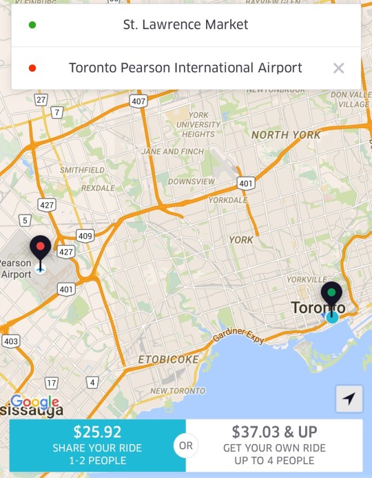
    The alternative for many is probably a taxi. So let’s also look at some Uber fare estimates. For someone like me leaving the St. Lawrence Market area, I’m looking at $25.92 with UberPOOL (meaning I’m sharing the car with 1-2 other people) or $37.03 if I insist on riding solo.

    image

    Against the non-PRESTO fare, UberPOOL is a cheaper option and it’s door-to-door service. Against the PRESTO fare, UPX is potentially $6.92 cheaper. But if you’re someone who has to take the subway to the UPX station, then it’s only $3.67 cheaper (add $3.25 for the subway) and it’s not door-to-door service. So for the vast majority of people, I suspect that UberPOOL would win out in this particular scenario.

    If you happen to be traveling with someone, then UberPOOL and UberX are probably going to be cheaper no matter how you slice it. And again, you’re getting door-to-door service. So I think the consensus is right: fares need to come down.

    But I don’t think Metrolinx should be solely focused on price. They should also be thinking about ways to create additional values for riders. 

    One of my favorite travel experiences is that of Hong Kong’s airport train. There, they have airline check-in counters in the city so you can collect your boarding pass and check your baggage up to a day before your actual flight. This is a huge value add because it means you can check out of your hotel, liberate yourself of your luggage, and spend the day in the city before leaving on the train to catch your flight. You can’t do that with an Uber. And lugging bags around a busy city, sucks.

    My point with all of this is simply that you can’t expect people to pay more or roughly the same, if they are not getting additional value. And right now, the train isn’t door-to-door and taxis are. (Though, the train has a travel time advantage during peak times.) So you either make it cheaper or you create additional value. Or, you do some combination of the two, which is where my head is at.

    What are your thoughts? Please respond in the comments below so all the feedback is public. Thanks.