Daily insights for city builders, delivered every morning at 6 AM ET. I’m Brandon Donnelly — a Toronto-based real estate developer and founder of Globizen. I’ve been writing here since 2013.

Category: Economics

  • The Florida homestead exemption

    I was at a family dinner over the weekend and the topic of the Florida homestead exemption came up. The Florida Constitution bestows a number of advantages upon homeowners (provided the home is that person’s primary residence). And like all rules, it impacts behaviors.

    For one, your primary residence is largely protected from creditors, meaning a sale generally can’t be forced in order to pay back what you might owe. If you’re out there in the world “betting the farm,” this might be a way to protect yourself.

    There are also a number of property tax benefits. You can reduce your assessed value by certain specified amounts, and any increases are (I think) capped at the lesser of 3% or the rate of inflation. (Related post: California’s Proposition 13.)

    As we’ve talked about before on the blog, this second exemption likely creates a disincentive for longtime homeowners to sell/move, as even a lateral move would result in possibly much higher taxes. So why move unless you really have to?

    The counter argument is that it helps fixed income retirees not get squeezed by rising taxes (and that’s an important consideration in Florida). But it also means that first-time/younger buyers end up shouldering more of the property tax burden — at least initially.

    If any of you have strong opinions about the Florida homestead exemption, I would be interested in hearing from you in the comment section below. I am not a lawyer or a tax expert. So please don’t consider this post as any sort of advice.

  • The re-allocation of capital (and predictions for this decade)

    I have stayed at two hotels over the last month where I did not need to interact with a human as part of the check in process. And in one of those two instances I didn’t even need to interact with a computer at the hotel.

    My room key was issued to me through an app and I used that (and Bluetooth) to open my hotel room door (after the app, of course, notified me that my room was ready).

    This is prediction #2 in Fred Wilson’s annual roundup of what is going to happen next in the world. Automation is reducing the costs associated with operating many businesses. Who is going to be the beneficiary of this consumer surplus?

    The other prediction that should interest most of you — because the impacts would be widespread — is this one here regarding climate change:

    The looming climate crisis will be to this century what the two world wars were to the previous one. It will require countries and institutions to re-allocate capital from other endeavors to fight against a warming planet. This is the decade we will begin to see this re-allocation of capital. We will see carbon taxed like the vice that it is in most countries around the world this decade, including in the US. We will see real estate values collapse in some of the most affected regions and we will see real estate values increase in regions that benefit from the warming climate. We will see massive capital investments made in protecting critical regions and infrastructure. We will see nuclear power make a resurgence around the world, particularly smaller reactors that are easier to build and safer to operate. We will see installed solar power worldwide go from ~650GW currently to over 20,000GW by the end of this decade. All of these things and many more will cause the capital markets to focus on and fund the climate issue to the detriment of many other sectors.

    For the rest of Fred’s predictions, click here. These are always great reads.

  • Cashing out home equity

    Below is an interesting chart from the WSJ showing total home equity cashed out in the United States by quarter. What is clear is that the US is nowhere near its pre-2008 peak in terms of total dollars. However, if you look at the percentage of homeowners who refinanced their home in 2018 and took out cash at a higher interest rate, it was nearly 60% of all refis. This is up in the pre-2008 territory and it’s about 3x more than the average from 2009 to 2017.

    Now, you could argue that this is a fairly rationale outcome after a long period of economic expansion and home price appreciation. And interest rates were, on average, even lower in the 2012 to 2016 period. But, the WSJ posits that this could be a signal that people simply need the cash — which is why the majority are willing to accept a higher interest rate. Here is another chart from a different WSJ article:

    Housing debt (mortgage balances) has come way down since 2008, but non-housing debt has come way up and now exceeds that of the former. Non-housing consumer debt rose by about $1 trillion in real dollars from 2013 to 2019, principally driven by student loans and car loans. Noteworthy is the fact that student loans are rising fairly linearly (along with dramatically), whereas car loans and credit card debt seem to follow the overall economy.

    When people are feeling richer (and confident about their economic prospects) they go out and buy things, like cars.

    Charts: WSJ

  • Australia lost 124,000 millionaires last year

    Global household wealth is currently estimated at about $360 trillion, according to Credit Suisse’s 2019 Global Wealth Report. This represents an increase of about $9 trillion (~2.6%) from 2018-2019.

    Over the last decade, much of this growth in household wealth has come from two countries: the United States and China. 40% of the world’s US dollar millionaires reside in the United States, and China now has the second highest number of dollar millionaires. (If there are any curious Canadians reading this, Canada represents 3% of the world’s total.)

    The number of ultra-high-net-worth individuals — individuals with a net worth greater than $50 million — exhibits a similar pecking order. The US is by far the most dominant.

    Of course, dollar millionaires represent a small percentage of the world’s total population. Credit Suisse estimates that there are about 5.1 billion adults in the world. About 56.6% have a net worth under $10,000 and about 0.9% (okay, 1%) are millionaires. This 1% controls/owns about 44% of global wealth. Thinking back to figure 7 (above), consider this math: 50% of the world’s millionaires are now in the US and China.

    Fluctuations do happen, however. Australia lost some 124,000 millionaires last year largely because of a (-6%) drop in home prices, which tends to correlate pretty closely to the real asset part of household balance sheets. Australia shed about $443 billion in household wealth since 2018, making it the biggest loser in Credit Suisse’s report.

    The other thing that you may find interesting from this report is the wealth/GDP ratio that they use. Household wealth and GDP tend to correlate. But the ratio of wealth to GDP also has a tendency to increase as a country develops. This makes sense because things like the rule of law and access to capital tend to increase people’s willingness to invest/borrow. But in developed countries, it could also be a signal for asset inflation.

    If you’d like to download a PDF of the full wealth report, click here.

    Note: Credit Suisse’s definition of household wealth is your typical net worth calculation: assets (financial assets and real assets) minus liabilities. For most people, the real asset part is principally housing.

    Charts: Credit Suisse Global Wealth Report 2019

  • A crisis of regional imbalance

    Last week’s general election in the UK was yet another example of the urban-rural divide that we are all seeing emerge around the world. Taking a look at this chart from the Centre for Towns, it’s pretty clear that the type of community someone lives in (i.e. how urban), says a lot about the way in which they probably voted. In big cities, the vote share was 49% Labour. And in villages, communities, and small towns, the vote share was about 48-58% Conservative.

    But what does this stem from? According to John Burns Murdoch of the Financial Times, the biggest predictor (for constituencies) of a swing vote over to the Conservatives during this last election was the share of the population in a blue collar job. Here is a graph from John’s article. Circles with a black outline are constituencies that changed hands last week. Note Great Grimsby, which I wrote about here, in the top right corner.

    These facts probably aren’t all that surprising to most of you. But it is an important reminder of how concentrated the new economy is becoming in big — or perhaps I should say, certain — cities. The Brookings Institution recently referred to this as “a crisis of regional imbalance.” Because it’s not just a case of urban vs. rural. Brookings found that from 2005 to 2017, more than 90% of innovation sector growth in the US could be traced back to just five metro areas. (You’ll be able to guess most of the five. Only one stood out for me.)

    This is the world we live in.

  • How coffee grew São Paulo

    For all of us who are involved in the building of cities, it is important to remember that cities emerge and thrive as a result of economic purpose. Take, for example, Sao Paulo. Once one of the poorest of Portuguese colonies, it is today the largest city in the southern hemisphere and one of the largest and most diverse urban agglomerations in the world.

    How did all of this happen? It was probably because of coffee.

    Brazil is the largest producer of coffee in the world. And it has owned this title for some 150 years. The best areas to grow coffee (as a result of climate, I’m told) are in the southeast part of the country, in and around Sao Paulo and Rio de Janeiro. The inland state of Minas Gerais is the biggest producer.

    But here’s the thing. Rio de Janeiro is along the coast and Sao Paulo is not, though as of 1869 it had been connected to the port of Santos by rail. This geographical feature made Sao Paulo a logical place for rail to converge as it made its way from the coffee plantations in the interior of the country to the coast, and then out to the rest of the world.

    Coffee was the economic purpose. And it was facilitated by Brazil’s longstanding use of slave labor.

    In 1888 that changed. Slavery was abolished, giving Brazil the dubious distinction of being the last country in the Western world to do so. The problem is that the coffee industry relied heavily on this labor. So to fill this void and keep the coffee industry happy, a deliberate effort was made to increase immigration.

    From 1870 to 2010, about 2.3 million immigrants settled in the state of Sao Paulo, many from Italy and Japan. Today, about half of the city is thought to have at least some Italian ancestry. And it is generally believed that it was this significant influx of immigrants that helped the city to industrialize in the way that it did.

    Big and diverse. And coffee probably had a lot to do with it.

    Photo by ViniLowRaw on Unsplash

  • 4 decades of inequality

    We all know the story: Much of the world is becoming increasingly less equal thanks to the new knowledge economy. Using data from the Federal Reserve Bank of New York, the NY Times (Emily Badger and Kevin Quealy) recently published this interesting piece on “4 decades of inequality” in American cities. This is what the findings look like:

    In 1980, the United States was relatively flat in terms of wage inequality (except for maybe Fairfield). In fact, inequality in a place like Binghamton, New York was about the same as in New York City. But thanks to decline in the former and growth in the latter, New York City is now a much more unequal place.

    Economic growth is usually considered a good thing, but inequality is not. Emily and Kevin rightly call attention to the fact that — according to the above charts — these two things seem to come together as one package. See New York, Chicago, San Francisco, San Jose, Washington, D.C., and so on.

    The other takeaway from these charts is the way in which inequality seems to correlate with metro area population. We know that as the population of a city increases it tends to also become more productive. And so what we are seeing here are those urban agglomeration benefits accruing to some, but not all.

    There’s a lot that can be inferred from these charts.

  • US counties with the highest per-capita income

    Below are the US counties with the highest per-capita income (as of 2018), according to this recent Bloomberg article:

    Teton, WY is home to the Jackson Hole valley (which has some of the best skiing in the world). And Pitkin, CO is home to Aspen. Turns out, rich people like ski towns.

    Interestingly enough, 2018 saw per capita income grow in the greatest number of US counties since 1981. According to the Bureau of Economic Analysis, it was 97% of all counties:

    For the full Bloomberg article, click here.

    Charts: Bloomberg

  • Uncreative and greedy

    There’s a narrative out there that all developers are uncreative and greedy, and if only they would start being more creative and generous, we could solve the housing affordability problem that is plaguing many (if not all) global cities. In other words, the solution to increasing the supply of low and middle incoming housing is simply a psychological reframing on the part of developers.

    The problem with this mental model is that it ignores reality. Development happens on the margin. The market is competitive. It’s difficult to find developable sites. And it’s a challenge to make projects work. More often than not, you have to say no as a developer. No I can’t buy this land. No I can’t build housing here. And no the market will not support new office space here. Sorry, but no. (See cost-plus pricing.)

    Development needs to give back. On the blog we usually call this city building. And that’s because it implies a greater sense of civic responsibility. Developers aren’t just building one-off buildings, they’re building a city. I believe wholeheartedly in this. But the belief that projects can be saddled with an endless array of government fees and civic contributions is a problematic one. There are limits — because markets have limits.

    If only city building were that easy.

  • Holding back the sea, in Venice, maybe

    Venice has been keeping flood records for 150 years, though it is generally understood that the city has been regularly flooding since the very beginning. It usually happens between the fall and the spring and the earliest record is believed to be from the 6th century.

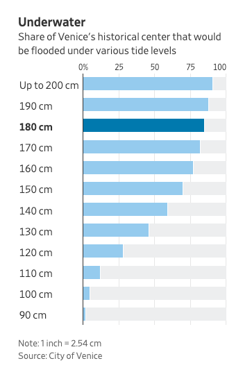
    This past week, Venice saw its acqua alta (or high water) peak at 187cm (6’2″) above its normal level. This is the second highest number on record and is just below its 1966 peak. At these numbers, about 80% of the historic center is underwater. Here is a chart from the WSJ explaining that:

    Venice has been working on a flood management project called MOSE since the 1980s. The name is an acronym, but there’s a deliberate biblical reference here. Remember when Moses parted the red sea?

    The project has been mired in engineering delays and corruption scandals, and so it’s not yet operational. If it were, it would have, in theory, protected the city this past week. 2022 is the anticipated completion date, but I don’t know if that’s realistic or not.

    The system consists of 78 mobile gates that fill with water and sit flat on the seabed when the tide is low. When a high tide is predicted, the gates are then to be pumped with air so that they rise (hinged on one side) and close off the three inlets that connect the Venetian Lagoon to the Adriatic Sea.

    As I was reading about this project and everything else that has been going on in Venice this past week, I became curious about how exactly the Dutch have been managing to hold back the sea. I mean, a big chunk of the Netherlands sits below sea level.

    If you’re also curious, here’s a video that explains how they do it.