Daily insights for city builders, delivered every morning at 6 AM ET. I’m Brandon Donnelly — a Toronto-based real estate developer and founder of Globizen. I’ve been writing here since 2013.
According to this recent Bloomberg article, the world is expected to add more than 3 billion people by 2100. At the same time, the global average fertility rate is dropping. In 1960, it was five live births per woman. As of 2017, it had dropped to 2.43.
About half of all countries are now below the rate of replacement, which means they’re relying on immigration (places like Canada) and/or they’re relying on labor productivity gains to keep their economy growing (places like China).
The article is also fascinating in that it begins to consider the economic and cultural forces that shape the above fertility rates. Women in Saudi Arabia, for example, have one of the lowest labor force participation rates in the world. Only about 25% are in the workforce.
If you’d like to read the full article, you can do that here.
The transfer of sovereignty over Hong Kong (also known as the handover) happened at midnight on July 1, 1997. At the time, Hong Kong had a population of about 6.5 million people and China had a population of about 1.23 billion people. But Hong Kong punched well above its weight class and its GDP as a percentage of mainland China’s GDP was about 18.4% (see above). In other words, Hong Kong represented about 0.53% of the population, but almost 1/5 of China’s economic output. Today, well as of 2018, this number has declined to 2.7% (again, see above). Hong Kong still possesses a number of structural benefits compared to mainland China, but its position as a global financial center is not guaranteed.
This UN report (2018) on urbanization trends is a fascinating way to understand how our world is growing and changing. So today’s post is about some of my takeaways. If you have others, feel free to add them to the comment section below.
But first, some definitions.
The UN report considers 3 ways to measure the size of a city, all of which we have used before on this blog. The first is the “city proper.” That is the current administrative boundary of a city. The second is the “urban agglomeration” area, which is a city’s contiguous built-up area. And the third is the “metropolitan area,” which is the approximate area of economic and social interconnectedness.
Above is what these 3 boundaries might look like for Toronto (which is the example they use in their report). About the only one that isn’t debatable is the “city proper” boundary; but it really doesn’t capture the full extent of a city. Wherever possible, the UN report relies on the city’s urban agglomeration area. They also define a “megacity” as a city of over 10 million people.
The largest city in the world is currently Tokyo. However, from 2018 to 2030 it is expected to decline by almost 900,000 people. Whereas, the city in 2nd position — Delhi — is expected to add more than 10 million inhabitants during this same time period. By 2030, these are expected to be the largest cities in the world:
Most current megacities are located in what the UN refers to as the “Global South.” And 9 out of the 10 cities projected to become megacities by 2030 are located in developing countries. The one exception is London. Though all regions in the world are becoming more urban, the real population growth is happening in Asia and Africa.
Most cities — 59% of cities with 500,000 or more people — are at risk of at least one natural disaster. And 3 megacities — namely Manila, Osaka, and Tokyo — are high risk for 3 or more types of natural disaster.
Going through the report’s data charts, it’s also interesting to note that Toronto is not projected to become a megacity by 2030. However, the Toronto area already represents over 20% of Canada’s entire urban population.
In the United States, Chicago’s urban agglomeration is projected to continuing growing and does come close to megacity status by 2030. The Miami region is similarly expected to grow and is actually right on top of Toronto in terms of population. But the fastest growing regions are, of course, expected to be the city’s that can more easily sprawl (Las Vegas, Phoenix, and so on).
Bogotá, Colombia is already a megacity and is expected to add almost 2 million people by 2030. It currently represents about 26.5% of the country’s entire urban population. São Paulo remains one of the top 10 largest cities in the world and is similarly projected to add over 2 million people in the same time period, but to a much larger base.
In Europe, it’s London, Paris, and Moscow, with the latter two already in possession of megacity status.
Now quantity isn’t everything. Despite not ranking in the top 10 in terms of population, both New York and London are widely considered to be the world’s preeminent global cities. At the same time, we do know that the size of a city does create certain socioeconomic benefits. Urban agglomerations create agglomeration economies.
If you’d like to download a copy of the World’s Cities in 2018 (United Nations), click here.
Applications to American business schools, including MBA programs, have fallen for five straight years according to this recent WSJ article.
Compared to last year, business school applications to US schools are down about 9.1%; whereas they have been rising in other parts of the world. If you look at the change in applications from international students, the drop is even more significant — about 13.7%.
Here are two charts from the WSJ:
There are a couple of possible explanations for this. Tech is/has been hot. I would imagine that space has been absorbing many people who would have historically gone to do an MBA.
But perhaps more significantly, stricter immigration policies are making it harder for international students to come to the US. At the same time, top tier alternatives are emerging around the world, such as in China.
China exports more business school students than any other country and they are by far the largest international student base in the US. But the numbers are coming down. At the peak in 2015, the US issued nearly 275,000 student visas to people from China. By 2017, that number had more than halved to 112,817.
Out of curiosity, I decided to look up the class profile for the most recent Rotman MBA cohort (my alma mater). 70% of the class was born outside of Canada. That’s not surprising.
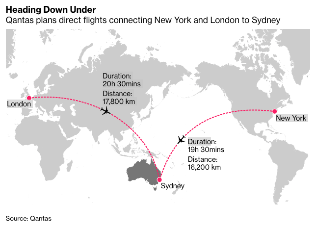
Over the weekend, Qantas Airways set a new record with a nonstop ultra long haul flight from New York to Sydney. At a distance of 16,200 kilometers and a duration of 19 and a half hours, this is now the world’s longest flight. Though, this was still a test voyage. It remains to be seen whether this will be a commercially viable route. The company also plans to offer a similar ultra long haul from London.
It’s fascinating to think about the logistics that go into a flight like this. The flight took off with its fuel tanks maxed out at 101 tons. But according to Wired, the loss factor on each additional ton of fuel is about 60% simply because of the additional weight. In other words, most of the incremental fuel to get all the way to Sydney just gets cannibalized by the heavier load. Wow. That doesn’t feel all that sustainable.
Similarly, every ten passengers roughly equates to one ton (200 pounds per person). So there’s a balancing act between reducing weight (optimizing fuel consumption) and maximizing revenue (adding lots of people). There’s also a question of how best to price discriminate across economy, premium economy, and first class.
Initially these ultra long haul flights were imagined to be flying hotels, where people could sleep, workout, and do all sorts of other things while they traveled halfway around the world. But the economics didn’t work. Too much wasted space on non-revenue generating items.
The other interesting thing about these ultra long haul flights is how much work goes into passenger comfort, specifically around our body’s natural rhythms. Angus Whitley of Bloomberg was onboard this maiden voyage and he talks about how the food they served — spiced with things like chili and lime — was designed to fire up your clock when you shouldn’t be sleeping.
And this isn’t new a feature of ultra long hauls. Qantas already employs things like hot chocolate laced with tryptophan in order to help people sleep onboard. I’m not great at sleeping on planes, generally because I don’t fit in the seats very well. But maybe it’s because I’ve been passing on the hot chocolate.
Many, or perhaps most, developers I know have a minimum project size that they will work on. That’s why you’ll hear people say, “No, that project is too small. I need at least X square feet or Y number of units.” Given that smaller scale development such as laneway housing and “the missing middle” are so in vogue today, I thought I would discuss some of the reasons why scale matters.
But first, it’s worth mentioning that “laneway suites,” as we have structured them here in Toronto, are intended to be built by individual homeowners and not by developers. The lots can’t be severed and most lots will yield less than 1,000 square feet. So this is a bit of a unique circumstance. As most of you know, I am a big supporter of this initiative.
When you get into larger developer-led projects, it’s a different ball game. For one, it’s hard to even find sites. And good luck if you need to deal with multiple owners as part of an assembly. Most landowners have pricing expectations that do not even remotely align with “missing middle” level densities.
But assuming you’ve been able to find land at a reasonable price, you still have to contend with the fact that projects have a lot of fixed costs, as well as diseconomies of scale. In other words, there are schedule, cost, and resourcing considerations that won’t change no matter how big or small you go. It’s still going to take this long and cost this much, and you’re still going to need a set of humans to manage it through.
This can then create a situation where there’s not enough margin for error. The project is simply too small to absorb any shocks, such as an unforeseen delay or an unforeseen groundwater concern that is now adding millions to your project budget. There’s a lot of risk with development and it’s prudent to have contingency room. That’s harder to do with smaller projects.
The other problem developers run into with smaller projects is that the construction subtrades also tend to think of them as smaller projects. They have their own set of fixed costs and margins to worry about. So unless you happen to catch them with an opening in their schedule, you run the risk of them telling you they’re too busy or them giving you a stinky price, which is just another way of them saying they don’t want the job.
On top of all this, there’s minimum project size inflation. If capital is not a constraint, there’s a tendency to want to do bigger projects (see above). And because the cost of everything keeps going up, it’s simultaneously getting harder and harder to make smaller projects pencil; unless you, maybe, go ultra luxury and ultra exclusive. But that’s kind of the opposite goal of this whole “missing middle” movement, is it not?
Bloomberg recently came up with a new index to define the distribution of wealth across adults in the world. They’re calling it your “net worth number” and the scale ranges from -2 to 11. Sadly, because the gap is so significant between the rich and the poor, it is based on a logarithmic or non-linear scale. Here’s how they break it down:
Logarithms of negative numbers aren’t a thing, and so, technically, if your liabilities exceed your assets (i.e. you have a negative net worth) you shouldn’t appear on this index. But Bloomberg has added those people — which could be students with debt, after all — into the -2 category of their scale. These are people with a penny to their name.
Now, the number of adults in each bracket is purely an estimate. If you look at different sources, you will end up with different numbers. Bloomberg believes that there are 2,800 adult billionaires in the world (numbers 9 to 11); whereas Credit Suisse’s estimate is about 1,600. (I wonder if it’s easier to estimate the number of billionaires or the number of -2’s.)
Still, it is eye-opening to see where most adults sit (at number 3) and how bottom heavy this index is.
Newly released data from the US Census Bureau has just revealed that the average household size is increasing for the first time in over 160 years. Put differently, the formation of new households has started to trail overall population growth. And that is causing the average number of people per household to increase.
In 1790, there were about 5.79 people per household in the United States. That number has been in decline pretty much since then, though there was a slight increase in the decade that began in 1850. Last year (2018), the number grew to 2.63 people per household (2.71 for owner occupied households and 2.48 for renter occupied households).
Here are two charts from Chris Fry’s recent piece at the Pew Research Center:
So what is causing this?
Well, we know that US fertility rates aren’t on the rise. In fact, they’re generally viewed as hitting record lows. I say “generally” because there are a number of different ways to measure fertility. There’s the general fertility rate, completed fertility, the total fertility rate, and others. But we are seeing some alignment here: fertility rates are down.
One probable explanation is the fact that more Americans are living multi-generationally. According to the Pew Research Center, 1 out of every 5 Americans lived in such a household as of 2016. Part of this may be a result of immigration. Asian and hispanic populations are more likely to live in a multi-generational household compared to white people.
Another demographic trend is the increase in people living in shared quarters, whether that might be with a roommate or someone else. This is interesting because it suggests that there’s an affordability constraint. Are people being forced to “double up?” The current co-living trend is at least partially because of this.
Lincoln Road is one of my favorite parts of Miami Beach. Supposedly the pedestrian-only street attracts some 11 million visitors a year. But I have noticed that the street has lost some of its mainstays to areas such as Wynwood. This is probably why the city and local property/business owners struck a deal this past summer to makeover the street based on a design by Field Operations.
The deal works like this: The City of Miami Beach is going to pay for the entire US$67 million makeover. This money will come from city and county taxes, as well from bonds. In return, property owners in the Lincoln Road Business Improvement District (BID) have agreed to tax themselves an additional 25% in order to pay for promoting and programming the street.
Obviously everyone believes that they will come out ahead as a result of this makeover. An improved Lincoln Road means more foot traffic, more sales, and more tax revenue. There’s also talk of expanding the boundaries of the BID, which would generate additional funds. Right now the district is bounded by Alton Road on the west and by Washington Avenue on the east.
For those of you who aren’t familiar with Business Improvement Districts, they are essentially defined areas where additional taxes are levied in order to fund projects and improvements that help overall economic development within the district. It is a structure that is used all around the world and it is one that was actually pioneered here in Toronto.
Here we call them Business Improvement Areas, and the first ever was the Bloor West Village BIA, which was established in 1970. There are now 83 BIAs in the City of Toronto. The first BID in the United States was the Downtown Development District in New Orleans. It was established in 1974. There are now over 1,200 across the U.S.
If you’d like to learn more about the improvements planned for Lincoln Road, here’s a copy of the master plan that was submitted to the City of Miami Beach’s Historic Preservation Board. The link is from The Next Miami.
I went to graduate school in the United States. After I graduated I was given, if I remember correctly, 90 days to leave the country. The US wasn’t a good place for professionals in architecture and/or real estate at that particular time, and so I did exactly that. I left the country.
Lately, I’ve been having a number of informational coffee meetings here in Toronto where I have been connecting with highly intelligent and educated people who have moved to this city in search of success. They couldn’t get a visa in the US and so they decided to, instead, move to the greatest city in the world.
These are people from Brazil to Bangladesh. These are people who are young (late 20’s), who have multiple masters degrees, who are hungry to get ahead, and who have a strong, if not perfect, command of English (or French).
I have been finding this fascinating. As I sit and drink my coffee, I can’t help but think to myself, “This is what a merit-based immigration system looks like.”