Daily insights for city builders, delivered every morning at 6 AM ET. I’m Brandon Donnelly — a Toronto-based real estate developer and founder of Globizen. I’ve been writing here since 2013.

Category: Architecture

  • Fast fashion is embracing luxury placemaking

    The future of physical retail continues to evolve.

    Recently, we spoke about LVMH’s approach of spending billions on some of the world’s most prime real estate. But the focus on human-centred destination experiences isn’t unique to the luxury segment. Case in point: Zara just opened a new flagship store in Shanghai designed by AIM Architecture (which appropriately stands for Authentic Immersive Matters).

    Located on a major commercial street, the store looks like this and can be generally described as follows:

    • Positioned on a prime open-air main street (versus an enclosed mall).
    • Large amphitheatre-style seating on the ground floor that connects the store to the street and encourages people to linger.
    • Beautiful interiors with not a lot of clothes on display — it has more of a gallery feel.

    It is a clear example of fast fashion adopting luxury placemaking and brand immersion. The point is not to bombard you with clothing options. The point is a human-centred space that gives you an opportunity to experience the Zara brand and then decide if its products might help you better define your sense of self. It’s a media channel, giving you something you can’t get online.

  • Does design and brand equity sell?

    It is a core belief of mine that design and brand equity create value in real estate. But to what extent is this true? And how much should a developer invest in these things? Is it worth spending a 3-5% licensing fee on a cool brand? Will the price premiums really be there? Here are some ways to think about it.

    One, good design can just mean good taste and, as we talked about yesterday, giving a shit. This doesn’t need to cost any more than bad design; you just have to put in the effort. This is the low-hanging fruit to be seized.

    Two, good design solves problems. And if you’re solving problems that increase returns and development yield, promote sales or leasing velocity, and/or lower operating expenses, then you have tangible value. You can start to figure out the return on your investment, and that helps with decision-making.

    Three, good design can also just mean cool and luxurious materials and details. Here, you’ve got the highest cost of our three options, but it may be important in order to differentiate your offering, drive scarcity value, and create prestige. This one can be harder to evaluate quantitatively.

    All of these approaches ultimately intertwine with the overall brand of a project and of the developer, and that’s the next piece for us to discuss.

    The concept of brand equity has always been fascinating to me because on some level, it’s simply the premium people are willing to pay “for a name” because of the perception they have of that name. It is, by one definition, the “sum of consumers’ thoughts, feelings, and attitudes about your brand that influences their willingness to pay for your product.”

    The challenge with brand equity is that it takes a long time to build, which is one of the reasons developers often borrow it (i.e., license it) from established consumer-facing brands to use on their projects. The other reason is that real estate tends to be local and slow-moving, so it’s objectively difficult to build a global brand.

    Design and brand work together. If you’re developing an Aman Residence, the brand will dictate its standards so you don’t negatively impact the equity it has built up over time. But now we get back to our original question: To what extent does it make sense to invest in design and brand?

    In economics, the definition of a luxury good or superior good is that demand increases more than proportionally as incomes rise. What this effectively means is that when times are good and people are feeling wealthy, they tend to overspend on luxury goods. And when times are not so good, they will often underspend on luxury goods and focus on normal or necessary goods.

    What this means for real estate is that there is an opportunity to capture additional value through investments in design and brand when the overall market supports it. But during downturns, this pricing premium may feel like it disappears. Still, prudent investments in design and brand can lead to selling or leasing when the rest of the market isn’t. Your investments bought liquidity.

    When Steve Jobs launched the original NeXT computer, he overshot the market by a wide margin, and it was a commercial failure. And when he launched the iPhone, critics similarly said it was too expensive. Apple ended up having to lower its initial pricing slightly, but the product turned out to be exactly what consumers wanted.

    Finding the right sweet spot depends on local market conditions and the point you’re at in the development cycle. This involves as much art as it does science. But perhaps the above framework can start to help you think through the options.

  • How Tokyo fits 11 homes on 1,600 square feet

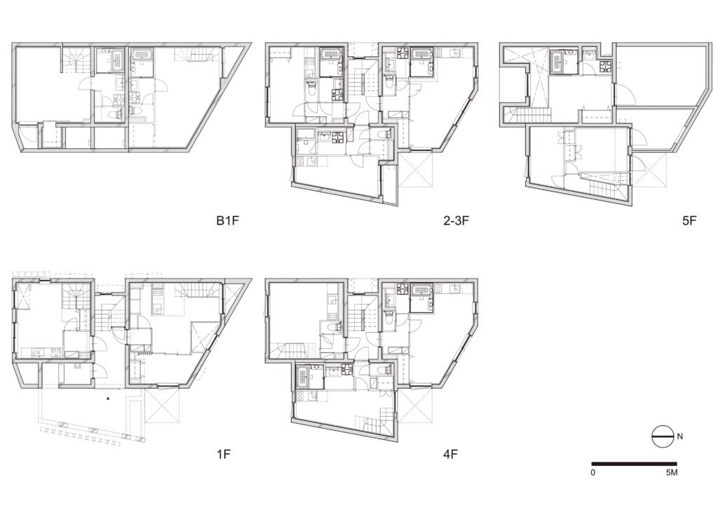
    Last week, Globizen shared this 11-unit condominium project in Tokyo on Instagram. Some of you may like the design by Ryuichi Sasaki Architecture, and some of you may not. But regardless, it’s an interesting case study in that the site area is only 152.27 square metres (or 1,639 square feet). The building footprint is 84.86 square metres and the total floor area is 416.68 square metres. If we divide the total area by 11 units, we get an average area per home of only 37.88 square metres, and so these are certainly on the compact side. Here are the floor plans:

    The unit composition is as follows:

    • Ground and basement: 2 x 2-storey homes
    • Levels 2-3: 6 x single-storey homes
    • Levels 4-5: 3 homes, 2 of which are 2-storey homes

    The other thing you’ll notice is that there’s a single access stair in the middle of the building. As compact as the homes may be, it is this point-access-block design that unlocks the site. To put the site area into perspective, it is almost certainly smaller than the average single-family lot in the central parts of Toronto. A 20′ x 100′ lot is 2,000 square feet, versus the 1,639 square feet we have here (though the proportions are different).

    I’m not suggesting that 37.88-square-metre homes are the objective; rather, I’m suggesting that reducing the barriers to developing small infill sites will unlock new housing opportunities that can then be tailored to the needs of the market. Had two egress stairs been required for this building, it would look very different, and may not have ever been built.


    Floor plans from Ryuichi Sasaki Architecture

  • The 2026 Governor General Medals in Architecture

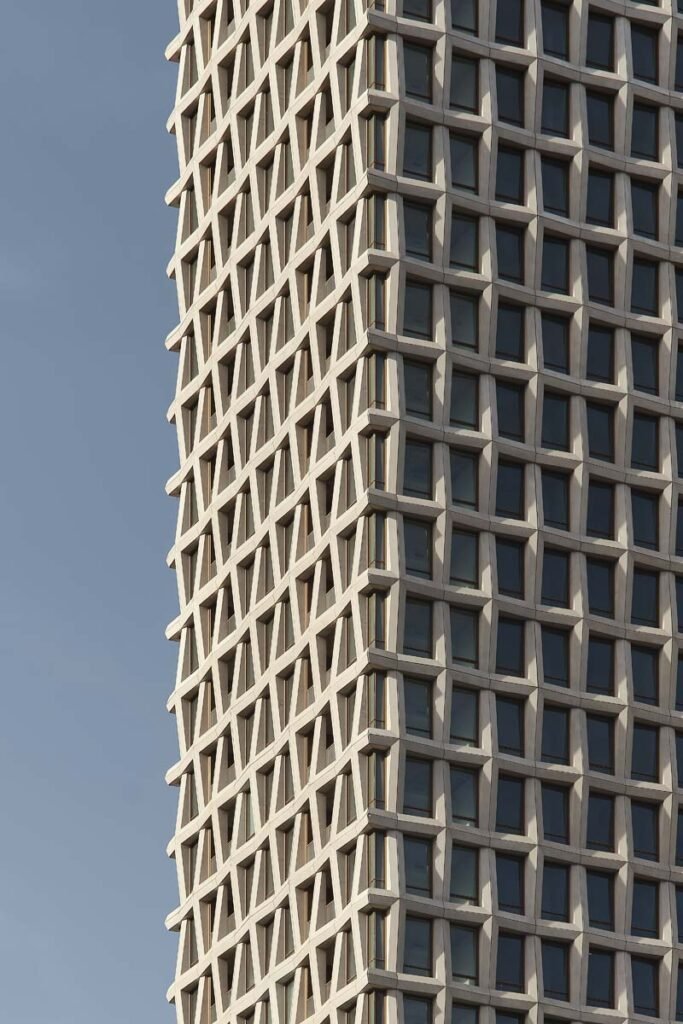
    I was in Montréal at the start of this year for work and I stayed at the Moxy Downtown. (I will, by the way, use any excuse to find my way to Montréal.) As I walked over to the hotel from the train station, I remember thinking to myself, “Wow, this is a beautiful tower.” It has a nice slenderness ratio and the entire precast facade has been designed to look like an intricate woven pattern.

    Well, it turns out, I’m not alone in my appreciation of 900 Saint-Jacques. The Royal Architectural Institute of Canada and the Canada Council for the Arts have just revealed the winners of the 2026 Governor General’s Medals in Architecture (which are given to exceptional projects recently completed by Canadian architects) and it’s on the list.

    Designed by Chevalier Morales architectes and Brian Elsden Burrows Architecte – Le Groupe Architex, the project is worth checking out if you aren’t familiar. Not just because of its beautiful facade, but because of its urban contributions to the Quartier des Gares. The jury called the site “prominent but hostile.”

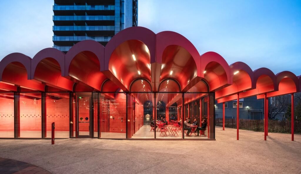
    Also on the list are two projects by Toronto-based gh3*, who some of you might recall are the architects behind our Project Bench. One is Windermere Fire Station and the other is O’Day-Min Pavilion, both of which are in Edmonton and are exceptional.

    I could keep talking about more of the projects, but I’ll end by saying that this is the first time I’m learning about Kìwekì Point in Ottawa (designed by Patkau Architects and Janet Rosenberg & Studio — the landscape firm behind One Delisle). This is reason enough to book a trip to Ottawa.

    Congratulations to all of the winners. For the full list of projects, click here.


    Photography: 900 Saint-Jacques by Maxime Brouillet; O’Day-Min Pavilion by Raymond Chow

  • What does Toronto want to be?

    So, what bold and uncomfortable 21st-century master plan should Toronto adopt? I don’t know exactly, but what I was getting at in my lead-up post is that it’s hard not to sometimes feel like Toronto is trying to run a 21st-century global city on a 19th-century Victorian street grid, surrounded by Houston.

    In the core of the city, we have narrow, generally 20-metre rights-of-way. Many of these east-west arteries are beautiful streets to walk on with fine-grained retail patterns, but the streets themselves have slow-moving streetcars in the middle two lanes and on-street parking on both sides. The result is streets that don’t move and are frustrating to navigate for all users: drivers, transit riders, and cyclists. It can take an hour to drive 10 km.

    Other major streets don’t have streetcars or much retail activity, but the land-use pattern reflects a bygone era. It doesn’t make sense to have only single-family housing on Toronto’s busiest arteries. It’s time for these streets to grow up. (To be fair, the City of Toronto is trying to achieve this with its new Major Streets policies, but the development economics do not make these changes feasible at scale.)

    As you move out of the core, Toronto’s major streets naturally widen along with the recency in which they were built. Now we have the opposite problem where we’re faced with “stroads” with little to no urbanity. Overall, it’s the result of a city that grew organically over time without the same kind of defined plan seen in cities like New York, Barcelona, and Paris (after it had already been built out).

    Here’s the thing: Toronto’s low-rise single-family era is over. Virtually the only single-family housing that gets built nowadays is when somebody demolishes an existing house and builds anew. The future is a uniformly higher-density city built on the backbone of robust transit, vehicular, and cycling networks; not a monocentric downtown that people commute to.

    So what might that mean exactly?

    To start, I believe it means getting our transit vehicles onto their own dedicated lanes, widening certain major streets (for the benefit of cars), shrinking and pedestrianizing others (for the benefit of human-scaled urbanism), carving through new major streets to fix connectivity gaps, and pricing congestion as a means of funding constant transit expansion. My fellow urbanists may not want to hear me advocate for the selective widening and creation of arterial roads, but we have to stop pretending that cars are going to disappear.

    Once the bones are in place, it’s then a matter of getting the land-use policies right and letting the private sector do what it does best — build for the future. Now, I don’t profess to know the exact combination of major street widths, one-way patterns, and whatever else should be done, but I do feel strongly that it’s time for a bold and uncomfortable 21st-century master plan for Toronto.

    What does Toronto want to be? We should host an international design competition and find out.


    Cover photo by Oles Borys

  • Toronto needs a bold and uncomfortable 21st-century master plan

    Earlier this week, I tweeted that Toronto needs a Haussmann moment where we make some bold and uncomfortable changes in order to set ourselves up to be a dominant 21st-century global city. I mentioned Haussmann because his work is perhaps the most notable, but that is just one example.

    In addition to Haussmann’s renovation of Paris (1853-1870), I was also thinking about the Commissioners’ Plan for New York City (1811), and Ildefons Cerdà’s grid system of octagonal blocks for Barcelona (1859), as well as some more contemporary examples.

    In recent years, Barcelona has revisited its grid system and pioneered a new set of “superblocks” that focus traffic along the periphery and create pedestrian-focused spaces on their interior.

    The common thread among these examples is that they all represent a grand master plan. In the case of Barcelona and New York, it was a plan that served to guide development as the city grew. And in the case of Paris, it was a destructive plan that went back and redid what was deemed to have not been working. (In thinking about this now, it’s probably best that I used Haussmann as the example in my tweet).

    Toronto has never had such a plan. We flirted with the City Beautiful movement at the beginning of the 20th century — a movement intent on beautifying and introducing monumental grandeur to our cities — but, not surprisingly, we ultimately saw it as a superfluous and frivolous spending exercise.

    Instead, Toronto has grown incrementally, becoming what I see as an accidental global city. We are no longer the ultra-conservative, deeply Protestant city that we once were, but at the same time, it’s hard not to feel like we have a grid and public realm that doesn’t reflect the city we have become today.

    Toronto needs a bold master plan. And over the coming weeks, I’ll put some of my ideas to paper. In the meantime, if you have any of your own, please feel free to share them in the comment section below.

  • Cité Radieuse, Duplex Type E

    Le Corbusier’s Cité Radieuse in Marseille is, as I have mentioned before, one of the most important and influential multi-family buildings of the 20th century. As an architecture student, this is one of those buildings that you get indoctrinated with, so I was excited to visit it for the first time with Neat B in 2022 on what was our second visit to Marseille. We’re big fans of the city. Here is the post I wrote following that visit.

    Today, let’s look at one of the actual suites, which is currently listed for sale through Architecture de Collection. But first, a reminder: The complex was originally constructed between 1948-1952 and was meant to serve as a new housing model for post-war France. In 2016, the building was designated a UNESCO World Heritage Site and, today, you’ll sometimes find things like a Chanel fashion show taking place on its rooftop.

    The suite that is for sale is Type E, which is about 100 m2. It has 3 bedrooms and 2 bathrooms. A balcony. And a view of the Mediterranean. It is listed for 650 000 €, which works out 6,500 € per square meter. For Toronto readers, this is right now the equivalent of C$965,485 or about C$897 per square foot. The monthly copropriété charge is about 300 € and the annual property taxes are about 2000 €.

    Does this seem reasonable or expensive to you?

    For more info, click here.

    Photo by Louis Charron on Unsplash

  • Opinionated design

    This is a longstanding joke / criticism among nerds:

    Namely, it is the fact that the charging port for Apple’s Magic Mouse is on its bottom, meaning, when it’s being charged, you can’t use it. This would be annoying if you ignored the low battery warnings and let it die in the middle of working on something critically important. And so lots of people think it’s a ridiculous design. But is it? Here’s an excerpt from a recent post by John Gruber of Daring Fireball:

    Yes, with the charging port on the mouse’s belly, you cannot use it while it charges. There are obvious downsides to that. But those positing the Magic Mouse as absurd act as though Apple doesn’t know this. Of course Apple knows this. Apple obviously just sees this as a trade-off worth making. Apple wants the mouse to be visually symmetric, and they want the top surface to slope all the way down to the desk or table top it rests upon. You can’t achieve that with an exposed port.

    This is an argument that feels right. Apple is not the kind of company that makes arbitrary design decisions. And the deliberate decision they have made is that a more perfect design is more important than solving for the few instances where a user was negligent and forgot to charge their mouse. Gruber goes on to say, the “charging port placement is an opinionated design, not an absurd design.”

    But this then raises another question: Is opinionated design the right approach?

    For well over a century, one of the maxims of good design has been that form should follow function. In other words, the shape and design of an object should relate to its intended use. And so, in this instance, if “function” involves using the mouse while it’s being charged then maybe, by this criteria, it isn’t a good design. Then again, it is a wireless mouse. Maybe Apple doesn’t want you to use it while it’s charging.

    Let’s consider another design object that you touch with your hand: Walter Gropius’ famous door handle.

    Originally designed in 1922, the simple design consisted of a square bar and a cylinder. And its job was to communicate to you that, in order to use it, you should grab the cylindrical part, and not anywhere else. So on this level, the design was responding to its intended use, to our hands. Grab here. But is this truly an example of form following function? It’s debatable.

    Architect and professor Witold Rybczynski, who I would say generally isn’t a fan of modernism, has argued that it’s not. His critique of the overall Bauhaus movement — of which Gropius was the founder — was that it was actually a design school dedicated to “form follows predetermined aesthetics rather than form follows function.”

    In some ways, he’s right. You can tell when something came out of the Bauhaus, just as you can tell when something is from Apple. There’s a particular aesthetic and stubbornness to maintaining it. That’s why the Magic Mouse can’t be charged while in use and why Apple, equally famously, clung to the simplicity of a single-button mouse. Two just didn’t look as nice.

    But I see this as an honorable quality. Having an opinion is better than not having one. And there are lots of objects out there without one.

  • Social friction

    Vishaan Chakrabarti is an architect based in New York City. He is the founder of Practice for Architecture and Urbanism (PAU) and the author of two books.

    His first book, published in 2013, was A Country of Cities: A Manifesto for an Urban America. And as the title suggests, it was about the virtues of dense urban agglomerations. You know, the kind of cities that I like and have good bike lanes.

    His second book, which just came out, is called The Architecture of Urbanity: Designing for Nature, Culture, and Joy. In this one, he talks about the role of architecture and urbanism in fighting both climate change and social division.

    Below is an excerpt from a recent interview in Bloomberg where he discusses the book’s theme of “social friction.” This snippet is also a timely follow-up to yesterday’s post about autonomous vehicles:

    Cars are problematic when it comes to connective design. It doesn’t matter if they’re electric because the problem with a car is it’s a divider. It’s a metal bubble and it keeps you from interacting with your neighbors. So the virtues of mass transit, public parks and well-designed buildings in cities are not just that they are good for the climate. They are also good for this sense of social coherence. If we’re going to live up to our promise as a country — a multicultural democracy — we need to have spaces that both reflect and perpetuate that.

    I haven’t read the book yet, but it sounds like it’s in the wheelhouse of this blog. If you’d like to, here’s a link.

  • Map of every development project in Paris

    It is surprisingly difficult to find good real estate and development information about a market that you’re not familiar with. So I was pretty excited when I came across this map of every development project in Grand Paris (Greater Paris) created by Arthur Weidmann.

    It’s in Google My Maps and what he has done is pin every project according to status: under construction, under renovation, approved, proposed, and recently delivered. For each pin, you’ll also find information like the expected completion date, the use(s), the area, the architect(s), and photos. It is unbelievably detailed and, according to Google, it was last updated 8 hours ago.

    Here’s the full map with all statuses shown:

    And here’s what it looks like if you filter by only projects under construction:

    It’s interesting, but not surprising, to note that the majority of construction projects seem to be taking place outside the boundaries of Paris proper. However, if you alternate to projects under renovation, it more or less flips, with most of the projects being within Paris:

    This tells you something about the city.

    Sometimes when I’m looking at or for information like this, I think to myself that I must be in the minority of people who are interested in tracking development projects with this level of detail. So I find it interesting that this map has been viewed nearly 300,000 times. Clearly, I’m not actually alone.