Daily insights for city builders, delivered every morning at 6 AM ET. I’m Brandon Donnelly — a Toronto-based real estate developer and founder of Globizen. I’ve been writing here since 2013.

Author: Brandon Donnelly

  • Construction is about to begin on the new Tour Montparnasse

    March 5, 2026 · View original


    At the end of this month, the last tenants will vacate the Tour Montparnasse in Paris to make way for its renovation. Nouvelle AOM, a collective of architects formed to respond to the project’s international design competition, first won the commission back in 2017. And initially, the plan was to complete the renovation in time for the Paris Olympics in 2024.

    But that time came and went, as it does, and now construction is starting this year. Nouvelle AOM, which includes Franklin Azzi Architecture, ChartierDalix Architectes, and Hardel Le Bihan Architectes, is in charge of the tower. And Renzo Piano Building Workshop is in charge of redesigning the commercial podium at the tower’s base.

    We’ve spoken about the Tour Montparnasse many times over the years on the blog (here, here, and here). Parisians customarily hate it, and after visiting it in 2023, I can confirm that it’s desperately in need of a renovation, and that the ground plane experience is abysmal at best. It is of that era where grandiose “slab-based planning” was going to elevate us beyond the pathologies of fine-grained urbanism.

    Here’s a Google image from atop the site’s enormous podium:

    What’s interesting about the design from Renzo Piano is that it will reuse a lot of the structure that’s already in place. The plan is to carefully open up the site, stitch it back together with the surrounding urban context, and then build up from there. Importantly, at the centre of the project will be a large, planted piazza that is intended to become a new civic space for the community.

    The project renovations are expected to last until “at least 2030.” So, we have several years until we’ll know if it’s an urban and financial success. But my prediction is that this project will positively transform how Parisians think about the Tour Montparnasse, and maybe how they think about tall buildings.

    The tower itself will, of course, need to be beautiful. It’s a highly visible object. There’s only a trifecta of buildings and structures inside Paris proper that exceed 150 meters in height: the Eiffel Tower, Tour Montparnasse, and the Tour Triangle (Herzog & de Meuron), which is currently under construction and expected to finish this year. In this case, architecture is not irrelevant.

    But it is the ground plane experience that will ultimately revitalize the area and demonstrate that tall buildings can be good urban neighbours, even in a sea of Haussmannian mid-rise buildings. I’ve said before that the reconfiguration of the podium is arguably the project’s most crucial design move.

    Get it right and you’ll see what happens.


    Cover photo by Luxigon via Nouvelle AOM

    Aerial and street view photos from Google

    Model photos from Renzo Piano Building Workshop
  • Parkview Mountain House featured in Monocle

    March 4, 2026 · View original


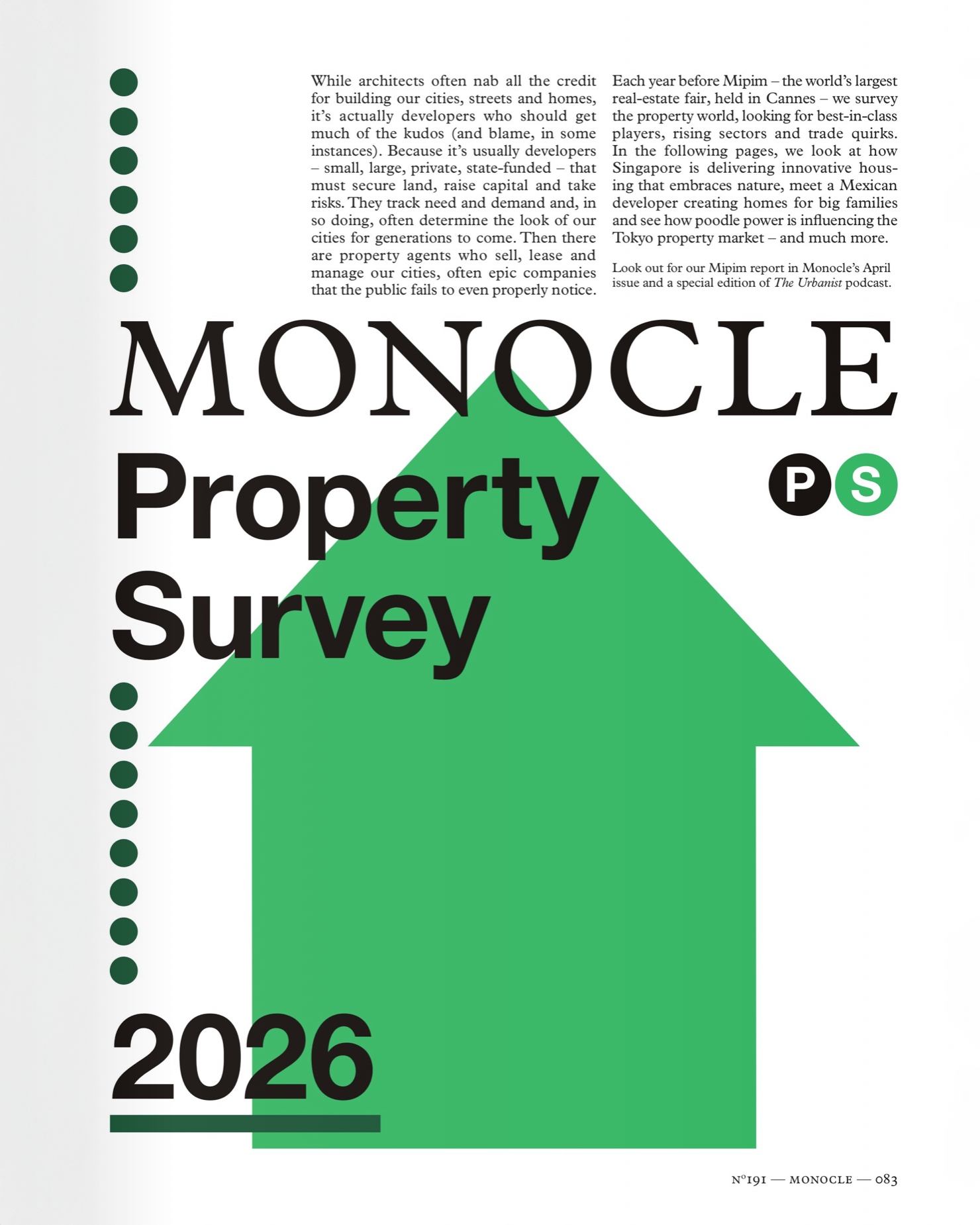
    The March issue of Monocle just dropped, debuting a new format called the Monocle 100. It’s a list of the people, places, and things worth knowing about. And in the middle of it is something called the Monocle Property Survey, which was deliberately timed to coincide with MIPIM, the massive real estate conference that takes place every March in Cannes.

    As a quick aside, our team contemplated going to MIPIM this year in search of both friends and money, but then we thought to ourselves: Why bother going to the South of France when we have Toronto in the middle of March to enjoy?

    The first thing the Property Survey does is give a rare nod to developers: While architects often nab all the credit for building our cities, streets and homes, it’s actually developers who should get much of the kudos (and blame, in some instances). Because it’s usually developers — small, large, private, state-funded — that must secure land, raise capital and take risks.” It almost feels weird hearing somebody say something positive about our kind.

    But even better, the survey includes a full page on our unique creative residency program at Parkview Mountain House (Park City, Utah):

    A big thanks to the Monocle team for the feature. If you’re in Toronto and would like to pickup a copy of this month’s issue, visit their shop in Little Italy at 776 College Street. And if you’d like to learn more about PMH, including our creative residency program, visit pmhpc.com.

  • Fewer stops, faster transit

    March 3, 2026 · View original


    “The problem with buses,” writes transportation planner Nithin Vejendla in Work in Progress, “is that they are slow.” The same thing could also be said about other surface transit routes like Toronto’s streetcars, including some of our new lines. Now, there are lots of ways to speed up surface routes. Dedicated lanes and signal priority are two obvious ones. But an even simpler one is to just get rid of some stops!

    North American cities tend to be plagued by too many transit stops. I think we do it because more stops sounds better than fewer stops. It creates the illusion of servicing more people. But too many stops can make routes painfully slow, by increasing dwell times. According to Nithin, buses in the US spend about 20% of their time just stopping and then starting again. Obviously the more stops you have, the worse this downtime gets.

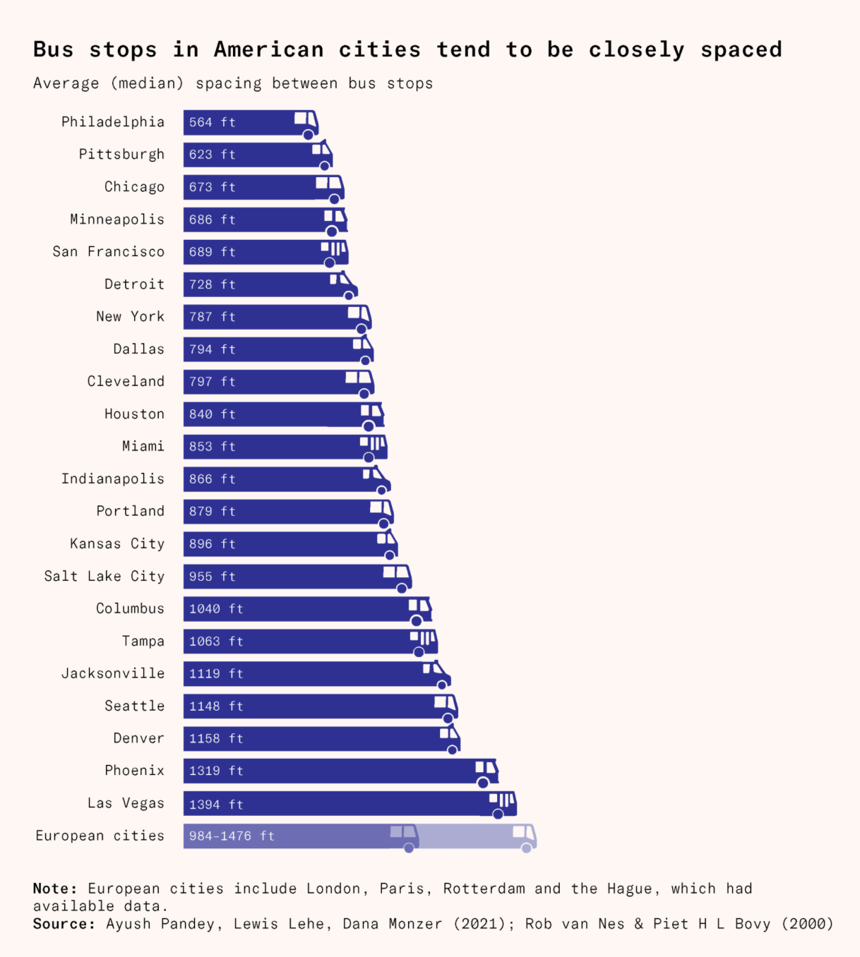
    Here’s the average spacing between bus stops for various US cities taken from the above article:

    If I convert some of these numbers into the system of measurement used by the rest of the planet, you’ll find the following average stop spacings:

    – 172 m in Philadelphia – 205 m in Chicago – 210 m in San Francisco – 240 m in New York – 260 m in Miami – 350 m in Seattle – 425 m in Las Vegas

    European cities tend to have wider stop spacing, somewhere closer to 300–450 m. And as a further point of comparison, AI tells me that the current average streetcar stop spacing in Toronto is about 250 m, but that the official target for both streetcars and local buses is between 300–400 m. This is better. 400 m is a 5-minute walk. And if you’re on the transit corridor, it means you’ll never have to walk more than 200 m, or 2-3 minutes, to the next stop.

    Consolidating stops has been shown not to have a meaningful impact on coverage area, but the benefits are significant. To give just one example, Los Angeles saw its operating speeds increase by 29% and its ridership grow by 33% on the Wilshire/Whittier Metro Rapid corridor by doing exactly this. So, if you’re looking for a way to speed up your surface routes, one starting point would be to just do less.


    Cover photo by Renato on Unsplash

  • Are AVs about to disrupt the disruptor?

    March 2, 2026 · View original


    It seems like just yesterday that people were protesting Uber for disrupting the traditional taxi business. Now the question has become: are AVs about to disrupt Uber?

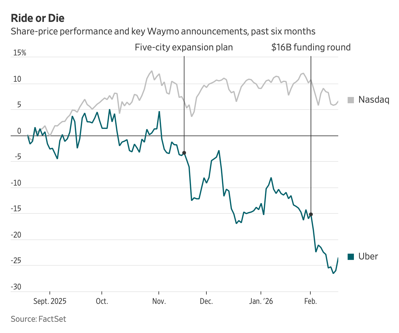
    Over the last six months, Uber’s stock price has declined nearly 19%. At the time of writing this post, its market cap is around $155 billion, compared to Waymo’s private market valuation of $126 billion (though I’m sure many would argue this is a wee bit high).

    The market seems to think that self-driving cars are a two-horse race between Waymo and Tesla. If this is true, what role will Uber play?

    Uber has naturally tried to assuage concerns. Alongside their Q4 2025 earnings, they published a 13-page “spotlight” on AVs, where they argued, don’t worry, everything is fine:

    > AVs will change how trips are supplied, but not how demand is aggregated. History suggests that over time as supply fragments and technology commoditizes, the platform that can bring the highest utilization to assets, and superior reliability to customers, will capture a large share of value. That is the role Uber is set up to play.

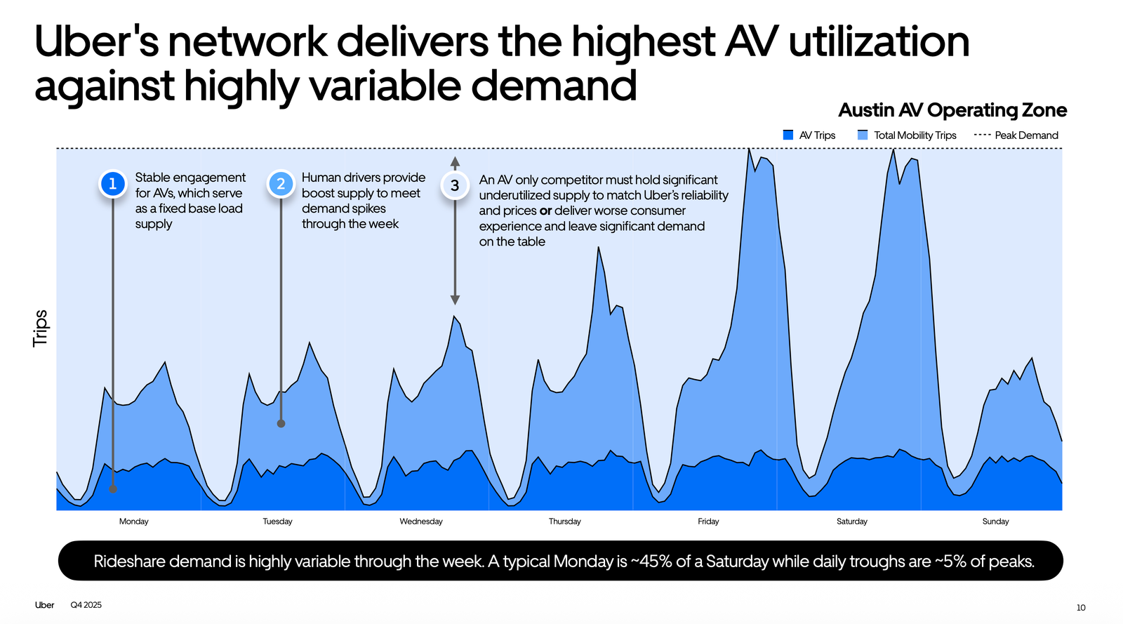
    One of the arguments for this is that rideshare demand is highly variable throughout a week. A typical Monday can be less than half of a Saturday night, and daily troughs can decline to something like 5% of peaks.

    So, if you try and service this demand variability with only AVs, you’re going to have a lot of underutilized vehicles during off-peak times. This makes sense to me right now, but I’m not certain it will persist or always matter as the space evolves.

    When Uber sold its AV division in 2020, I understood why (to try and reach profitability), but it always felt a little unsettling to me. AVs were very clearly the future — are you sure you want to sell this off?

    Now I suspect they’ll have to re-enter in a meaningful way. They’re going to need to do it as long as the market continues to believe the current narrative.

    I use Uber on a regular basis, but I already have the Waymo app on my phone (I downloaded it on a long layover in SFO where I contemplated a joy ride). As soon as rides become available in Toronto at reasonable prices, I wouldn’t think twice about switching.


    Cover photo by clement proust on Unsplash

    Stock graph from the WSJ

    Demand chart from Uber Q4 2025 Earnings — Autonomous Vehicles Spotlight

  • The case for elevated rail

    March 1, 2026 · View original


    There is a school of thought that elevated rail is bad, or at least suboptimal, for cities. The thinking is that it’s a visual blight, it’s noisy, it disconnects neighbourhoods, and it can even reduce surrounding real estate values. Having a train passing directly in front of your window is admittedly less ideal than not having a train passing directly in front of your window.

    But there is no shortage of examples from around the world where elevated rail does far more to benefit a community than detract from it. Tokyo is perhaps the obvious place to look. It is decidedly rail-oriented city with the majority of its network above ground and countless examples of active commercial spaces being tucked under and adjacent to elevated rail.

    Here, for example, is a restaurant that I visited on my last trip and that was immediately adjacent to a track:

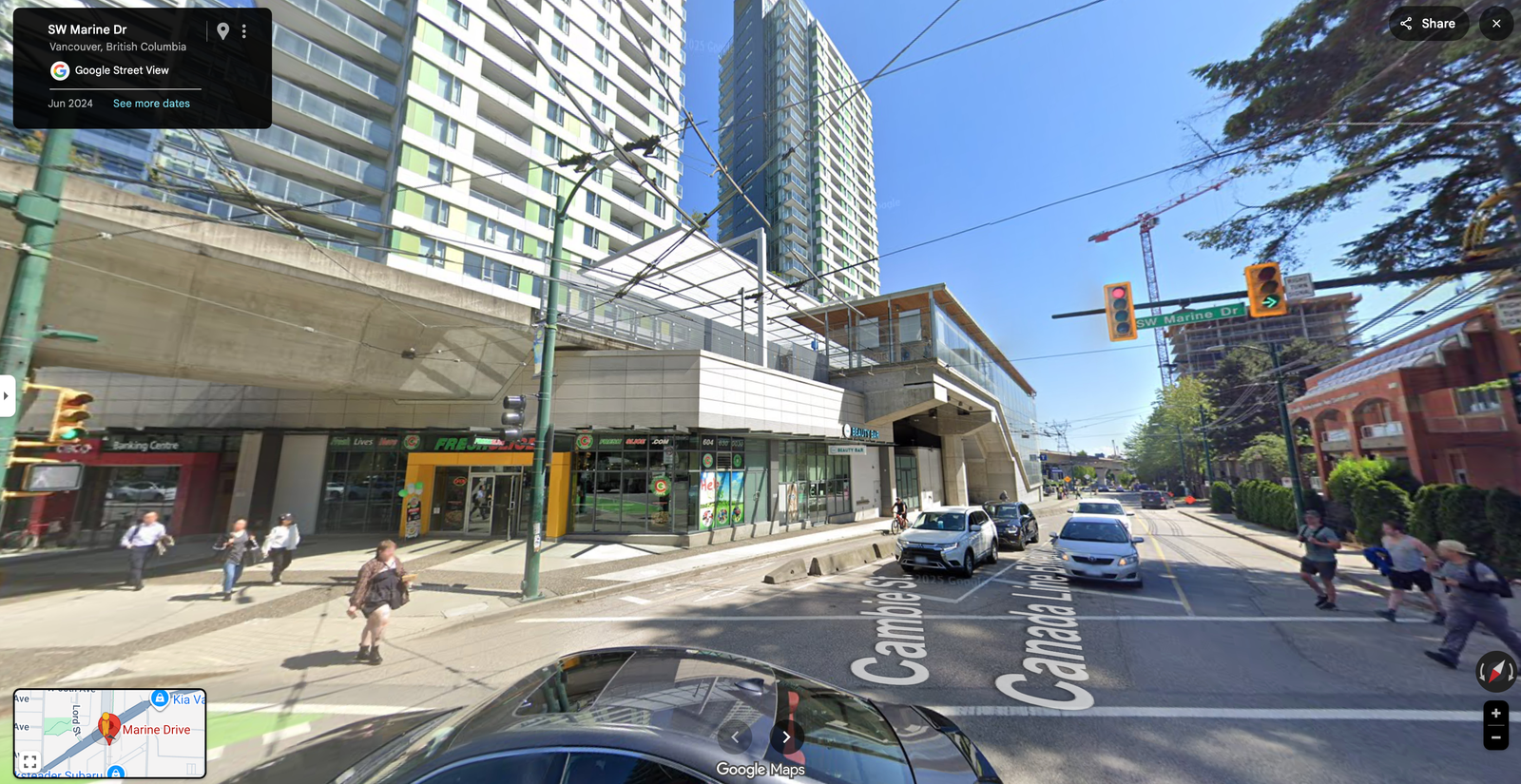
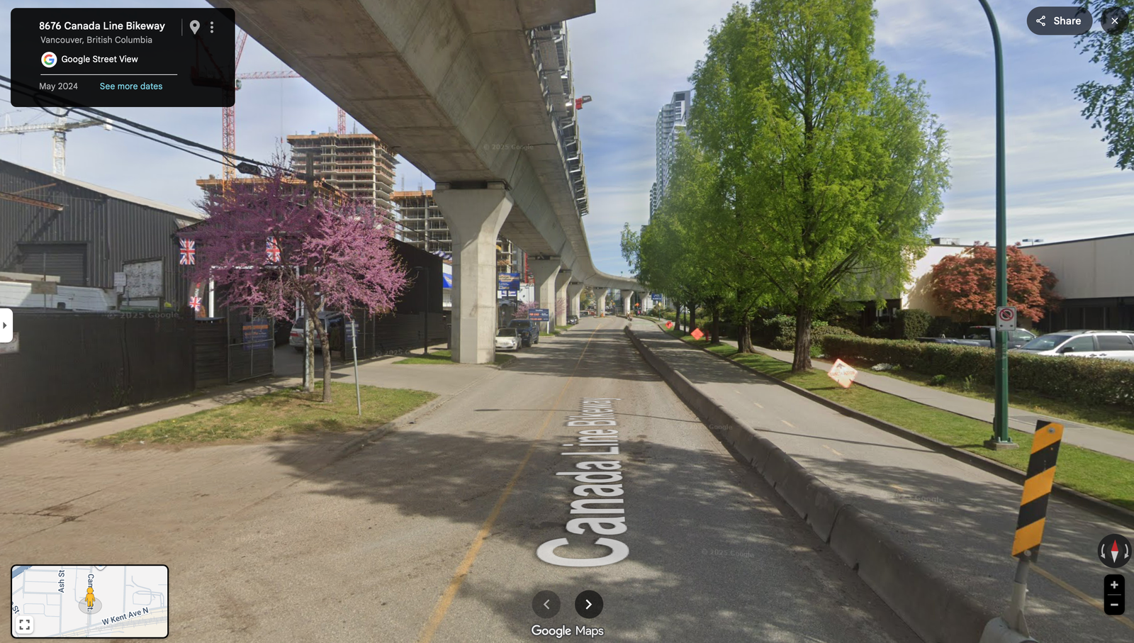
    But you don’t have to travel all the way to Japan to find examples where elevated rail does little to detract from the urban experience. Here’s Marine Drive station in Vancouver, integrated into a newish development:

    And here’s what the elevated guideway looks like as it heads toward the station:

    The obvious advantage of elevated rail is that it’s significantly cheaper than underground rail. According to global data collected by the Transit Costs Project at New York University, underground rail tends to be at least 2x the cost — often it’s even more. Are the benefits worth this additional cost, and is it worth building less overall transit with the same capital budget?

    Elevated rail is not without its drawbacks, but good design and urban sensibilities can help to mitigate many of them. As is the case with a lot of urban design, what matters most is how we treat the ground plane underneath the rail. So, to the extent that it remains out there, I think it’s time we get rid of any stigmas associated with elevated rail. More transit is better than less transit.


    Cover photo by Daiji Sasahara on Unsplash

  • What is a “stable” neighbourhood?

    February 28, 2026 · View original


    Read through planning documents across North America and you’re bound to find language that refers to low-rise residential neighbourhoods as “physically stable areas” where the “existing neighbourhood character” is paramount. But to be more precise, what this kind of language is actually saying is not that these neighbourhoods need to be broadly stable; it is saying that they just need to look more or less stable.

    Here in Toronto, for example, it has been widely documented that many of our low-rise neighbourhoods are losing people. Household sizes are getting smaller, and houses that used to be subdivided are being returned to single-family use. A similar thing is happening in other cities like New York:

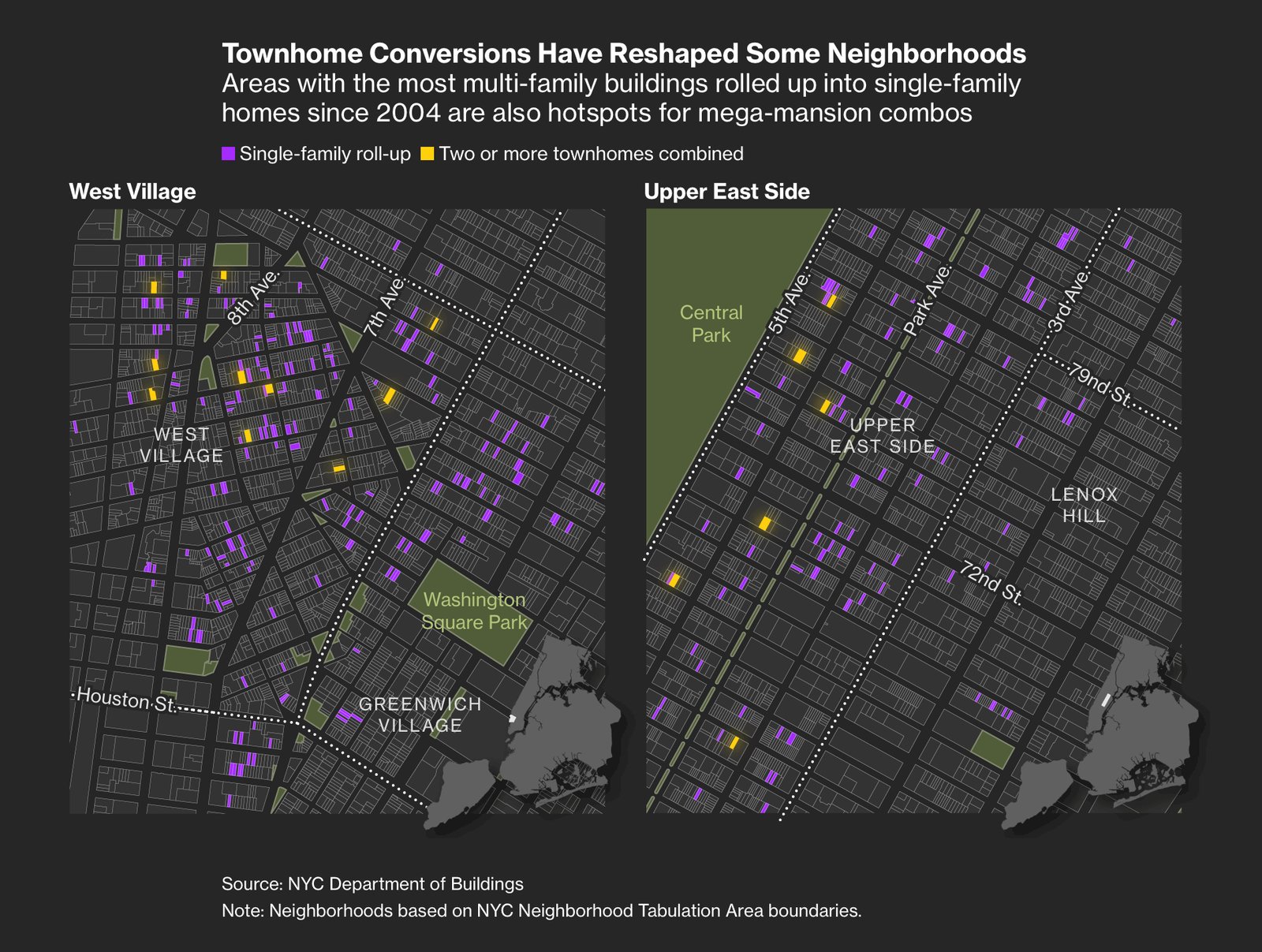
    Bloomberg News recently reported that since 2004, at least 9,300 homes have been lost as a result of multi-family buildings getting “rolled up” into single-family homes. More recently, the city has even seen an increase in people combining two or more buildings into large urban mansions.

    And while the total number of homes removed is relatively small for New York as a whole, it can be quite impactful to individual neighbourhoods. In the West Village, where there’s a high concentration of rowhomes and townhouses, Bloomberg estimates that one out of every six small apartment buildings has been rolled up into a single-family home since 2004!

    From a built form standpoint, you could say these are “physically stable” areas that are obediently adhering to their existing neighbourhood character. But under the hood and behind their street walls, they are clearly changing.

    It is one of the great ironies of city building. People often fear new development because they worry it might disrupt the character of a neighbourhood. But preventing development does not guarantee stasis. In fact, we know that not building new housing actually increases the pressures felt on a city’s existing housing stock, as people compete for a more fixed amount of supply.

    The wealthy can always outbid the less wealthy on housing. So if you don’t provide any new options, the wealthy will just buy up the existing stuff and turn it into what they want. Alternatively, you can build more housing and create a “moving chain” that frees up more existing housing for people of lower incomes.


    Cover photo by Chanan Greenblatt on Unsplash

    Map from Bloomberg

  • London approves the pedestrianization of Oxford Street

    February 27, 2026 · View original


    It’s not easy gaining support for pedestrian-only streets. Here in Toronto, Kensington Market is a neighbourhood that has been under consideration for pedestrianization for as long as I can remember. Yet it remains an aspiration, largely because of a number of common objections: it will hurt local businesses, lower foot traffic, and limit access for those with mobility issues.

    Yonge Street in downtown Toronto went through a similar debate, and the end result is a plan that will prioritize pedestrians, while still allowing one vehicle lane in each direction. This will still be a nice improvement, and my understanding is that the option to fully pedestrianize has been or will be designed in. Construction is expected to start on this in 2030, once the Ontario Line Queen subway station is complete.

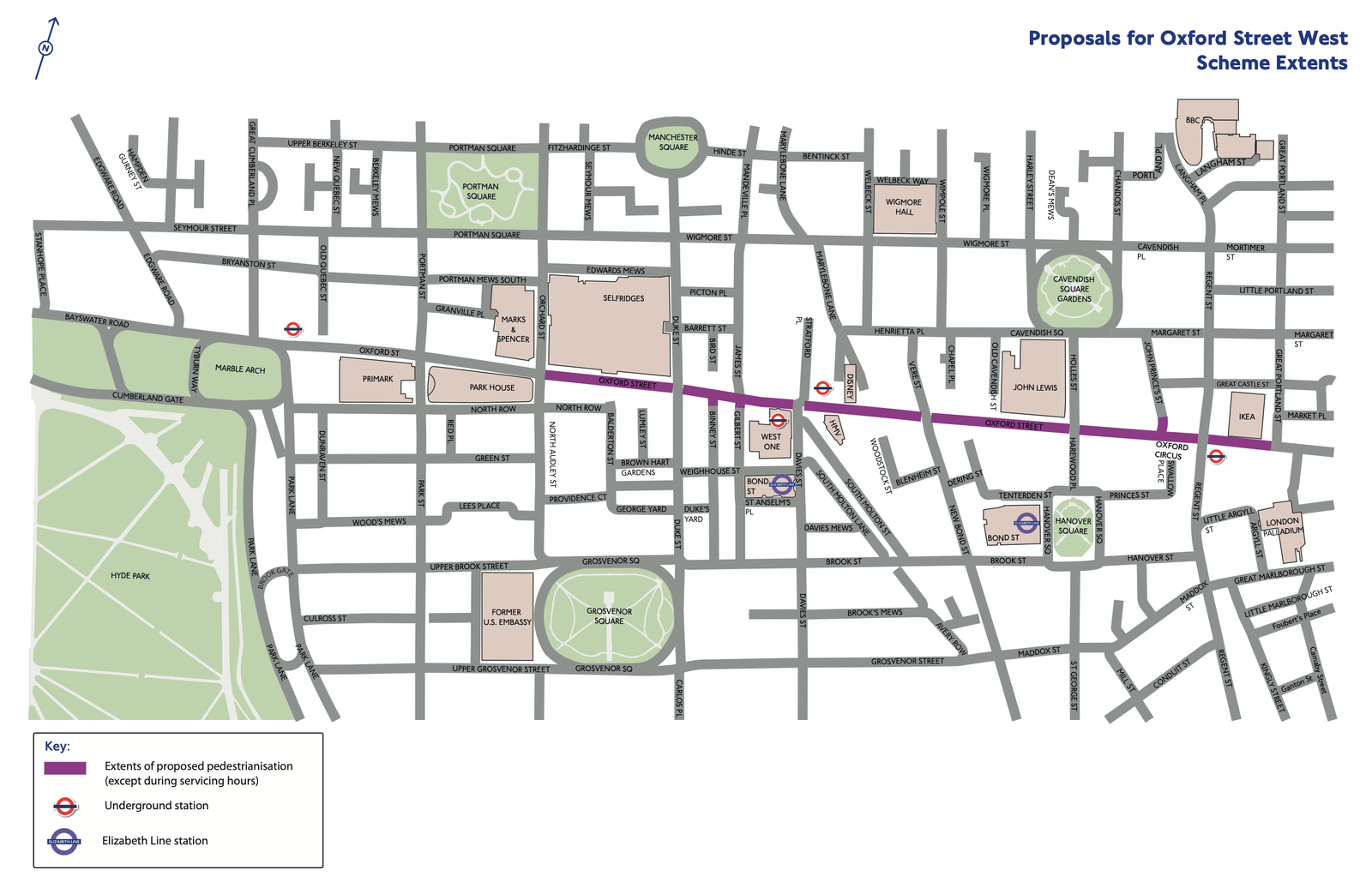
    But there are cities that are going all the way. This week, it was announced that London has approved the pedestrianization of Oxford Street, specifically the stretch between Orchard Street in the west and Great Portland Street in the east.

    Oxford Street is one of the most important thoroughfares in the world, and one of, if not the, busiest shopping streets in Europe. It is estimated that nearly 500,000 people visit it each day, meaning that most are not travelling there by car.

    Pedestrianizing Oxford is an idea that arguably dates back to the 1960s, when a plan was put forward to create pedestrian-only walkways on top of podiums; although, this may have been more about getting people out of the way of cars. Pedestrianizing the street was also a prominent part of Mayor Sadiq Khan’s platform when he was first elected in 2016, some 10 years ago. So, it too has had its opponents.

    However, consultations done last year showed that nearly two-thirds (63%) of Londoners were in favour of pedestrianizing the street — a figure that increased to almost three-quarters (72%) when the question was asked to people who had specifically visited the area within the last 12 months.

    Data from similar pedestrianization projects completed around the world indicates that both foot traffic and retail sales should increase once the project is built out. And I have little doubt that the same will prove true here in London. If you can’t pedestrianize a pre-eminent, transit-rich street in one of the world’s capital cities, then where can you?


    Cover photo from the Mayor of London

    Map from Transport for London

  • The cost of spending too much on housing

    February 26, 2026 · View original


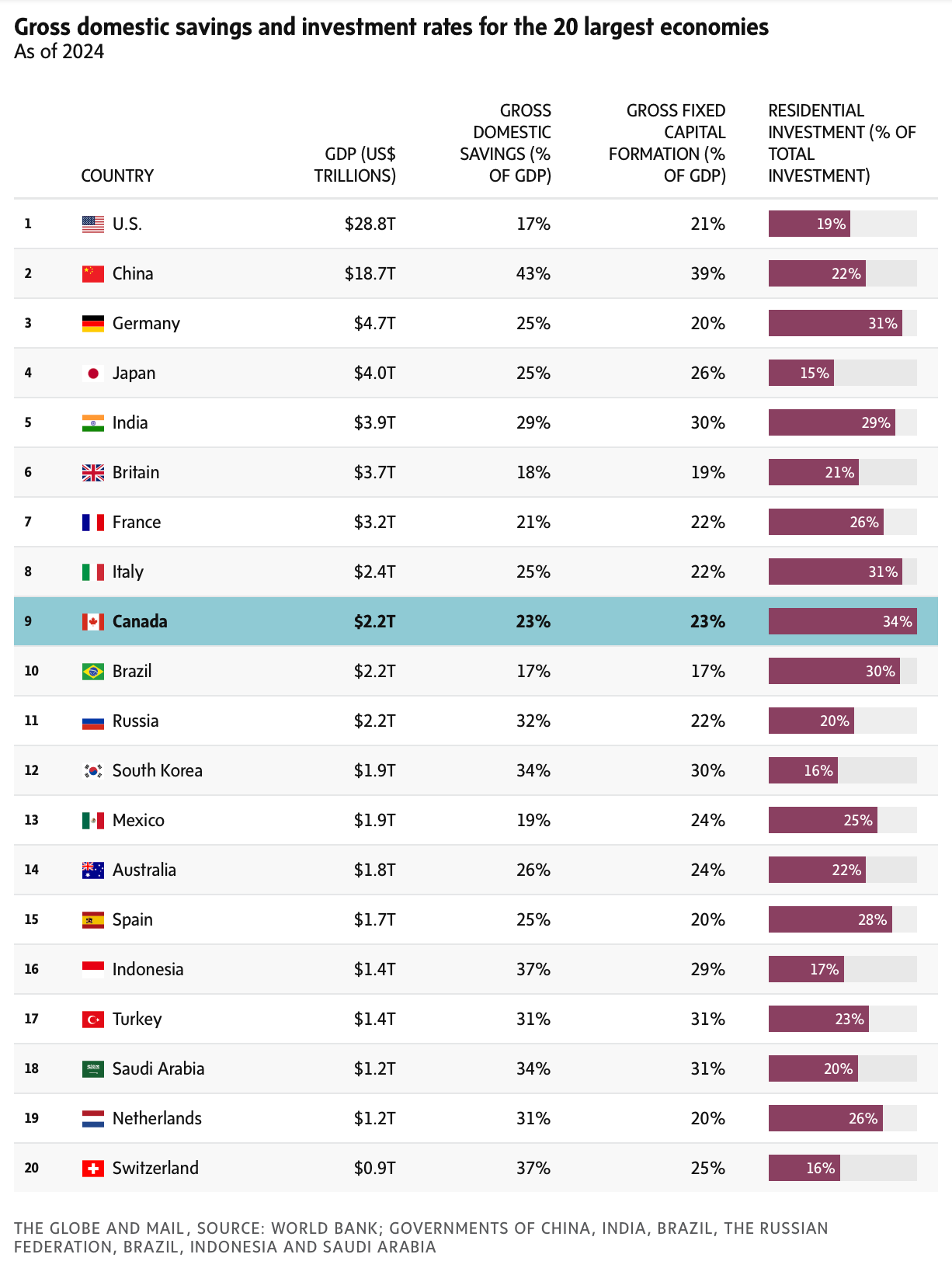
    This is an interesting chart from the Globe and Mail. It shows GDP, Gross Domestic Savings (how much a country’s residents and businesses save), Gross Fixed Capital Formation (technical term for investments in productive long-term assets), and the share of total investment going into housing for the 20 largest economies in the world.

    One of the key takeaways from the chart is that Canada invests the most into residential real estate (figures are from 2024). Now, I’m not an economist, but the risk here is that we are tying up too much of our capital in housing, as opposed to investing in new ideas, emerging tech, and the future. And this imbalance could help explain why Canada has had weak productivity growth for decades.

    Housing demand should be a byproduct of a strong economy; simply building housing won’t drive an economy forward on its own. And I say this as a developer of housing.


    Cover photo by Roshan Raj on Unsplash

    Table via the Globe and Mail

  • Waiting for the real estate bottom

    February 25, 2026 · View original


    Deflation is bad for economies.

    That is why the typical standard for most central banks is a target inflation rate of 2%. This leaves a factor of safety in case you miss your target. Because if you target 0% and end up with a negative number, then you’re in trouble. A negative number is significantly worse than moderate inflation. The principal problem with deflation is that consumers start expecting goods and services to be cheaper next month and stop buying non-essential items, creating a vicious cycle with prices.

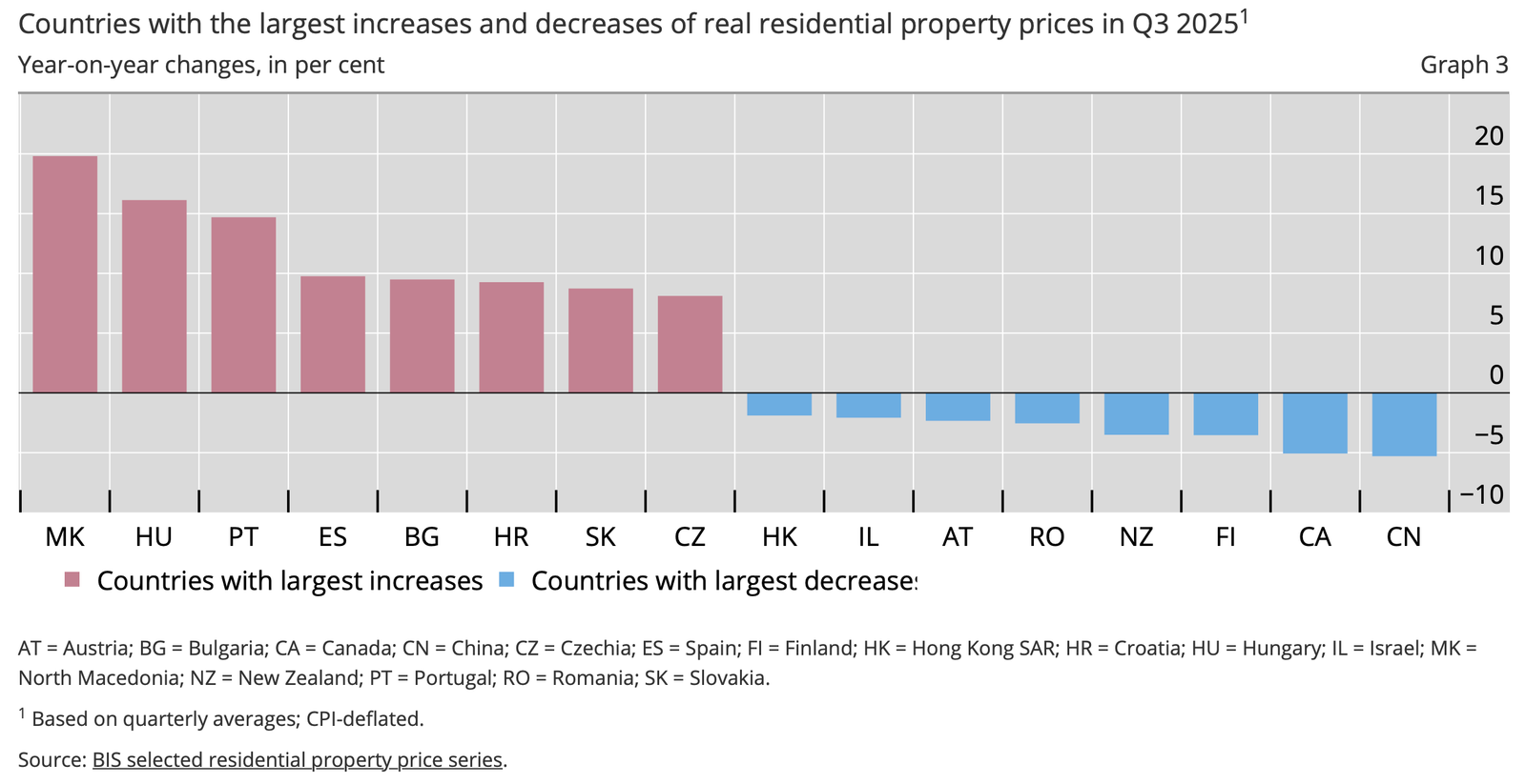
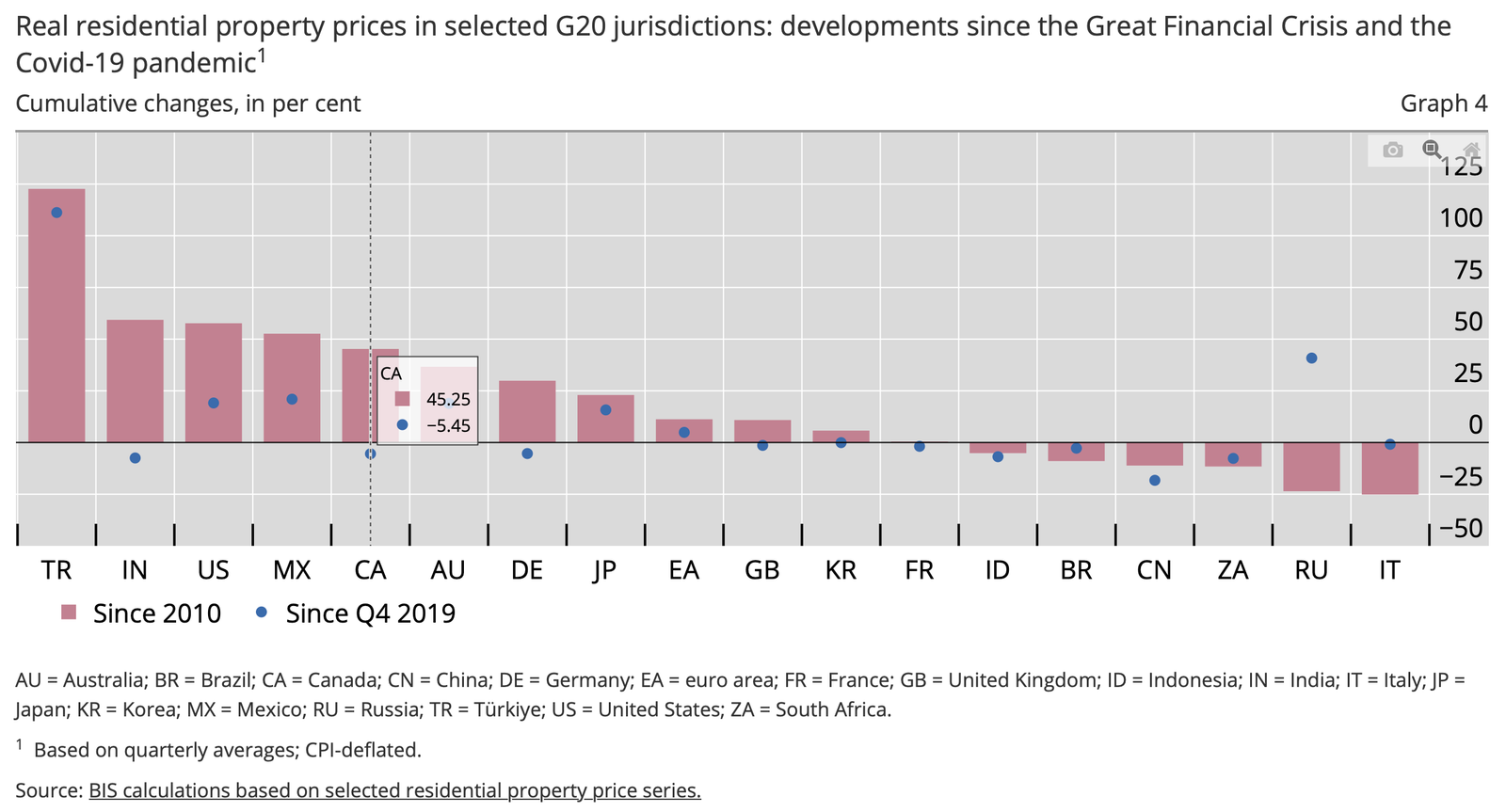
    I think we are seeing this same psychology play out with real estate in Canada (though not in every local market). According to the above charts from the BIS, real residential property prices across Canada were down just over 5% year-over-year in Q3-2025. And since Q4-2019, they were cumulatively down 5.45% (but up ~45% since 2010 after the Great Financial Crisis). Right now, many buyers are waiting on the sidelines, just in case things get cheaper.

    But I expect things to stabilize and feel better toward the end of 2026 and into 2027. And once that happens, a different buyer psychology will come to the fore.


    Cover photo by Anthony Maw on Unsplash

    Charts from BIS

  • The effects of new housing supply in Switzerland

    February 24, 2026 · View original


    Last month, we talked about how even “luxury” housing can improve overall housing affordability in a market. In that post, we spoke about a recent study that looked at the downstream effects of a new condominium tower in Honolulu. Today, let’s look at Switzerland.

    I stumbled upon this working paper on Twitter. The authors are Lukas Hauck and Frédéric Kluser, both from the University of Bern. In it, they look at the country-wide effects of new residential housing supply in Switzerland and, more specifically, the “moving chain” that new supply produces.

    Moving chains work generally as follows:

    – A household moves into a newly constructed home – Their previous home becomes vacant – Another household moves into this vacant unit, leaving their previous home vacant – And the process continues, until someone breaks the chain (which can happen by way of a new household being formed or someone moving in from out of the market)

    The authors found that these moving chains are relatively short in Switzerland. Approximately 75% of them terminate within three migration rounds. But this doesn’t mean that these chains aren’t critical for the market.

    Importantly, they found that every new market-rate unit typically results in 0.75 moves for households with below-median incomes. So, that is 75 moves for every 100 new homes constructed.

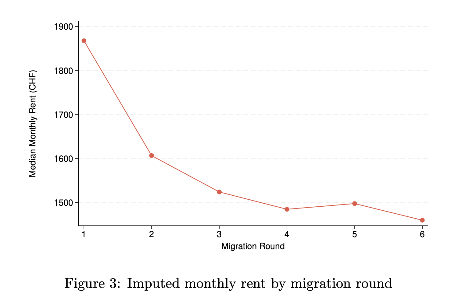
    The reason why new supply ends up also benefiting lower-income households is because there’s a clear income and rent gradient across the moving chain:

    New housing (migration round 1) is typically priced at the highest end of the market. This makes sense because we know that development happens on the margin. But by migration rounds 2 and 3, median rents fall off noticeably, creating housing opportunities for other people.

    New market-rate housing is sometimes criticized for only serving one segment of the market. But once again, we see evidence that it helps to ease overall housing pressures. There are other indirect benefits that shouldn’t be ignored.


    Cover photo by Henrique Ferreira on Unsplash

    Chart from “Country-wide effects of new housing supply: Evidence from moving chains.”