Daily insights for city builders, delivered every morning at 6 AM ET. I’m Brandon Donnelly — a Toronto-based real estate developer and founder of Globizen. I’ve been writing here since 2013.

Tag: zoning

  • Barriers to entry: Salvador vs. Toronto

    Netflix has a new docuseries out about Latin American street food. I watched two episodes of it last night. The first was about a chef from Buenos Aires, Argentina and the second was about a chef — named Dona Suzana — from Salvador, Brazil. Even if you aren’t necessarily into food shows, it’s a good way to remind yourself just how much you probably miss traveling right now.

    The story of Dona Suzana is an interesting one. Before opening her restaurant, she was doing laundry in order to make ends meet. Then at one point, the City of Salvador came to her community in order to undertake a large construction project. They needed someone to cook food for the construction workers and so they asked her if she would do it.

    Since she had always dreamed of being a chef, she jumped at the opportunity and took out a loan to buy everything she needed in order to fit out her kitchen. She cooked for the workers and everyone loved the food. But she never ended up getting paid. They stiffed her.

    That turned her off cooking for a bit and it was not until a trio of graffiti artists were working in her community and looking for a place to eat that she tried her hand at it again. They offered to pay her in advance and persuaded her to make them something. She agreed and the food was a huge hit.

    In fact, the group of artists loved the food so much that they made her a sign with the name “RéRestaurante” (titled this way because Dona has a stutter) and began sharing photos of her dishes on social media. All of a sudden she had people showing up at her door. And today she has people from all around the world showing up at her door.

    This is a wonderful success story. But I think it also says something about land use policies. As far as I can tell from the episode, she setup her restaurant at her place of residence — a community along the waterfront where her husband fishes and where she uses his catches for her renowned dishes.

    Here in Toronto, we are operating in an environment where if you try and setup a coffee shop in a residential “Neighbourhood” — like, for example, Contra at 1028 Shaw Street — you might spend a few years fighting with your neighbors and battling it out at LPAT hearings in order to get the appropriate permissions.

    I’m not necessarily suggesting that we should do away with all zoning (or maybe I am). But I would like to draw your attention to this contrast. Because one has to wonder whether RéRestaurante Dona Suzana would exist today and be known around the world had the barriers to entry not been so low for her. Of course, had there been more rules, maybe she wouldn’t have gotten stiffed the first time around.

    Either way, I am currently in the market for some dende oil.

    Photo by Milo Miloezger on Unsplash

  • Where developers won’t build even with $0 land

    Building on yesterday’s post about inclusionary zoning, below is a telling diagram from the Urban Land Institute showing which areas of Portland can support new development and which areas cannot. To create this map, ULI looked at achievable rents in each US census block to determine, quite simply, where rents will cover the cost of new development (all types of construction).

    However, in their models they are also assuming a land value of $0. And typically people want you to pay them money when you buy their land. So in all likelihood, this map is overstating the amount of blue — that being land where new development is feasible.

    But it does tell you something about developer margins. A lot of people seem to assume that the margins on new developments are so great that things like inclusionary zoning can simply be “absorbed” without impacting overall feasibility. The reality is that there are large swaths in most cities where development is never going to happen even if you were to start handing out free land.

    This map is also helpful at illustrating some of the impacts of IZ. If you assume that rents are the highest in the center of the city and that they fall off as you move outward, then the outer edge of the above blue area is going to be where development is only marginally feasible. And so any new cost imposed on development would naturally start to uniformly eat away at the blue feasible area — that is, until rents rise enough to offset it.

    Of course, this is a simplified mapping. Land usually costs money. Land values might also be highest in the center and fall off as you move outward, or there could be pockets of high-cost land. There may be more price elasticity in certain sub-markets compared to others. So the impacts of a new development cost may not play out as neatly as I outlined above.

    Regardless, there will be impacts, which is why I find this map telling even if it isn’t fully accurate or up to date. Maybe some of you will as well.

  • Zoning in Silicon Valley, New Haven, and Austin

    Robert C. Ellickson’s recent paper, titled Zoning and the Cost of Housing: Evidence from Silicon Valley, Greater New Haven, and Greater Austin, really holds back when it comes to the shortcomings of zoning ordinances. Here’s an excerpt:

    Zoning, as practiced in much of the nation, gravely misallocates resources. Some distortions are micro, such as the mediocre siting of Anton Menlo housing [a project by Facebook], and the lack of walkable neighborhoods in New Haven suburbs. Others are macro. If Silicon Valley were more populous, it would be a world tech center even more attractive to IT workers. The misuse of zoning squanders land, adds to the nation’s carbon footprint, warps interstate migrants’ choices about where to reside, and helps price poor households out of wealthier neighborhoods that would offer better life prospects for their children.

    The paper focuses on three metropolitan areas: Austin, Silicon Valley, and New Haven. Of these three, Austin is the most permissive in terms of allowing new and denser housing. Silicon Valley and New Haven, by contrast, have done a great deal to limit intensification by adopting exclusionary policies.

    In 1970, home prices in Silicon Valley were only slightly above the national average. Today, they are by far the highest in the United States, which is, of course, partially a result of high demand (tech salaries) and low supply (zoning ordinances). Ellickson’s paper examines the effects of the latter.

    If you’d like to download a copy, click here.

    Photo by Carlos Delgado on Unsplash

  • Low but dense — a missing middle solution for Toronto’s neighborhoods

    Alex Bozikovic (architecture critic for the Globe and Mail) is one of the most vocal proponents of more housing and more density within Toronto’s low-rise neighborhoods. Last year, he organized an international design competition where he asked firms to come up with innovative, yet sensible, solutions for how this could be done. I’m a little late getting to this, but today I’d like to walk you through this immensely clever solution by Batay-Csorba Architects, called Triplex Duplex.

    The project uses two prototypical, but random, semi-detached lots from the Christie & Bloor area of the city. Each one is 18′ wide x 100′ deep. So your typical long and narrow lots. From the street (see above image), it looks highly contextual. But in plan, you begin to see the 3 main volumes of the project emerge. Here’s a ground floor plan from the architect:

    Each volume is around 2,500 square feet. I presume that includes the basement. If you exclude the basement area and the vertical voids throughout the project, which you’re allowed to do in your calculation of gross floor area in residential zones, I suspect we’d arrive at an FSI (density) number that isn’t that much more than what already exist in these sorts of areas.

    At the front of the house (right side of the above plan) is a set of stairs (and a patio) leading down to the front basement unit and a set of stairs leading up to the main front unit. An inset patio also forms part of this main entrance (image below), which is a great way of adding outdoor space while at the same time maintaining privacy across the units. These strategy is one of my favorite aspects of the project.

    The rear units are similarly accessed at the back of the building. And the two middle units are accessed along the side of the house. All in all, this housing typology has the ability to accommodate up to 6 units: 3 main suites and 3 secondary type suites. By the architect’s own estimate, this could result in 147,000 new housing units across the city if every lot occupied by a semi-detached house were to be redeveloped in this way.

    But I wonder if any consideration was given to the secondary (basement) suites that may already exist in these zones. Because in some cases, and as beautiful as these homes may be, we may only be talking about 2 additional suites. Triplexes are also already allowed in some areas of the city. So does this ultimately achieve its intended goal, which is the creation of more “missing middle” housing in order to ease overall housing pressures? Or do we need to be thinking bigger?

    As a follow-up to this post (subscribe to stay connected), I am going to look at what a development pro forma might look like for a project of this scale. The numbers have a way of answering a lot of questions. That said, kudos to Alex for taking on this initiative and kudos to the design team for a pretty spectacular architectural solution.

    All renderings by the talented Norm Li.

  • A mapping of development potential in Toronto

    I first met Monika Jaroszonek in 2017, right before she started RATIO.CITY. Since then she has developed some pretty incredible tools for the city building space.

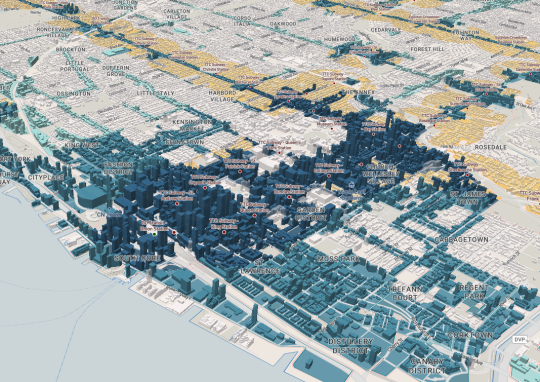
    Yesterday the company published this interactive visualization looking at development potential across the City of Toronto. The mapping looks for the following:

    The tool then ranks each development site – AAA, AA, A – according to how many of the above criteria it meets.

    It also flags land that it refers to as “Missed Opportunity.” These are lands located within 500m of a Major Transit Station, but that are designated as Neighbourhoods (considered stable) or Employment (whole other discussion).

    Based on this filter, about 5.6% of the City’s land is a “Missed Opportunity” and about 1.2% is AAA.

    When you look at the visualization, that is one of the first things you will probably notice; a lot of our transit infrastructure is currently underutilized as a result of land use policies.

    Image: RATIO.CITY

  • Increasing housing supply in Ontario

    The Government of Ontario is currently working on a Housing Supply Action Plan that they hope will address “the barriers getting in the way of new ownership and rental housing.”

    Through initial consultations, they have already identified 5 key themes (my words below):

    1. The approvals/entitlement process for new housing is too slow
    2. There are too many restrictions on what is allowed to be built (that is, we should be encouraging more “gentle density” and “missing middle” type infill)
    3. Development costs are too high
    4. Tenants need protection; regulation is making it increasingly difficult to be a small landlord
    5. Overall housing innovation

    The province is also looking for public input and is currently running this online survey. It is open until January 25, 2019. And I would encourage all of you to complete it and help shape the action plan.

    My understanding is that the plan should be ready by Q2-2019.

  • Planning staff reports

    A bunch of people have asked me lately about what they should do if they want to get smarter on land use planning and on the entitlement process for development projects. It was specific to Toronto, but I don’t think my answer is specific to only this city.

    I took a few planning classes in graduate school when I was in the US. But I was more focused on architecture and real estate, and so I did not leave school an expert by any means.

    I learned about the failures of euclidian zoning and about things like the Low-Income Housing Tax Credit, which always seemed like a sensible supply-side tool to get the private sector to invest in affordable housing.

    But what I have found most useful is to just read planning staff reports. These are the responses to actual development proposals and they show you how staff interpret the policies that are in place and how staff apply them to real buildings.

    I may be in the minority in that I actually find these reports interesting. But regardless, they are a great crash course in planning and development approvals and they can help you manage your entitlement risk.

  • Anachronistic employment areas

    Today I was at the Land & Development Conference here in Toronto. I started live tweeting during the breakfast, but my vintage iPhone 6 couldn’t keep up, so I had to stop. Some insights throughout the day. But a lot of what you would expect. I suppose it’s more about the networking.

    I would, however, like to reiterate something that Ken Greenberg mentioned about Employment Areas/Lands in Toronto. For those of you who aren’t familiar, these lands are essentially intended to serve one, and only one, purpose: employment. And the process for introducing a mix of uses, including residential, is an onerous one to say the least.

    I appreciate why this is the case. But I agree with Greenberg in that this kind of single use zoning is antiquated. It does not reflect the realities of the market today. There are other mechanisms we can use to maintain and provide for employment, and ensure that we don’t end up with a city of all residential.

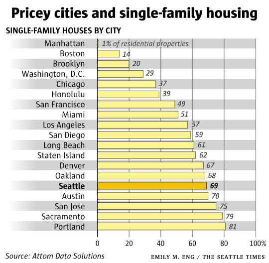
  • Percentage of residential properties dedicated to single-family housing in US cities

    The Seattle Times has an article up about “widespread single-family zoning” that will feel familiar to many here in Toronto who, I know, are having similar conversations about the amount of land dedicated to low-density housing.

    The article, by Mike Rosenberg, estimates that 49% of all developable land in Seattle is dedicated to single-family housing; that 8% is dedicated to multi-family housing; and that another 8% is dedicated to commercial and mixed-use buildings. The rest of the land is institutional, open space, vacant, and so on.

    Of all the residential lots in the city, the estimate is that 69% of them are occupied by single-family houses. This is compared to 1% in Manhattan. 

    I tried to reverse engineer the 69% based on the land use areas in the article, but the math didn’t quite add up. In any event, the argument here is, of course, that single-family homes are too expensive in Seattle and that the city needs more land available for multi-family housing.

    Housing supply is no doubt important, but looking at the above chart, having a low, or lower, percentage of residential land dedicated to single-family housing doesn’t seem to necessarily guarantee affordable housing.

  • Manhattan real estate prices during the Great Depression

    image

    I was searching around trying to find data on long-term real estate prices and I came across a paper by Tom Nicholas and Anna Scherbina called, Real Estate Prices During the Roaring Twenties and the Great Depression.

    Here are some stats about Manhattan real estate (from the paper) that you all might find interesting:

    – In 1930, Manhattan housed 1.5% of the US population, but had approximately 4% of all US real estate wealth.

    – To construct their price indices the authors randomly collected 30 real estate transactions per month in Manhattan between 1920 and 1939. The mean price per square foot in 1929 was $6.91 (year of Black Tuesday). And the mean price per square foot in 1939 – 10 years later – was $2.29.

    – Buildings containing a store at grade tended to sell at higher prices. The authors speculate that this could be because a zoning change in 1916 made it difficult to open stores in “residential” areas.

    – Buildings with three, four and five storeys tended to sell at a discount. Six storeys or higher and the buildings generally had an elevator, which resulted in higher pricing.

    – Manhattan real estate prices reached their highest level in Q3-1929 before falling 67% by 1932. Prices remained more or less flat during the Great Depression.

    – If you bought a “typical property” in 1920, it would have retained only 56% of its value (in nominal dollars) by 1939. In fact, it took until 1960 for assessed property values in Manhattan to exceed their pre-Depression pricing.

    – An investment in the stock market index during this same time period, 1920-1939, would have outperformed real estate by a factor of 5.2x.

    Much of this probably seems hard to believe given the market today. Imagine waiting 40 years for the value of your property to come back.

    Photo by jesse orrico on Unsplash