Daily insights for city builders, delivered every morning at 6 AM ET. I’m Brandon Donnelly — a Toronto-based real estate developer and founder of Globizen. I’ve been writing here since 2013.

Tag: walking

  • How would you make this street better?

    Let’s resume looking at sidewalks and public spaces.

    If you look in the City of Toronto’s Official Plan for the stretch of Dundas Street West that runs between Dupont Street and Bloor Street West, you’ll find a map that looks like this:

    Red signifies “Mixed Use.” And so if you were to just look at this map, you might naturally assume that, in the real world, this is a continuous main street that connects The Junction neighborhood down to Bloor. But that’s not actually the case. Instead, it looks like this:

    Because of the rail corridor on the east side, it is a single-sided street. And generally speaking, these don’t make for the best retail streets. But it also has narrow sidewalks and a compromised public realm. If you go back to the map I shared yesterday, you get this:

    I don’t think 30cm is entirely accurate here, but that’s beside the point. What matters is that this is just one of many examples in the city of a discontinuous public realm. (Here’s another, undignified example, from Parkside Drive.)

    Over the years, there have been a number of design concepts proposed. Below is one by Brown + Storey Architects that was done I don’t know how many years ago. Their proposal widened the sidewalks along this stretch, and added bike lanes. They also proposed a roundabout at the intersection of Dundas, Dupont, and Annette, which is another matter that needs addressing.

    But none of this has been implemented and I don’t know of any plans to do it. When we were going through the rezoning process for Junction House, we were made aware of some transportation studies that had been done for the above intersection. But that’s about it. There wasn’t an actual ETA.

    However, now that my commute consists of walking up and down this part of Dundas, I’ve been thinking more about how it could be improved.

    I think there’s no question that the sidewalks need to be widened. It would also be helpful if there were crosswalks to facilitate getting off the south end of this exotic island:

    But equally important, I think that something should be done about the single-sided nature of the street. Given that there’s limited width, my mind immediately goes to shipping containers, or something similar, to start activating the east side of the street.

    This has already been done further south on Dundas (east of Bathurst):

    And it could work here too. Already there’s a Blondie’s Pizza anchoring the south end of this stretch (really fantastic pizza, by the way):

    But I would love to hear your ideas, as I’m currently in the market. I also don’t think that you necessarily need to be from Toronto in order to comment. Great streets are great streets. So if it were up to you, what would you change, if anything, about this part of Dundas Street West? Let me know in the comment section below.

  • Is less people walking bad for traffic fatalities?

    Here’s some recent data, via CityLab, suggesting that Americans are walking less and driving less, but killing more people when they do drive around. (The report is based on data from 2019 to 2022.)

    My first reaction to these high-level findings is that they seem to make sense. This time period was the pandemic. And people were locked away at home (though I used to take some seriously long walks around downtown during this dark time).

    So I don’t know, I’m not sure we can conclude that walking less is truly a structural phenomenon. Similarly, I’m not sure that we can immediately conclude that cars are becoming increasingly more dangerous.

    According to Wikipedia, deaths per capita, deaths per billion vehicle miles traveled, and total deaths, have all been generally declining in the US since the 1960s.

    However, I do wonder if there’s some sort of correlation between people walking less and car-related fatalities. The most dangerous streets, in my mind, are often the ones that don’t have a lot of pedestrians.

    That’s why, broadly speaking, it feels safer walking around Manhattan than it does Los Angeles. So maybe less people walking is enough to trigger an increase in pedestrian fatalities.

  • The value of boredom

    I took a class during my undergraduate degree about the material culture of the Victorian era. I took it mostly for fun and because I found the lessons relevant to architecture. But it also allowed me to write papers about things like gin (though I remember not doing very well on that one).

    My big takeaway from that class, which continues to stick with me to this day, is about how difficult it was for the Victorians to process and ultimately accept new technologies and ideas. There seemed to be immense skepticism and concern for everything that was novel.

    Take, for example, the first ever escalator. An invention of the Victorian era, there were very serious concerns at the time about what such rapid changes in elevation would do to the human body. That’s why they initially gave people booze at the top of the ride. A little something to calm the nerves after such a traumatic experience.

    This, of course, seems silly today. But I always come back to it when I see us trying to process new technologies. Will posterity eventually think that we too were being silly for worrying? Will they think it’s cute that we thought social media was turning us all into narcissistic and envious creatures? Probably.

    Still, there’s no denying that material culture impacts us all. I was reminded of this while reading this WIRED article by Craig Mod called, “The Glorious, Almost-Disconnected Boredom of My Walk in Japan.” (Tim Ferriss shared it in his most recent newsletter.)

    Craig does ultra-marathon walks. And the article is about one that he did in Japan. While this may seem like a recipe for a whole lot of nothing, there are things to be learned here. In it, he talks about how he rationed his use of technology on these walks and how “boredom” became something of value.

    In the context of a walk like this, “boredom” is a goal, the antipode of mindless connectivity, constant stimulation, anger and dissatisfaction. I put “boredom” in quotes because the boredom I’m talking about fosters a heightened sense of presence. To be “bored” is to be free of distraction.

    Perhaps the biggest drawback of our phones is that they allow us to fill every second of boredom with stuff. Have 3 three seconds to spare? Pull out the phone. On the one hand it’s nice to never be bored. But on the other hand, it’s harder to be contemplative. It’s harder to go deep into things. And it’s harder to find that right kind of “bored.”

    Or maybe we’re just being fuddy-duddies who will one day be made fun of by future generations when somebody decides to teach a university course about early 21st century material culture.

  • Morning bagel run

    image

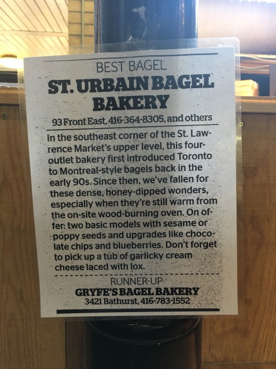
    This morning I woke up and decided that I could go for a bagel with lox and cream cheese. I figured, it’s the weekend, I’m going to treat myself. So I walked across the street to St. Urbain Bagel Bakery (see above photo).

    My Montreal friends reading this are probably thinking that this is no substitute for a Fairmount or St-Viateur bagel. But I enjoy St. Urbain. They are my go-to place for breakfast in the market.

    What I really value, though, is the ability to walk across the street and grab a bagel for breakfast. It’s a pretty simple action. Nothing complicated about it. 

    But in our world of constant traffic jams, cars that should soon drive themselves, and near-instantaneous online delivery, it can be easy to forget that there’s still something really nice about just walking down the street in the morning and saying hello to a human.

    I feel lucky that my neighborhood allows me do this. Not all do.

  • Journeys by walking

    Arup, the global consulting firm, has an interesting publication out called Cities Alive: Towards a walking world. The report highlights 50 benefits of walking and then 40 actions that city leaders can take today to transform their cities. The entire study was informed by examining 80 international case studies.

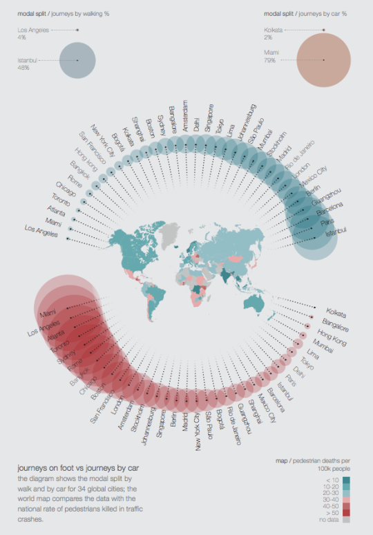
    As I was going through the report, the following diagram caught my attention. It compares journeys on foot vs. journeys by car for a collection of global cities.

    The turquoise circles represent % of journeys by walking. On the left is Los Angeles at 4%. And on the right is Istanbul at 48%.

    The red circles represent % of journeys by car. On the left is Miami at 79% (with Los Angeles right beside it). And on the right is Kolkata at 2%.

    The map in the middle of the circles represents pedestrians killed in traffic crashes per 100,000 people.

    I’m not sure where the data was drawn from, but it’s not all that surprising to see a few North American cities clustered towards the left (less walking; more driving). Still, I wonder how “journey” is defined.

    To view the full report, click here. Arup also produces a lot of other great content that you can download for free, here.

  • Do you know where you spend your time?

    Yesterday my friend Sachin Monga published a really great article on Medium called, 2014: My Year in Review. It was broken down into a few sections that included everything from his favorite blog posts of the year to all of the images he posted on Instagram. He called it “a stream of personal observations, data, and highlights for the year.”

    And it put my end of the year blog post to shame.

    One section that really stood out for me though was Places & Transit. Using a mobile app called Moves, Sachin extracted an incredible data set for where he physically spent his time and how he got around in 2014. I can’t believe I haven’t heard of this app yet – it’s totally in my wheelhouse. But I’m clearly late to the party. Facebook bought them in the first half of last year.

    The data set included how many hours he spent at home and at work. His top 3 most visited coffee shops. His top 5 most visited friends. How many nights he stayed in a hotel. His average daily commute time. And his total distance walked and cycled, among many other things. It was fascinating. I love data – especially when it was previously impossible or difficult to collect it.

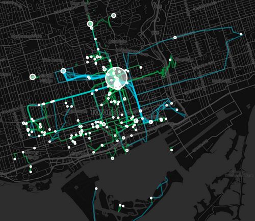
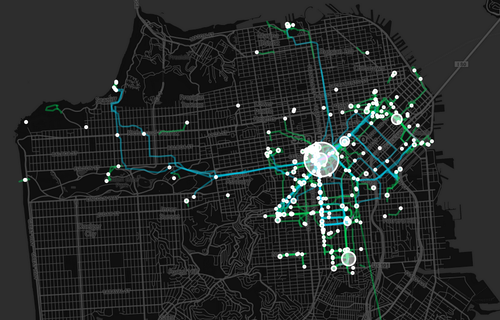
    He was also able to translate his data into a set of beautiful maps, showing where he spent his time and how he got around. Here is his personal map for Toronto. The larger the circle, the more often he was there. Blue lines are cycling. And green lines are walking.

    image

    And here’s San Francisco (where he now lives):

    image

    After reading his post, I immediately downloaded Moves. And I can’t wait to see how my personal map of Toronto will look like in a few weeks and months. Once I have enough data points, I’ll be sure to share it with you all here.

    In the interim, do you have any ideas for what this kind of data might be used for? I can certainly think of many. Let us know in the comment section below.
  • People in big cities walk faster

    One of the most interesting things about cities is that as they grow their “urban metabolism” also tends to increase. People become more productive. Economic output increases. It becomes easier to hail a cab (which is a test I like to use). And, according to this recent article by CityLab, people walk faster.

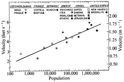
    Yes, research has shown that there’s a correlation between population size and the speed in which people walk. And some of the studies go as far back as the 1970s – like this one from psychologists Marc and Helen Bernstein:

    image

    In many ways, this makes intuitive sense. Life in the big city is a fast paced one. But why exactly do people start literally walking faster? The most probable answer seems to be, quite simply, that time is money. Subsequent research from the 1980s and 1990s has revealed that the best predictor of fast walking is economic output.

    When a city grows larger, they wrote, wage rate and cost of living increase, and with that the value of a resident’s time. As a result, “economizing on time becomes more urgent and life becomes more hurried and harried,” Walmsley and Lewis suggest. (Source: CityLab)

    The first thing that crossed my mind when reading all of this is that there must be some sort of upper limit. Humans don’t just keep walking faster and faster as the city in which they live in grows bigger. If that were the case, the mega cities of the world – such as Tokyo – would have people sprinting around all the time. But that’s obviously not the case.

    So this is a topic that could probably use some more data. And I would imagine it would be a lot easier to collect today given that we all now walk around with mobile sensors in our pockets (our smartphones). And pretty soon we may have mobile sensors on our wrists (smart watches).

    I would certainly like to see more data on this. The idea of an “urban metabolism” has always interested me.

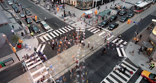
    Image: Dundas Square, Toronto via Flickr

  • 8 standards for transit oriented development

    Recently in the comment section of ATC, Lloyd Alter of Treehugger shared a great article talking about the 8 principles of Transit Oriented Development (TOD). “TOD” is one of those buzzwords (or buzz acronyms?) that gets thrown around a lot in city building and real estate circles. But I suspect that most people don’t exactly know what it takes to design and build successful TOD projects and neighborhoods.

    Which is why the Institute for Transportation and Development Policy came up with these 8 standards:

    1. WALK: Develop neighborhoods that promote walking
    2. CYCLE: Prioritize non-motorized transport networks
    3. CONNECT: Create dense networks of streets and paths
    4. TRANSIT: Locate development near high-quality public transport
    5. MIX: Plan for mixed use
    6. DENSIFY: Optimize density and transit capacity
    7. COMPACT: Create regions with short commutes
    8. SHIFT: Increase mobility by regulating parking and road use

    What should be apparent from this list is that the standards are quite clearly stacked against cars. Number 2 is about prioritizing non-motorized transport networks. And number 8 is about regulating parking use and road use. It’s about making a decision who you are planning for and acknowledging that when you do all of the above, you largely eliminate the need for driving.

    If you’re a “war on the car” kind of person, this might offend you. But if you look at the data I shared about a week ago (forgive me, I know the chart is a pain to read), you’ll see that it’s seemingly pretty difficult to design a city that’s equally great for both cars and for people. The cities where people love to walk, cycle, and take transit are precisely the ones where few people drive.

    Image: Flickr

  • From bicycles to cars in Beijing

    image

    Earlier this week, a friend of mine shared this TED talk on my Facebook wall talking about the state of climate change in the world. The talk is by Nicholas Stern. And at one point he talks about the incredible urban transformation that has taken place in Beijing over the last couple of decades; specifically, the shift from a bicycle oriented city to a now automobile oriented city.

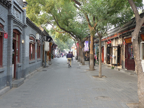
    I knew that this was the case, but it got me thinking. Because alongside this mobility change, there’s also been – not surprisingly – pronounced changes to the urban fabric of the city. The most significant is perhaps the demolition of the city’s hutongs and siheyuan. Hutongs are basically narrow alleys (see above photo) and siheyuan are the traditional Chinese courtyard houses.

    For centuries, these alleyways and courtyard houses have defined Beijing. And while I realize that not all of them were as glamorous as Melbourne’s laneways, only about 1,000 of Beijing’s original 6,000 hutongs remain (according to Time). Which makes me wonder: Is China making the same mistakes that we made in the 20th century?

    Because as the developed world moves toward transit oriented development, bike lanes, heritage preservation, and compact urban living, China has seemingly gone and done the exact opposite. They got everyone off bicycles and into cars, and they went and erased a scale of urbanism that has been in place for centuries.

    This is not to say that China doesn’t deserve to have the same standard of living as the developed world. It absolutely does. It just seems a bit ironic to me that the things we’ve become sharply critical of, are exactly what China seems to want to recreate.

    Image: Flickr

  • How are you being shaped?

    image

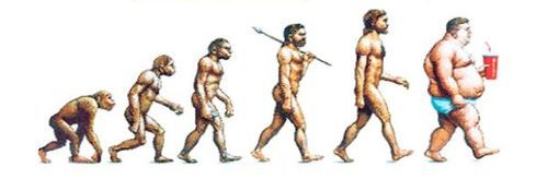
    “We shape the cities, and then our cities shape us.” That’s one of my favorite lines from the documentary The Human Scale, featuring Danish architect and urban designer Jan Gehl. I like it because I don’t think many of us think enough about the way in which the built environment – that we create – ultimately goes on to influence the way we live our lives.

    One of the most interesting connections for me is the link between urban form and public health. There’s been a lot of talk over the years about how suburban sprawl is, or might be, making us fat (among other things). We’ve created environments that are only navigable by cars and that has forced many of us into sedentary lifestyles. We sit in our cars, and then we sit in our offices.

    So today I’d like to conduct a bit of a poll. If you’d like to participate, please share the following 3 things in the comment section below: 1) your city, 2) the type of neighborhood you live in (urban, suburban, rural, etc.), and 3) the amount of time you spend walking or doing something active on an average day.

    Here’s me:

    I live downtown Toronto in the St. Lawrence Market neighborhood (urban). I take the subway to work and the station is a 10 minute walk from my place. So as a bare minimum, I spend at least 20 minutes a day walking. But since I also walk to do most of my regular errands, and since my gym is another 10 minute walk from my place, I’d say I average a good 30-45 minutes of walking each day.

    Now it’s your turn 🙂

    This is a pretty crude survey, but with the advent of things like smartwatches and health monitors, I think we’ll soon have lots of great data on the ways in which our cities might shape our health.

    Image: The Economist