Daily insights for city builders, delivered every morning at 6 AM ET. I’m Brandon Donnelly — a Toronto-based real estate developer and founder of Globizen. I’ve been writing here since 2013.

Tag: walkability

  • Multi-modal cities are the new reality

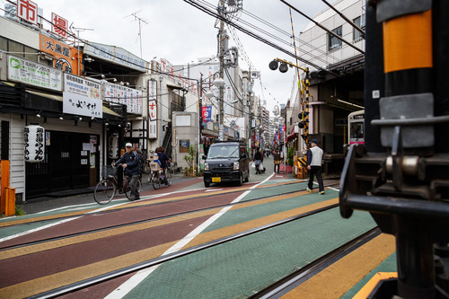
    CityLab published an article last week on multi-modal cities that caught my attention (because it used a picture of Toronto with about 3 or 4 streetcars stacked up along Queen Street). The premise of the article is that all of this car vs. transit debate is actually missing the bigger picture: our cities are multi-modal and we need to be planning for that.

    That’s not to say that the shift away from cars isn’t a good thing. It is. But it’s not as simple as saying that, instead of driving, people should now only take transit. In today’s cities people walk, bike, take streetcars, take buses, take subways, take taxis, take private shuttles, use Uber, and, yes, they still drive.

    From my own experience, this is absolutely how I get around Toronto today. I walk to the gym. I ride my bike whenever I’m going somewhere downtown. I take the subway to my office in midtown because it’s far and I would be too sweaty if I biked there. I use Uber and Hailo when I’m going out at night. And I drive when I need to go to the suburbs or leave the city.

    But the key takeaway here is that we now have a much tougher challenge on our hands. When we were only optimizing for cars – however detrimental to our cities that was – we only had one mode to plan for. Now we have several. Some of which are public and some of which are private.

    However we also have access to technologies that we didn’t have before. We are networked in ways that weren’t possible before and we’re at the dawn of many profound mobility changes, such as driverless cars. (Have you read about Tesla’s new Autopilot feature yet?)

    So as I’ve said before, I really believe that we need to look at this, not as a war on the car, but as a war on inefficiency. The problem we are trying to solve relates to mobility: What’s the best way to move lots of people around dense urban regions? Stop focusing so much on the technologies and focus more on the people.

    Image: Flickr
  • From bicycles to cars in Beijing

    image

    Earlier this week, a friend of mine shared this TED talk on my Facebook wall talking about the state of climate change in the world. The talk is by Nicholas Stern. And at one point he talks about the incredible urban transformation that has taken place in Beijing over the last couple of decades; specifically, the shift from a bicycle oriented city to a now automobile oriented city.

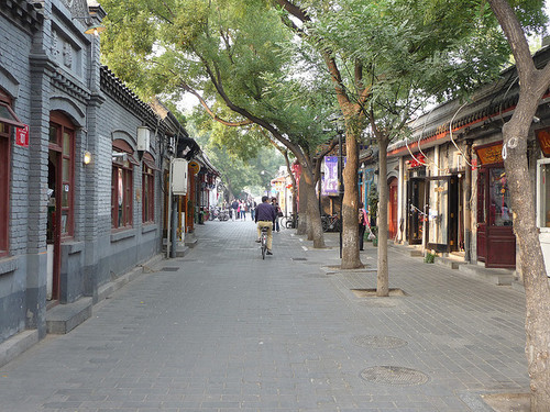
    I knew that this was the case, but it got me thinking. Because alongside this mobility change, there’s also been – not surprisingly – pronounced changes to the urban fabric of the city. The most significant is perhaps the demolition of the city’s hutongs and siheyuan. Hutongs are basically narrow alleys (see above photo) and siheyuan are the traditional Chinese courtyard houses.

    For centuries, these alleyways and courtyard houses have defined Beijing. And while I realize that not all of them were as glamorous as Melbourne’s laneways, only about 1,000 of Beijing’s original 6,000 hutongs remain (according to Time). Which makes me wonder: Is China making the same mistakes that we made in the 20th century?

    Because as the developed world moves toward transit oriented development, bike lanes, heritage preservation, and compact urban living, China has seemingly gone and done the exact opposite. They got everyone off bicycles and into cars, and they went and erased a scale of urbanism that has been in place for centuries.

    This is not to say that China doesn’t deserve to have the same standard of living as the developed world. It absolutely does. It just seems a bit ironic to me that the things we’ve become sharply critical of, are exactly what China seems to want to recreate.

    Image: Flickr

  • How are you being shaped?

    image

    “We shape the cities, and then our cities shape us.” That’s one of my favorite lines from the documentary The Human Scale, featuring Danish architect and urban designer Jan Gehl. I like it because I don’t think many of us think enough about the way in which the built environment – that we create – ultimately goes on to influence the way we live our lives.

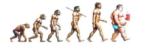
    One of the most interesting connections for me is the link between urban form and public health. There’s been a lot of talk over the years about how suburban sprawl is, or might be, making us fat (among other things). We’ve created environments that are only navigable by cars and that has forced many of us into sedentary lifestyles. We sit in our cars, and then we sit in our offices.

    So today I’d like to conduct a bit of a poll. If you’d like to participate, please share the following 3 things in the comment section below: 1) your city, 2) the type of neighborhood you live in (urban, suburban, rural, etc.), and 3) the amount of time you spend walking or doing something active on an average day.

    Here’s me:

    I live downtown Toronto in the St. Lawrence Market neighborhood (urban). I take the subway to work and the station is a 10 minute walk from my place. So as a bare minimum, I spend at least 20 minutes a day walking. But since I also walk to do most of my regular errands, and since my gym is another 10 minute walk from my place, I’d say I average a good 30-45 minutes of walking each day.

    Now it’s your turn 🙂

    This is a pretty crude survey, but with the advent of things like smartwatches and health monitors, I think we’ll soon have lots of great data on the ways in which our cities might shape our health.

    Image: The Economist

  • TIFF: Getting ready for guests on King Street

    image

    Right now the Toronto International Film Festival is going on in the city. It’s actually one of my favorite times in Toronto. There’s so much going on and the city generally does things that it doesn’t normally allow, but that it should do all throughout the year, such as extending last call at bars and closing down streets to cars.

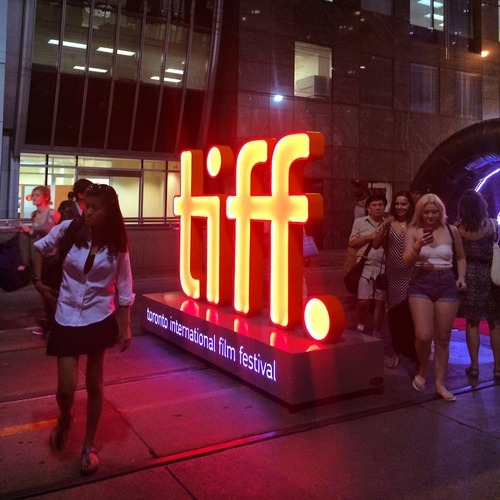
    This year, King Street between University Avenue and Peter Street has been made pedestrian-only. It encompasses an area known as the Entertainment District and includes the Bell Lightbox, which is the TIFF HQ. The street was closed last Thursday and will reopen this Monday. So it’s a 4 day thing, that TIFF is calling “Festival Street.”

    Some people – like me – are really excited about this. Here’s s picture I tweeted out on Thursday night. Given the engagement (retweets/favorites), I think there are others who feel the same way I do:

    //platform.twitter.com/widgets.js

    But there are others who are furious that their commute was disrupted last week and that we’re inconveniencing locals for the sake of hosting one of the top film festivals in the world. (King Street typically moves about 60,000 people per day on the streetcar and 20,000 vehicles.)

    But when I walked the entire 650 meter stretch on Thursday night, it was completely full of people. There were people playing large-scale chess. There were people eating at picnic benches. And there were lots of people just enjoying a wonderful summer stroll in the city.

    And all I could think about is that this is an unmet need in the city. King Street is a wonderful place to be right now and we don’t have an equivalent during the other 361 days of the year here in Toronto. So rather than be upset that we’ve closed down 6 blocks of downtown, I’m only upset that we don’t do more of this and make it permanent during the rest of the year. 

    I’m not necessarily saying that King Street is the best place to do this. Yonge Street initially strikes me as being a better place to start. But I am saying that if we have to reconfigure things to make our city more awesome for when guests come over, that maybe we should think about how to make it more awesome all the time.

  • Understanding the radius of demand for transit

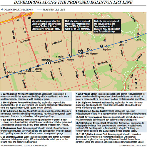
    Last week The National Post published an article talking about Toronto’s Crosstown LRT and how it’s spurring a wave of development all along Eglinton Avenue. Below is a map, taken from that article, showcasing some of the developments that are currently in the pipeline and awaiting the Crosstown’s opening date of 2020.

    image

    Not surprisingly, developers like transit investment. But more specifically, they like fixed track transit investment. Rarely do new bus routes elicit the same sort of response that you’re seeing above. And that’s because fixed track investment has permanence. If you’re going to go long on an area, you want certainty.

    As the Crosstown tunnel boring machines move across midtown Toronto, I thought it would be interesting to look at a transit concept that I first learned about through Jarrett Walker’s Human Transit blog. It’s called: the radius of demand

    One of things that transportation planners look at when designing and building a new line is the spacing of stops. Typically, as you move from buses all the way up to subways, the spacing between stops and stations increases. Spacing is always a bit of a trade off though, because more stops means easier access for riders, but it also means slower overall service. Somewhat famously, Paris designed its metro system so that you’re rarely more than 500 meters away from a station. 

    Once you have your station locations, it’s quite common to then draw a radius around each stop to simulate the catchment area. In other words: How much of the city can I service with this station and how far will people be willing to walk in order to get there? However, this distance, which is the radius of the circle, usually depends on the type of transit. Oftentimes people are willing to walk further in order to get to faster transit service.

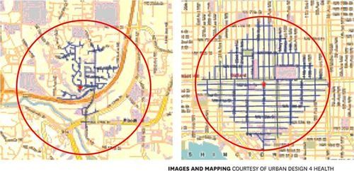
    But what’s most interesting about this radius of demand is that it’s entirely dependent on the fabric of the city. Take for example, the following two maps from Seattle, which I have taken from Walker’s blog. On the left is a suburban setting and on the right is a downtown setting. In both cases, the red circle represents a 1 km radius.

    image

    Now, if humans could fly over barriers, such as highways, and every Seattle resident was willing to fly exactly 1 km to a transit station, these two radiuses of demand would be perfectly accurate. But since that’s not the case, we instead need to look at what actually represents a 1 km walk – those are the blue lines in each image.

    Because once you do that, you realize that the cul-de-sacs and highways on the left make it impossible for most of that radius of demand to actually walk to the station in under 1 km. So the catchment area actually becomes much smaller. On the other hand, if you look at the image on the right, you’ll see that the tried and true city grid is actually remarkably efficient for walking. Almost all of the circle is serviced.

    So as the Eglinton Crosstown LRT makes its way through the center of Toronto, I think it’s important to keep in mind that it’ll be cutting through quite a few different kinds of street grids. Some of them will be highly conducive to transit usage and others not as much. And in many ways, this is one of the greatest challenges of transit investment. The track itself is only one part of the puzzle.

    That’s why the City of Toronto is also undertaking a planning exercise called Eglinton Connects. Its intent is to leverage the opportunities, as well as address the challenges, that will result from Metrolinx’s Crosstown LRT. If you’re interested in the future of Eglinton Avenue, you should consider getting involved. Oftentimes it’s only the critics that speak up. But that’s not the best way to build anything.

  • Mapping public transit travel times

    image

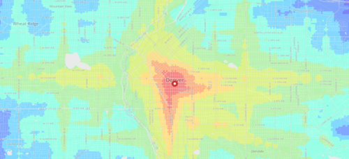
    I just came across an interesting web app created by geographer and programmer Andrew Hardin that maps public transit travel times for San Francisco, Seattle, Boulder and Denver.

    The app allows you to click on a location within one of these cities (or enter an address) and then receive a visual representation of travel times from that location.

    Both public transit and walking are factored in, and the fastest of the two is then modeled. The public transit data is taken from each respective authority and is similar to the data used by Google Maps.

    With these sorts of applications, I always wonder what it might look like overlaid with additional data points, such as home prices. Intuitively I would expect the best connected neighborhoods to also have some of the highest real estate values.

  • Car as prosthetic

    I spent a lot of time in the suburbs over the holidays and it got me thinking.

    For all the talk about intensification here in Toronto, adapting our car dependent suburbs to become, well, less car dependent is going to be an enormous challenge. Once you’ve built out an area around the car, it’s almost impossible to go back. 

    One of the biggest challenges is going to be figuring out how to turn the suburbs from inward to outward. If you think about it, the suburbs are an incredibly inward type of development pattern.

    Retail plazas typically have their entrances—not off main streets—but off internal parking lots. And residential areas often have backyards facing the main streets because nobody wants a house fronting on a major thoroughfare. These are the design principles we’ve used to create our suburbs.

    But the result is that we’ve created environments that are inhospitable to pedestrians. What enjoyment would you get out of walking along a street where everything has its back turned to you? This is the anthesis of animated street life. And in this case, Margaret Thatcher would probably be right: I would feel like a failure taking the bus.

    To compensate for this kind of environment, we’ve made it virtually mandatory to have a car. It’s the only reasonable way to get around. Writer Rebecca Solnit put it best when she said:

    “In a sense the car has become a prosthetic, and though prosthetics are usually for injured or missing limbs, the auto-prosthetic is for a conceptually impaired body or a body impaired by the creation of a world that is no longer human in scale.”

    And that’s precisely it. We built around the car and not around people. And in doing so, we made ourselves dependent. I don’t know about you, but there’s something liberating about being able to walk to all the things I commonly want—food, money, coffee and so on. But maybe that’s just me.

  • Measuring urban form

    Last night the Toronto Transit Commission offered free service starting at 7pm. This is typical of Toronto on New Year’s Eve, as it is with many other cities. I think it’s great thing to do and I love seeing so many people taking transit to get around. I took it everywhere last night.

    Since I knew I would be doing a lot of walking, I charged up my Fitbit Flex and strapped it on around lunch time. Here is my New Year’s Eve according to Fitbit. I took 11,239 steps yesterday afternoon/evening.

    Activity tracking and health monitoring devices have really taken off over the past year. And I absolutely do think they help motivate. But beyond an individual level, I also think this data could be really interesting in aggregate and overlaid with other data points, such as where people live, where they work, how they travel/commute, and so on.

    Many have speculated that urban sprawl makes people fat since it privileges driving over walking. But with all the data that companies such as Fitbit and Nike are collecting, it would be interesting to see some hard data on how much more urbanites really walk compared to suburbanites.

    One idea would be to use Walk Score and examine the correlation between the walkability of a person’s neighbourhood and the average number of steps they take everyday. Intuitively, it seems like there would be a strong one. But it would be cool to see it quantified. I’d happily share my data if somebody would like to take this on.

    Happy New Year, everyone. Welcome to 2014.