Daily insights for city builders, delivered every morning at 6 AM ET. I’m Brandon Donnelly — a Toronto-based real estate developer and founder of Globizen. I’ve been writing here since 2013.

Tag: vienna

  • People prefer IKEA’s maze-like design

    IKEA opened its first permanent showroom in 1953. And by 1965, it had opened a 500,000 sf flagship store on the outskirts of Stockholm.

    Supposedly, the inspiration for this new store was Frank Lloyd Wright’s Guggenheim Museum in New York. Inspired by its continuous looping design, IKEA wanted to create a real-life version of its well-known catalog. This led to the current maze-like design where you wander through staged living spaces and get excited to buy lots of things.

    However, as IKEA began to open in more urban locations it actually started doing away with this prototypical design. The thinking, which seems perfectly reasonable, was that mazes weren’t appropriate for smaller and more urban locations. These customers would want to pop in, quickly get what they need, and then leave.

    But it turns out they were wrong. Their customers are telling them the opposite: they still want mazes. In other words, they want a curated experience that helps them figure out what to buy. According to IKEA: “People buy more when they are shown more.” Sounds right. And so IKEA is now working to make its urban stores more, you know, maze-like.

    The company has already done this in cities like Vienna and Paris, and apparently it consistently leads to higher sales. It’s a good reminder that (1) humans are still humans regardless of where they live and (2) if you want people to visit and linger in your physical store, it’s good practice to curate experiences.

    P.S. I love IKEA.

  • Project Profile: Social housing in Vienna by trans_city architecture

    I stumbled upon this multi-unit housing project in Vienna because I thought it looked beautiful and I started thinking about the solid wall-to-window ratio on its facades. But it turns out that this project is far more than just a pretty face.

    It’s actually a social housing project on the outskirts of Vienna, where the city transitions into the countryside. And it incorporates a number of interesting design features:

    • The complex is heated using groundwater heat pumps (geothermal) and domestic hot water is provided with the help of rooftop solar panels.
    • The structural system consists of concrete slabs and columns (no shear walls) and was all poured in place. But the envelope consists of “prefabricated thermo-brick walls” which were craned into place (see below image). The curving balconies also look to be prefabricated elements.
    • The suites have been designed with a saw tooth pattern and the circulation mirrors this through a zig zagging pattern. The result is units that are akin to what you will find at King Toronto (Bjarke Ingels), though on average the suites here look to be bigger than what we typically design in Toronto.
    • The zig zagging corridors also incorporate skylights that let light down into the middle of the building. I think these run through multiple floors as well, and not just through the top floor of the building.

    This certainly looks like a nice place to live.

    Sources: Architecture by trans_city (Christian Aulinger, Mark Gilbert). Photography by Daniel Hawelka and David Schreyer. Both via ArchDaily.

  • Affordable housing for all?

    Bloomberg CityLab has a new video out talking about how Vienna has seemingly solved the housing unaffordability problem that is impacting most global cities around the world. Each year Vienna builds about 14,000 new housing units and about half of this is supply is “affordable.” Already over 60% of Viennese live in an affordable home. The title of the video suggests that their approach is radical, but is that really the case?

    What was clear to me when I watched the video is that there are perhaps two key differences in terms of how Vienna approaches this problem. One, they quite simply care about delivering high-quality affordable housing to the middle class. They think it’s culturally important and they believe that architecture and design matters. Two, they are willing to invest in it, both up front and over time (maintenance).

    In the video, the former Vice Mayor of Vienna talks about how the City will go out and buy land (or use already owned land) and then make it available (sale or lease) at discounted rates so that it makes economic sense for non-profit housing developers. If the math still doesn’t work for the private sector, then there are other subsidies available.

    I’m certainly not an expert on Vienna’s approach to housing delivery. And I’m not suggesting it’s perfect. My knowledge base comes largely from one 13 minute episode by CityLab. But I think it’s notable that I didn’t pickup anything in the video about inclusionary zoning leading the way (which I have argued before tends to shift the burden to the remaining market rate housing units). Instead, they value it and they invest in it. There’s no such thing as a free lunch.

    Image: CityLab

  • The sensing power of taxis

    The latest project out of MIT’s Senseable City Lab examines the “sensing power of taxis” in various cities around the world. Looking at traffic data, they determined how many circulating taxis you would need to equip with sensors if you wanted to capture comprehensive street data across a particular city. This might be useful if you wanted to measure things like air quality, weather, traffic patterns, road quality, and so on.

    What they found is that the sensing power of taxis starts out unexpectedly high. It would only take 10 taxis to cover 1/3 of Manhattan’s streets in a single day. However, because taxis tend to have convergent routes, they also discovered rapid diminishing returns. It would take 30 taxis (or 0.3% of all taxi trips) to cover half of Manhattan in a day, and over 1,000 taxis to cover 85% of it. A similar phenomenon was observed in the other cities that they studied: Singapore, Chicago, San Francisco, Vienna, and Shanghai.

    However, if you look at the percentage of trips needed to scan half of the streets in a city, Manhattan has the lowest rate at 0.3%. Vienna is the highest at 9%. But I’m not sure if this is a function of the utilization rate of their taxis or if it has something to do with urban form. Singapore has a similarly low rate (0.44%), but its street grid looks nothing like that of New York’s.

    Here’s a short video explaining the project:

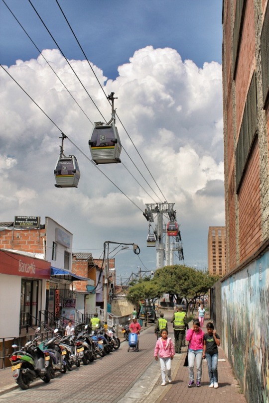
  • Medellín wins 2016 Lee Kuan Yew World City Prize

    image

    Thanks to my friend Darren Davis, I just recently learned about something called The Lee Kuan Yew World City Prize.

    Named after Singapore’s first Prime Minister, the prize is a biennial award that honors cities who have made, “outstanding achievements and contributions to the creation of liveable, vibrant and sustainable urban communities around the world.” Along with the prize comes $300,000 (Singapore Dollars), which is about $287,000 Canadian as of today.

    The 2016 Prize Laureate is Medellín, Colombia.

    Over the past two decades, the city has transformed itself from one of the most dangerous cities in the world to one that has become a model for social inclusion and urban innovation. Here is a video that talks about the transformation. It’s a bit cheesy, but it does provide a high-level overview of their urban initiatives. A lot of them will serve as a reminder about the importance of urban connectivity.

    If you’re a regular reader of this blog, you may also remember that my good friend Alex Feldman (VP at U3 Advisors) wrote a guest post about Medellín after he visited the city for the World Urban Forum almost two years ago. That post was called, What cities could learn from Medellín.

    It’s worth mentioning that the runners-up for this year’s World City Prize were Auckland, Sydney, Toronto, and Vienna. In the case of Toronto, our “far-from-ideal transit” was specifically called out as a negative. Thankfully we are now working on road pricing, which will provide additional funding for transit. 😉

    Image by Jorge Gobbi

  • A tale of two cities

    image

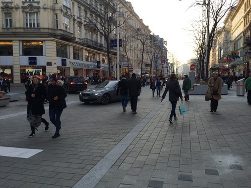
    Yesterday my friend Darren Davis out of Auckland introduced me to a 3-part blog series that he recently did with Andreas Lindinger out of Vienna, which looked at pedestrian zones and shared spaces across these two cities.

    The first post looks at the redesign of Vienna’s Mariahilferstraße (important shopping street that I’m somewhat glad I get to write and not try and pronounce). The second post looks at Auckland’s overall shared space program. And the third one offers a direct comparison between the two cities. The posts are all hosted on an interesting blog called Vienncouver (Vienna + Vancouver), which I am now following as of this morning.

    Compared to both Auckland and Vienna, Toronto is behind when it comes to pedestrian zones and shared spaces. So it’s interesting to see how other cities have managed to pull it off. It’s also further proof that you don’t have to be a warm climate city to have amazing public spaces.

    Image: Vienna via Vienncouver (notice the cars and pedestrians mixed in)

  • How inclusive are your public spaces?

    I subscribe to a blog called Cities for People. It’s the blog of Gehl Architects out of Copenhagen and their focus–both the blog and the firm—is on how the built environment affects people’s quality of life. They call themselves Urban Quality Consultants.

    This morning, they wrote a post on gender mainstreaming in public spaces, which, I’m told, is top of mind in cities such as Copenhagen and Vienna.

    The key insight was that, for a variety of reasons, men and boys seemed to be engaging with public spaces more than women and girls. For example, they found that boys were generally more assertive than girls and so, if there was a toss up between who was going to use a space, the boys would usually win out. As a result, there’s been a lot of debate around creating more inclusive public spaces, both from a design standpoint and a policy standpoint.

    Interestingly enough, this is a debate that doesn’t seem to be happening here in Toronto. And I wonder if it’s because we don’t have the same problems (or I’m just oblivious) or if it’s because we don’t care enough about public spaces to do gender mapping exercises.

  • The 2013 Anholt-GfK City Brands Index

    When most people think of brands, I suspect that they think of companies, products and services. But what about the brand of your city? As cities continue to compete for talent in the global economy, brand is becoming a hugely important differentiator.

    I just stumbled upon the Anholt-GfK City Brands Index and here’s their 2013 ranking:

    1. London
    2. Sydney
    3. Paris
    4. New York
    5. Rome
    6. Washington D.C.
    7. Los Angeles
    8. Toronto
    9. Vienna
    10. Melbourne

    The study looks at 6 key dimensions: presence, place, pre-requisites, people, pulse and potential.

    What do you think of the above list?

    Here’s a bit more information on how the index was prepared:

    “The Anholt-GfK Roper City Brands Index measures the image of 50 cities based on more than 50 questions related to perceptions of their Presence, Place, Pre-requisite, People, Pulse and Potential.  For the 2013 study, a total of 5,144 interviews were conducted in Australia, Brazil, China, France, Germany, India, Russia, South Korea, the United Kingdom and the United States.  Adults age 18 or over who are online are interviewed in each country.  Using the most up-to-date online population parameters, the achieved sample in each country has been weighted to reflect key demographic characteristics including age, gender, and education of the online population in that country.  Fieldwork was conducted from May 8th to May 23rd, 2013.”