Daily insights for city builders, delivered every morning at 6 AM ET. I’m Brandon Donnelly — a Toronto-based real estate developer and founder of Globizen. I’ve been writing here since 2013.

Tag: urbanism

  • Rethinking downtowns to improve urban mobility

    Jarrett Walker of Human Transit recently published an interesting post talking about downtowns. His argument is that we shouldn’t be planning our transit networks around the traditional notion of a single-centered city.

    Here’s a snippet:

    So growing a single downtown isn’t the key to becoming a great transit city. Quite the opposite, it’s best to have a pattern of many centers, all generating high demand, and supporting balanced two-way flows between them that let us move more people on less infrastructure.  This is the great advantage of Paris or Los Angeles or the Dutch Randstad over Chicago or Manhattan.

    Now, there are many cases where a singular economic center still dominates an urban region. See downtown Toronto. And many will argue that the current economic environment is creating more, rather than less, concentrated urban spikiness.

    But at the same time it is quite clear that many of our cities have shifted away from a monocentric model to a polycentric one. 

    I mean, just look at all employment nodes that have developed across the Toronto region. The idea that everyone comes downtown in the morning and then leaves in the evening has become an anachronism for many. Early in my career I spent 4 years commuting from downtown to the suburbs.

    So what is happening is that our cities need to start performing more like point-to-point networks. This isn’t a new thought. But it’s a lot harder to execute on compared to what many cities have been used to. 

    You need a critical density of both residents and employers and the right kind of connectivity to create a true “mobility hub.” In Toronto, you could argue that we really only have one of those and it’s centered around Union Station.

    But I think that will change for many cities. And when we do get it right, we will be doing a lot to improve the crippling traffic congestion that so many of our cities are suffering from.
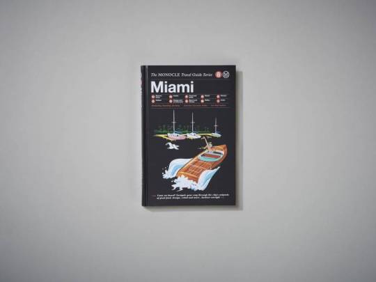
  • The Monocle Travel Guide Series — Miami

    I’m off this week to South Florida to check out Art Basel (among other things). This week isn’t a great week to be leaving the city since it’s the Toronto Real Estate Forum and lots of people are coming to the city for that. But I’ve wanted to go to Art Basel for over a decade, so it was about time I did that.

    I also decided to pick up the new Monocle Travel Guide to Miami. This is the 8th city that they’ve covered and, as you might know from reading this blog, I’m a big fan of Monocle. (I’m still waiting for the Toronto edition, guys.)

    As part of this guide launch – which was timed to coincide with Art Basel Miami Beach – they also released a short video that is worth watching.

    When most people think of Miami they probably think of sun and flash. And that is certainly part of the DNA of the city. But Miami has also grown into a global city with important and extensive connections to Latin America. It’s also an incredible place for those who love art, architecture, and design. If you watch the Monocle video, I’m sure you’ll feel that. 

    Miami is absolutely one of my favorite cities.

  • But what about employment?

    The Neptis Foundation here in Toronto just recently published a fantastic report looking at the regional economic structure of the Greater Golden Horseshoe area. It’s called Planning for Prosperity.

    In it they identity the polycentric nature of employment in the Toronto region by way of downtown Toronto and three suburban “megazones.” Here’s one of their maps showing overall employment density and the megazones (light blue circles):

    Here’s a snippet to give you an idea of the scale of these megazones:

    “The Airport megazone, one of the three employment megazones outside Downtown Toronto, is the second largest concentration of employment in Canada, after Downtown Toronto. It represents almost 300,000 jobs, more than the central business districts of Montreal, Vancouver, or Calgary individually.”

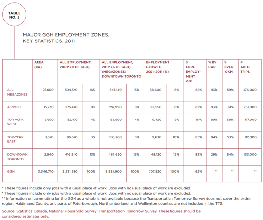
    And here’s a chart showing the hard numbers:

    Downtown Toronto dominates in terms of employment. But it’s also fascinating to see how much more efficiently it provides that employment. It has the smallest physical area of all the employment zones (2,540 hectares or 6,276 acres) and the lowest percentage of car trips (29%).

    But the big takeaway from their report is that we have not been focused enough on employment in our planning. Instead, we seem to be thinking residentially. Here’s a final snippet:


    “This study shows that the Growth Plan and The Big Move, which are currently under review, do not address the challenges and opportunities of a globalizing regional economy or the reality of a transforming economic landscape.

    The Growth Plan’s focus has largely been on managing residential growth rather than non-residential and employment-related development. Indeed, the Growth Plan is based on shockingly little hard evidence on the evolving economy of the region. Plans for city-regions a fraction of the size of the GGH typically involve more economic research, analysis, and evidence.”

    Clearly we need to be looking at both the residential and non-residential sides of the equation as we grow the region. To read the full report, click here.

  • Housing completions in Toronto from 1996 to 2014

    Whenever I read studies that cite census data, I’m often left feeling like the data is out-of-date. 

    Five years – which is how often Canada conducts its national census – is a long time. Somebody could move to this country for school, complete a 4-year degree, and then leave, and we wouldn’t even pick it up in our data.

    Thankfully, we’ve at least reinstated the long-form census for next year. Here are the questions, if you’re curious.

    But all of this is a digression. 

    This morning I read through a housing report that the City of Toronto published in October of this year. It’s about housing trends. And I wanted to share the below chart that covers housing completions for the period of 1996 to 2014. Keep in mind that this is for the City of Toronto, and not the Greater Toronto Area.

    What it shows is that over this 18 year period, 78% of all housing completions in this city have been either low-rise or high-rise condominiums/apartments. The remaining 22% is a mix of detached and semi-detached houses and townhouses.

    However, this 22% is an average. 

    Detached and semi-detached housing completions declined from 22% in the 1996-2001 period to 10% a decade later. And row and townhouses declined from 16% to 6% during this same period.

    At the same time, “many” of the housing units in this 22% were actually replacing existing and older housing stock. That is, according to the report, many were “knock-downs” and rebuilds. In these cases, it means that the completions actually do not represent net new housing units. So in reality, the supply of new single-family housing is even lower than it appears in the chart above.

    When you look at all of this, it should come as no surprise to you that our current combination of low interest rates and low supply has been leading to huge price increases on the single-family side of the market.

    And it’s for this reason that I believe Toronto will eventually start to look towards allowing more low-rise intensification. Laneway housing, as one example, would represent virtually 100% new ground-related housing in already built up areas. Where else are we going to find that kind of housing opportunity?

    So in my view, it is a question of when, not if, this will happen.

  • The rise of the East

    I love the work that LSE Cities (London School of Economics) is doing with Urban Age. If you haven’t yet checked out their site, you should do that now. If you’re a city geek, it’s the kind of site you can get lost in for hours. Especially if you’re a sucker for great diagrams like I am.

    Here’s one I found today that shows where cities are growing in the world:

    Each circle represents a city (well, metropolitan area). The dark green dot is the city’s population in 1950. The lighter green dot is the city’s population in 1990. And the yellow dot is the city’s projected population by 2025. Click here for a larger version of the map.

    What’s fascinating about this diagram is that you can so clearly see how the most significant population growth has shifted away from the West to the rest of the world and in particular Asia. That is, those dots have more yellow than green.

    We, of course, already knew this was happening. And population is just one dimension. But it’s still interesting to see this in diagram form. We are living through the rise of the East. And this diagram is a reminder of that.

  • Project: Under Gardiner — Re-imagining Toronto’s urban infrastructure

    image

    If you’ve been reading this blog since the summer, you might remember that there was a period of time where I wrote incessantly about the removal of the eastern portion of Toronto’s elevated Gardiner Expressway.

    Ultimately City Council didn’t vote the way I believe we should have. But I remain hopeful that somehow we will manage to do the right thing and replace it with a surface boulevard. Now – before the east waterfront gets developed – is the right time to make that happen.

    However, the western portion of the Gardiner Expressway is a different story. The adjacent area is already developed and it is unlikely that this highway is going anywhere any time soon. So for the foreseeable future, we are stuck with it.

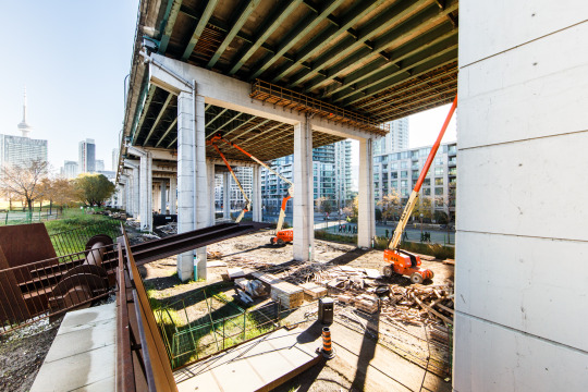
    And if we are stuck with it then we should make the absolute best of it – even celebrate it. Which is why Toronto is buzzing right now with the news that a 1.75 km stretch under the western portion of the Gardiner Expressway will be remade into a vibrant public space by 2017. This is thanks to a generous $25 million private donation. (Is that enough money?)

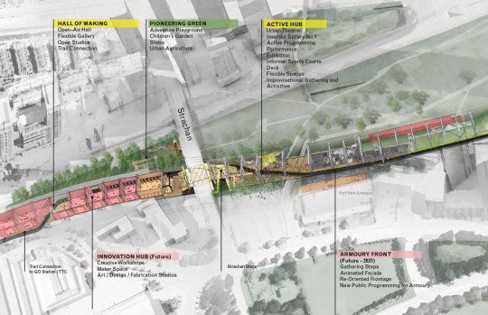
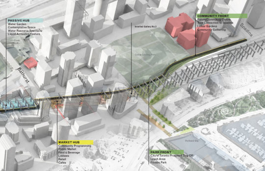
    Here’s the overall programming strategy, going from west to east (via undergardiner.com):

    imageimageimage

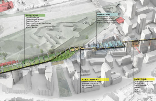
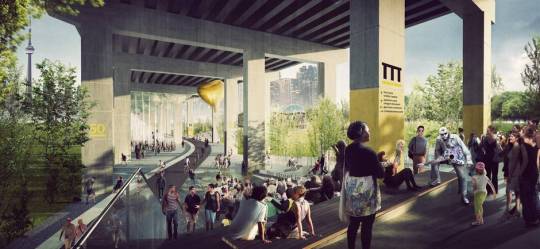
    And here are two renderings:

    imageimage

    The first phase is expected to run from Strachan Avenue in the west all the way to Spadina Avenue in the east. That is what is shown above.

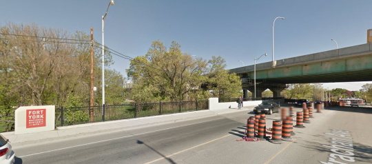
    Two key elements include a grand stair at Strachan Avenue, which looks like this today (via Google Streetview):

    image

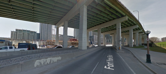
    And a pedestrian bridge over Fort York Boulevard, which looks like this today:

    image

    All of this doesn’t change my opinion of the Gardiner East, but I do believe that this is an incredibly exciting opportunity for the city. Today the space under the Gardiner is a void in our public realm.

    I also think it could be quite interesting to have these two opposing urban conditions along the central waterfront. A linear underpass park in the west and an open air boulevard in the east.

    It’s also exciting to see private money step up. It goes to show you that there is no shortage of passionate city builders in this town.

    Top image courtesy of Harry Choi Photography.

  • Ridesharing could help solve the last mile problem

    X by Keith Mokris on 500px.com

    https://500px.com/embed.js

    A few months ago I wrote a post about Uber’s new “Smart Routes” feature and ended by saying that it’s not just taxis who need to be thinking about platforms like Uber, it’s also public transit authorities.

    I said that because I think that multi-modal is already the new reality in terms of how we get around cities and because the line between different modalities is becoming greyer all the time.

    That’s why I was interested when I stumbled upon this NextCity article talking about how Lyft is starting – it’s still early days – to collaborate with transit authorities in order to make it easier for people to switch between public transit and its peer-to-peer ridesharing marketplace.

    Why might this matter? Here’s an excerpt from the article:

    “According to the company’s data, 25 percent of Lyft riders say they use the service to connect to public transit. In Boston, 33 percent of those rides start or end near a T station. And transit hubs like Chicago’s Union Station, D.C.‘s Union Station and Boston’s South Station are among the most popular destinations for its users, Lyft finds. So riders already see on-demand rides as a solution to the first mile/last mile problem. Lyft thinks it can do more.”

    These last 2 sentences are interesting. Public transit can often suffer from what is known as the first mile/last mile problem. This is a problem where riders find it difficult to get to the nearest transit route from their departing point or to their ultimate destination once they exit transit.

    Bikesharing can be used to solve this. But, clearly, so can ridesharing.

    The other important aspect of this emerging collaboration is that ridesharing apps can offer a lot of incredibly valuable data to transit authorities. If 25% of users are indeed using it to connect to public transit, then all of a sudden cities are getting a more complete picture of point A to B travel. (Among many other things.)

    But the question in my mind is now, who is going to and who should act as the overall steward in this multi-modal urban mobility network? 

    There are lots of different players involved. Some are public and some are private. But they all play a role in how we are going to continue moving around our cities.

  • The value equation

    On Tuesday night I attended a great industry event that Quadrangle Architects organized about mid-rise buildings. 

    Mid-rise buildings (somewhere around 4-12 storeys) are all the rage in Toronto these days. But there are many challenges associated with this building typology and this was an event to talk about them and hopefully push things forward.

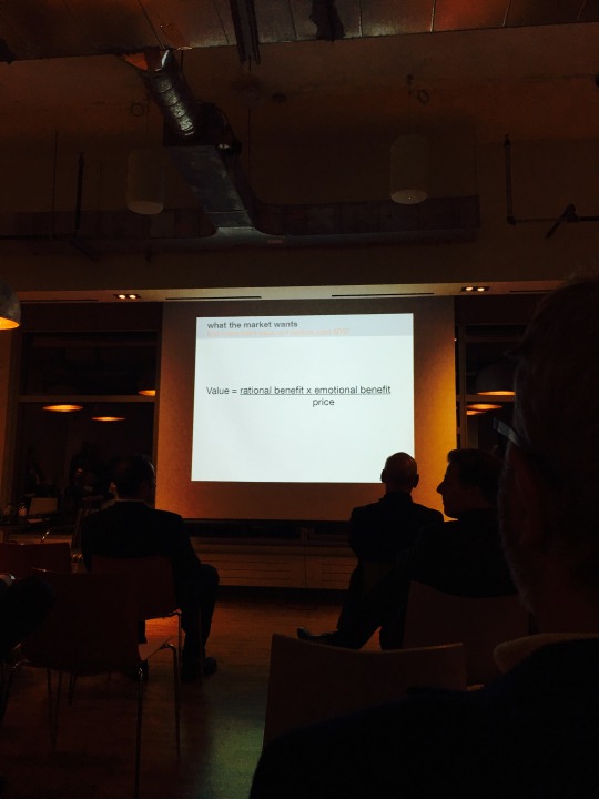
    One of the speakers at the event was Jeanhy Shim of Housing Lab Toronto. And I’d like to share one of her slides here:

    It reads:

    Value = (rational benefit x emotional benefit) / price

    I believe she admitted to taking it from someone at Bruce Mau Design. But that’s okay. That’s how ideas build. What I really like about it is that it attaches a value to the things that are difficult and sometimes impossible to measure: the emotional stuff.

    As I mentioned in this post over the weekend, we are all obsessed with the quantitative side of our businesses. In the case of development, we look at prices, per square foot prices, apartment sizes, and the list goes on. And we often reduce our “products” to these sorts of key metrics.

    But if you’re competing just on numbers, then you’re missing a big and important part of the equation. People consume things – and housing is no different – for a number of different reasons. We buy things because of how it makes us feel, how it reinforces our sense of self, how it improves or promises to improve our lives, and so on. These are all harder to measure than square footage. 

    But we are living in a data driven world and more and more of this type of information will become available for city building. If you and your business can get your head around it first, you’ll have a huge advantage. 

  • Balancing oil and ideas

    Colorado Sunset by Travis Bredehoft on 500px.com

    https://500px.com/embed.js

    Canada is a resource rich country. And one of the things that commonly happens to countries with a lot of resources is that they begin to myopically focus on the immediate gains from resources at the expense of long term innovation and economic development. 

    This is known as the “resource curse.”

    The Martin Prosperity Institute here in Toronto recently published a report that looks at this exact topic: Canada’s urban competitiveness through the lenses of its resource economy and its knowledge economy. In the end, Richard Florida and Greg Spencer conclude that two can and should work together, but that we need to stop neglecting our cities:

    “The oil and gas industry is not necessarily a constraint on the creative economy, but in the past decade or so it has come to dominate thinking around economic development policy-making. It is time to use the resources from the energy economy to build a more secure future as an urban knowledge economy. We can also use
    talent and technology to deepen and expand the resource economy.”

    And one of their key recommendation is something I have argued for many times here on Architect This City:

    “A New Federalism for Cities: It is time to give cities the taxing and spending powers they require. Cities must be given more control over their own destinies if they are to prosper
    in the 21st century.”

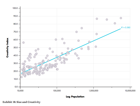
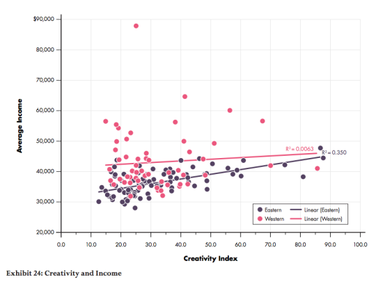
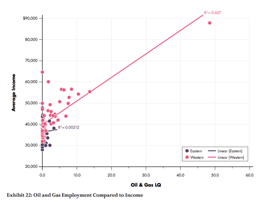
    Now, here are a few interesting charts from the report.

    This first one looks at the relationship between a city’s population and its creativity levels. The two are positively correlated, which means that, in this context, bigger is better.

    This second one splits Canada in half – east and west – and then looks at how average income levels are affected by creativity levels (the knowledge economy). Here we see that in eastern cities, income levels are positively correlated with creativity levels. But in western cities, changing creativity levels have almost no impact on income levels. 

    Finally, this third chart compares the relationship between oil and gas employment (LQ = location quotient) and average income levels. What it finds is that income levels and oil and gas employment are positively correlated in the west, but there’s almost no relationship in eastern cities. 

    The way to read this chart is to think of the LQ as the employment multiple relative to the national average. So for example, a LQ = 10 means that the oil and gas employment levels are 10 times the national average. As you probably guessed, the pink dot way out on the right is Fort McMurray.

    If you’d like to read the entire report, you can do that here. I hope that our new Prime Minister, Justin Trudeau, will read reports like this and spend more of his efforts investing in our knowledge economy – which means investing in our cities.

  • Condo building identities according to Instagram

    I am very interested in the social side of buildings. What I mean by that is that we usually focus on the quantitative side. We look at sale prices. We look at average prices per square foot. We look at reserve fund balances. And as I recently argued, this is all very important stuff. I think we should do much more to make this data publicly available.

    But there’s also a side to buildings that’s harder to measure: the human side. Sale prices and staged MLS listings don’t tell you what the people who live in the building are like. What the vibe will be like at the pool during the summer. If you can expect to find dog poo in your elevators. But when you live in a multi-family building, I think most people will tell you that the qualitative side also matters.

    So this morning, I thought I would run a little experiment and pull the top Instagram photos for a random sampling of relatively new condo buildings in Toronto. These are public photos that have been uploaded and tagged with that building’s location ID. 

    Obviously there’s an inherent bias since I figure Instagram users probably lean towards Millennials. Also, the top posts could be easily skewed by a small number of heavy influencers. But I still thought it would be interesting to see if any particular identities started to emerge. And I do see some differences that reflect what I would have expected. I wonder how these might relate to the original marketing for the buildings.

    What do you think of the photos below?

    Feel free to do the same for your building and post the photo in the comments below. That could make for a really interesting discussion. My building is the first photo.