Daily insights for city builders, delivered every morning at 6 AM ET. I’m Brandon Donnelly — a Toronto-based real estate developer and founder of Globizen. I’ve been writing here since 2013.

Tag: urbanism

  • A new era of (digital) globalization

    McKinsey recently published a report called Digital globalization: The new era of global flows.

    The overarching thesis is that we are transitioning to a data-driven global economy:

    “Flows of physical goods and finance were the hallmarks of the 20th-century global economy, but today those flows have flattened or declined. Twenty-first-century globalization is increasingly defined by flows of data and information. This phenomenon now underpins virtually all cross-border transactions within traditional flows while simultaneously transmitting a valuable stream of ideas and innovation around the world.”

    One of the benefits of this shift is that it has become easier for emerging economies and individuals from all around the world to participate.

    Of course, not all countries and cities are participating equally. In their report, McKinsey ranks the top cities according to five global flows. In each case a proxy was used:

    “Unfortunately, data on global flows are not available at the city level. However, we have obtained data that serve as proxies for each of our five global flows. Container port volumes approximate goods flows; airport passenger volumes serve as a proxy for goods, service, and people flows; the ranking of cities in the Global Financial Centers Index by the Z/Yen Group provides an indication of financial flows; the number of foreign-born residents in a city measures people flows; and Internet bandwidth approximates data flows.” 

    Using this methodology, they believe that the world only has 8 truly global cities right now: New York, Los Angeles, San Francisco, London, Singapore, Shanghai, Hong Kong, and Dubai. They are the colored cities listed below:
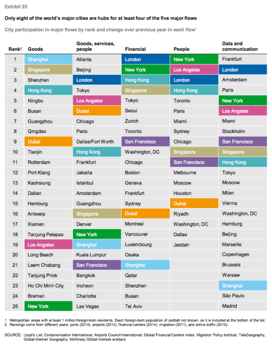
    I always take these city rankings with a grain of salt. This stuff is not easy to quantify and a lot depends on the methodology that you use. 

    For instance, Atlanta sits on the top of “goods, services, and people” because it has the busiest airport in the world according to passenger volume. (It’s the primary hub of Delta Air Lines.) But is that enough to assert that Atlanta is #1? Maybe. Maybe not.

    In any case, the report is packed full of information. If you’d like to take a look, click here.

  • Urban jungle

    Keeping with yesterday’s theme of urban density, here is a photo by Andy Yeung that I am embedding via his 500px page:

    Urban Jungle #04 by Andy Yeung on 500px.com

    https://500px.com/embed.js

    The photo is of Hong Kong and it was taken using a drone. Click here for other photos from his “Urban Jungle” drone series.

    If you remember the maps from yesterday, you might remember that Hong Kong had a peak residential density of around 111,100 people per square kilometre (2013).

    Above is what that generally looks like.

  • Residential population densities compared

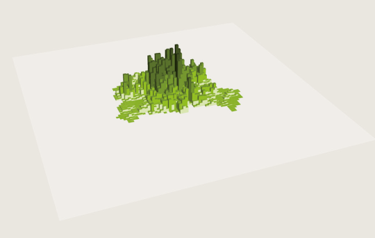
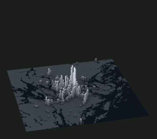
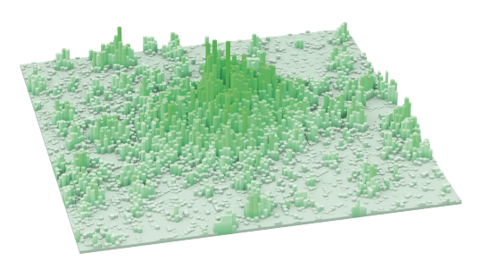
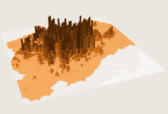
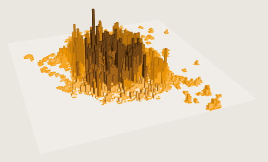
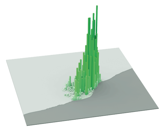
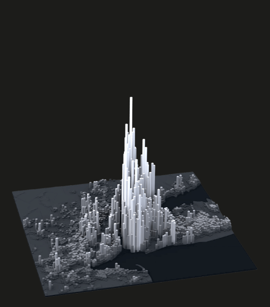
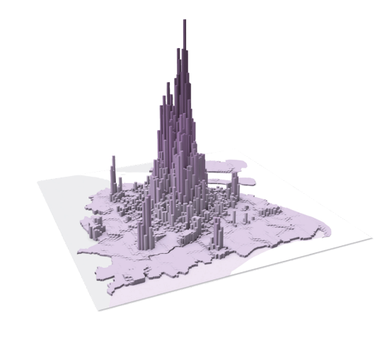
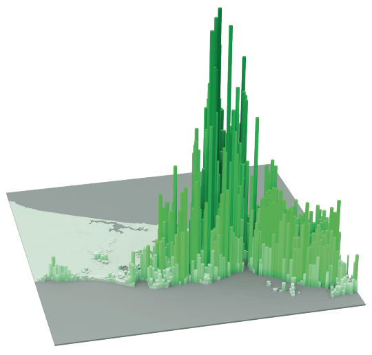
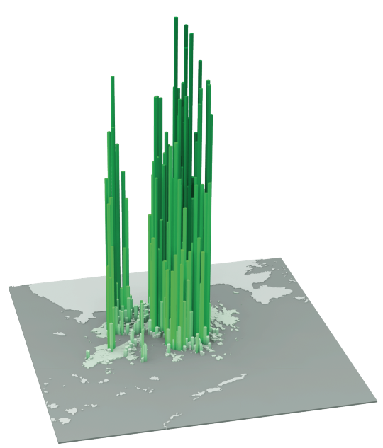
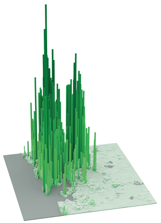
    The following diagrams were taken from LSE’s Urban Age website. I’ve sorted them from lowest to highest peak residential population density. In each case I’ve also included the year of the dataset. 

    It’s amazing how much these simple extrusion diagrams can tell you about the city. It also shows you that high population densities don’t necessarily need to equate to tall buildings. Barcelona, in particular, stands out for me.

    Berlin (Peak residential density: 21,700 people/km2, 2009)

    image

    Stockholm (Peak residential density: 24,900 people/km2, 2012)

    image

    London (Peak residential density: 27,100 people/km2, 2013)

    image

    São Paulo (Peak residential density: 29,380 people/km2, 2009)

    image

    Mexico City (Peak residential density: 48,300 people/km2, 2009)

    image

    Barcelona (Peak residential density: 56,800 people/km2, 2013)

    image

    New York (Peak residential density: 59,150 people/km2, 2012)

    image

    Shanghai (Peak residential density: 74,370 people/km2, 2011)

    image

    Istanbul (Peak residential density: 77,300 people/km2, 2013)

    image

    Hong Kong (Peak residential density: 111,100 people/km2, 2013)

    image

    Mumbai (Peak residential density: 121,300 people/km2, 2013)

    image

  • Global home prices at the end of 2015

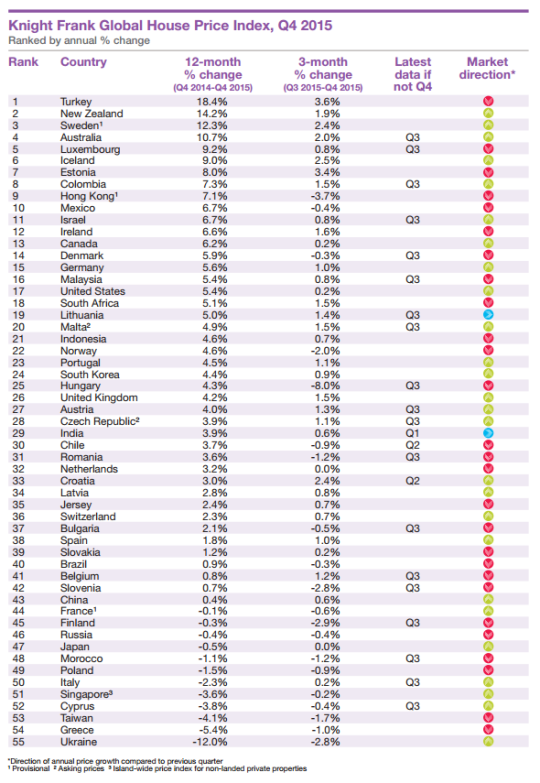
    Seeing how we’ve started looking at data from last year, I thought it would be interesting to look at global home prices as of Q4 2015. Here’s a chart from Knight Frank, which they refer to as their Global House Price Index:

    At the top of the list is Turkey, with an 18.4% increase from Q4 2014 to Q4 2015. (Supposedly this is because it has recently become easier for foreigners to buy property in the country.) Canada is 13th with a 6.2% increase (during this same time period) and the United States is 17th at 5.4%.

    This is obviously a high level analysis. There are lots of regional and local variations within each country. For instance in Canada right now, Calgary is a very different place than, say, Vancouver or Toronto.

    Nonetheless, it’s still valuable to see the relative performance of each country and see what their (Knight Frank’s) prediction is for 2016:

    “Our outlook for 2016 is muted. We expect the index’s overall rate of growth to be weaker in 2016 than 2015. The global economy is experiencing a potentially dangerous cocktail of low oil prices, a strong [US] dollar and a continued slowdown in China.”

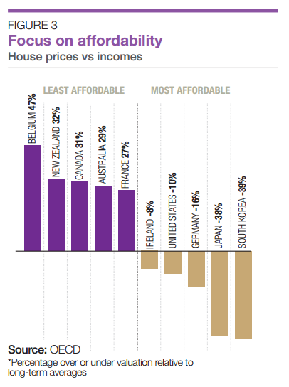
    It’s also interesting to see how the countries rank in terms of affordability:

    Once again, Canada ranks as being one of the least affordable countries in terms of home prices.

  • Easier said than done

    Earlier this week I saw the Chief Planner of Toronto, Jennifer Keesmaat, tweet this out:

    //platform.twitter.com/widgets.js

    I responded with the below quote retweet because I figured I should probably devote a blog post to this topic and not just a tweet.

    //platform.twitter.com/widgets.js

    Now, I don’t know for sure, but I am guessing that her tweet was in response to the criticism from architects and developers that Toronto’s design guidelines are creating homogenous architectural outcomes. Some people – and I’ve written about this before on ATC – believe they’re too prescriptive.

    So today I’d like to talk about why playing creatively within the guidelines/zoning envelope, particularly at the mid-rise scale, is a lot easier said than done.

    Generally speaking, the value of land is dependent on what you can do with it or, in this case, what you can build on it.

    If all you could do was plant things on it, then the value of the land would be correlated with crop yields. If on the other hand you could build a building, it would be correlated, at least in theory, with the amount of space you could build and the rents you could charge for that space.

    Of course, this isn’t a perfect science. That’s why I said “in theory.”

    Landowners obviously want to maximize the value of their asset when it comes time to sell. So they, along with their brokers, will naturally try and stretch what is possible with the land. Why else do you think the best neighborhoods seem to magically grow new boundaries?

    When you combine this with the fact that mid-rise buildings are inherently less efficient to build and with the fact that their smaller size creates diseconomies of scale, it can be exceptionally difficult to find development sites where the numbers make any sort of financial sense. That is, even if you “maximize the envelope” and push rents or sale prices.

    So, with all due respect, not maximizing the envelope is almost unthinkable, unless you somehow managed to get a bargain on the land.

    Many of you will likely respond in the comments saying that all of this is simply a result of real estate developers being greedy capitalist pigs. But what we are talking about is no different than in any other competitive business environment. 

    Developers rent and sell products – albeit products that take an incredibly long time to make and bring to market. To make those products, there are a many costs, ranging from the cost of land to the cost of drawings. But hopefully within all of those numbers sits a profit margin that makes sense given the amount of work and risk that the developer has taken on. 

    Put differently, telling developers not to maximize the envelope is like telling a pizza maker to throw out 10-15% of her dough before she makes every pizza – even though she already (over)paid in full for the dough.

    If you’ve ever created a development pro forma, you’ll know that it’s not easy getting the numbers to work when you’re operating in a competitive market. This is not a knock against creative design. Trust me, I am a design snob. This is just business.

  • Boondoggle or architectural icon?

    Today, the new World Trade Center Transportation Hub, designed by architect Santiago Calatrava, opened up – at least partially – in New York City. 

    Given that it was originally supposed to open in 2009 and cost about half as much (original budget was $2.2 billion), the critics haven’t been kind.

    Here are a few snippets from Michael Kimmelman’s writeup in the New York Times, called, Santiago Calatrava’s Transit Hub Is a Soaring Symbol of a Boondoggle:

    …at first blush, Mr. Calatrava’s architecture can almost — almost — make you forget what an epic boondoggle the whole thing has been. That virgin view, standing inside the Oculus and gazing up, is a jaw-dropper.

    The project’s cost soared toward a head-slapping, unconscionable $4 billion in public money for what, in effect, is the 18th-busiest subway stop in New York City, tucked inside a shopping mall, down the block from another shopping center.

    And it’s not really a hub. A maze of underground passages connects the site to far-flung subway lines, but there are not free transfers. The place is a glorified PATH station for some 50,000 weekday riders commuting to and from New Jersey.

    I haven’t been following this project, so I can’t really comment on the delays and cost overruns. But I sure wish that main hall (called the Oculus and pictured above) was a part of my regular travel routine.

    Image via Curbed

  • A breakdown of land use in Vancouver

    Last night when I was thumbing through Twitter before bed, I came across this blog post describing Vancouver’s land use types. The blog itself is called Mountain Doodles, but it’s not exactly clear who the author is. 

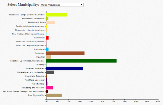
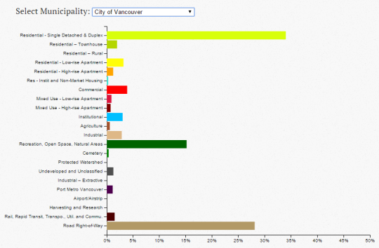
    In any event, what she/he did was analyze Vancouver’s land use dataset to come up with a series of charts that break down the percentage of each type: residential single detached, residential low-rise apartment, commercial, green space, and so on.

    Here’s what the chart looks like for Metro Vancouver:

    And here’s what it looks like for just the City of Vancouver, proper:

    When you look at the metro area, green / open space dominates. Although, the author states that, given the dataset, there could be a small overstatement of green space. There’s also the question of where the overall boundary was drawn.

    When you look at only the City of Vancouver, it’s land for residential housing (detached and duplex) and roads that dominate, with green / open space coming in a somewhat distant third.

    Of course, this does not speak to the intensity in which any of the above land might be used, such as the apartment lands (i.e., the third dimension). But from a two-dimensional perspective, you certainly get a sense of what we – for better or for worse – have chosen to privilege.

  • NO TOWER on Commercial Drive

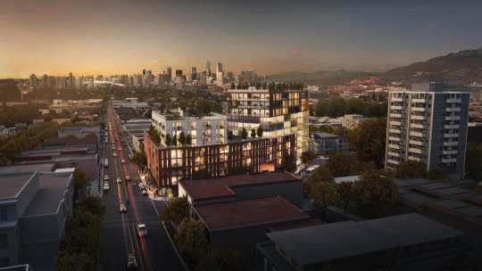
    For the past week or so I’ve been seeing the proposed Kettle Boffo Project in Vancouver make the rounds online. Here’s a rendering of the project, which is located at Commercial Drive and Venables Street:

    image

    The reason it has been making the rounds is that a community group called NO TOWER (written in all caps) has come out in fierce opposition of the 5 to 12-storey building. They have over 3,500 signatures.

    As an outsider looking in, this is surprising. The scale of the project seems appropriate. The height roughly matches the existing building shown above to the right. It may even be lower. And the project will provide somewhere around 30 social housing units, as well as additional space for the Kettle Friendship Society non-profit, who are currently on the site. (Note: An application to the city hasn’t yet been made.)

    What this has me thinking about is the push and pull between bottom-up and top-down planning. 

    When architect Bjarke Ingels talks about his Dryline project in New York, he likes to refer to it as the love child of Robert Moses (top-down planning) and Jane Jacobs (bottom-up planning). In the case of this project, it’s because it’s a large infrastructure project that they are trying to root into the local neighborhoods. Makes sense.

    But this same thinking could also apply to overall city building. Local communities rightly have their own wants. But at the same time, cities need to be thinking about the overall. The challenge is finding that right balance.

    I would be curious to hear your thoughts on the Kettle Boffo Project in the comment section below – especially if you’re from Vancouver.

  • What the UPX fare reduction means for the west side of Toronto

    Last week Metrolinx slashed fares on Toronto’s Union to Pearson Airport express train (UPX), by a lot. From $27.50 to $12 for people without a PRESTO card and from $19 to $9 for people with a PRESTO card. They listened to the pundits. And there were a lot of them regarding this topic.

    At these fares, the UPX is decidedly cheaper than a taxi or Uber, but more than regular transit, which I think makes sense given that it’s a better overall experience. I would take this train all day long.

    But the other thing that Metrolinx did was also reposition the train service as an inner city commuter service by matching fares with GO transit for non-airport trips within the city. As one example, this means that you can now go from Bloor & Dundas West in the west end to downtown Union Station for $5.30 in cash or $4.71 with a PRESTO card. This is in comparison to $3.25 in cash on the subway.

    But this is huge, because look at the options for this transit trip:

    • UPX Train: 8 minute trip; service every 15 minutes
    • GO Train: 12 minute trip (additional stop); service every 20-30 minutes during peak times and roughly every hour during off-peak times (so no drinks after work)
    • Subway: 26 minute trip; most frequent service

    This is a significant connectivity upgrade for the west side of the city. One that reinforces my belief that, next to Union Station, Bloor/Dundas West is the best connected mobility hub in the Toronto region. This now a perfect location for companies and people who need quick access to both the Financial District and the airport. Unfortunately though, I don’t think we’ve taken full advantage of this connectivity in terms of what we’ve allowed and disallowed to be built in the area to date.

    I’ll end by saying that I think the pundits have been overly critical of the UPX train. Everyone loves to talk about it as a failure. But look, every organization and person makes mistakes. If you’re not making mistakes, then you’re not pushing yourself hard enough. The key is to iterate and refine as you charge along. So go make some mistakes today 🙂

    Image: UP Express

  • The local vs. global city

    Blogger and Senior Fellow at the Manhattan Institute for Policy Research, Aaron M. Renn, recently published an interesting long-form article called, Rethinking America’s Cities’ Success Strategy.

    One of the central themes is the idea that globalization has caused a kind of bifurcation in cities – a disconnect between the local and the global. In an effort to compete with other global cities around the world, we have begun to turn our back on local concerns. At the same time, not every city has the market power of, say, New York or London.

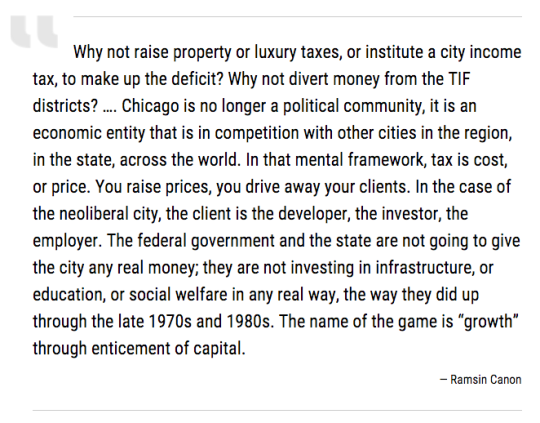
    So what does this mean for cities? Here’s a quote from the article that I think does a good job explaining the mental model:

    At the end of the article, Aaron makes a number of recommendations for how to better think about local entrepreneurship and economic growth. The first one is as follows:

    “Local civic priorities should favor building a successful and inclusive local economy, including entrepreneurship, over global concerns and real estate development.”

    Despite this being seemingly contradictory to do what I do for a living, I think it’s important to note that on a fundamental level, architects and developers simply create space. 

    It might be a beautiful space. A space that improves well-being, creates value, and enables certain activities. But at the end of the day, there needs to be demand for that space. And a robust local economy is paramount to that equation. So I agree that we shouldn’t forget about local and expect that “if we build it, they will come.”

    If you have the time, the full article is worth a read. It’s also part of a broader series on entrepreneurship and cities, so there are a bunch of other related articles on the same page.