Daily insights for city builders, delivered every morning at 6 AM ET. I’m Brandon Donnelly — a Toronto-based real estate developer and founder of Globizen. I’ve been writing here since 2013.

Tag: urbanism

  • Unpacking the family condo

    John Lorinc has a piece in the Autumn 2018 issue of University of Toronto Magazine that is worth a read. It covers families in Toronto being priced out of the low-rise housing market and/or making the conscious decision to live in an apartment or condo.

    He raises an important question:

    The big question hovering over this generational transition is all about city-building, and whether increasingly dense metropolitan regions such as Toronto and Vancouver can figure out how to turn all those newly sprouted forests of highrises into true communities that are both affordable and appealing to the wide range of people who call these cities home.

    The reality seems to be that more people in this city – out of economic necessity and/or because of a lifestyle preference – are choosing to raise a family in multi-dwelling housing. I live in a condo and my neighbors are raising a child two doors down from me.

    I am sure that we will continue to see more of this and I am sure that we will get better at designing for families. We are trying to do our part with the 2-storey homes that we have incorporated into our Junction House project. 

    I would, however, like to respond to the underlying tone in the article that but for developers being stubbornly resistant to larger 3-bedroom apartments in this city, we would have a myriad of new condominiums filled with families.

    The reality is that there are market and structural forces (including cultural biases) that steer what gets built.

    There are affordability considerations. Larger condos cost more money than smaller condos. And that prices out many families, particularly if there are cheaper alternatives available in the form of low-rise housing. 

    The reason we appear to be at an inflection point today is because the cheaper alternatives are disappearing. (This of course returns us to the broader question of overall housing affordability.)

    There are also timing and financing considerations that likely create a supply-side bias. Most lenders require that a certain number of condo units be pre-sold before construction starts. 

    This means that, as a developer, you need people that can both afford what you’re selling and that are willing to buy three to five years out, and perhaps even longer. That can be difficult for many families.

    Lastly for this post, there’s the GST/HST New Housing Rebate in Ontario, which I have argued before on the blog could be incentivizing smaller suite sizes and could use a refresh for today’s home prices.

    All of this is not to say that we shouldn’t be designing for urban families and that we shouldn’t be focused on delivering more affordable housing to this and other cities. Those are two very important things.

    It is simply to say: there’s a lot going on here that needs to be unpacked. 
  • Rules are meant to be broken

    Things are busy right now as we get ready to unveil Junction House this fall and so I’m a bit behind on my news and reading. 

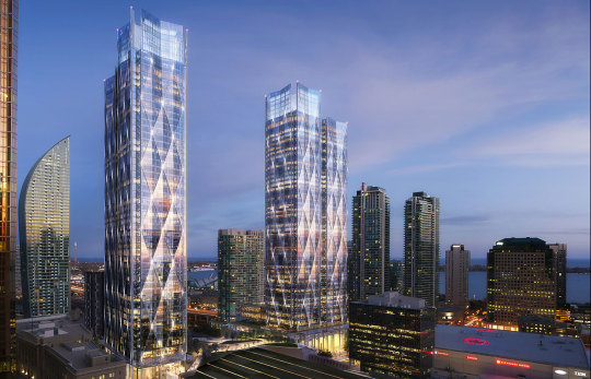
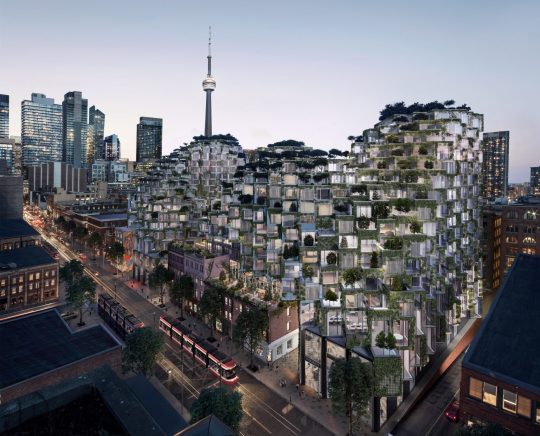
    I just finished reading Alex Bozikovic’s Globe article on BIG’s new KING Toronto project (official name). It is an interesting piece about creating villages and a sense of community in new developments – something that Bjarke Ingels has been focused on for many years. 

    Below are a few renderings of the project. I’m excited for this one. And as I said before on the blog, I am sure it will be precedent setting in a number of ways.

    One remark from the article that stood out for me is this one here:

    Still: The design breaks a lot of rules. Which is why it took two years of difficult negotiations with city planners to reach approvals. “We wanted it to be quieter,” says Lynda MacDonald, a senior Toronto planner who was involved in overseeing the project. “It’s a very large project, and we wanted to make sure it respected the character of King Street.”

    I am often asked why we don’t see more innovation in architecture and real estate. There are a number of reasons for that. One of them is risk. Development is in many ways a game of risk mitigation. 

    But another reason is that when you try and do something unconventional that disrupts the status quo, you also call into question the typical planning criteria used to evaluate projects. And that may slow you down.

    Alex accurately points out in his article that we are used to doing things around here in one of two ways:

    The King Street project is also an ambitious experiment with urban design. There are basically two species of tower in Toronto: a midrise slab of six to 10 storeys, which steps back at the top; and a “tower-and-podium,” a model borrowed from Vancouver that combines a fat, squared-off base (or “podium”) with a tall, skinny residential tower. Both can work, but can also create the big-box blandness that many people dislike about new urban housing.

    None of this is to suggest that we should ignore the character of a particular area. It is critical and I believe that KING Toronto has been mindful of that. 

    But I also firmly believe in ambitious city building and I think there’s no question that KING Toronto is doing exactly that.

    Images: Hayes Davison via Dezeen and courtesy of Westbank

  • Our social connectedness

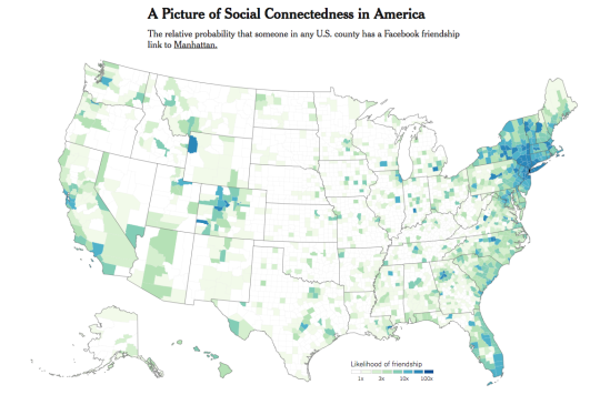
    Economists at Facebook, Harvard, Princeton and NYU recently analyzed anonymous Facebook data in order to study our social connectedness. The New York Times’ Upshot wrote about it here and it is a must read.

    There are a number of interesting takeaways from the study. One of them is that geography, distance, and political boundaries actually matter a great deal when it comes to our connectedness. 

    In other words, Americans are more like to be connected to someone nearby – within county or state boundaries – than they are to someone further away who may be infinitely more similar. This may seem somewhat intuitive.

    But at the same time, having a dispersed network also suggests certain things. Here’s the relationship that they discovered:

    These networks are important in part because of other patterns that are correlated with them. Counties with more dispersed networks — where a smaller share of Facebook friends are located nearby, or among the nearest 50 million people — are on average richer, more educated and have longer life expectancies. Places that are more closely connected to one another also have more migration, trade and patent citations between them.

    Counties that are more geographically isolated in the index are more likely to have lower labor force participation and economic mobility, and they have higher rates of teenage births. Some of the most economically distressed parts of the country appear to be the most disconnected: Among the 10 U.S. counties with the highest share of friends within 50 miles, six are in Kentucky.

    Again, it is worth checking out the full article. There’s also an interactive map to play around with.

  • The un-hotel

    According to Condé Nast, the coolest hotel trend for 2018 is the “un-hotel.” Here’s what they mean by that: “Instead of many rooms under one roof, these new un-hotels have different rooms in various locations, united only in character and concept.”

    I wrote about one of these un-hotels, the Vipp Shelter, back in the spring. I was interested both in how the company was using their hotel as a kind of shop and how they had adopted this decentralized approach to hospitality.

    Different rooms in different locations has got to create some diseconomies. But the appeal is clear. We are all craving new experiences.

    To me, it feels like a hybrid between an Airbnb and a boutique hotel. You get to “travel like a local”, but you’re still staying with a brand and there’s likely some sort of unifying concept across the portfolio.

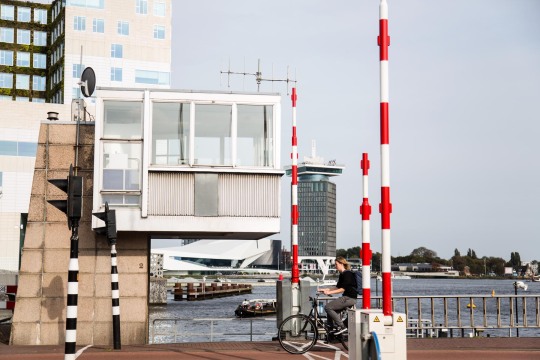
    Check out the SWEETS hotel in Amsterdam.

    Image: SWEETS hotel

  • Leading female architects

    Reed Kroloff has a noteworthy piece in the New York Times talking about how architecture is no longer just a ‘gentleman’s profession’. Though less than a third of AIA (American Institute of Architects) members are females, “offices led or owned by women are creating an ever-wider range of public buildings that address architecture and urbanism in new and invigorating ways”, says Kroloff.

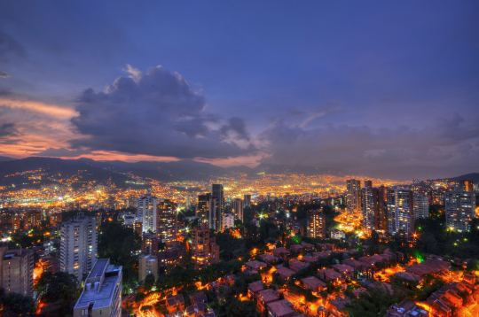
    I am thrilled, but not surprised, to see Jeanne Gang of Studio Gang on the list (pictured above). Her firm is the design architect behind our One Delisle proposal. And I was also happy to see Magui Peredo of Estudio Macias Peredo on the list. She is based in Guadalajara and, if you aren’t familiar with her work, I recommend you check it out. I love the materiality of it.

    Image: New York Times

  • Invisible walls

    image

    This is an interesting working paper by a team of researchers at NYU’s Marron Institute of Urban Management. The paper examines the relationship between urban density and organized violence, first in Colombia and then within a sample of 200 global cities.

    The finding is that organized violence actually increases the population density of the surrounding areas within a city because it creates a kind of “invisible wall” – effectively a no-go zone.

    This makes perfect intuitive sense, but it’s not something I ever considered. Geography and other natural constraints typically drive density. Think about the island of Manhattan. But so too can invisible walls.

    For the full working paper, click here.

    Photo by Joel Duncan on Unsplash

  • Microsoft Canada moving to CIBC Square

    image

    Today, Microsoft announced that it will be moving its Canadian headquarters from Mississauga to the new CIBC Square development that is currently under construction in downtown Toronto (and rendered above). 

    According to RENX, Microsoft will occupy 132,000 square feet across 4 floors in the first tower. Occupancy is scheduled for September 2020.

    I love this project. The design architect is WilkinsonEyre. And there’s going to be an elevated one-acre park spanning the rail corridor between the project’s two towers.

    But it’s also noteworthy because it is an example of a major suburban tenant deciding to relocate to a transit-oriented urban environment. (I have a post on this somewhere.) 

    Image: WilkinsonEyre

  • Unzipped wall on King Street West

    image

    Last night I checked out the Unzipped Toronto exhibition, which is the relocated Serpentine Pavilion (pictured above) that was designed by Bjarke Ingels Group in 2016. 

    It was initially housed in Hyde Park London, but it’s now on King Street West Toronto. Westbank purchased the “unzipped wall” after it was installed in London and supposedly it will eventually find a permanent home in Vancouver.

    The official opening of Unzipped Toronto is September 15th, 2018. It will be free and open to the public. If you’d like to get a complimentary ticket, you can do that here

    The timing of all this lines up with condo sales for Bjarke Ingels’ first project in Toronto. I believe that will be starting this fall. And I am sure they will end up setting some new records for the King West submarket.

  • Red streetcar tracks

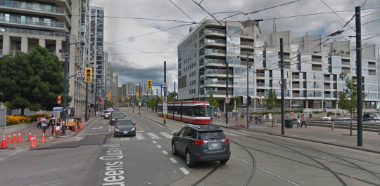
    A few months ago when I wrote about “Toronto’s great streets” I mentioned that Queens Quay West – while magnificent – has had its share of issues. Cyclists and pedestrians often find themselves battling for space. And drivers are consistently driving in the wrong places.

    Part of the problem, I think, is that the turning radii (among other things) are a bit atypical and unusual compared to the rest of the city. And so if you’re at all in mental autopilot, it can be fairly easy to make a wrong turn. You really have to be paying attention.

    Below is a screenshot from Google Street View showing the foot of Lower Spadina, looking east on Queens Quay West. If you’re making a left turn from the former onto the latter, you need to end up on the left (north) of the streetcar tracks (even though the tracks themselves might be directing you elsewhere).

    There’s lots of signage telling you not to drive onto the tracks, but that hasn’t really been working. So the tracks were recently painted in bright red. You can see what that looks like here. Some people are still getting mixed up, but it’s certainly more noticeable.

    What I am wondering today is whether all of this signage and paint should be considered a symptom of poor design. In other words: Should good design require few instructions? Or, is this simply a normal part of iterative city building?

    What do you think?

  • Limits of housing affordability

    The San Francisco Chronicle recently published an article called, “SF residential projects languish as rising costs force developers to cash out.” It talks about the impact that rising costs (both construction and other) are having on new housing supply. Some developers aren’t building even though may have entitled sites. And that’s because the math doesn’t work, even though we’re in a market with a severe housing shortage.

    Here is an excerpt from the article that talks about the kind of pricing that is needed in order to make a project work:

    Chris Foley, a real estate investor and partner in brokerage firm Polaris Pacific, said that in the current construction environment a condominium developer needs to sell units for at least $1,400 a square foot for a wood-frame building and $1,800 a square for a taller, steel-frame midrise or high-rise. Even in a city where more than 80 percent of the population is priced out of the market, those numbers are a stretch, Foley said.

    San Francisco also has inclusionary zoning, which requires a certain percentage of units in any new development to be priced below market. According to the article, it is 18% for new rental projects and 20% for new condo projects. That’s a cost that needs to be absorbed by the remaining market rate units – so price accordingly. 

    The MIRA tower designed by Studio Gang is currently under construction and has 156 affordable units and 393 market rate units. The market rate pricing looks something like this:

    That’s the case with three buildings rising near the new Transbay Transit Center: Mira, the Avery at 400 Folsom St., and One Steuart Lane, which overlooks the Embarcadero at the foot of Howard Street. Unless there is a remarkable drop in the market, units in all three of those buildings will probably have an average sales price of more than $2,000 a square foot and penthouses could fetch $3,000 or even $4,000 a square foot. A 3,326-square-foot penthouse at 181 Fremont St., which opened last spring, recently sold for $15 million, or $4,500 a square foot.

    Projects being squeezed by rising costs is something that we are also seeing here in Toronto. And I don’t believe that the general public fully appreciates that there are limits to the costs that can be shouldered by new development. And the reason for that is because there are limits to what people can afford to pay for new housing.

    Photo by Jamie Street on Unsplash