Daily insights for city builders, delivered every morning at 6 AM ET. I’m Brandon Donnelly — a Toronto-based real estate developer and founder of Globizen. I’ve been writing here since 2013.

Tag: urban

  • European-style height, but not density

    As I wrote about last month in this pithy post, the relationship between building height and density are often misunderstood. They mean different things and so the implications for our cities can also be vastly different.

    I woke up this morning to a couple of tweets by John Michael McGrath that I think hit the nail on the end with respect to this duality. If you can’t see them below, click here.

    https://twitter.com/jm_mcgrath/status/1105500872979742720

    Paris is known, and largely celebrated, for its “European-scaled” mid-rise buildings. But as John points out, these buildings often line narrow streets (see above). They are typically also built across large blocks with compact internal courtyards and with few setbacks and/or stepbacks. The combined result is that Paris is one of the densest cities in Europe. It has mid-rise at scale.

    The North American context is quite different. The large majority of our land is usually reserved for low density housing. (Here in Toronto this land has been nicknamed the “Yellowbelt.”) We have a policy context that only allows intensification in select places, and that can create pressures to build up. It’s a bit like squeezing a closed tube of toothpaste.

    In 2012, Eurostat ranked Paris as the densest city in Europe with an average population density of approximately 21,516 people per square kilometer. Whereas, according to Wikipedia, the population density of metro Toronto was around 5,905 people per square kilometer in 2016.

    What is it, again, that we love so much about Paris?

  • Algorithmic home buying — what’s the end game?

    Bloomberg recently published a good summary of Zillow’s business and their move into algorithm home buying and flipping. (They are trying to avoid the “flipping” moniker because of the negative connotations associated with it.)

    Zillow started buying homes directly from owners last spring. They charge the seller between 6-9%, so more than using a typical agent, but inline with their competitors. There’s clearly a segment of the market willing to pay a premium for the added convenience.

    The thinking used to be that discount brokerages were the way to disrupt the housing market. This is the opposite strategy.

    Interestingly enough, Zillow felt that they needed to make this pivot with their business model. It used to be about selling ads. They were definitive in that they were not a disruptor of real estate agents.

    But now:

    If getting an offer from an iBuyer became a crucial step in the selling process, they worried, Zillow could lose its audience and its advertising base. What’s more, market researchers kept finding that consumers said they’d pay a modest premium to get a cash offer. “People expect to press a button and have magic happen,” says Rascoff, a 43-year-old former Expedia executive who’d earlier started the travel search engine Hotwire, which he sold to Expedia for $700 million. Getting into the business of buying homes directly, Rascoff says, was “the only way to remain in a leadership position.”

    Here is a map of the companies in this particular space and the cities in which they operate:

    Some investors aren’t sold on this strategy and have begun short selling Zillow (according to the Bloomberg article). I keep getting the sense that there’s a greater end game in the cards here. It is about building up A (algorithmic home buying and flipping) in order to unlock B.

    But what’s B — a new end-to-end transactional model for the housing market?

  • Blue Zones

    Over the weekend I learned about Dan Buettner’s Blue Zones. These are cities and parts of the world where, according to Dan, people have a much longer life expectancy. The five regions he identifies as Blue Zones are: Okinawa (Japan); Sardinia (Italy); Nicoya (Costa Rica); Icaria (Greece); and Loma Linda (California).

    Many of you have probably heard of this finding from Malcolm Gladwell. I think he writes about it in Outliers. I had. But I didn’t know about Dan Buettner and his efforts to teach these “secrets” to other regions around the world. 

    I can’t speak for the efficacy of his consulting practice, but I think it’s interesting that some of the characteristics of these Blue Zones include a strong sense of family and community, as well as constant moderate physical activity. In other words, activity that is integral to normal life, such as lots of hills in a mountain town.

    The links between urban form, walking and biking (instead of driving), and health outcomes are something that get a lot of air time. It is, of course, one of the reasons why denser cities are thought to be healthier cities. They encourage more active forms of mobility.

    But what else could we be doing to make physical activity an inseparable part of urban life? In Rio de Janeiro, they often incorporate fitness facilities into their public spaces, whether it’s a parklet or the beach. That probably doesn’t qualify as inseparable, but it’s certainly a start.

  • Cities are labor markets

    Eduardo Porter recently published this piece in the New York Times on the “relentless economic decline” of small-town rural America. We often talk about rising income inequality, but the greater concern is the alarming rate of joblessness in many of these communities. Earning less than others is not as bad as earning nothing.

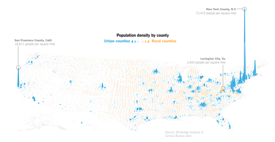
    I think the below map from the article, depicting population density by county, starts to show how uneven the economic landscape is across the US. Porter puts it this way: “This is the inescapable reality of agglomeration, one of the most powerful forces shaping the American economy over the last three decades.”

    image

    But, of course, we don’t really have a solution to this problem. Some are suggesting employment subsidies, such as the earned-income tax credit. While others are suggesting that we need to make it easier to build in the large blue spikes shown above. That way we’ll be able to more affordably accommodate the people who will ultimately need to move from rural to urban.

    While this latter suggestion may seem grim for small-town America, it is perhaps a reminder of what cities really are at their core: Cities are labor markets. They are the places where people come to get a job and make money.

  • One Delisle unanimously supported at Design Review Panel

    One Delisle was at the City of Toronto’s Design Review Panel today where it received unanimous support. For those of you who may not be familiar with the process, at the end of every DRP session the panel members – who are all independent design professionals – vote on the project. They can support it, support it with conditions, or they can not support it and send it back for a redesign. One Delisle received 100% support.

    There were a number of positive comments around the need for more projects like this, and for better design in general, here in Toronto. That was really nice to hear. I also liked the comment that One Delisle feels like a tall building that one might find in London. And since every tall building in London has an endearing nickname – Gherkin, Walkie-Talkie, Cheese Grater, and so on – this too deserves one. 

    So let’s find a name. I have one in mind, but I’d love to hear from you in the comment section below.

  • Sidewalk Toronto releases draft site plan for Quayside

    Yesterday Sidewalk Toronto released its draft site plan for Quayside. Here’s what it looks like:

    There’s a big emphasis on people-first streets and on the public realm. I like the idea of a waterfront plaza at the tip of the Parliament slip and of a floating walkway bridge to Promontory Park (bottom right hand corner of the above image).

    There are also a number of more enclosed pedestrian laneways and courtyards, which I am sure will result in more favorable microclimate conditions. That matters, especially on the water.

    Here are some high level project stats:

    • All mass timber construction
    • Five “sites”
    • Buildings ranging from 3 to 30 storeys
    • 68% residential (40% of the residential will be below-market, with 20% being affordable and 5% being deeply affordable)
    • 20% commercial
    • 15% flex space (retail, production, arts, community)
    • ~2,500 residential units

    A full copy of the draft site plan can be downloaded, here.

    Image: Sidewalk Toronto

  • Shortage of cities

    Joe Cortright of City Observatory recently looked at “the myth of revealed preference for [the] suburbs.” In it, he cites the work of Jonathan Levine, who is the author of a 2006 book called, Zoned Out: Regulation, Markets, and Choices in Transportation and Metropolitan Land-Use.

    There’s an argument out there that, on average, people prefer the suburbs to urban neighborhoods because, well, more people in the US live in auto-oriented neighborhoods compared to urban ones. What Levine wanted to figure out was whether this was truly a result of consumer preference or simply a lack of urban neighborhoods – or a “shortage of cities” as Cortright calls it.

    To do this Levine examined two cities with very different urban fabrics: Boston and Atlanta. The idea was to take a city with lots of urban neighborhoods (Boston) and compare it to one with relatively few (Atlanta). 

    For his comparison, he classified all of the neighborhoods in both cities on a scale according to how urban they were. “A” meant very urban. And “E” meant sprawling/exurban. He then went out and interviewed residents, asking them about both the kind of housing they would ideally like to live in and how happy they were with their current housing. 

    What Levine discovered, among other things, was that in Boston – where about half of all housing fell into the top 3 most urban categories – about 83% of people with a strong preference for urban neighborhoods were also living in one. Whereas in Atlanta, just 48% of people with a strong for urban neighborhoods were living in one.

    Put differently, the study suggests that in cities with fewer urban neighborhoods, it is more difficult for people with a preference for that housing type to find and live in it, which makes intuitive sense. The spread between preference and reality widens, once again suggesting that this could be about supply rather than an issue of demand.

    Anecdotally, I have seen this phenomenon play out here in Toronto. I often hear people talk about the neighborhoods that they would ideally like to live in, if only they could find a reasonably priced home. (Low supply leads to upward pressure on pricing.) How aligned would you say you are with your ideal level of urban-ness? 

    For more on Levine’s work, head over to City Observatory.

  • Decline of children in some, but not all, parts of Chicago

    The Institute for Housing Studies at DePaul University recently published this overview of the “socioeconomic factors affecting demand for housing in Chicago.”

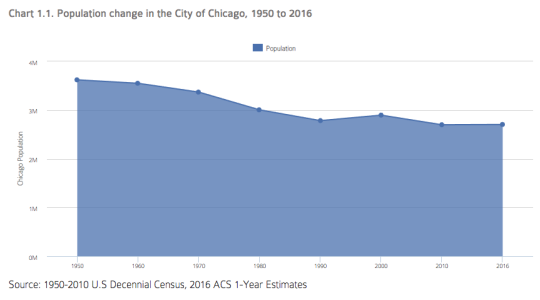
    Here is the change in population in the City of Chicago from 1950 to 2016:

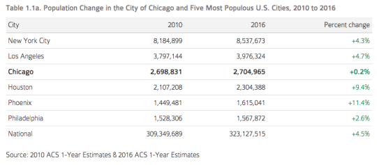
    And here is a comparison between Chicago and the five biggest cities in the US. Note the “sun and sprawl” phenomenon. Also note that the list below is for city proper boundaries.

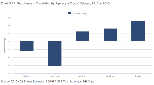
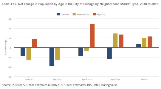
    One particularly interesting set of stats is the decline of children (population under the age of 18) in the city:

    Since 2010, the city has lost over 40,000 children and teenagers. 

    But, if you break it down by neighborhood market type, it is the low-cost and moderate-cost neighborhoods that lost the population. The high-cost neighborhoods were up.

    The study posits that the old trend of moving to the suburbs after you have kids may not be for everyone – provided, of course, that you have the means. And it goes beyond Chicago. DC is predicting a 25% increase in K-12 students within the District.

    For the rest of the charts, click here.

  • Cities are always changing. What’s happening in Miami Beach?

    image

    The Miami Herald has a recent article up asking: Has Miami Beach lost its mojo? While the beach will always be an immense draw, there’s concern that entertainment dollars could now be starting to favor mainland neighborhoods like Wynwood, Brickell, and the Design District. 

    Here are some of the reasons why it is believed that may be happening:

    – Structural changes to the retail landscape

    – High rents have pushed out all of the interesting and distinctive tenants

    – City is too lenient when it comes to the nighttime economy; South Beach has become a circus

    – Investors and developers are worried about the Beach’s exposure to sea level rise

    – Strips like Ocean Drive and Lincoln Road have simply completed their urban cycle and are no longer attractive and novel

    – Overdevelopment of luxury housing (curiously, there’s a preservationist quoted in the article who appears to believe that restricting development to only mid-rise will result in less luxury housing)

    Many of these points are certainly not unique to Miami Beach. We know the retail landscape is changing. But as I was reading through the article, I was once again reminded that cities are always changing – even when we try and stop them from doing that.

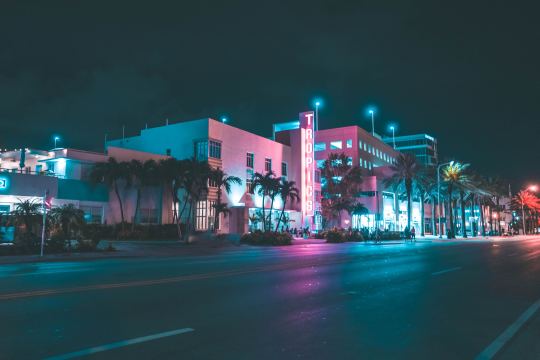
    There are over 900 historic buildings in the Miami Art Deco District. Most are low-rise and mid-rise. This includes the iconic Ocean Drive. And yet the above article is all about the changes that the Beach has seen and experienced over the years.

    Oftentimes we only associate change with new buildings. But architectural preservation does not guarantee any sort of urban stasis. Cities are far more complex than that.

    Image: Photo by Ryan Spencer on Unsplash

  • Homes built in the past year

    I’m on a flight right now reading the latest issue of Monocle Magazine in a seat that barely accommodates the length of my femur. This month’s issue has their annual ranking of the top 25 cities in the world.

    Munich is first, which is not unusual for their ranking methodology. It generally scores well. Quality of life is high. Crime is low. The economy is strong. Beer gardens are fun. And you’re close to the Alps for snowboarding.

    One stat that caught my attention — and it’s not included for all of the cities — is the number of homes built in the past year. Presumably this is all housing units in the metro area — for sale, for rent, subsidized and so on.

    Here are their (clearly rounded) numbers. The order is as they appeared in the ranking, but again, not ever city included this stat.

    • Munich: 8,300
    • Tokyo: 150,000
    • Copenhagen: 5,000
    • Berlin: 11,000
    • Madrid: 1,600
    • Hamburg: 7,000
    • Melbourne: 5,100
    • Helsinki 4,400
    • Stockholm: 7,000 (18,000 in Greater Stockholm)
    • Sydney: 39,000
    • Hong Kong 17,000
    • Vancouver 22,600
    • Amsterdam 5,100
    • Kyoto 8,900
    • Dusseldorf 2,600
    • Barcelona 1,000

    Some of these numbers appear to stand out, such as the counts for Tokyo, Sydney and maybe Vancouver. But it’s hard to draw any conclusions around housing supply and housing affordability.

    Melbourne and Amsterdam allegedly have the same number of homes built over the past year, but according to Monocle the metro areas of Melbourne and Amsterdam have populations of 4.85 million and 2.4 million, respectively. This also says nothing about their growth rates.

    So which one is doing a better job of addressing housing demand? I’m not sure.

    But it was still interesting to see that Tokyo delivers somewhere around 150,000 homes a year. Tokyo is somewhat unique globally in that it’s a big city — one of the biggest — that somehow manages to gracefully balance both scale and quality of life.

    Photo by Elias Keilhauer on Unsplash