Daily insights for city builders, delivered every morning at 6 AM ET. I’m Brandon Donnelly — a Toronto-based real estate developer and founder of Globizen. I’ve been writing here since 2013.

Tag: united nations

  • Largest cities in the world — revisited

    Following my recent post about the largest cities in the world (from 100 to 2015 CE), a number of you rightly pointed out that the data looked questionable. Where, for example, is Shanghai in this latest list of largest cities? So I think it’s important that I do a follow-up post.

    There are a number of nuances to consider when trying to measure urban populations. Perhaps the two most obvious are the geographic extent of each city (i.e. what urban boundary do you use) and the number of people living in informal settlements.

    The UN recently estimated that there are some 1 billion people living in slums or informal settlements. That represents nearly a quarter of the world’s urban population, which is a staggering number and a pressing global need. We desperately need more housing.

    When it comes to measuring the size of an urban agglomeration, most of the studies that I have seen tend not to focus on municipal boundaries (“city propers”) or metropolitan areas. The former is often based on arbitrary political boundaries and the latter often contains undeveloped rural land.

    So for the purposes of this post, I’m going to go with Demographia’s definition of “built-up urban area.” They define this as being a continuously built-up area with one labor market and with no rural land. In their view, the world is either urban/built-up or rural. The built-up part is the lighted area that you would see on a nighttime satellite photo.

    Given this definition, there are a number of interesting fringe cases. For example, contiguous/adjacent urban areas with more than one labor market get split up into multiple ones. This is the case in the US with the northeastern “megalopolis” that runs from Boston to Washington.

    Conversely, if adjacent urban areas share a labor market and are linked together by similar commuting flows, then they get grouped into one urban area. This might be the case even if the area(s) straddle a national border. In this particular case, the free movement of people and goods would be another prerequisite.

    With these definitions out of the way, below is another stab at sharing an accurate list of the world’s largest megacities or built-up urban areas. This is one is by Demographia and there are a number of key changes compared to the last one I shared. Shanghai now features in the top 10. But Lagos drops down to number 20, which remains a bit of a question mark for me.

    For a copy of Demographia’s full report, click here. It looks at all urban areas with a population greater than 500,000 people (total is 985). Of course, if any of you have any other data sources that you think I should take a look at, feel free to share them in the comment section below.

  • The world’s cities by 2030

    This UN report (2018) on urbanization trends is a fascinating way to understand how our world is growing and changing. So today’s post is about some of my takeaways. If you have others, feel free to add them to the comment section below.

    But first, some definitions.

    The UN report considers 3 ways to measure the size of a city, all of which we have used before on this blog. The first is the “city proper.” That is the current administrative boundary of a city. The second is the “urban agglomeration” area, which is a city’s contiguous built-up area. And the third is the “metropolitan area,” which is the approximate area of economic and social interconnectedness.

    Above is what these 3 boundaries might look like for Toronto (which is the example they use in their report). About the only one that isn’t debatable is the “city proper” boundary; but it really doesn’t capture the full extent of a city. Wherever possible, the UN report relies on the city’s urban agglomeration area. They also define a “megacity” as a city of over 10 million people.

    The largest city in the world is currently Tokyo. However, from 2018 to 2030 it is expected to decline by almost 900,000 people. Whereas, the city in 2nd position — Delhi — is expected to add more than 10 million inhabitants during this same time period. By 2030, these are expected to be the largest cities in the world:

    Most current megacities are located in what the UN refers to as the “Global South.” And 9 out of the 10 cities projected to become megacities by 2030 are located in developing countries. The one exception is London. Though all regions in the world are becoming more urban, the real population growth is happening in Asia and Africa.

    Most cities — 59% of cities with 500,000 or more people — are at risk of at least one natural disaster. And 3 megacities — namely Manila, Osaka, and Tokyo — are high risk for 3 or more types of natural disaster.

    Going through the report’s data charts, it’s also interesting to note that Toronto is not projected to become a megacity by 2030. However, the Toronto area already represents over 20% of Canada’s entire urban population.

    In the United States, Chicago’s urban agglomeration is projected to continuing growing and does come close to megacity status by 2030. The Miami region is similarly expected to grow and is actually right on top of Toronto in terms of population. But the fastest growing regions are, of course, expected to be the city’s that can more easily sprawl (Las Vegas, Phoenix, and so on).

    Bogotá, Colombia is already a megacity and is expected to add almost 2 million people by 2030. It currently represents about 26.5% of the country’s entire urban population. São Paulo remains one of the top 10 largest cities in the world and is similarly projected to add over 2 million people in the same time period, but to a much larger base.

    In Europe, it’s London, Paris, and Moscow, with the latter two already in possession of megacity status.

    Now quantity isn’t everything. Despite not ranking in the top 10 in terms of population, both New York and London are widely considered to be the world’s preeminent global cities. At the same time, we do know that the size of a city does create certain socioeconomic benefits. Urban agglomerations create agglomeration economies.

    If you’d like to download a copy of the World’s Cities in 2018 (United Nations), click here.

    Charts/Maps: United Nations

  • Canada delimits its continental shelf in the Arctic Ocean

    Last week the Government of Canada filed a 2,100-page submission with the United Nation’s Commission on the Limits of the Continental Shelf. Under UN Convention on the Law of the Sea (UNCOLS), states with coastal territory have the exclusive rights to about 370 kilometers beyond their shores in order to conduct economic activity. This includes the exclusive rights to any resources. However, states may also make claims to further extensions underneath the water if they can substantiate them through scientific research. Last week’s submission attempts to do exactly that for an additional 1.2 million square kilometers of sea bed.

    Here is a map from High North News:

    The challenge with all of this is that Norway, Denmark, and Russia all have their own continental shelf claims, and there’s geographic overlap. (The US has not yet ratified their UNCOLS agreement.) So it is unlikely for this to be resolved anytime soon, though all states seem willing to work with the UN. This is a relatively new debate because the North Pole and Arctic Ocean were previously considered neutral territory. But climate change is opening up new economic opportunities (i.e. there’s a lot less ice). That’s worrisome in its own right.

    Click here for the full press release from the Government of Canada.

  • Human Development Index

    The Human Development Index (HDI) is a composite index that ranks countries based on four key indicators (3 dimensions):

    • Life expectancy in years (health)
    • Expected years of schooling (education)
    • Mean years of schooling (education)
    • Gross national income per capita (standard of living)

    Equal weighting (1/3) is given to each of the above dimensions: (1) health, (2) education, and (3) standard of living.

    And the resulting index value is a normalized number between 0 and 1, with the latter number representing the maximum possible value.

    Generally speaking, a country is thought to be developed or advanced when it has an HDI greater than 0.8.

    The way you calculate each dimension’s index value is by using the minimum and maximum limits set out by the United Nations.

    To give you an example, for gross national income per capita (standard of living), the minimum is $100 and the maximum is $75,000. (Logic behind these numbers, here.)

    Once you know the boundaries, you then use this formula for each dimension:

    Dimension Index = (Actual Value – Minimum Value) / (Maximum Value – Minimum Value)

    Each of the individual dimension indices are then aggregated together to create that country’s HDI.

    In 2017, the country with the highest HDI was Norway at 0.953. Brazil, which is what got me started thinking about this, was at 0.759. So not quite developed.

    Canada and the US were on top of each other at 0.926 and 0.924, respectively.

  • The challenges of the metropolis beyond Habitat III

    This morning I woke up to an email from the Urban Ecology Agency of Barcelona. They are a public consortium dedicated to urban sustainability and made up of the City Council of Barcelona, the Municipal Council and Metropolitan Area of Barcelona, and the Barcelona Provincial Council. The email was about this upcoming “urban congress” taking place in Barcelona from May 22-24:

    Sadly, I have no plans to be in Barcelona next month. But if any of you are based or traveling there, the conference is all about the future challenges that cities will face and about contributing to the new urban agenda. The main topics are: sustainability, city planning, social cohesion, and competitiveness. 

    Habitat III – which is in the title of the conference – was a United Nations conference on housing and sustainable urbanization. It took place in Quito, Ecuador in October 2016. However, it forms part of a much larger framework around sustainable global development. More info here.

    Barcelona is also one of my favorite cities, so I am happy to share this one with all of you. If you’d like to register for Post-Habitat III, head over here.

  • Current state of renewable energy

    image

    The United Nations and Bloomberg New Energy Finance recently published a report covering global trends in the renewable energy space for 2017

    Here are some of their key findings:

    – 2016 was a record year in terms of renewable power capacity installed worldwide. This includes wind, solar, biomass and waste-to-energy, geothermal, small hydro, and marine sources.

    – The share of global electricity generated from renewable sources rose from 10.3% (2015) to 11.3% (2016).

    – However, overall investment in renewables declined in 2016 for two main reasons. Costs went down (good news). And China and Japan exhibited a dramatic slowdown in terms of investment activity (bad news).

    – Acquisitions of renewal assets, such as wind farms and solar parks, hit a new peak at $72.7 billion.

    – A number of promising new pricing records set in 2016: $29.10 per MWh for solar in Chile and $30 per MWh for onshore wind in Morocco.

    – In one year, the cost of solar generation dropped on average about 17% and onshore wind dropped about 18%.

  • Mapping of global migration

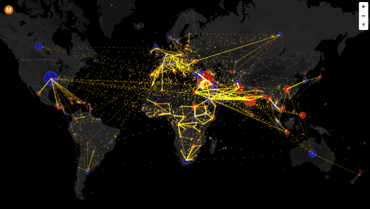
    Max Galka has created an incredible visualization of country-to-country net migration (from 2010 to 2015) on his blog, Metrocosm.

    Here’s a screenshot:

    image

    But you really need to view the full screen interactive version

    In that version, you can hover over a country to see the total net migration number (+/-) and you can click on a country to see where people are moving to and from. A blue circle indicates positive net migration (greater inflows) and a red circle indicates negative net migration (greater outflows).

    All of the data is from the United Nations Population Division. And though the numbers are estimates, it’s a fascinating look at global migration. For instance, look at the outflow from Syria.

    It would also be interesting to see these numbers on a per capita basis because some countries certainly punch above or below their weight in terms of migration. Off the top of my head, I’m thinking of Canada and Australia vis-à-vis the US.

  • The world in 2050

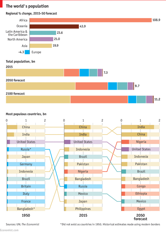
    The United Nations recently released its 2015 version of World Population Prospects. It looks as if they put out and revise this report every 5 years.

    The Economist then took some of their data and assembled it into the following charts:

    image

    It’s obviously extremely difficult to predict what will happen in the world by 2100, but to the extent that forecasting is possible, the world’s population is expected to reach somewhere around 11.2 billion people. Today it’s 7.3 billion.

    The bulk of this growth is expected to happen first in Africa, and then in Asia. By 2100, Africa’s share of the global population is expected to grow to 39% and Asia’s share is expected to decline to 44%.

    If you’ve been following population trends, most of this shouldn’t come as a surprise to you. The meaningful population growth happening in the world today is happening in the developing world. 

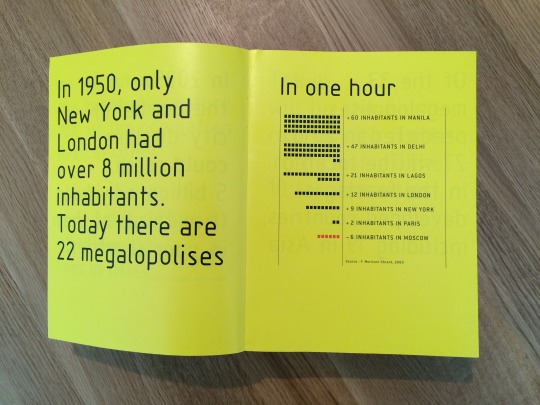
    That’s why architects, such as Rem Koolhaas, have been studying cities like Lagos (Nigeria) since the late 1990s and early 2000s. Below is a photo from a book/research project that I love called Mutations (2000). I pulled it from my bookshelf this morning.

    image

    It’s interesting to think about what all of this will mean for the global economy and for global governance. 

    The United States is about to be alone when it comes to advanced economies with a globally competitive population. Europe is shrinking, which leads me to believe that a strong EU is likely important. And we now have lots of megalopolises with big populations, but with very low income levels.

    Nigeria is the largest economy in Africa, but per capita income is somewhere around $3,000.

  • The top 10 mega-cities by 2030

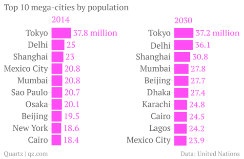
    One of the reasons I’m so fascinated by cities is that it’s becoming increasingly more important to get them right. From about 1831 to 1925, London was the largest city in the world. Its population went from somewhere around 1.5 to 2 million people to nearly 7.5 million. London surpassed Beijing as the largest city and was then surpassed by New York.

    Today our largest cities are significantly bigger. Tokyo has almost 40 million people and London doesn’t even make the top 10. But there’s also a broader shift taking place. According to a new report by the United Nations, most of the world’s largest cities will be in Africa and Asia by 2030. Here’s a chart from Quartz:

    image

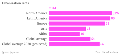
    And the reason for this shift is because Asia and Africa are newly urbanizing, whereas the rest of the world has already urbanized. In North America, over 80% of people already live in cities.

    image

    But even though Asia and Africa are following a trend that has already taken place in the rest of the world, it doesn’t mean we should assume we know what we’re doing. Having spent time in cities like Dhaka, I can attest to the many challenges that these mega-cities are facing and will continue to face as people flood in from the rural areas looking for economic opportunities.

    So while it’s important that we talk about strategies for reviving cities like Detroit – which has a population somewhere around 700,000 – 800,000 people – we should also keep in mind that we have some significant challenges ahead of us in terms of creating a sustainable urban planning agenda for the world.