Daily insights for city builders, delivered every morning at 6 AM ET. I’m Brandon Donnelly — a Toronto-based real estate developer and founder of Globizen. I’ve been writing here since 2013.

Tag: transit

  • Where should Toronto’s relief subway line go?

    Those of you from Toronto might be aware that the city is currently assessing the possibility of a “relief subway line” that would connect the downtown core back up to the Bloor-Danforth subway line in the form of a stretched out “U”.

    The reason this line is being called a “relief line” is that – in addition to providing local service all across downtown and its “shoulders” – it would also relieve much of the pressure that the Yonge-Bloor interchange is facing today. Instead of always having to connect at that location, passengers coming from the east and west would be able to do so sooner as a result of this new subway line (bypassing Yonge-Bloor).

    For those of you who are regular readers of ATC, you might know that I’m a big supporter of this relief line. I believe it should be our number one transit priority. It’s going to cut through areas of the city that have some of the highest population and employment densities, and so it’s an area where I think subway makes sense. The ridership would be there.

    Many people at the city also seem to agree:

    https://twitter.com/jen_keesmaat/status/571745025941487616

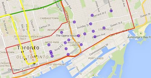
    Given that an assessment is currently underway, the city is looking for feedback from the public. One of the ways you can do that is by clicking here. The site will allow you to comment on the potential station locations (shown below using purple circles). I did it this morning and I would encourage you to do the same if you’re from Toronto.

    For clarity, this current study is only for the eastern portion of the relief line (study area is outlined in red below).
    image

    Once you’ve given this some thought, I’d love to have a discussion in the comments about where you think the relief subway line should go (or if you even think it’s a good idea in the first place).

    My initial thought is that it should connect into King station, run along King Street East, merge with Queen Street East near the Don Valley, go through Riverside and Leslieville, and then start making its way north to Danforth Avenue.

    My reasons are as follows:

    • King Street East is the most vibrant pedestrian street on the east side of downtown. There isn’t enough commercial activity further south.
    • King Street would allow it to eventually cut right through the Financial District when it heads westward.
    • The connection to Union station (for GO Transit, VIA Rail, and the Union-Pearson Express Train) would be manageable from King Street. Plus, SmartTrack may feed directly into Union.
    • King Street is roughly the midpoint between Queen Street and Lakeshore Boulevard. And if you place it too far south, it would take away from the proposed Queen’s Quay LRT line.
    • Having it merge into Queen Street near the Don Valley would allow it to service both Regent Park to the north, as well as the West Don Lands neighborhood to the south. It would also allow for a connection to a Cherry Street LRT line servicing the future Portlands neighborhood.
    • Queen & Broadview is emerging as a major node with a significant amount of density in the pipeline. And further north, Dundas & Carlaw is similarly seeing a lot of intensification.

    But I may have missed a few things. These are just my thoughts. What are yours?
  • Urban Engines launches app

    [youtube https://www.youtube.com/watch?v=FZ8ODREybcs?rel=0]

    About 9 months ago I wrote about a new startup called Urban Engines that was trying to improve urban mobility by using big data to optimize transit usage. 

    Last Tuesday the app launched in 10 cities across North America. So if you’re in Boston, Chicago, Los Angeles, New York, Portland, Seattle, San Francisco, Toronto, Vancouver, or Washington D.C., you can go ahead and download it right now.

    The biggest “wow factor” is probably the augmented reality feature that allows you to hold your phone up and see transit information overlaid on top of the street in front of you.

    But more fundamentally, the real potential lies in the platform’s ability to collect data on the way people move in cities and on how transit lines are performing, so that it can be fed back to improve overall efficiency.

    That’s why the company is also working with cities to give them 24/7 analytics and reporting on how every bus, car, and train is performing in their networks.

    My hope is that with better data at our disposal, we’ll be able to elevate the discussions around transit and transit planning. Without great data, it’s too easy for these discussion to become political.

  • A long history of ‘rail plus property’

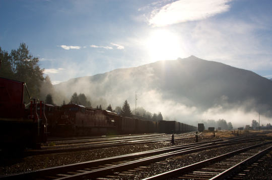
    Photograph morning fog by Familie Pinksterbos on 500px

    morning fog by Familie Pinksterbos on 500px

    Today’s Architect This City post is being brought to you live from the mid-base lodge at Revelstoke Mountain Resort on Mount Mackenzie in British Columbia. 

    It’s currently foggy, rainy, and about 2 degrees celsius — which I’m told is fairly anomalous for this area. It’s unfortunate for my friends on the slopes, but it makes me feel somewhat better about hanging out all day to rest my back and shoulder.

    The town of Revelstoke was founded in the 1880s when the Canadian Pacific Railway connected the area. And traditionally its economy has been closely connected to that rail. However, with amenities like the resort I’m currently sitting in, its economy now increasingly includes tourism.

    One of the most interesting reminders for me on this trip through the Canadian Rockies is how instrumental rail was in unifying and then building this country. But in actuality, it wasn’t just rail. It was rail plus property.

    Within the Canadian Pacific Railway was a division called Canadian Pacific Hotels, which built and operated both urban and rural hotels such as the Banff Springs Hotel and the Chateau Lake Louise (both of which I visited for the first time on this trip). And today, these railway hotels are absolutely some of Canada’s most inspiring landmarks.

    The model at the time was simple. 

    Sir William Cornelius Van Horne — who was president of CPR in 1888 — believed: “If we can’t export the scenery, we’ll import the tourists.” He knew that it was all about moving as many people as possible. And to do that he needed to create accommodations and destinations all along the rail. In other words, rail alone wasn’t going to cut it. It had to be rail plus property.

    This of course is a model that still persists today. Many public transit authorities, such as the MTR in Hong Kong, have been hugely successful by adopting a rail plus property model.

    However as the case study of the Canadian Pacific Railway demonstrates this is not a novel approach. It’s actually a tried a true model. Rail, and infrastructure in general, goes really nicely with property development. 

    So why don’t all transit authorities adopt a rail plus property approach?

  • How Uber is driving down the cost of transportation

    A few days ago, Bill Gurley – who is an investor in Uber – wrote a really fascinating blog post called, Uber’s New BHAG (Big Hairy Audacious Goal): UberPool. Bill doesn’t update his blog very often, but when he does it’s incredible stuff.

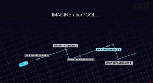
    I’ve touched on UberPool briefly before. But basically it’s a true “ride sharing” service where people with overlapping routes can easily share the same car – much like people do today informally. The obvious advantage of this is cost. It’s cheaper to share.

    image

    What’s most fascinating about this service though is how it fits into Uber’s larger mission to drive transportation costs down. And there’s a specific reason for that (via Bill Gurley):

    When Uber launched its low-cost UberX offering in the summer of 2012, the company quickly realized that the demand for its transportation services is HIGHLY elastic. As the company achieved lower and lower per-ride price points, the demand for rides increased dramatically. A lower price point delivered a much better value proposition to the consumer, yet still remained a great business decision due to the remarkable increase in demand.

    So what Uber quickly figured out was that if they could increase the utilization rate for drivers (the time actually spent with passengers), they could charge consumers lower prices while at the same time maintaining driver salaries. Prices went down, but volume went up.

    One way to do that is to obviously decrease driver downtime by improving liquidity on the marketplace. But another way is to simply increase the number of passengers being transported at one time. Hence the creation of UberPool.

    But it doesn’t stop there.

    Because of all the transportation data that Uber now has (the company has a data group called the “math department”), they can fairly accurately predict what a price cut will do to their ridership levels. This allows them to “forward invest” their capital in new services – such as UberPool – before they even have the revenue from the anticipated increase in ridership.

    So what does this all mean?

    It means that Uber is going to get cheaper and cheaper and cheaper. Uber is trying to get to what they call “The Perpetual Ride”, which basically means that drivers will always have customers (100% utilization). That’s quite a goal, but it would mean the absolute lowest prices for consumers (barring any other changes to their cost structure). 

    Dirt cheap transportation is a pretty compelling value proposition, which is why I continue to believe that cities should be hard at work trying to figure out how to harness this transportation shift.

    If you’re interested in this topic, I would encourage you to give Bill Gurley’s blog post a read.

  • How I moved over the last 3 weeks

    At the beginning of this year I wrote a post about a mobile tracking app called Moves that I had heard about through my friend Sachin Monga. He had just published a beautiful set maps showing where he physically spent his time in both Toronto and San Francisco.

    His post spurred me to download the app and at the end of my post I promised to share my own set of maps once I had collected enough data points. It’s only been about 3 weeks, but already my maps are starting to fill out, so I thought I would do a release.

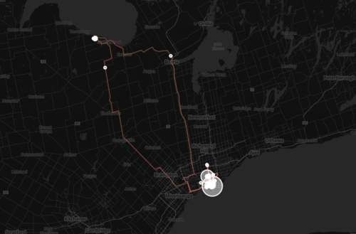
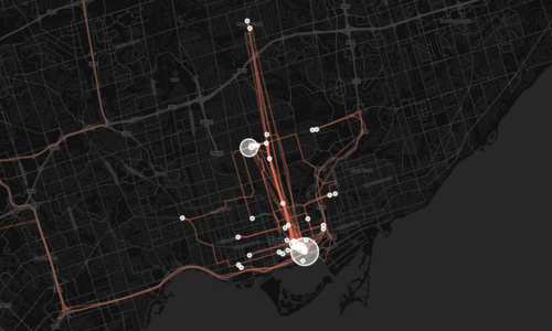
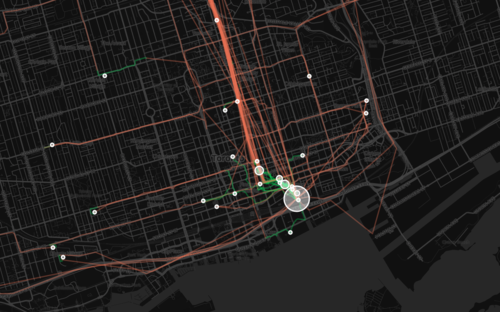
    The orange lines represent transport of some sort (car, subway, streetcar, and so on) and the green lines represent walking. I don’t cycle very often in the winter (I know, I’m a fair-weather cyclist), so you won’t see any of those lines just yet. However if I posted a map from the summer, I know it would look completely different.

    Here’s a first one showing a regional scale:

    image

    Here’s a second one showing the city of Toronto:

    image

    And here’s a third one showing mostly downtown:

    image

    What’s interesting about these maps is how much you can tell about me and the way I move around the city.

    For one, there’s a good chance I ski or snowboard given that I’m driving up to Collingwood, Ontario in the winter. You can also see how heavily dependent I am on the Yonge subway line, which is the thickest orange line in the middle of downtown. It’s also interesting to see how localized I am within my neighborhood (St. Lawrence Market). I walk to get groceries. I walk to the gym. I walk to coffee. And the list goes on.

    This is fairly typical for people living in urban neighborhoods, but it would be interesting to see where it applies in the city and where it begins to fall apart. I would also imagine that there’s a correlation to the area’s Walk Score, although this (Moves) might actually be a better measure since it’s usage data.

    Either way, imagine what cities could do if they had this sort of data for every resident. They would be able to see precise resident flows and then determine exactly where transit and infrastructure investments should be made instead of politicking to determine where they should be made.

    That time is coming.

  • Marginal cost = 0

    Earlier this week I wrote a post called: The pull from services to products. And in it I made mention of the fact that part of what’s driving this pull towards products is that the marginal cost of servicing additional users or customers is almost nothing in a world of internet services and products.

    Well the reality is that this phenomenon is driving a hell of a lot more. It could – and probably will – fundamentally change almost all aspects of the economy.

    I know that sounds like a pretty audacious statement, but if you watch the following 10 minute talk by Albert Wenger (Union Square Ventures) you might start to feel the same way. He outlines 5 changes being driven by the fact that in the digital world, marginal cost = 0. The impacts go well beyond tech, capturing sectors such as transportation and industrial real estate.

    [youtube https://www.youtube.com/watch?v=sVEtTzlqsoE?rel=0]

    If you can’t see the video, click here.

  • Do you know where you spend your time?

    Yesterday my friend Sachin Monga published a really great article on Medium called, 2014: My Year in Review. It was broken down into a few sections that included everything from his favorite blog posts of the year to all of the images he posted on Instagram. He called it “a stream of personal observations, data, and highlights for the year.”

    And it put my end of the year blog post to shame.

    One section that really stood out for me though was Places & Transit. Using a mobile app called Moves, Sachin extracted an incredible data set for where he physically spent his time and how he got around in 2014. I can’t believe I haven’t heard of this app yet – it’s totally in my wheelhouse. But I’m clearly late to the party. Facebook bought them in the first half of last year.

    The data set included how many hours he spent at home and at work. His top 3 most visited coffee shops. His top 5 most visited friends. How many nights he stayed in a hotel. His average daily commute time. And his total distance walked and cycled, among many other things. It was fascinating. I love data – especially when it was previously impossible or difficult to collect it.

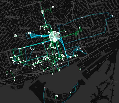
    He was also able to translate his data into a set of beautiful maps, showing where he spent his time and how he got around. Here is his personal map for Toronto. The larger the circle, the more often he was there. Blue lines are cycling. And green lines are walking.

    image

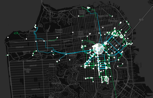
    And here’s San Francisco (where he now lives):

    image

    After reading his post, I immediately downloaded Moves. And I can’t wait to see how my personal map of Toronto will look like in a few weeks and months. Once I have enough data points, I’ll be sure to share it with you all here.

    In the interim, do you have any ideas for what this kind of data might be used for? I can certainly think of many. Let us know in the comment section below.

  • Where Uber operates and where it’s banned

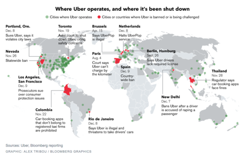
    Earlier this month, Bloomberg published this map showing where Uber operates and where it’s been banned (or is being challenged). You can click on the map for a larger version.

    image

    Uber operates in about 250 cities across the world. But it’s being challenged in a lot of them, including Portland, San Francisco, Los Angeles, Toronto, Rio de Janeiro, Paris, Berlin, as well as others.

    I don’t want to dismiss any of the safety concerns that have arisen lately, because those are very serious and they need to be addressed. Life safety is paramount. But I continue to believe that banning a service that many people clearly want to use isn’t the right solution.

    On top of that, I think it could lull many of the local taxi communities into a false sense of security about the future. Uber is moving incredibly quickly. UberX launched in Toronto in September of this year. And UberPOOL – their new carpool service – is likely next.

    With these releases, Uber is working towards a specific vision for the future: Their goal is to eliminate the need for private vehicle ownership. Should they be successful, this will not only impact taxis, but also car manufacturers and urban mobility in its entirety.

    So as difficult as it might seem right now, I think urban leaders would be better served trying to figure out how to harness these innovations. Cities have been trying for decades to get people out of their cars. Uber wants to do the same.

  • The ultimate Toronto transit map

    image

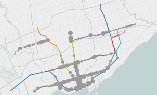
    If you live in Toronto and only give serious thought to one thing today, it should be to this interactive transit map created by Metro.

    The map shows all existing, planned, and proposed transit lines in the city, and then overlays population densities, commuting patterns, household income, and so on. It’s a super valuable map that I think reveals a lot about how we should be focusing our energies to get Toronto moving.

    So what sorts of things does it tell us? I’ll give 2 examples.

    If you look at commuting patterns across the Bloor-Danforth subway line, you’ll see that Runnymede station in the west is where people switch over from taking transit to driving. People west of that station tend to drive. Naturally, it also happens to coincide with where population densities start to fall off.

    By contrast, if you look at the east side of the city along the Danforth and beyond, the entire stretch more or less relies on transit to get around. Part of this likely has to do with income levels, but it’s also because of the availability of the Gardiner Expressway. There’s no equivalent in the east end. Dylan Reid of Spacing Magazine believes this makes a case for some sort of road pricing along the Gardiner, and I would agree.

    As a second example, look at the population densities along the proposed Downtown Relief Line, Finch LRT, and John Tory’s SmartTrack line. Outside of the core, the population densities are relatively low along the proposed SmartTrack line – which is never a good thing for rapid transit.

    There’s also no Sherbourne station on the SmartTrack line, which happens to have the highest population density across the entire Relief Line – 22,131 people per square kilometre! That’s more than any other stop along the Yonge-University subway line except for Wellesley station.

    I’ve written about this a lot before, but I think we need to do a better job of matching up transit investment with expected customer demand. Too often we let politics get in the way of rationale decision making. Maybe it’s time we did something like set minimum population densities. If you want a subway line in your area, you have to first bring the people.

    What else does this map tell you?

  • 8 standards for transit oriented development

    Recently in the comment section of ATC, Lloyd Alter of Treehugger shared a great article talking about the 8 principles of Transit Oriented Development (TOD). “TOD” is one of those buzzwords (or buzz acronyms?) that gets thrown around a lot in city building and real estate circles. But I suspect that most people don’t exactly know what it takes to design and build successful TOD projects and neighborhoods.

    Which is why the Institute for Transportation and Development Policy came up with these 8 standards:

    1. WALK: Develop neighborhoods that promote walking
    2. CYCLE: Prioritize non-motorized transport networks
    3. CONNECT: Create dense networks of streets and paths
    4. TRANSIT: Locate development near high-quality public transport
    5. MIX: Plan for mixed use
    6. DENSIFY: Optimize density and transit capacity
    7. COMPACT: Create regions with short commutes
    8. SHIFT: Increase mobility by regulating parking and road use

    What should be apparent from this list is that the standards are quite clearly stacked against cars. Number 2 is about prioritizing non-motorized transport networks. And number 8 is about regulating parking use and road use. It’s about making a decision who you are planning for and acknowledging that when you do all of the above, you largely eliminate the need for driving.

    If you’re a “war on the car” kind of person, this might offend you. But if you look at the data I shared about a week ago (forgive me, I know the chart is a pain to read), you’ll see that it’s seemingly pretty difficult to design a city that’s equally great for both cars and for people. The cities where people love to walk, cycle, and take transit are precisely the ones where few people drive.

    Image: Flickr