Daily insights for city builders, delivered every morning at 6 AM ET. I’m Brandon Donnelly — a Toronto-based real estate developer and founder of Globizen. I’ve been writing here since 2013.

Tag: towers

  • The Eiffel Tower and the awful tower

    It was explained to me this week that Paris has two principal towers: The Eiffel Tower and the awful tower. The awful tower is, of course, the Tour Montparnasse. Completed in 1973, the Tour Montparnasse is tall, brown, monolithic, and seemingly out of place with the rest of Paris’ urban context. At the time of its completion it was the tallest building in Paris and it remains the tallest building outside of La Defense (business district).

    But the Eiffel Tower is also tall. In fact, it’s taller. So how is it that the Eiffel Tower became such a symbol for Paris and the Tour Montparnasse became the “awful tower?” Both were intended to represent modernity (at their respective times) and both were controversial at the time of their construction.

    Today people respond to these two towers very differently. Is it because the Eiffel Tower is set in a beautiful park and more separated from its urban context? Or is it because the Eiffel Tower has had almost another 100 years to settle in. It’s not exactly clear. But we do know that as humans we have a bias toward the status quo. And so I like to think of change in the following way:

    – There’s change that people immediately like

    – There’s change that people hate and will always hate

    – And there’s change that people initially hate but will eventually like

    The Eiffel Tower, you could argue, falls into category number three. It was big, modern, and alarmingly different when it was built at the end of the 19th century. But now people seem to like it. I know this based on the number of street vendors selling little replicas. For the record, I have yet to see little replicas of the Tour Montparnasse sitting on blankets on the street. I’m a buyer if I do come across one though.

    But is it really right to place Montparnasse into category number two? Could it be that it just needs more time to settle in and then it will ultimately move into number three? Maybe. In 2017, an international design competition was held to find an architect for the redesign of the tower. Studio Gang submitted an entry. But Nouvelle AOM was ultimately selected.

    I wasn’t part of the selections committee, but I think a good way to evaluate the success of this project will be whether or not it moves the tower into category three. That is, people start to like it. Then maybe Paris will become known as a city of two towers, as opposed to a city with one nice one and one awful one.

  • One big tower split into two

    The OMA-designed Greenpoint Landing Towers in northern Brooklyn recently topped out. Photos and announcement over here. If you aren’t familiar with the project, it’s very OMA. What I mean by that is that there’s a kind of simple rationality to it. (I just made up this architecture speak.) Big bold moves with a certain logic behind it. Here’s the story and thinking behind Greenpoint Landing:

    Supposedly this project is in a part of Brooklyn that stipulates a maximum tower floor plate size of 11,000 square feet. Following this rule, you get a two-tower design that looks something like image number one in the top left hand corner of the above diagram. The resulting tower separation would be 40 feet, or just over 12 meters. (Are you seeing these numbers, Toronto?)

    What OMA did was taper one tower (diagram image #2) and then create an inverted ziggurat form for the second tower (diagram image #3). The effect is two towers that look like they were almost one giant tower that had been simply pulled apart. The resulting tower separation distance in this final scenario is 60 feet, or just over 18 meters.

    I am assuming that there’s some area loss in this design because of the increased tower separation, though maybe the larger podium makes it up. Either way, from what I can tell, there are two main benefits to this design: (1) you get a tower with stepbacks facing the water (so places for outdoor spaces) and (2) it breaks up the visual monotony of two equally extruded towers.

    If any of you are more familiar with this project, I would welcome your thoughts in the comment section below.

    Image: OMA

  • Limits of housing affordability

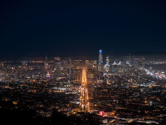
    The San Francisco Chronicle recently published an article called, “SF residential projects languish as rising costs force developers to cash out.” It talks about the impact that rising costs (both construction and other) are having on new housing supply. Some developers aren’t building even though may have entitled sites. And that’s because the math doesn’t work, even though we’re in a market with a severe housing shortage.

    Here is an excerpt from the article that talks about the kind of pricing that is needed in order to make a project work:

    Chris Foley, a real estate investor and partner in brokerage firm Polaris Pacific, said that in the current construction environment a condominium developer needs to sell units for at least $1,400 a square foot for a wood-frame building and $1,800 a square for a taller, steel-frame midrise or high-rise. Even in a city where more than 80 percent of the population is priced out of the market, those numbers are a stretch, Foley said.

    San Francisco also has inclusionary zoning, which requires a certain percentage of units in any new development to be priced below market. According to the article, it is 18% for new rental projects and 20% for new condo projects. That’s a cost that needs to be absorbed by the remaining market rate units – so price accordingly. 

    The MIRA tower designed by Studio Gang is currently under construction and has 156 affordable units and 393 market rate units. The market rate pricing looks something like this:

    That’s the case with three buildings rising near the new Transbay Transit Center: Mira, the Avery at 400 Folsom St., and One Steuart Lane, which overlooks the Embarcadero at the foot of Howard Street. Unless there is a remarkable drop in the market, units in all three of those buildings will probably have an average sales price of more than $2,000 a square foot and penthouses could fetch $3,000 or even $4,000 a square foot. A 3,326-square-foot penthouse at 181 Fremont St., which opened last spring, recently sold for $15 million, or $4,500 a square foot.

    Projects being squeezed by rising costs is something that we are also seeing here in Toronto. And I don’t believe that the general public fully appreciates that there are limits to the costs that can be shouldered by new development. And the reason for that is because there are limits to what people can afford to pay for new housing.

    Photo by Jamie Street on Unsplash

  • Hong Kong in plan view

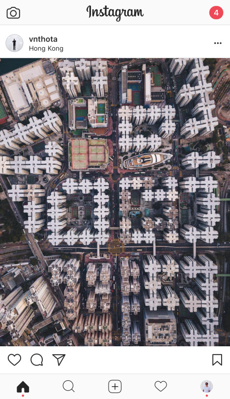
    This morning I came across this drone photo of Hong Kong by @vnthota:

    image

    I immediately thought it was a good example of the typical Hong Kong tower plan that I have been writing about on this blog. You can see the cruciform plan, the light/air cutouts, and how this plan allows for towers to be built directly beside each other.

    In some cases the result is perhaps not that dissimilar from a European courtyard block, except the building typology here is high-rise as opposed to mid-rise. Note the outdoor spaces in the middle of the blocks.

    The cruciform plan also creates a secondary scale of courtyards at the corners of these “tower courtyard blocks.” That is, where you have 3 towers arranged in a triangle. I only see two instances where you have 4 directly adjacent towers. Probably discouraged.

    It’s also interesting to note how relatively subtle shifts in tower positioning seem to open up the possibility of additional towers. You can see that just below the boat in this picture (not sure what the boat is all about).

    Is there anything else you find interesting in this picture?

  • The Hong Kong window ledge

    image

    My friends at the architecture practice Valente Rodgers told me something fascinating about the Hong Kong real estate market last night. Both partners worked as architects in Hong Kong for a number of years.

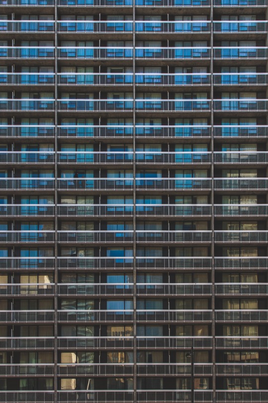
    In Hong Kong, you’re allowed to deduct certain projecting windows from your calculation of Gross Floor Area

    This is provided they’re a certain height above the finished floor level, they don’t project beyond certain distances from the outer face of the building’s structural elements, and so on. The precise measurements seem to vary depending on things like the building’s use.

    Since space is such a precious commodity in Hong Kong, it shouldn’t surprise you that lots of developers and architects take advantage of this. The result being a proliferation of these projecting window ledges all across the city. 

    It’s a phenomenon that happens in many cities when a perfectly legal loophole is found in the land use policies.

    In Toronto it used to be solariums. You could also deduct these from your overall GFA, which means a lot of them them got built in condos and apartments of a certain vintage.

    In New Orleans it was the camelback house. These were houses with a single storey toward the street and a second storey toward the rear of the property. This was done because property taxes were assessed based on the height of the house as it met the street. Pushing the density toward the rear of the lot meant homeowners weren’t taxed more. 

    I find these outcomes fascinating because they have absolutely nothing to do with architectural intent and everything to do with trying to optimize within a given framework.

    But what’s even more interesting about the Hong Kong example are some of the downstream externalities.

    Firstly, it sounds to me like these projecting windows have become a normal part of underwriting projects in Hong Kong. Meaning, if you don’t factor in these projections, you’re effectively giving up free GFA. (Can anyone familiar with the HK market confirm this?)

    However, building these projections also means you can’t do unmodulated and clean floor-to-ceiling windows. And if that’s the desired aesthetic, somebody has got to be willing to pay for that “luxury.” So arguably there’s a socioeconomic dimension to having and not having this ledge.

    Secondly, because space comes at such a premium, these ledges are fully taken advantage of and furniture makers have responded by designing pieces that can dovetail with them.

    Below is a photo of a bedroom in Hong Kong that I found on bohemia.life:

    image

    This may be a custom bed and I don’t know how deep that window projection is, but it begins to show you how valuable these ledges can be from a space perspective.

    I think we should try and come up with a name to describe these sorts of built form phenomena. If you have any ideas, please drop them in the comments below. And if any of you are familiar with the HK market, let me know if I’m off the mark with any of the above.

    Photo by Jason Wong on Unsplash

  • Where the cranes are

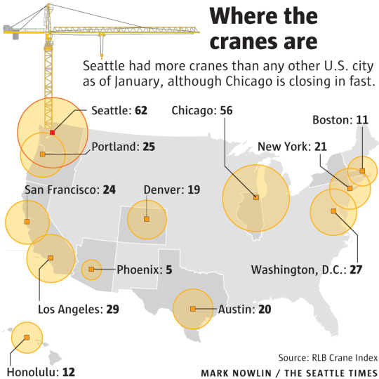
    Earlier this week the Seattle Times published the following graphic showing the US cities with the most (construction) cranes up in the air at the end of 2016:

    At the top of the list is Seattle with 62. And in second place is Chicago with 56. 

    You really need to see these numbers over time to get a better sense of activity. But supposedly, Seattle has been holding pretty steady. Also, these numbers only include cranes within each city proper. The suburbs don’t seem to be counted.

    To put these numbers into perspective, here’s a snippet from the article:

    “Seattle remains behind Toronto, which has 81 cranes, for the North American lead. In Australia, the Middle East, and elsewhere, there are cities where more than 100 cranes are at work.”

    I wonder which city has the global lead. Any guesses?

  • An interview about homogeneous towers

    image

    My friend Randy Gladman, who is Vice President of Development at Triovest Realty Advisors, recently sat down for an interview with Alex Josephson, who is a founding partner of the Toronto-based architecture practice PARTISANS. 

    The topic of discussion was the book that PARTISANS published last year (Rise and Sprawl) and, more specifically, why Toronto’s condominiums all look the same.

    Firstly, let me admit that I haven’t read Rise and Sprawl from cover to cover. So take what you would like from my comments. Still, the book was very successful at spurring a lot of discussion within the industry and so I’ve been getting hit with it since it was released. 

    Generally speaking, I fully support and commend their call for better architecture in Toronto. Here is an excerpt from Alex:

    “There’s a subtle but critical distinction I think some people are missing about the book: We are not criticizing condominiumization; we are criticizing condo architecture. We support density and we support condos. Toronto has become a much more vibrant city as a result of the condo boom. But the values that are driving the designs are suburban. The virulent spread of homogeneous design? That’s practically the definition of suburban. The radiator balconies I mentioned? They’re the result of a hard-wired fantasy that, as Canadians, we all have some kind of God-given right to an outdoor space, namely a back or front yard. And parking lots. Why do we still own and drive cars in the downtown core? This is a serious problem totally born out of a suburban driving mentality.”

    Where I struggle with the book is that it has always felt a bit idealistic, fanciful and, in some cases, elitist (as Randy mentions in the interview). Idealism can be great for spurring discussion (and drawing attention to a practice), but what are the root economic causes for what we are seeing? Virtually every building is a “spreadsheet in the sky”, not just the condo towers in Toronto.

    That said, the discussion does acknowledge that profit will always drive projects. And I do agree with this particular comment about building heights:

    “Anything above twenty stories is inconsequential from street level. So whether it’s twenty or a hundred storeys, I’m mostly indifferent. We are so obsessed in Toronto with height. But height equals money. If we can figure out a way to allow for more height in exchange for better design, we’ll end up with better buildings. But that kind of logic is just not embraced by the city planning culture here.”

    Click here for the full interview in ArchDaily.

  • Un bosco verticale

    At the end of 2015, the Council on Tall Buildings and Urban Habitat awarded Bosco Verticale in Milan the “2015 Best Tall Building Europe” and the “2015 Best Tall Building Worldwide.” It was the 14th Annual of these awards.

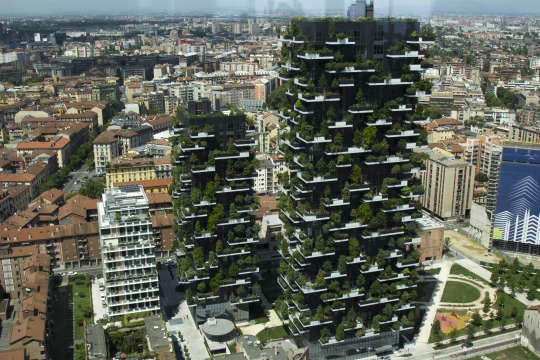
    What makes Bosco Verticale (or Vertical Forest) special is its integration of landscape into the tower building typology. In fact, the architect, Stefano Boeri, describes the project as a “skyscraper for trees that also takes humans.”

    Here is a photo of the two towers via Wikipedia:

    And here is description of the plantings via Houzz:

    “The more than 17,000 plantings include 780 full-size trees of 60 species on all sides of both towers for a suspended-garden visual effect. Among the plantings are holly oak, ornamental apple and beech trees, as well as a great mass of smaller plants, such as lavender, azaleas and camellias, positioned among the trees with taller crowns. The plantings provide shade in summer and help filter the air. The number of trees in each building is the equivalent of 1.7 acres of forestland and 18.5 acres of an urban area with single-family dwellings. The vegetation is watered with a greywater filtration system.”

    This idea is something that has appeared a lot in theoretical projects. But it is still in its infancy in terms of realized projects. So the architect has also published a book explaining – using drawings and photos – how the project works and how it could be reproduced in other cities. It’s in both Italian and English.

    With so many cities trying to build up, as opposed to out, it makes a lot of sense for us to figure out how to make up as livable, enjoyable, and sustainable as possible.

    Photo by Luca Nebuloni from Milan, Italy – Milan_7899, CC BY 2.0, Wikipedia

  • To connect rather than isolate

    When I was
    a kid growing up in the suburbs of Toronto, I never played in the backyard. I
    played in the streets. That’s where all the kids came together.

    We would
    play baseball in somebody’s driveway, using one of the garage door “squares” as
    the strike zone. We would play football on corner lots, where it was tackle on
    the grass and “two-hand touch” on the street. And we would wax our curbs so
    that we could skateboard them.

    None of these
    spaces were ever really intended for baseball, football, or skateboarding, but
    we kids repurposed them.

    As people,
    including families, continue to move into urban centers around the world, I
    have no doubt that the next generation of children will once again repurpose
    spaces for play. But that doesn’t mean that we don’t have work to do when it
    comes to properly preparing our communities for people of all shapes and sizes.

    One of the
    most interesting design challenges facing us today has to do with our towers.

    Architects
    have long been obsessed with the idea of vertical villages. Le Corbusier’s Unité
    d’habitation
    in Marseille had two shopping streets embedded within the tower
    that were intended to act as public spines. I don’t know how well they did, but
    it was a highly progressive idea for the time.

    Following
    on this idea, I was recently watching a
    TED talk with architect Ole Scheeren
    (thanks Mariane) and I was fascinated
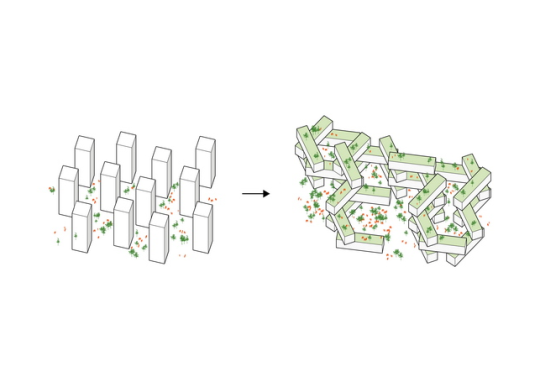
    by his obsession with breaking down the raw verticality of towers.

    His belief
    was that, yes, cities are and will continue to become more dense through tall
    buildings, but that most towers isolate rather than connect people. His work strives to do the opposite.

    And this
    one of the big trends that I think we will see more of in our cites. We will see
    new forms of urban connectedness and a blurring of private, public, and
    semi-public spaces. Screw Euclidean zoning.

    On that
    note, I am reminded that I owe the ATC community a post on my predictions for
    2016. I hope to get that out shortly.

    Diagram via Büro Ole Scheeren

  • Rethinking the tall building

    Back in February of this year (2015), Philip Oldfield, who is an Assistant Professor of Architecture at the University of Nottingham, gave the following talk at the Illinois Institute of Technology. Click here if you can’t see it below.

    [youtube https://www.youtube.com/watch?v=lOfkx39soIs?rel=0]

    If you’re interested in cities and how tall buildings might make them more sustainable, you’ll enjoy it. It’s filled with a number of interesting stats and takeaways, and it’s about an hour long.