Daily insights for city builders, delivered every morning at 6 AM ET. I’m Brandon Donnelly — a Toronto-based real estate developer and founder of Globizen. I’ve been writing here since 2013.

Tag: study

  • If man had developed a third arm, where might this arm be best attached?

    Roman Mars of 99% Invisible recently published an excellent episode called The Mind of an Architect. It has to do with a set of research studies completed in the late 1950s by an organization at the University of California, Berkeley known as the Institute of Personality Assessment and Research (IPAR).

    IPAR was founded by a personality psychologist named Donald MacKinnon. He initially worked for the precursor to the CIA and founded IPAR with the intent of studying “combat readiness and efficiency.” But over fears of how creative the Soviets were getting, the focus of IPAR shifted to instead studying creativity.

    And architects were deemed to be an ideal test subject (from 99percentinvisible.org):

    “Researchers saw architects as people working at a crossroads of creative disciplines, a combination of analytic and artistic creativity. As professionals, architects had to be savvy as engineers and businessmen; as aesthetes, they also acted as designers and artists.”

    So over a series of weekends in the late 1950s, some of the most celebrated minds in architecture – including people like Philip Johnson, Richard Neutra, and Louis Kahn – were studied and picked apart. 

    image

    They were asked to do quick sketches, create mosaics, and they were asked questions such as this one: “For the next 45 minutes we would like you to discuss this notion: if man had developed a third arm, where might this arm be best attached?”

    In the end, here’s what they concluded:

    The researchers began to notice certain patterns across creatives of all professions and genders, including a tendency to nonconformity and high personal aspirations. They also found many creatives shared a preference for complexity and ambiguity over simplicity and order. Creatives could make unexpected connections and see patterns in daily life, even those lacking high intelligence or good grades.

    In short: IPAR found that creative people tend to be nonconforming, interesting, interested, independent, courageous and self-centered, at least in general. Many of these traits may seem obvious today, but they were not necessarily obvious prior to these studies. Back when their tests were being conducted and findings presented in the 1950s and ’60s, the very idea of a “creative personality” was a novelty in academic and public discourse.

    The findings may not be groundbreaking to us today, but the documents and recordings produced during the study are certainly interesting. If you’re into this topic, there’s also this book you can pick up.

    Oh, and if we are to have a third arm, I would like mine to run almost parallel to my existing dominant arm (right). That way I could double up on my most potent dexterity. It would also be far less intrusive than an arm on one’s head or in the middle of one’s back. Then again, it would ruin our symmetry as humans. And perhaps that third arms need to be celebrated instead of being masked.

    What would you suggest?

    Image: Institute of Personality and Social Research, University of California, Berkeley / The Monacelli Press (via 99% Invisible)
  • The Death and Life of Great Italian Cities

    image

    I am sure that a lot of you know where the title of this post comes from. It’s a riff on one of the most important and influential books in the world of city planning: The Death and Life of Great American Cities by Jane Jacobs (1961).

    But when Jane Jacobs first wrote this book, there was no such thing as smartphones and nobody was “checking-in” to hipster dive bars on Foursquare

    So instead of leveraging big data, her analyses and arguments were based on observation. She walked the streets of New York and Toronto and figured out what made cities thrive and what made cities die. That was her brilliance.

    Today, however, we have data – lots of it. And so recently, a group of researchers set out to test Jane Jacob’s theories using mobile phone data. The study was called, The Death and Life of Great Italian Cities:
    A Mobile Phone Data Perspective
    .

    More specifically, they set out to test the following 4 essential conditions:

    “She [Jane Jacobs] argued that, to promote urban life in large cities, the physical environment should be characterized by diversity at both the district and street level. Diversity, in turn, requires four essential conditions: (i) mixed land uses, that is, districts should serve more than two primary functions, and that would attract people who have different purposes; (ii) small blocks, which promote contact opportunities among people; (iii) buildings diverse in terms of age and form, which make it possible to mix high-rent and low-rent tenants; and (iv) sufficient dense concentration of people and buildings.”

    To accomplish this, the team assembled and studied data from the following sources:

    • Mobile phone activity (specifically internet activity)
    • OpenStreetsMap Data
    • Census Data
    • Land Use Information
    • Infrastructure Data
    • Foursquare Data (Venues API)

    Ultimately, they determined that Jane Jacobs knew what she was talking about. The above conditions are essential to urban vibrancy and they apply to Italian cities, just as they did and do to American cities. But this test was valuable, because the more that we can measure and quantify cities, the better I think we’ll get at creating and promoting urban vitality. 

    Now imagine if you overlaid the findings of their report with residential and commercial rents. I bet you’d also find that there’s a strong business case for urban vitality.

    I’ve heard a number of people say that, eventually, every company will be a software/technology company. And I don’t think we’re far off from that reality. To me, this study feels like an early example of what that might look like for city building.

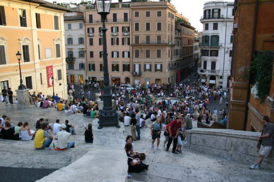
    On a side note, the picture at the top of this post is of the Spanish Steps in Rome. I took it on a weekend trip in 2007. I was living in Dublin at the time.

  • A new era of (digital) globalization

    McKinsey recently published a report called Digital globalization: The new era of global flows.

    The overarching thesis is that we are transitioning to a data-driven global economy:

    “Flows of physical goods and finance were the hallmarks of the 20th-century global economy, but today those flows have flattened or declined. Twenty-first-century globalization is increasingly defined by flows of data and information. This phenomenon now underpins virtually all cross-border transactions within traditional flows while simultaneously transmitting a valuable stream of ideas and innovation around the world.”

    One of the benefits of this shift is that it has become easier for emerging economies and individuals from all around the world to participate.

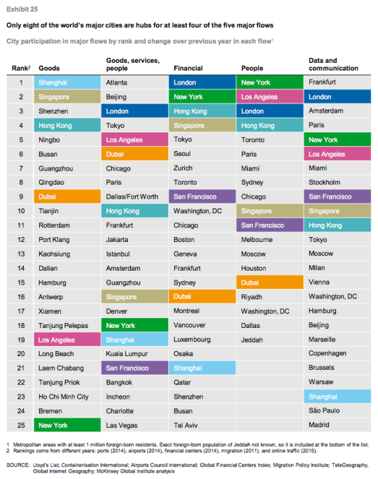
    Of course, not all countries and cities are participating equally. In their report, McKinsey ranks the top cities according to five global flows. In each case a proxy was used:

    “Unfortunately, data on global flows are not available at the city level. However, we have obtained data that serve as proxies for each of our five global flows. Container port volumes approximate goods flows; airport passenger volumes serve as a proxy for goods, service, and people flows; the ranking of cities in the Global Financial Centers Index by the Z/Yen Group provides an indication of financial flows; the number of foreign-born residents in a city measures people flows; and Internet bandwidth approximates data flows.” 

    Using this methodology, they believe that the world only has 8 truly global cities right now: New York, Los Angeles, San Francisco, London, Singapore, Shanghai, Hong Kong, and Dubai. They are the colored cities listed below:

    I always take these city rankings with a grain of salt. This stuff is not easy to quantify and a lot depends on the methodology that you use. 

    For instance, Atlanta sits on the top of “goods, services, and people” because it has the busiest airport in the world according to passenger volume. (It’s the primary hub of Delta Air Lines.) But is that enough to assert that Atlanta is #1? Maybe. Maybe not.

    In any case, the report is packed full of information. If you’d like to take a look, click here.

  • But what about employment?

    The Neptis Foundation here in Toronto just recently published a fantastic report looking at the regional economic structure of the Greater Golden Horseshoe area. It’s called Planning for Prosperity.

    In it they identity the polycentric nature of employment in the Toronto region by way of downtown Toronto and three suburban “megazones.” Here’s one of their maps showing overall employment density and the megazones (light blue circles):

    Here’s a snippet to give you an idea of the scale of these megazones:

    “The Airport megazone, one of the three employment megazones outside Downtown Toronto, is the second largest concentration of employment in Canada, after Downtown Toronto. It represents almost 300,000 jobs, more than the central business districts of Montreal, Vancouver, or Calgary individually.”

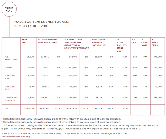
    And here’s a chart showing the hard numbers:

    Downtown Toronto dominates in terms of employment. But it’s also fascinating to see how much more efficiently it provides that employment. It has the smallest physical area of all the employment zones (2,540 hectares or 6,276 acres) and the lowest percentage of car trips (29%).

    But the big takeaway from their report is that we have not been focused enough on employment in our planning. Instead, we seem to be thinking residentially. Here’s a final snippet:


    “This study shows that the Growth Plan and The Big Move, which are currently under review, do not address the challenges and opportunities of a globalizing regional economy or the reality of a transforming economic landscape.

    The Growth Plan’s focus has largely been on managing residential growth rather than non-residential and employment-related development. Indeed, the Growth Plan is based on shockingly little hard evidence on the evolving economy of the region. Plans for city-regions a fraction of the size of the GGH typically involve more economic research, analysis, and evidence.”

    Clearly we need to be looking at both the residential and non-residential sides of the equation as we grow the region. To read the full report, click here.

  • Balancing oil and ideas

    Colorado Sunset by Travis Bredehoft on 500px.com

    https://500px.com/embed.js

    Canada is a resource rich country. And one of the things that commonly happens to countries with a lot of resources is that they begin to myopically focus on the immediate gains from resources at the expense of long term innovation and economic development. 

    This is known as the “resource curse.”

    The Martin Prosperity Institute here in Toronto recently published a report that looks at this exact topic: Canada’s urban competitiveness through the lenses of its resource economy and its knowledge economy. In the end, Richard Florida and Greg Spencer conclude that two can and should work together, but that we need to stop neglecting our cities:

    “The oil and gas industry is not necessarily a constraint on the creative economy, but in the past decade or so it has come to dominate thinking around economic development policy-making. It is time to use the resources from the energy economy to build a more secure future as an urban knowledge economy. We can also use
    talent and technology to deepen and expand the resource economy.”

    And one of their key recommendation is something I have argued for many times here on Architect This City:

    “A New Federalism for Cities: It is time to give cities the taxing and spending powers they require. Cities must be given more control over their own destinies if they are to prosper
    in the 21st century.”

    Now, here are a few interesting charts from the report.

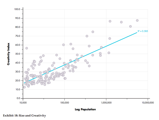
    This first one looks at the relationship between a city’s population and its creativity levels. The two are positively correlated, which means that, in this context, bigger is better.

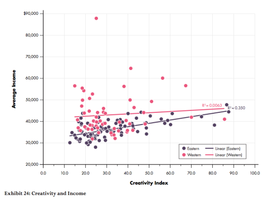
    This second one splits Canada in half – east and west – and then looks at how average income levels are affected by creativity levels (the knowledge economy). Here we see that in eastern cities, income levels are positively correlated with creativity levels. But in western cities, changing creativity levels have almost no impact on income levels. 

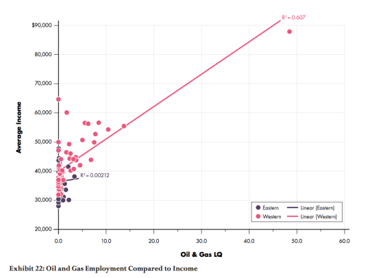
    Finally, this third chart compares the relationship between oil and gas employment (LQ = location quotient) and average income levels. What it finds is that income levels and oil and gas employment are positively correlated in the west, but there’s almost no relationship in eastern cities. 

    The way to read this chart is to think of the LQ as the employment multiple relative to the national average. So for example, a LQ = 10 means that the oil and gas employment levels are 10 times the national average. As you probably guessed, the pink dot way out on the right is Fort McMurray.

    If you’d like to read the entire report, you can do that here. I hope that our new Prime Minister, Justin Trudeau, will read reports like this and spend more of his efforts investing in our knowledge economy – which means investing in our cities.

  • The most segregated cities in North America

    The Martin Prosperity Institute here in Toronto just released a new research study called Segregated City: The Geography of Economic Segregation in America’s Metros

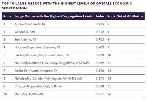
    The report looks at the physical sorting and separation of advantaged and disadvantaged groups within cities. And it did so across 70,000+ Census tracts in the US and in terms of 3 different dimensions: income, education, and occupation.

    Here are the most segregated “large metros” in the US:

    image

    Table Source: MPI

    And here are some of their broader findings – taken verbatim from page 9 of the study (click here for the full report):

    Economic segregation is positively associated with population size and density. It is also positively correlated to two other sets of factors that follow from metro size and density: how people commute to work and the breakdown of liberal versus conservative voters.

    Economic segregation tends to be more intensive in high-tech, knowledge-based metros. It is positively correlated with high-tech industry, the creative class share of the workforce, and the share of college grads. In addition, it is associated with two key indicators of diversity, the share of the population that is gay or foreign-born, which tend to coincide with larger, denser and more knowledge-based metros.

    Economic segregation is connected to the overall affluence of metros, with positive correlations to average metro wages, income, and economic output per capita.

    Race factors in as well. Economic segregation is positively associated with the share of population that is black, Latino, or Asian, and negatively associated with the share that is white.

    Economic segregation is associated with income inequality and even more so than with wage inequality. Its effects appear to compound those of economic inequality and may well be more socially and economically deleterious than inequality alone.

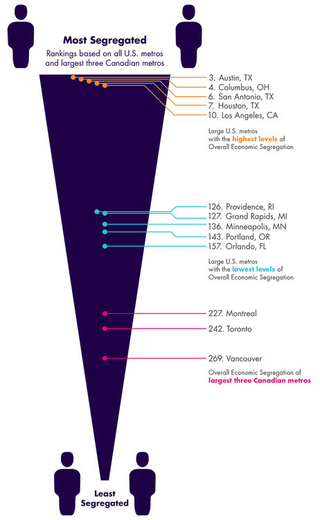
    The research team also looked at how Canada’s 3 largest metros – Toronto, Montreal, and Vancouver – compare to those in the US in terms of segregation. 

    The finding was that Canadian cities are overall less segregated than US cities, but that it should still be considered an area of concern. The most segregated of Canada’s 3 largest metros was found to be Montreal.

    image

    Image Source: MPI

    My view is that our economy is going through a profound shift right now. We’re transitioning from the industrial age to the information age. And in its wake, we’re seeing a number of disruptions, one of which appears to be rising inequality and segregation. 

    That’s not to say that I think this transition is a bad thing (I don’t think it is), but I do think we should be carefully considering and designing our future.

  • How open are you to experiences?

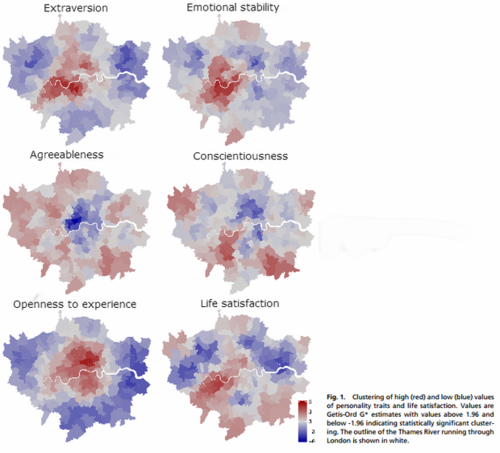
    This morning Richard Florida published an interesting CityLab article that talks about how different personality types cluster within cities. The study he references was done by a team of psychologists that surveyed 56,000 people in the London metro area.

    Here is a summary of what they found (darker red indicates higher concentration of each personality trait):

    image

    Probably the most interesting personality trait is the “openness to experience” one, as there appears to be a clear divide between people who live in the center of London and people who live in the suburbs.

    Here’s how Florida describes it:

    The most clustered personality trait the researchers found was “openness to experience” (bottom left map), which is concentrated in the center of London. Openness to experience, according to a wide body of psychological studies, is associated with creativity, innovation and entrepreneurship. This type is concentrated in higher density neighborhoods, with higher housing prices, more ethnic and religious diversity and higher crime ratesMeanwhile, the blue concentrations at the periphery indicate that there are fewer people open to experience in metro London’s suburbs.

    It’s fascinating to think about the role of psychology in city building. It’s not something we often talk about, but it’s there.

    I live downtown and I would definitely classify myself as extraverted and open to experiences. How would you classify yourself?

    Maps via CityLab

  • Downtown Toronto in numbers

    Last week I tweeted out a Tweetstorm with some of the key facts from this City of Toronto study on the downtown core. Here are two of those tweets:

    //platform.twitter.com/widgets.js

    While I realize that reading city reports is probably not everyone’s idea of fun, it is a good one if you want to understand the massive change that is taking place in Toronto right now and also the importance of the downtown core for this region.

    To put things into perspective, consider that the downtown core (including King West, King East, and the Portlands) is estimated to be responsible for 51% of the entire wealth generated in this city. And yet its physical area is easily less than 10% of the entire city (which is about 630 square kilometers).

    That’s fascinating to me.