Daily insights for city builders, delivered every morning at 6 AM ET. I’m Brandon Donnelly — a Toronto-based real estate developer and founder of Globizen. I’ve been writing here since 2013.

Tag: study

  • Atlas of Urban Expansion

    Since 2012, a team at New York University has been working on something called the Atlas of Urban Expansion. What they are doing is collecting and analyzing data related to the quantity and quality of urban growth around the world. Everything from population densities to how well the streets were laid out during each geographic expansion.

    The Atlas defines a city as having at least 100,000 people, which is a commonly used benchmark. According to this definition, there were 4,245 cities on the planet as of 2010. Included in their study is a representative sample of 200 of them, all of which can be found here.

    They are also, rightly, looking at each city in terms of its extrema tectorum — the limits of its built-up area. This is as opposed to using administrative boundaries, which wouldn’t be as relevant in a study like this.

    I really like the animations that they created depicting urban growth from 1800 to 2014, because they show: (1) where each city started (the dark nucleus); (2) how different urban shapes emerge as a result of geography, transport, and other factors; and (3) how land consumptive many of our cities have become in recent years.

    Image: Atlas of Urban Expansion

  • Dendrochronology of U.S. immigration

    I can’t remember where I found it, but I recently stumbled upon this video simulating the dendrochronology of U.S. immigration from 1830 to 2015. 

    It is part of an ongoing project by Pedro Cruz, John Wihbey, Avni Ghael, and Felipe Shibuya, and is supported by Northeastern University.

    As its name suggests, the video (and broader study) uses the metaphor of a tree (and its growth rings) to explain historical immigration to the U.S. 

    If you can’t see the video below, click here.

    [vimeo 276140430 w=640 h=280]

  • The real reason people oppose new development

    image

    A good friend of mine just sent me this fascinating research paper called: Opposition to Development or Opposition to Developers? Survey Evidence from Los Angeles County on Attitudes towards New Housing. It is a study out of UCLA that was published earlier this year by Paavo Monkkonen and Michael Manville.

    For the paper, they conducted a survey-framing experiment with over 1,300 people in Los Angeles County to test how strongly they felt about a number of common anti-housing sentiments; arguments such as traffic congestion, neighborhood character, and strain on local services. 

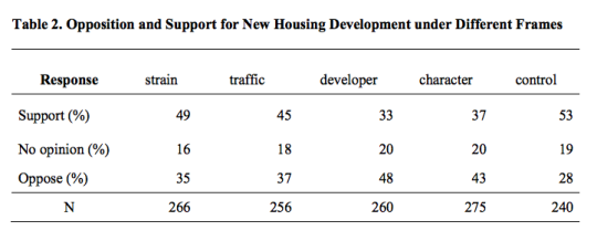
    However, they also introduced another argument: large developer profits. And interestingly enough, they discovered that respondents were 20 percentage points more likely to oppose a new hypothetical housing development when the survey was framed around the developer making a lot of money.

    Here is a table from the paper showing the various frames, as well as the percentage of people who supported, had no opinion, and who opposed. Note that under the “developer” frame, the opposition number is 48%.

    image

    So their “takeaway for practice” is as follows: “Housing opposition is often framed as a form of risk aversion. Our findings, however, suggest that at least some opposition to housing might be motivated not by residents’ fears of their own losses, but resentment of others’ gains.”

    Photo by Cameron Stow on Unsplash

  • A unique taste in buildings

    image

    A condo developer friend of mine once told me something along the lines of this: “Brandon, I have generally learned over the years that if I like something, it probably means the general public [our purchasers] isn’t going to like it. And that’s because if I like it, there’s probably something unique or quirky about it.”

    When he told me this it made perfect sense to me, because there’s a well documented taste divide that seems to exist between architects and design-types and non-architects and non-design-types (whatever this latter categorization means).

    A few years ago The Architects’ Journal published an article referencing a 1987 study that took a group of students – some architecture students and some non-architecture students – and asked them to rate the attractiveness of a series of photos containing both unfamiliar people and buildings.

    What they discovered was that most people had similar views on the attractiveness of the people. I guess hotness is somewhat universal. But when it came to the buildings, the viewpoints were completely opposite. The architecture students’ favorite buildings were what everyone else disliked the most.

    The conclusion in the article: “Professionals are, empirically, the very worst judges available of what people want or like in the built environment.”

    Photo by Simon Goetz on Unsplash

  • Why east sides are often poorer than west sides

    In a recent Spacing article, called Pollution and the fall and rise of urbanism, Dylan Reid argues that one of the reasons why urbanism declined in the 20th century was because of industrial pollution. (There are, of course, other contributing factors beyond just pollution.)

    This article is the first time I have come across a study supporting the widely held belief that pollution and prevailing windows are the reasons for why the east sides of many former industrial cities are poorer than the west sides. Here is more on that from the article:

    People recognized and understood that pollution had an impact on them, and they tried to avoid it if they could afford to do so. Have you noticed, for example, how in so many cities (Toronto included), the east side is poorer than the west side? It’s because the prevailing winds in Europe and North America are west to east, and they blow pollution to the east side. A fascinating study by economists Stephan Heblich, Alex Trew and Yanos Zylbergerg quantified this effect, identifying how 19th century pollution was dispersed eastwards and showing that the most polluted areas were also the poorest. 

    What the authors discovered is that not only did pollution cause a geographic sorting based on wealth, but that there’s also a certain degree of persistence to it. This makes sense if you think about it. Pollution in our cities has waned significantly and yet here we are still remarking and talking about east vs. west.

    It goes to show you just how long lasting the impacts of our city building decisions can be.

  • What cars can tell you about a neighborhood

    This is an interesting study from a team of AI researchers at Stanford. What they did was use car images taken directly from Google Street View (so images of cars parked on-street) to predict income levels, racial makeup, educational attainment, and voting patterns at the zip code and precinct level.

    Admittedly, it’s not a perfect survey, but when they compared their findings to actual or previously collected data (such as from the American Community Survey), it turns out that their study was actually remarkably accurate. Google Street View allowed them to survey 22 million cars, or about 8% of all cars in the US.

    Here are some of the things they found:

    –  Toyota and Honda vehicles are strongly associated with Asian neighborhoods.

    – Buick, Oldsmobile, and Chrysler vehicles are strongly associated with black neighborhoods.

    – Pickup trucks, Volkswagens and Aston Martins are strongly associated with white neighborhoods.

    Interestingly enough, the ratio of pickup trucks to sedans, alone, is a pretty reliable indicator of voting patterns. If a neighborhood has more pickup trucks than sedans, there’s an 82% chance it voted Republican in the last election.

    Perhaps this isn’t all that surprising given that car purchases are highly symbolic. But given that the American Community Survey costs $250 million a year to administer, this study is a good preview of what cheaper and more realtime data collection might look like.

  • The geography of innovation and equality of opportunity

    The Equality of Opportunity Project has a recent paper out called: Who Becomes an Inventor in America? The importance of Exposure to Innovation. Vox also has a summary of the findings, here.

    The overall goal of the project is to “use big data to identify new pathways to upward mobility.” And in this particular study, they discover that in America there are many “lost Einsteins” – people who have the ability, but not the opportunity.

    Not surprisingly, socioeconomic class, race, and gender play a significant role. Children from high-income families are 10x more likely to become inventors (measured in patents) as compared to children from low-income families.

    Geography, place, and environment also matter. Where and how a child grows up has a significant impact on future outcomes. If a child grows up in a city/network that exposes them to other inventors, it increases the likelihood that they too will invent. 

    Where a child grows up also has an impact on the types of inventions, even if the child move cities as an adult. For example, the study found that if a child grows up in Silicon Valley but moves to Boston as an adult, it is still more likely to author patents related to computers because that’s what it was exposed to as a child.

    These associations also impact in a gender-specific way. Women are more likely to invent in a particular technology if they grow up surrounded by similar female inventors. The presence of male inventors has no impact. This makes a powerful case for better gender diversity and strong role models.

    If you would like to read the full paper, click here.

  • We are all biased against creativity

    image

    I would like to do a follow-up to yesterday’s post about innovators and creators, because I recently stumbled up the following quote:

    “We think of creative people in a heroic manner, and we celebrate them, but the thing we celebrate is the after-effect,” says Barry Staw, a researcher at the University of California–Berkeley business school who specializes in creativity.

    It is taken from a Slate article called: Inside the Box – People don’t actually like creativity. And it’s supported by a bunch of research, including a 2010 study conducted by professors at Cornell University, the University of Pennsylvania, and the University of North Carolina.

    The key finding was that people generally hold a bias against creativity, and it’s activated when we become motivated to reduce uncertainty. This might be because we fear rejection or because we’ve come to learn that reducing uncertainty and promoting the status quo is often better for career advancement. 

    There’s less perceived risk.

    But here’s the thing: celebrating creativity after the fact is meaningless. There’s no genius in that. Everyone now knows this truth. The heroics come into play when you’re both willing to be misunderstood and willing to be dead wrong.

    Of course, talk is cheap. 

    Here are 5 suggestions for promoting greater creativity at your company taken from Tom Tunguz’s blog, who himself is borrowing from Barry Staw (author quoted above):

    1. Hire people who’s skills aren’t precise matches for the needs of the company.
    2. Encourage employees not to listen blindly to corporate policy and conventional wisdom; not all to speak with the same voice.
    3. Those in power should go as far as possible to encourage active opposition to ideas. (Similar to Drucker’s obligation to dissent).
    4. Optimize for adaptiveness. Have extra labor capacity and explore side projects. (How many creative companies started or were reinvigorated by side projects? Twitter and Slack are two that immediately come to mind).
    5. Lead rather than follow. Take risks.

  • Escalator etiquette

    image

    I am one of those people that gets annoyed when people don’t follow proper escalator etiquette. The etiquette being: stand on the right; walk on the left. Some cities – London and Tokyo come to mind – are draconian about this.

    But it turns out that this is not always the best way to optimize throughput. A recent study conducted in London found that during peak periods – such as the morning rush hour – it is actually better for everyone to stand still.

    What they found was that when 40-60% of people chose to walk up on the left, maximum throughput was 115 passengers per minute. But when everyone stood still maximum throughput increased to 151 passengers per minute.

    The reason for this is that walking takes up more space than staying put on one step. When demand is low, this has no impact on capacity. But as soon as people start slowing down to avoid the set of legs in front of them, a bottleneck occurs and capacity starts to drop. 

    This is not dissimilar to what happens in traffic jams. Imagine if during peak periods all of the cars could separate themselves by only a few inches and travel at exactly the same (slow) speed. That’s not going to happen until self-driving cars hit the road, but it would be more efficient than the current chaos of distracted drivers starting and stopping.

    All of this being said, since this finding only applies during very busy times, I plan to continue being annoyed when proper escalator etiquette is not followed.

  • Driving in the HOT lane

    image

    Joe Cortright of City Observatory recently published an interesting post on HOT lanes (high-occupancy toll lanes) and cited a research paper by Austin Gross (University of Washington) and Daniel Brent (Louisiana State University). The paper looked at the behavioral response of drivers to dynamic HOT lane pricing. 

    They way HOT lanes work is simple: when traffic is light, the price dynamically decreases; when traffic is heavy, the price dynamically increases to ensure a minimum level of service. That is, the price increases until enough cars leave the lane and driving speeds increase to some minimum threshold. In this case, it’s 45 mph.

    The key takeaway from the report is that “value of reliability” appears significantly more important to drivers than “value of time”. Put differently: it’s less about the time I’m wasting in traffic and more about the uncertainty of not knowing when I’m going to arrive at my destination.

    It’s for this reason that HOT lanes are used more frequently in the morning (when you’re running late for that meeting) than in evening (when you’re just on your way home from work). 

    Gross and Brent estimate that the spread is about 7.5x. The typical driver values saving time at about $3 per hour and reliability improvements at about $23 per hour! This is fascinating because we tend to focus a lot on time. But arguably what people really want to buy is greater certainty.

    I can tell you that it’s definitely one of the things that I love about walking to work, or for that matter cycling somewhere. I always know how long it’s going to take.