Daily insights for city builders, delivered every morning at 6 AM ET. I’m Brandon Donnelly — a Toronto-based real estate developer and founder of Globizen. I’ve been writing here since 2013.

Tag: st lawrence market

  • Where should Toronto’s relief subway line go?

    Those of you from Toronto might be aware that the city is currently assessing the possibility of a “relief subway line” that would connect the downtown core back up to the Bloor-Danforth subway line in the form of a stretched out “U”.

    The reason this line is being called a “relief line” is that – in addition to providing local service all across downtown and its “shoulders” – it would also relieve much of the pressure that the Yonge-Bloor interchange is facing today. Instead of always having to connect at that location, passengers coming from the east and west would be able to do so sooner as a result of this new subway line (bypassing Yonge-Bloor).

    For those of you who are regular readers of ATC, you might know that I’m a big supporter of this relief line. I believe it should be our number one transit priority. It’s going to cut through areas of the city that have some of the highest population and employment densities, and so it’s an area where I think subway makes sense. The ridership would be there.

    Many people at the city also seem to agree:

    https://twitter.com/jen_keesmaat/status/571745025941487616

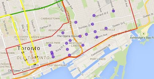
    Given that an assessment is currently underway, the city is looking for feedback from the public. One of the ways you can do that is by clicking here. The site will allow you to comment on the potential station locations (shown below using purple circles). I did it this morning and I would encourage you to do the same if you’re from Toronto.

    For clarity, this current study is only for the eastern portion of the relief line (study area is outlined in red below).
    image

    Once you’ve given this some thought, I’d love to have a discussion in the comments about where you think the relief subway line should go (or if you even think it’s a good idea in the first place).

    My initial thought is that it should connect into King station, run along King Street East, merge with Queen Street East near the Don Valley, go through Riverside and Leslieville, and then start making its way north to Danforth Avenue.

    My reasons are as follows:

    • King Street East is the most vibrant pedestrian street on the east side of downtown. There isn’t enough commercial activity further south.
    • King Street would allow it to eventually cut right through the Financial District when it heads westward.
    • The connection to Union station (for GO Transit, VIA Rail, and the Union-Pearson Express Train) would be manageable from King Street. Plus, SmartTrack may feed directly into Union.
    • King Street is roughly the midpoint between Queen Street and Lakeshore Boulevard. And if you place it too far south, it would take away from the proposed Queen’s Quay LRT line.
    • Having it merge into Queen Street near the Don Valley would allow it to service both Regent Park to the north, as well as the West Don Lands neighborhood to the south. It would also allow for a connection to a Cherry Street LRT line servicing the future Portlands neighborhood.
    • Queen & Broadview is emerging as a major node with a significant amount of density in the pipeline. And further north, Dundas & Carlaw is similarly seeing a lot of intensification.

    But I may have missed a few things. These are just my thoughts. What are yours?
  • What’s your complete neighborhood?

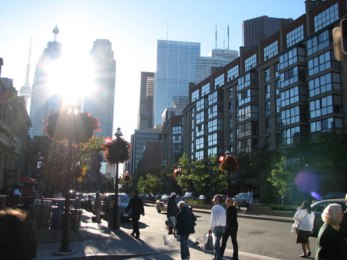
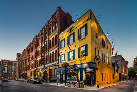
    Photograph Toronto - St Lawrence Market by Chris Dufresne on 500px

    Toronto – St Lawrence Market by Chris Dufresne on 500px

    This past Saturday night I was out with a few friends in my neighborhood (St. Lawrence Market area). And I was delighted to see how busy it was. Virtually every bar or club we walked by had a line down the street.

    Being the city geek that I am, I started thinking about two things: (1) how often I get localized to my neighborhood (I have data to back this up) and (2) what makes a “complete neighborhood”, such that you’re even able to be localized?

    In some ways the idea of a “complete neighborhood” is universal. Everybody needs a grocery store and access to food, for example. But in other ways, a “complete neighborhood” is very much a personal thing – you want goods and services that are important to you.

    So today I thought I would do a quick breakdown of the goods, services, and amenities that I really value in my neighborhood and that I think make it more or less “complete.” This list is a combination of universal and personal choices in no particular order. At the end, I summarize some of the things I wish I had.

    What I have:

    • A 5-10 minute walk to subway and streetcar
    • A 24/7 grocery store
    • A world famous food market (St. Lawrence Market)
    • Staple coffee shops (Starbucks and Balzacs)
    • Lots of restaurant and food choices (including decent Mexican, one of my favorite foods, and Pho, for when I feel a cold coming on)
    • 2 drugstores (Shopper’s Drug Mart and a new Rexall)
    • A great gym that’s less than a 10 minute walk away
    • An outdoor/athletic store that also fixes bikes
    • Cool local bar (AAA) where I can watch the Raptors (because I don’t own a TV)
    • After work bar with a good Happy Hour (Pravda)
    • Patios for the summer (all along the Esplanade)
    • All the major banks
    • Nearby recreational amenities (bike trails, waterfront, etc.)
    • Local employment base (Wattpad, BNOTIONS, etc.)
    • Great architecture (from Daniel Libeskind to the classics)
    • High walkability

    What I wish I had:

    • Less chains and a few more independent businesses
    • A hip indie coffee shop where the (male) staff have waxed moustaches
    • A good takeout sushi place
    • A pool that I could walk to (I ride my bike to Regent Park)
    • A liquor store with longer hours (but alas this is Ontario)

    Those are my working lists. What would create a complete neighborhood for you? And how does your current neighborhood hold up?

  • How I moved over the last 3 weeks

    At the beginning of this year I wrote a post about a mobile tracking app called Moves that I had heard about through my friend Sachin Monga. He had just published a beautiful set maps showing where he physically spent his time in both Toronto and San Francisco.

    His post spurred me to download the app and at the end of my post I promised to share my own set of maps once I had collected enough data points. It’s only been about 3 weeks, but already my maps are starting to fill out, so I thought I would do a release.

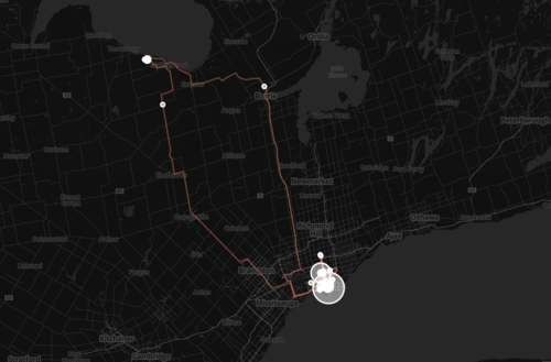
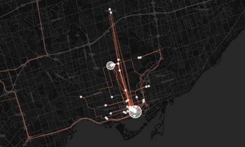
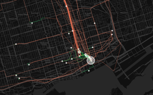
    The orange lines represent transport of some sort (car, subway, streetcar, and so on) and the green lines represent walking. I don’t cycle very often in the winter (I know, I’m a fair-weather cyclist), so you won’t see any of those lines just yet. However if I posted a map from the summer, I know it would look completely different.

    Here’s a first one showing a regional scale:

    image

    Here’s a second one showing the city of Toronto:

    image

    And here’s a third one showing mostly downtown:

    image

    What’s interesting about these maps is how much you can tell about me and the way I move around the city.

    For one, there’s a good chance I ski or snowboard given that I’m driving up to Collingwood, Ontario in the winter. You can also see how heavily dependent I am on the Yonge subway line, which is the thickest orange line in the middle of downtown. It’s also interesting to see how localized I am within my neighborhood (St. Lawrence Market). I walk to get groceries. I walk to the gym. I walk to coffee. And the list goes on.

    This is fairly typical for people living in urban neighborhoods, but it would be interesting to see where it applies in the city and where it begins to fall apart. I would also imagine that there’s a correlation to the area’s Walk Score, although this (Moves) might actually be a better measure since it’s usage data.

    Either way, imagine what cities could do if they had this sort of data for every resident. They would be able to see precise resident flows and then determine exactly where transit and infrastructure investments should be made instead of politicking to determine where they should be made.

    That time is coming.

  • Toronto seeks injunction to stop Uber

    image

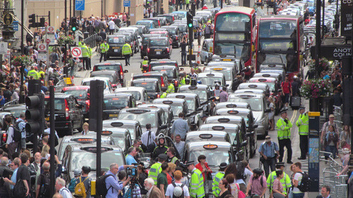
    One evening this past spring I was leaving a Rotman School event at Liberty Grand on the west side of Toronto. There aren’t a lot of taxis coming through this part of the city, so I figured I was going to have to wait while I hailed one from my phone. But as luck would have it, one happened to be pulling up just as I walked out of the hall.

    As he drove up and rolled down the window, I told him that I was going to the St. Lawrence Market area and that I needed to pay by credit card (I was trying to be a nice guy and avoid the inevitable fight when he was dropping me off). He responded by saying, “My machine is broken. Can’t you pay with cash?” I told him, “No, unfortunately I don’t have any cash on me. I need to pay with credit card.” He then rolled up his window and drove up closer to the entrance of the hall.

    Faced with this scenario, I did what most people would probably do nowadays: I pulled out my phone so that I could hail either an Uber or a Hailo cab (I’m sad that Hailo has since left the North American market). I decided on Hailo (it was cheaper until UberX came along) and ordered a car.

    But within a few minutes, the same taxi with the broken credit card machine circled back around, rolled down his window, and told me that his machine was now working and he would take me to the St. Lawrence Market. Knowing exactly what had happened, I said to him, “Wooooow, that’s funny that within the span of a few minutes your machine has magically started working again.” He wasn’t happy with that response.

    Now, we all know why he didn’t want to take my credit card. He didn’t want to pay the fees and he wanted the cold hard cash. And who can really blame him for wanting to maximize his profits. But for the end user, this experience sucks. When it’s 2 in the morning and all you want to do is go home to bed, you don’t care about the few dollars he’s trying to save. You just, want, to go, home.

    And that’s one of the reasons why Uber (and previously Hailo) is having such a huge impact on the market. Even before UberX arrived (the cheaper alternative), lots of people were more than willing to pay the Uber premium. And they continue to pay their controversial surge prices. But that’s because the experience is so much better than what’s offered today.

    We all know that Uber is under a lot of fire for what they do, but Toronto mayor Tory is 100% right in saying that ridesharing and peer-to-peer taxis are here to stay. Toronto may be seeking a court injunction to stop the service in this city, but I would agree that it’s likely going to be a big waste of money. The cat is already out of the bag.

    What’s happening here is no dissimilar to what happened with Napster. A court order may have forced the company to shut down, but it didn’t maintain the status quo for the music industry. That industry went, and continues to go through, a lot of change. So a better option, would be for everyone to sit down together and figure out what the future of the taxi industry is going to look like. Because I can guarantee you that it’ll continue to change.

    Image: Anti-Uber protest in London (Flickr)

  • A walk down memory lane in the St. Lawrence Market

    I recently got lost looking through the Toronto Archives for old photos of my neighborhood. I’ve blogged about what the St. Lawrence Market neighborhood looked like in the 70s, but I wanted to go back even further. I wanted to see what exactly had been demolished and lost over the years.

    But by the end of it, I was just sad. As a lover of cities, it always makes me upset to see great buildings disappear. I think you too will be surprised at what I found.

    The following picture depicts the north side of Front Street East, about 2 blocks east of Yonge Street. I don’t know what year it is, but look at how stunning these buildings are. It looks like Soho, New York meets some glamorous European capital.

    Can you imagine what we could do with these buildings today?

    image

    If there’s any doubt in your mind that this is Toronto or that it’s Front Street East, take a look at the spire in the far left hand side of the picture. It belongs to the Toronto Board of Trade Building, which used to sit at the north east corner of Yonge Street and Front Street. When it was built in the late 1800s, it was considered one of the first “skyscrapers” in Toronto. It was demolished in the 1950s.

    Here’s a picture of the Board of Trade Building so that you can compare. Again, take a look at the spire.

    image

    For those of you who might not be familiar with the area, here’s a map to help you out. The Board of Trade Building is shown on the bottom left hand corner. And the buildings in the first picture are in the triangular land area between Wellington and Front.

    image

    Now, let’s fast forward to the late 1960s. Those same buildings shown in picture number one have been demolished and in their place is the following parking lot. It’s a bit less glamorous looking. There are still heritage buildings on the south side of Front Street, but the balance of the area seems to have been blown out. What a shame.

    image

    Finally, here’s an aerial view of the area. It’s also from the late 1960s or early 1970s. You can see the same triangular land area, with only the Flatiron Building still standing at the very tip of it.

    image

    Obviously the St. Lawrence Market has come a long way since the 70s. That triangular area has since become Berczy Park, which is actually in the midst of being completely revitalized, and all of those parking lots have been filled in. But I still can’t help but wonder what the neighborhood would be like today had we preserved all of those heritage buildings. 

    I think cities work best when you can figure out that delicate balance between preservation and progress. It’s not always the simplest approach, but as most things in life, the right decisions are often the toughest ones to make.

  • How are you being shaped?

    image

    “We shape the cities, and then our cities shape us.” That’s one of my favorite lines from the documentary The Human Scale, featuring Danish architect and urban designer Jan Gehl. I like it because I don’t think many of us think enough about the way in which the built environment – that we create – ultimately goes on to influence the way we live our lives.

    One of the most interesting connections for me is the link between urban form and public health. There’s been a lot of talk over the years about how suburban sprawl is, or might be, making us fat (among other things). We’ve created environments that are only navigable by cars and that has forced many of us into sedentary lifestyles. We sit in our cars, and then we sit in our offices.

    So today I’d like to conduct a bit of a poll. If you’d like to participate, please share the following 3 things in the comment section below: 1) your city, 2) the type of neighborhood you live in (urban, suburban, rural, etc.), and 3) the amount of time you spend walking or doing something active on an average day.

    Here’s me:

    I live downtown Toronto in the St. Lawrence Market neighborhood (urban). I take the subway to work and the station is a 10 minute walk from my place. So as a bare minimum, I spend at least 20 minutes a day walking. But since I also walk to do most of my regular errands, and since my gym is another 10 minute walk from my place, I’d say I average a good 30-45 minutes of walking each day.

    Now it’s your turn 🙂

    This is a pretty crude survey, but with the advent of things like smartwatches and health monitors, I think we’ll soon have lots of great data on the ways in which our cities might shape our health.

    Image: The Economist

  • What’s in a neighborhood?

    image

    When I was working on my startup Dirt last year, one of the things we spent a bit of time figuring out was how to classify buildings according to neighborhood. Now, at first blush, this may seem like a fairly easy thing to do. You simply locate the building, figure out which neighborhood it’s in, and then tag it accordingly. But neighborhood boundaries and definitions aren’t as clear cut as you might think.

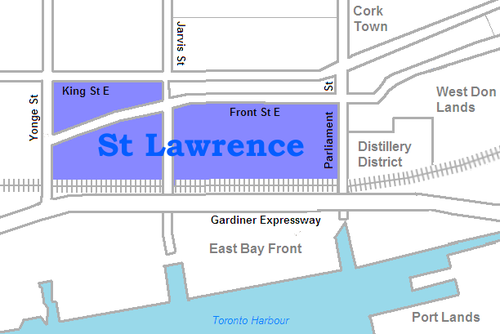
    For example, a lot of you probably know that I live in the St. Lawrence Market neighborhood of Toronto. And indeed, if you look at this Wikipedia definition, I live in that area. But if you look at what they call it, it’s just: “St. Lawrence.” They also specify that it used to be called “St. Lawrence Ward”, but that today most people actually call it “the St. Lawrence Market.” So here you have an example of an evolving and changing name.

    image

    But then there’s the question of boundaries. According to Wikipedia’s definition, the north boundary is Front Street. This means that the North Market Building would be technically outside of the area and so would the Market Square condos. But I suspect that almost everyone would consider these two buildings to be part of the neighborhood. So where exactly is the north boundary? Is it King Street? Or maybe by Front Street they mean that all buildings on the north side of the street are included.

    If you look at the city’s official neighborhood list (which is built from Statistics Canada Census Tracts) you’ll find a completely different boundary and name. According to this list, I live in the “Waterfront Communities–The Island” neighborhood. Obviously nobody, other than maybe somebody who deals with census data, would have any idea what this area is. But it’s how the city tracks its demographic data.

    What this begins to show you is that neighborhood definitions and boundaries aren’t as black and white as they might initially seem. And it’s partially because cities themselves are always in flux. New neighborhoods emerge and old ones reinvent themselves. And as that happens, people start introducing new names and new terminologies.

    image

    When I was about 19 years old, people in Toronto used to say they were going out “on Richmond and Adelaide.” Since then, gentrification has pushed many of the bars and clubs out of that area. So people instead go out “on King West” or “on Ossington.” And as people begin to use those terms and identify with an area, new brands are created. Ask anybody who lives downtown and I bet they’ll tell you that King West has its own unique personality and even a type of person who typically lives there. This is an on the ground type of awareness though, which doesn’t get captured in census tracts.

    The other reason neighborhood boundaries can be so fuzzy is because we – the real estate community – are constantly trying to manipulate them for our own benefit. I’m indifferent to the fact that this happens, but it is a reality. Think about how much the neighborhood of Yorkville has been stretched from its original roots north of Bloor Street. If a neighborhood has a good brand, agents and developers will naturally try and leverage it. Homeowners do it all the time too. Would you prefer to say that you live in Seaton Village or the Annex?

    Ultimately, we (my Dirt cofounder and I) decided that neighborhood definitions and boundaries needed to be fluid. They needed to dynamically adjust with the market and come from as many people as possible on the ground. Because at the end of the day if the official documents say one thing, but the majority of city residents believe another, then that official boundary and definition are probably out of date. The crowd wins here.

    We liked this approach because it was organic – just like cities.

    Images: Flickr, Wikipedia, Flickr

  • Berczy Park and the importance of public art in cities

    image

    Earlier this week a friend of mine was live tweeting a public consultation meeting for the revitalization of Berczy Park in the St. Lawrence Market neighborhood of Toronto. And since I live in the neighborhood, it’s a project that I’ve been following particularly closely–although anything related to the built environmental generally fascinates me.

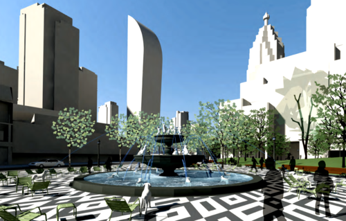
    As soon as I saw the pictures he was tweeting out, I was immediately excited. And after reviewing the full design package (which you can download here), I must say that I think it’s going to be a brilliant change for the neighborhood. 

    image

    On an entirely superficial level, I like the paving motif they’ve chosen; even if it does appear to be be a copy from somewhere else (see above photo). I don’t think one should underestimate how small details, like paving, can have a huge impact on how one feels in a space, whether inside or out. It all counts.

    But beyond just cosmetic changes, there are a couple of significant design changes being proposed.

    First, a larger kid-friendly green space is being proposed on the west side of the park. And what was interesting to see was how the community overwhelmingly expressed a need for this play area. I’d like to believe that this speaks to the growing acceptance of raising kids downtown. There are certainly lots of families in the St. Lawrence.

    Second, the south portion of the park is being “opened up” with a much larger hardscape area. The result will be a bigger promenade along Front Street, as well as, what I hope, will become an “urban stage” for people to hang out, breakdance, busk or try and sell me things I don’t need.

    But equally exciting is the fact that along with the revitalization of Berczy Park will come a public art competition. It’s already in the works, but there aren’t any pretty images to share, just yet. Regardless, I think the topic of public art is an interesting discussion.

    In a lot of cities around the world, there are mechanisms in place to encourage or mandate public art. Commonly, it comes in the form of a “Percent for Art” program, which means that, in the case of a new construction project, 1% of the construction costs would or should go to public art.

    But the fact that we, at least in some cities, have programs to mandate it, should immediately signal to you that public art is not something universally believed in. And certainly it’s one of those things where it’s hard to measure the return-on-investment. 

    But that doesn’t mean it doesn’t or can’t exist.

    In fact, I would argue that in today’s information and digital age it’s only going to become more important. We are living in a world of too much information and too little time. We’re living in a noisy world and, whether you’re a corporation or a city, the only way to stand out is to be remarkable. You need to bring delight to people.

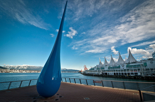
    Because when you do, you get noticed (and probably shared on Facebook, Twitter, Instagram, Tumblr, Snapchat, Vine, 500px, Flickr and maybe even Google+). As one example, how many of you recognize the public art piece below? It’s in Vancouver and I’ve seen it pop up a number of times in my social news feeds. It’s something that brings delight to people. 

    image

    But at the same time, it’s something that speaks to and creates a sense of place. What could be more Vancouver than a giant blue raindrop along the waterfront? And that’s really one of the ironies of today’s digital world. Despite the fact that, no matter where we are, we’re all hyper connected through technology, more and more of us are gravitating back towards cities. We want to live close to other people and we want to feel a sense of place.

    When done properly, public art can help cities achieve that. Whether it’s the famous LOVE sculpture or Richard Serra’s controversial Tilted Arc, public art can make you stop and take notice of your environment. It can give you that sense of familiarity or it can take you by surprise. Either way, it gives you a sense of place.

  • New York City on Market Street

    On my walk to the subway this morning I was confronted by a transformed Market Street in Toronto’s St. Lawrence Market area. New York City had taken over.

    There were NYC yellow cabs, NYPD cars, FDNY trucks and lots of film people milling about in Canada Goose jackets. Toronto, once again, stands in for New York.

    image

    But while I think it’s great that we’re (presumably) creating a bunch of local jobs, there’s also a part of me that hates to see this. I hate it because I want the Toronto brand to be strong enough so that movies actually take place here, instead of just being filmed here.

    I mean, who wants to be the stand-in? It’s much better to be the actor.

  • Why Toronto should stop complaining about all its condos

    Below is my latest post from the TAS blog. You can find it cross-posted here.

    Last week I wrote a post on my personal blog about housing policy in San Francisco. My argument was that the backlash against the tech community (for allegedly driving up real estate prices) is actually misdirected and that housing policy should be the target. 

    The reasoning behind this is simple: More people are moving to San Francisco than new housing is being provided. And so regardless of whether you have tech workers or not, you have an environment where the rich are always going to outbid the poor for housing.

    If you look at the numbers from the past 2 decades, San Francisco on average builds 1,500 new housing units a year. And yet the city gained approximately 25,000 new people between 2010-2012 (that’s roughly 8,300 people per year). So what you have is a perpetual housing supply shortage.

    To correct this problem, San Francisco needs to start building. And I’m stealing this idea from Harvard economist Edward Glaeser, who wrote an article on this very same topic back in December of last year for Bloomberg (and a book called Triumph of the City). His argument was that “the surest way to a more equitable housing market is to reduce the barriers to building.”

    Now, if you compare San Francisco’s situation to Toronto’s, we’re almost on the opposite end of the spectrum. Toronto doesn’t have a problem building. We’re building lots. So much so that it’s become fashionable to joke around and complain about all the condos going up in this city.

    But it’s important to remember that all of these condos are making us a relatively affordable city by global standards. We have more people moving to this city every year than San Francisco and yet home prices are less. We’re also less expensive than Vancouver, where there are strong natural barriers to building, namely water and mountains.

    So rather than complain, I’m going to be the contrarian. I like seeing new housing built. I like knowing that the neighborhoods I love in this city are becoming home to more and more people.

    At one point, my home (which is in the St. Lawrence Market) was a “new development” and somebody could have fought and opposed it. But it was allowed to be built and I was allowed to move in. I’m thankful for that. And so my plan is to be just as gracious to the next person who wants to join the neighborhood.