Daily insights for city builders, delivered every morning at 6 AM ET. I’m Brandon Donnelly — a Toronto-based real estate developer and founder of Globizen. I’ve been writing here since 2013.

Tag: senseable city lab

  • Tracking epidemics in cities

    The last thing you probably need at this point is another webinar. But this one could actually be interesting. On May 29th, 2020 at 9:00 AM eastern, the Senseable City Lab at MIT is hosting one called, Tracking epidemics in cities: urban environments and the insights they provide into disease. The Senseable City Lab has previously looked at how sewage could be mined for real-time information about an urban population, revealing things like eating habits, genetic tendencies, drug consumption, and — yes — contagious diseases. In this webinar, SCL plans to pickup on this last point, as well as discuss how mobile phone patterns can help to inform epidemiological studies. If you’d like to register, click here.

    Image: SCL

  • Tasty data

    A recent study and research paper by the MIT Senseable City Lab — called, Tasty Data — has discovered that restaurant data alone can be used to accurately predict location-based factors such as daytime population, nighttime population, number of businesses, and overall consumer spending within a specific geography.

    They started by pulling restaurant data from Dianping (Chinese equivalent of Yelp) for 9 Chinese cities: Baoding, Beijing, Chengdu, Hengyang, Kunming, Shenyang, Shenzen, Yueyang, and Zhengzhou. They then paired their Dianping data with other available data (such as aggregated mobile phone data) and used machine learning to search for any correlations.

    Below is a diagram of “nighttime population” in Beijing. They are using a 3 km2 grid.

    If you’re a regular reader of this blog, you’ll know that I like these kinds of studies. By 2020, it is estimated that 1.7MB of data will be created every second by every person on earth. The numbers are staggering. And yet, “official” data sources, such as census data, remain slow and fairly limited. Studies like this one continue to show us what’s next.

    Image: MIT Senseable City Lab

  • The sensing power of taxis

    The latest project out of MIT’s Senseable City Lab examines the “sensing power of taxis” in various cities around the world. Looking at traffic data, they determined how many circulating taxis you would need to equip with sensors if you wanted to capture comprehensive street data across a particular city. This might be useful if you wanted to measure things like air quality, weather, traffic patterns, road quality, and so on.

    What they found is that the sensing power of taxis starts out unexpectedly high. It would only take 10 taxis to cover 1/3 of Manhattan’s streets in a single day. However, because taxis tend to have convergent routes, they also discovered rapid diminishing returns. It would take 30 taxis (or 0.3% of all taxi trips) to cover half of Manhattan in a day, and over 1,000 taxis to cover 85% of it. A similar phenomenon was observed in the other cities that they studied: Singapore, Chicago, San Francisco, Vienna, and Shanghai.

    However, if you look at the percentage of trips needed to scan half of the streets in a city, Manhattan has the lowest rate at 0.3%. Vienna is the highest at 9%. But I’m not sure if this is a function of the utilization rate of their taxis or if it has something to do with urban form. Singapore has a similarly low rate (0.44%), but its street grid looks nothing like that of New York’s.

    Here’s a short video explaining the project:

  • Minimum fleet

    Here is an interesting study by the MIT Senseable City Lab, which looks at: “the minimum number of vehicles needed to serve all the trips in New York without delaying passengers’ pick up times.” If you can’t see the embedded video below, click here.

    [youtube https://www.youtube.com/watch?v=nFo64kBGF6o&w=560&h=315]

    This is interesting because it begins to quantify the amount of waste running through the system today and the possible efficiencies brought about by autonomous vehicles. In this model, the current taxi fleet in NYC could be reduced by 40%.

    For more on the study, go here.

  • Global mobility index

    Below is a short video that was created by the MIT Senseable City Lab, World Economic Forum and TomTom for a study on how people move in 100 cities around the world. They call it the Global Mobility Index.

    It shows congestion levels (using real-time traffic data from TomTom), commute times, and an estimate for the percentage of trips that could be shared if people were willing to wait up to 5 minutes.

    In the case of Toronto, they estimate that 99% of trips could be shared and that it would increase average speeds by ~7.9 km/h and reduce overall traffic levels by ~44.09%.

    Their solution to solving traffic congestion is a cocktail that involves car-sharing, bike-sharing, and public transit. It’s about developing a “mobility portfolio.” Seems sensible.

    I found myself wanting more information and data after watching the video. Still, it was interesting to see what the authors describe as the “pulse of our cities.”

    If you can’t see it below, click here.

    [youtube https://www.youtube.com/watch?v=ciJEHGMtpWc?rel=0&w=560&h=315]

  • Smart sewers may soon analyze our poop

    On September 2, 2017, a research project by several MIT laboratories – called Gangnam Poop: Underworlds in Seoul – will debut at the Seoul Biennale of Architecture and Urbanism.

    Here’s an excerpt from the exhibition description:

    A vast reservoir of information on human health and behavior lies in our sewage, and this resource is untapped. We imagine a future in which sewage is mined for information that can inform policy makers, health practitioners, designers, and researchers alike. Such is the idea behind Underworlds: a cross-disciplinary data platform for monitoring urban health patterns, shaping more inclusive public health strategies, and pushing the boundaries of urban epidemiology.

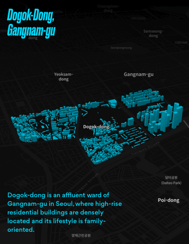
    For this exhibition and “proof of concept”, they analyzed three distinct neighborhoods in Seoul, using an aptly named sewer robot called Luigi. 

    Gangnam-gu (shown above) is an upper-class high-rise residential area. Mapo-gu is an emerging artist and designer enclave. And Seongbuk-bu is a hillside village with detached houses and an older demographic.

    In each case, they mapped out the bacterial populations found beneath each neighborhood. Interestingly enough, the different areas revealed different bacterial occurrences. You can see those diagrams here.

    I often think of healthcare as being very reactive. A future like the one this exhibition is imagining would be far more proactive. And that would be a very good thing.

    Image and project by MIT Senseable City Lab. Gangnam Poop: Underworlds in Seoul. Commissioned by Seoul Biennale of Architecture and Urbanism

  • Visualizing the origins of MIT’s international students

    “Like the United States, and thanks to the United States, MIT gains tremendous strength by being a magnet for talent from around the world. Faculty, students, post-docs and staff from 134 other nations join us here because they love our mission, our values and our community.” -L.Rafael Reif, MIT President

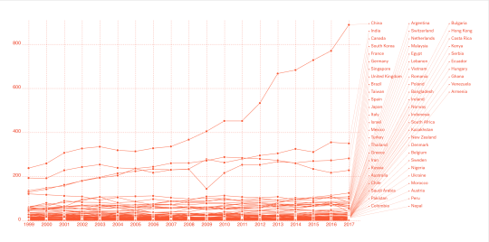
    The MIT Senseable City Lab recently analyzed nearly 20 years of ethnographic student data in order to visualize the origins of its international faculty, students, and researchers from 1999 to the present.

    The above chart may be a bit small (larger version here), but it shows all students (undergraduate, graduate, and visiting/others) by country. The top 5 countries are China, India, Canada, South Korea, and France.

    To give you some sense of the math, there are 3,808 international students at MIT as of 2017. 888 of them alone are from China – mostly at the graduate level (688 out of the 888). So China represents almost ¼ of MIT’s international student population.

    Another thing that stood out for me was the drop off in Canadians in 2009. You can see that “V” roughly in the middle of the chart. Canada went from 233 to 144 students. I wonder if this had something to do with the economic climate at the time. Not sure.

    Click here to see all of the visualizations. 

    Note that you can toggle by region and country, as well as by “Trump’s EO Countries.” That feature, as well as the quote at the beginning of this post, should give you an immediate appreciation for some of the motivations behind this exercise.

    Images: MIT Senseable City Lab

  • Shareable cities

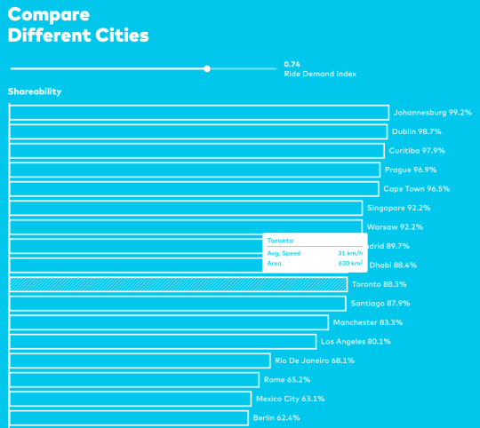
    The MIT Senseable City Lab recently looked at which cities are the most “shareable” when it comes to ride sharing services such as UberPOOL. Their goal was determine what fraction of individual trips (inefficient) could be shared or pooled (more efficient). To do this, they developed a single “shareability curve.” Full research paper, here.

    Not surprisingly, New York City does very well in this analysis. Its shareability is well above 95% for a delta of 5 minutes. That’s because the city has a large population, a small geographic area, enormous density, and lots of taxi traffic. (They used taxi data in their research.)

    But New York City also does very well when it comes to transit ridership. Highest in North America. So it strikes me that the characteristics that make a city “shareable” also apply to transit – which is effectively another form of ride sharing. Might we see the distinction between these 2 forms of mobility blur in the future? I think so.

  • The Green View Index

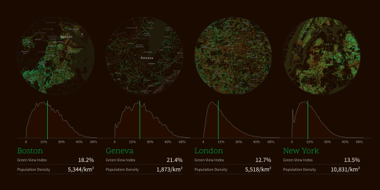
    The MIT Senseable City Lab recently developed something called the Green View Index. It is a measure of a city’s tree canopy. Below are the GVIs for Boston (18.2%), Geneva (21.4%), London (12.7%), and New York (13.5%). You may have to zoom in.

    image

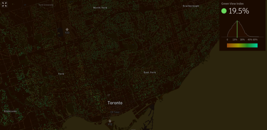
    And here is a screenshot of Toronto. We have a GVI of 19.5%.

    image

    The index was developed by methodically scanning for trees in Google Street View panoramas. The reason street view was used – as opposed to aerial photography – was so that they could capture the human experience at street level.

    All of MIT’s interactive city maps can be found here. It’s also interesting to pan around and see which neighborhoods are the greenest – particularly if you are familiar with the city.

    One thing I noticed is that large green spaces such as Central Park, High Park, and Stanley Park don’t show up as very green. And that’s because the index uses car-based street view data. I feel like these green spaces should count for something though.

  • Slot-based intersections

    If you don’t follow the work of MIT’s Senseable City Lab, I highly recommend that you start. 

    Earlier this year, researchers from the Massachusetts Institute of Technology, the Swiss Institute of Technology, and the Italian National Research Council developed something that they call “slot-based intersections.” In a world where cars have sensors and drive themselves, it is intended as a more efficient alternative to traditional intersections. Goodbye traffic lights.

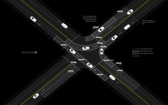
    Much like air-traffic control, the way the system works is by assigning individualized time slots to each car for when they may enter an intersection. For example, in the diagram below (Sequence 01) the car approaching from the bottom left (#10) has a “stop distance slot” in front of it reserved for 3 of the cars that are currently in the intersection. The two that are traveling perpendicular to it and the car currently turning left into the same lane as #10 (on the other side of the intersection). The car in the midst of turning right (#5) is exempt because there’s no possibility of collision. 
    image

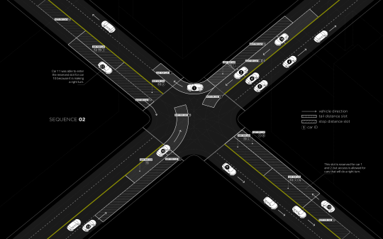
    In Sequence 02 (below) you can see that car #10 is now turning left, which means it has its own time slot in the intersection. Other approaching cars now have a “stop distance slot” dependent on car #10.
    image

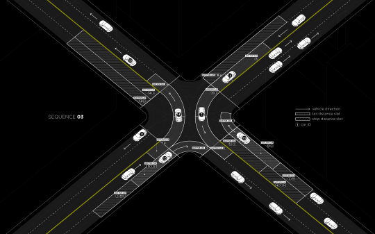
    In all cases, cars making a right turn are able to move freely, provided they will not interfere with any other cars.
    image

    The researchers estimate that real-time slot allocation might double the number of vehicles that a traditional traffic-light intersection can handle today and, in some cases, it might completely eliminate stop and go traffic.

    Often when I write about self-driving vehicles I hear people tell me that cars are still cars. It doesn’t matter whether they are self-driving or not. The same inefficiencies apply. They are not the solution to urban gridlock. Elon Musk was also criticized (following his Master Plan) for not properly understanding urban geography.

    But self-driving cars will create new efficiencies. I am not saying that they are a silver bullet, but I am saying that they will help a great deal. I don’t think that anyone truly understands the extent of these efficiencies, but there are a myriad of possibilities. This Senseable City Lab project is a perfect example.

    What I am grappling with right now is the relationship between self-driving vehicles and traditional forms of public transit. Until we get a handle on the efficiencies and overall impact, it’s hard to ascertain how these different forms of mobility will work together. My gut tells me that the lines are bound to get blurry and that self-driving “cars” will feel less and less like the cars we know today.

    Below is a video that was published along with the research. If you can’t see it, click here.

    [youtube https://www.youtube.com/watch?v=4CZc3erc_l4?rel=0&w=560&h=315]