Daily insights for city builders, delivered every morning at 6 AM ET. I’m Brandon Donnelly — a Toronto-based real estate developer and founder of Globizen. I’ve been writing here since 2013.

Tag: seattle

  • Job mixes and job losses

    Recent job posting data from Indeed has revealed a bit of a paradox. The metro areas where more people are able to work from home — i.e. tech hubs and finance centers — have experienced larger job posting declines compared to all other US metros, as well as to tourism destinations such as Las Vegas and Orlando.

    We know that the hospitality and tourism sector has been the hardest hit by the current environment. But that doesn’t appear to be the biggest driver for overall job losses. In fact, one of the key takeaways is that job losses between February and June 2020 look to be correlated with metro size. That is, the bigger the city, the greater the job losses (% change).

    So what’s going on?

    Well, according to Indeed, it’s important to look at the local job mix. In “work-from-home metros” like Seattle, San Francisco, and Boston, there has been a relatively high percentage of people who were able to quickly transition to working from home. This is reflected in the anonymized mobile-device data for these cities. More people at home. Less mobility. And a seemingly stronger adherence to social-distancing protocols.

    The problem with this outcome is that it crushes most of the in-person sectors and businesses that relied on this workforce moving about the city — things like food prep and beauty & wellness. I mean, just think about all of the food businesses that survive off lunches in a CBD. According to Indeed, it is these sorts of local economic connections that have really been driving the declines in job postings and overall payroll employment during lockdown.

  • The America we need

    The New York Times is running an opinion series right now called, The America We Need. It is all about how the US might emerge from this crisis “with a fair, resilient society.” This piece by Carol Galante covers many of the topics that we discuss on this blog. Carol is a former city planner and nonprofit housing developer. She is now the faculty director of the Terner Center for Housing Innovation at UC, Berkeley. Here are a couple of excerpts from her article that I think will resonate with many of you:

    There are two things we know: The U.S. economy will recover. And the recovery will start in and be strongest in the same cities that were thriving before the pandemic. Economies in places like Seattle, San Francisco, New York and Boston are driven by the innovation, technology and biotech sectors, which are proving to be remarkably resilient to the impacts of Covid-19.

    We have an obligation to ignore the short-term reactionary impulse to blame density for the spread of the coronavirus and instead use this opportunity to rethink the policies that impede the construction of new housing, at more price levels, in the places where housing is most needed.

    In my subsequent career as a nonprofit housing developer working in prosperous coastal California communities, I spent far too many nights in City Council meetings working to get apartment buildings for lower-income older people and families approved. Underlying the “density” battle was almost always a battle over who has access to the opportunities of a place and who doesn’t, cloaked in arguments about neighborhood character and traffic impacts.

  • The performance of cities proper

    Richard Florida is currently running a four-part CityLab series on the economic performance of America’s cities. What makes this study somewhat unique is that it looks at cities proper, rather than at their larger metro areas. In some cases there may not be that much of a difference. But in other cases, the performance of the city proper could be very different from that of the broader area.

    Here are the fastest and slowest growing cities from 2012 to 2017:

    Here are the fastest and slowing growing job markets:

    And here is the growth in share of adults with a graduate degree:

    It’s interesting to see Seattle at the top of the population growth list. It is not a sprawling sunbelt city. It is an expensive tech hub. And it is also interesting to see Miami’s strong employment and education growth. Years ago, Paul Graham wrote an essay arguing that tech hubs have two prerequisites: capital and nerds. He went on to argue that Miami has lots of the former, but not much of the latter. Maybe that’s changing.

  • Uber Movement introduces new Speeds product

    Since we’re on the topic of large-scale data collection, I thought some of you may be interested in Uber Movement‘s new “Speeds” product.

    First launched in 2017, Uber Movement aggregates anonymized data from their ride-sharing business to create data sets and tools that can help cities make better transportation decisions.

    Below is a (hex cluster) map of Toronto showing average travel times from downtown. I dropped the pin at Toronto City Hall. What is shown is the average for all days of the week during the month of January 2018.

    Uber Movement’s new Speeds product looks at how specific streets are performing relative to their “free-flow speed.” Uber defines this as “the average speed of traffic in the absence of congestion or other adverse conditions.” (The 85th percentile of all speed values.)

    As of right now, Speeds is only available in 5 cities: New York City, Seattle, Cincinnati, Nairobi, and London. Here is a snapshot of London during the same time period as above, January 2018:

    In comparison to what we were talking about yesterday, I have few concerns with the fact that my Uber rides around town have likely contributed to these mappings. With these use cases, the value really only emerges once you aggregate the data.

  • Tech and the North American office market

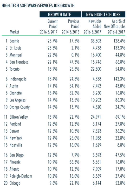
    CBRE recently published this report looking at the impact of the “high-tech software/services industry” on the North American office market. 

    Here are a few highlights:

    – Since 2010, tech has created ~1.1 million jobs in the US at an annual growth rate that is 3x the national average.

    – Seattle currently has the fastest tech job growth in North America. This is the first time in 7 years that San Francisco hasn’t been at the top of their list.

    – Silicon Valley, Toronto, New York, and Los Angeles all added more than 10,000 tech jobs from 2016 to 2017.

    – The biggest “momentum markets”, relying on 2016 and 2017 data, are Montreal, St. Louis, and Seattle.

    – Over the past two years (Q2-2016 to Q2-2018), Atlanta, Los Angeles, Orange County, Seattle, and Portland have all seen double-digit rent growth.

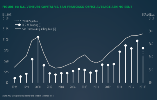
    One figure that also stood out for me was this one here showing the relationship between US venture capital investment and the average asking rent for office space in San Francisco.

    If you’d like to download the full report, click here. You’ll need to sign up for an account with CBRE, but it’s free to do that.

  • Detroit. Move here. Move the world.

    As part of the Amazon HQ2 bid process, a number of cities produced videos. I only discovered them today and so maybe some of you also missed them when they were released last fall. There are videos from Detroit, Boston, Pittsburgh, Philadelphia, Dallas-Fort Worth, Las Vegas, Louisville, Atlanta, and maybe others that I am still missing. 

    Some of the videos are bad. (I’ll let you make your own judgement calls.) I like the idea behind Atlanta’s video, which is the journey of someone named Georgia physically delivering their bid to Seattle. And Philadelphia’s video made me feel really nostalgic about my time there. Those were some great years. 

    But my favorite video is Detroit’s video. It feels authentic. The footage is outstanding. And it feels powerful. Though it is probably too long. It was a good reminder that I’m overdue for a visit. So here is Detroit’s video. If you can’t see it below, click over to YouTube.

    [youtube https://www.youtube.com/watch?v=DO4J_PC1b5M&w=560&h=315]

  • North American cities with the most construction cranes

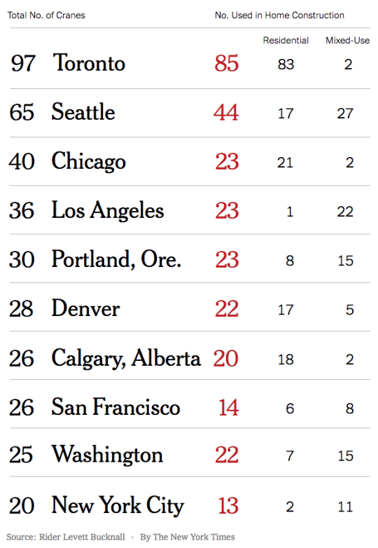
    Rider Levett Bucknall recently released its RLB Crane Index for Q3-2018. Here are the top 10 cities in North America (table via the New York Times):

    For the third consecutive reporting period, Toronto has taken the number one spot at 97 cranes – 85 of which are being used on residential projects. 

    I’m not at all sure how the study defines “mixed-use” projects. But given that Toronto only has 2 of them, it must not include projects with grade-related retail.

    Across North America, residential and mixed-use projects (whatever they are) make up approximately 70% of the total crane count. 

    I am surprised that Miami didn’t make the list.

  • Car-dependent spatial structure

    Earlier this week a 58 year old woman named Dalia was struck and killed by a car near the University of Toronto’s downtown campus. This tragedy has everyone talking about and questioning how to make our roads safer, though the answers are not difficult to find. Here is an excerpt from a piece that Richard Florida penned following the incident called, Toronto’s Deadly Car Crisis:

    Today, more Torontonians die from being hit by cars than from being killed by guns. In 2016, nearly 2,000 pedestrians and 1,000 cyclists in the city were hit by cars. Of these, 43 resulted in fatalities. On average, a pedestrian in Toronto is hit every four or five hours, and a cyclist every eight or nine. This means that Toronto’s rate of pedestrian deaths was 1.6 per 100,000 people in 2016 — worse than in Chicago, Seattle, San Francisco, Boston, Washington, D.C., Portland, Pittsburgh, Cleveland, and Buffalo. It has risen to 1.7 deaths per 100,000 people in 2017 and is on track to rise still further to 1.8 deaths per 100,000 this year. And, children and the elderly face the greatest risk of being struck and killed by a car. The problem is only getting worse. Across Canada, pedestrian fatalities increased by more than 10 percent between 2010 and 2016; at time when they decreased by more than 25 percent in European countries like Norway, Switzerland, and the Netherlands.

    The broader issue is what he refers to as Toronto’s “car-dependent spatial structure.” And it is detrimental to not only our public safety, as we saw this week, but also to our ability to grow as a global city. The Greater Toronto Area is projected to reach 10 million people by 2041. I agree with Florida that, for a number of important reasons, we are going to need to commit ourselves to a new model for growth.

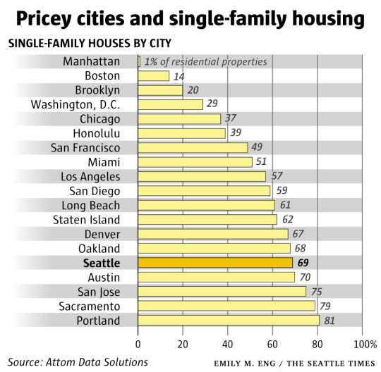
  • Percentage of residential properties dedicated to single-family housing in US cities

    The Seattle Times has an article up about “widespread single-family zoning” that will feel familiar to many here in Toronto who, I know, are having similar conversations about the amount of land dedicated to low-density housing.

    The article, by Mike Rosenberg, estimates that 49% of all developable land in Seattle is dedicated to single-family housing; that 8% is dedicated to multi-family housing; and that another 8% is dedicated to commercial and mixed-use buildings. The rest of the land is institutional, open space, vacant, and so on.

    Of all the residential lots in the city, the estimate is that 69% of them are occupied by single-family houses. This is compared to 1% in Manhattan. 

    I tried to reverse engineer the 69% based on the land use areas in the article, but the math didn’t quite add up. In any event, the argument here is, of course, that single-family homes are too expensive in Seattle and that the city needs more land available for multi-family housing.

    Housing supply is no doubt important, but looking at the above chart, having a low, or lower, percentage of residential land dedicated to single-family housing doesn’t seem to necessarily guarantee affordable housing.

  • Manhattan apartment rents post biggest decline since 2011

    A friend of mine sent me this article earlier today with a sarcastic comment about the relationship between housing supply and rents.

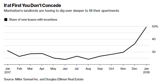
    The article talks about how rents in almost every Manhattan neighborhood have fallen compared to a year ago because of a flood of new apartment supply coming online. The median rent dropped 3.6% (year-over-year) which is the biggest decline since October 2011.

    image

    There has also been a spike in the number of leases with some sort of incentive attached to it (see above). As a landlord you typically want to use incentives, such as free rent, before resorting to lower face rents. Because lower rents mean a lower overall net operating income, which in turns depresses the value of your property.

    But sometimes you have no choice:

    “Landlords have finally realized, ‘OK, we have to adjust these prices because the concessions aren’t doing as much,’” said Hal Gavzie, who oversees leasing for Douglas Elliman. “Customers are looking past the concessions being offered and just looking for the best deals they can find.”

    A few weeks ago I wrote about a similar story playing out in Seattle. It’s almost as if excess housing supply is driving down rents.