Daily insights for city builders, delivered every morning at 6 AM ET. I’m Brandon Donnelly — a Toronto-based real estate developer and founder of Globizen. I’ve been writing here since 2013.

Tag: roman mars

  • I think Roman Mars would appreciate Utah’s new state flag

    Utah got a new state flag over the weekend that looks like this:

    And I immediately thought of this TED Talk by Roman Mars. For those of you who don’t know, Roman is the creator of 99% Invisible and a great lover of well-designed flags. His general rules of thumb are to keep things super simple and to use meaningful symbolism. And I’m fairly certain that he knows what he’s talking about because, in his talk, he refers to the Canadian flag as the gold standard for flags.

    In the case of Utah’s new flag, the symbols are this. The blue at the top is meant to represent Utah’s wide-open skies and lakes. The white in the middle represents its snowy mountains (of course). The red stripe is meant to represent Southern Utah’s red canyon landscape. The hexagon is meant to reference a honeycomb. And finally, the beehive is there because, well, Utah is the beehive state.

    Utah has long enjoyed this reference to beehives. Supposedly, it was early pioneers who started throwing around this reference because they believed it symbolized working together, perseverance, and overall industry. And that’s why the state’s official motto is, “Industry.” So I’d say that they used/kept the right meaningful symbolism.

    Though when I first saw the new flag, I immediately wondered whether the hexagon and honeycomb could have been made just a little simpler. Was the yellow fimbriation, for example, really needed within the blue hexagon? But the more I look at it, the more I like it and the more I think that Roman Mars would be happy with how this turned out. What are your thoughts?


  • The 99% Invisible City

    Roman Mars and Kurt Kohlstedt of the 99% Invisible podcast have a recent book out that is all about cities. True to their radio show, it is about the often-overlooked design choices that have shaped and continue to shape our cities. Everything from why jersey barriers are curved the way that they are to how roadway centerlines came to be. The book is called The 99% Invisible City: A Field Guide to the Hidden World of Everyday Design. And in some ways, it is what I try and do on this blog every day; look a little deeper and look at things — often cities — from a slightly different perspective (though I am no Roman Mars). So I think that many of you will appreciate this book. If you’d like to learn a bit more about it, here’s a recent interview that Roman did with StreetsBlog.

  • What is your city’s flag?

    How often do you see it around town? 

    Here in Toronto, I can’t say that I see ours all that often outside of city hall. Am I missing it? Here’s what it looks like:

    image

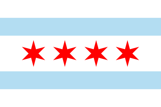
    In other cities, such as Chicago, the city flag seems to be far more ubiquitous. Here’s what Chicago’s looks like:

    image

    In the case of Toronto’s flag, the two white bands are meant to represent the architecture of Toronto City Hall. The maple leaf is the Council Chamber at the bottom. And there is some suggestion of a letter “T” for Toronto. Wikipedia says the “T” is supposed to be found in the blue space between and above the two towers of city hall, but I’ve always seen the two white bands as being the “T.”

    In the case of Chicago’s flag, the blue bands represent the lake and river (I like that) and the four six-sided stars represent significant events in the history of the city (positioned between the two bodies of water to mimic its actual geography).

    Roman Mars of 99% Invisible has a great podcast and TED talk on this topic. (The study of flags is known as vexillology.) In both instances, he outlines what he believes to be the 5 rules of great flag design. They are:

    1. Keep it simple
    2. Use meaningful symbolism
    3. Use 2-3 basic colors
    4. No lettering or seals
    5. Be distinctive

    Toronto’s flag generally conforms to these rules. But there’s something about the positioning of the maple leaf that makes the flag feel a bit arbitrary to me. I want to rationalize it.

    In any event, I think it could be really interesting if all of us shared our city’s flag in the comment section below and made a comment about how ubiquitous it is within the urban landscape.

    Roman makes the argument that a great flag gives people something to rally behind. And with cities only becoming more important on the global stage, there’s something to be said about having a well-designed flag today.

    I wonder if there will be a correlation between good flag design and ubiquity. My guess: probably.

  • If man had developed a third arm, where might this arm be best attached?

    Roman Mars of 99% Invisible recently published an excellent episode called The Mind of an Architect. It has to do with a set of research studies completed in the late 1950s by an organization at the University of California, Berkeley known as the Institute of Personality Assessment and Research (IPAR).

    IPAR was founded by a personality psychologist named Donald MacKinnon. He initially worked for the precursor to the CIA and founded IPAR with the intent of studying “combat readiness and efficiency.” But over fears of how creative the Soviets were getting, the focus of IPAR shifted to instead studying creativity.

    And architects were deemed to be an ideal test subject (from 99percentinvisible.org):

    “Researchers saw architects as people working at a crossroads of creative disciplines, a combination of analytic and artistic creativity. As professionals, architects had to be savvy as engineers and businessmen; as aesthetes, they also acted as designers and artists.”

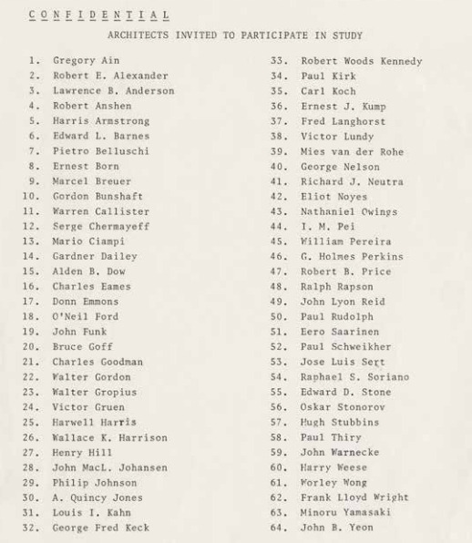
    So over a series of weekends in the late 1950s, some of the most celebrated minds in architecture – including people like Philip Johnson, Richard Neutra, and Louis Kahn – were studied and picked apart. 

    image

    They were asked to do quick sketches, create mosaics, and they were asked questions such as this one: “For the next 45 minutes we would like you to discuss this notion: if man had developed a third arm, where might this arm be best attached?”

    In the end, here’s what they concluded:

    The researchers began to notice certain patterns across creatives of all professions and genders, including a tendency to nonconformity and high personal aspirations. They also found many creatives shared a preference for complexity and ambiguity over simplicity and order. Creatives could make unexpected connections and see patterns in daily life, even those lacking high intelligence or good grades.

    In short: IPAR found that creative people tend to be nonconforming, interesting, interested, independent, courageous and self-centered, at least in general. Many of these traits may seem obvious today, but they were not necessarily obvious prior to these studies. Back when their tests were being conducted and findings presented in the 1950s and ’60s, the very idea of a “creative personality” was a novelty in academic and public discourse.

    The findings may not be groundbreaking to us today, but the documents and recordings produced during the study are certainly interesting. If you’re into this topic, there’s also this book you can pick up.

    Oh, and if we are to have a third arm, I would like mine to run almost parallel to my existing dominant arm (right). That way I could double up on my most potent dexterity. It would also be far less intrusive than an arm on one’s head or in the middle of one’s back. Then again, it would ruin our symmetry as humans. And perhaps that third arms need to be celebrated instead of being masked.

    What would you suggest?

    Image: Institute of Personality and Social Research, University of California, Berkeley / The Monacelli Press (via 99% Invisible)

  • Do you podcast?

    I have never really gotten into podcasts. 

    Sometimes I listen to The Urbanist on Monocle Radio when I’m puttering around my place, but generally speaking I don’t consume a lot of content in this format.

    Part of this might be because I don’t have a commute (commuting sucks) and I don’t drive enough that I feel the need to fill my time with stimulating things. 

    Sometimes I also find it hard to do other meaningful things at the same time. I just want to sit and listen attentively. (That probably speaks to my multitasking abilities.)

    But every now and then I feel like I should be taking more advantage of all the information embedded in podcasts.

    So below are three that I’m going to try and listen to more often and that you might also enjoy. If you know of any great podcasts, please share them in the comment section below.

    If you can’t see the embedded podcasts below, you’ll need to visit this blog post on the web.

    99% Invisible with Roman Mars

    [soundcloud url=”https://api.soundcloud.com/tracks/252094403″ params=”auto_play=false&hide_related=false&show_comments=true&show_user=true&show_reposts=false&visual=true” width=”100%” height=”450″ iframe=”true” /]

    The Urbanist on Monocle 24

    [soundcloud url=”https://api.soundcloud.com/users/25784122″ params=”auto_play=false&hide_related=false&show_comments=true&show_user=true&show_reposts=false&visual=true” width=”100%” height=”450″ iframe=”true” /]

    Unlisted with Brand Inman (Real Estate)

    [soundcloud url=”https://api.soundcloud.com/tracks/254352869″ params=”auto_play=false&hide_related=false&show_comments=true&show_user=true&show_reposts=false&visual=true” width=”100%” height=”450″ iframe=”true” /]