Daily insights for city builders, delivered every morning at 6 AM ET. I’m Brandon Donnelly — a Toronto-based real estate developer and founder of Globizen. I’ve been writing here since 2013.

Tag: right of way

  • The Arc de Triomphe roundabout takes some getting used to

    In case I haven’t been clear enough: I love cities. I vividly remember being a kid and being excited to come downtown. My mom has told me that my eyes used to light up — every, single, time. Even today, when I’m away from Toronto and I return home, I’m excited to see the skyline. I miss it.

    This afternoon I got that same feeling on our return to Paris, even though it is not home. We spent the last two days in Normandy, specifically Étretat and Rouen, and as beautiful and as wonderful as these places are, I was genuinely excited to come back to the capital.

    My other revelation is that driving in Paris sucks.

    I would much rather walk, cycle, or take the metro. That is what this city is designed for. Still, I’m happy that we rented a car for Normandy and that I learned — after being honked at — how to appropriately conduct myself in the infamous Arc de Triomphe roundabout.

    Unlike every other roundabout in the world, you do not yield to cars already in the circle; you yield to cars entering the circle. Once you understand that, it’s significantly easier. Though, supposedly, car accidents that happen within the circle are automatically every driver’s fault and every insurer pays.

    I guess that says something about its orderliness.

    Aren’t cities wonderful?

  • It’s okay to put buildings close together

    This morning I came across this beautiful photo by @callicles of the 11th in Paris. After admiring it for a few moments, I then immediately tweeted it out with the above caption: “It’s okay to put buildings close together.” Because here’s the thing about this photo: It represents one of the great paradoxes of city building. When most people look at this photo, I suspect that they will find it beautiful. They will like the mid-rise architecture and they will like the quaint European-scaled streets. But despite its fairly universal appeal, very few cities are able to build this way today. It’s often not allowed. So instead what people do is travel to Europe in the summer, sit in cafes, admire the architecture and urban design, and then lament the fact that we don’t build cities like we used to.

    What is it that makes this intersection so inviting? Well, the buildings are tight up against each other. I’m guessing that the right-of-ways (ROWs) in this picture are maybe 6-9 m wide. There are no building setbacks or stepbacks to speak of, save and except for the penthouse floors which taper back slightly. And so all of the spaces in these buildings would likely have some sort of direct facing condition with their opposing neighbors (but partially mitigated by the fact that these aren’t all glass buildings). The ratio of ROW to building height is, I’m guessing, something like 1:4, which, at the end of the day, is a large part of the reason why these streets feel so intimate and inviting. The buildings frame the streets and public realm.

    What I just described breaks many of the guidelines that I suspect many of you in the industry are accustomed to following. In our world, the streets should be wider to allow for adequate fire and service vehicle access. The buildings should stepback to allow light to reach the sidewalks, to mitigate impacts on any surrounding single-family homes, and to provision for sky views. Here in Toronto, the midrise guidelines also stipulate that buildings should have a ROW to building height ratio that is closer to 1:1. Though to be fair this guidance is often rightly broken. But the truth remains, we generally don’t build like this anymore. Why is that?

    It’s not because we can’t do it. We certainly could. We are, for whatever reasons, choosing not to. Is it because we’re bad at understanding what we actually like and what makes for great cities? Is it because what we end up liking is a bit counterintuitive? My unproven and untested theory is that it is at least partially the result of an approach to planning that is defensive — instead of offensive — in nature. We plan around and bow completely to existing contexts. We plan to mitigate impacts. We plan to satisfy some very individualistic concerns about how cities and neighborhoods should be built. For better or for worse, we plan to piss off the least amount of people. Politics also play an outsized role.

    What is far less common to think about is how to plan offensively. The fact of the matter is that the Paris we all love today pissed off a lot of people when it was being constructed. The approach was top-down and hugely disruptive. It ignored and completely erased much of the city’s previous urban context. Artists at the time, and probably many others, despised the new regularity of Paris’ street wall buildings. They longed for the old hodgepodge of medieval blocks and the visual variety that they created. But today, it’s hard not to think of this offensive move as anything but visionary. Of course, there are also countless examples of top-down offenses turning out terribly bad for cities.

    Perhaps the right approach, then, is to simply start being more deliberate about introducing elements of planning offense. My friend David Wex of Urban Capital likes to remind me that Montreal is a city with grandeur and that Toronto, for the most part, is a city without it. So as I have argued before, over here, I think it’s time we rethink our approach. Instead of just worrying about things like shadow impacts and angular planes (defensive), we should also be asking ourselves offensive questions. How refreshing would it be to sit down in a project meeting and have someone ask: “Okay, but does this design contribute to the overall grandeur and beauty of our city?”

    And maybe once we take this new perspective, we’ll come to the conclusion that sometimes it’s okay to put buildings close together.

  • yongeTOmorrow

    Yonge Street divides Toronto between east and west. It’s an iconic street (though it has its ups and downs). Since 2018, the City has been studying ways to redesign and improve the stretch that cuts through the middle of downtown.

    It is a story that we have seen in many other cities around the world, perhaps most famously in NYC. Here is a street where pedestrians outnumber vehicles and yet we allocate more space to the latter (within a fixed ROW). This study hopes to fix that.

    They’ve narrowed things down to four Alternative Designs (downloadable, here). All of them prioritize pedestrians, but in different ways. As of right now the preferred option is Alternative #4. It looks like this:

    The section around Dundas Square (from Dundas Sq up to Edward Street) is fully pedestrianized with only emergency vehicles having access during the day. This segment has the highest pedestrian volumes. The other blocks allow for a combination of one-way and two-way vehicular traffic.

    Vehicular access is obviously still important for things like loading, but it’s pretty clear that the future of Yonge Street is pedestrian priority. We should probably be doing this right now. If you’d like to voice your own opinion, you can do that here until Friday, December 6, 2019.

  • Leveraging LRT

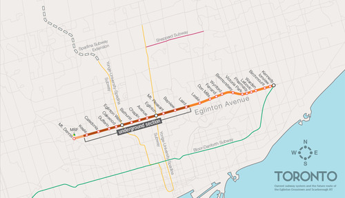
    One of the biggest pieces of infrastructure currently under construction in Toronto is the Crosstown LRT line, which will run on and under Eglinton Avenue right through the heart of midtown. The total length of the line is 19 km, and 10 km of it will be underground along with 12 of its stations.

    Here’s a map:

    image

    But as the Chief Planner of Toronto, Jennifer Keesmaat, rightly pointed out in this blog post earlier this year, it’s important to think of this line, not just as a piece of transit infrastructure, but as a broader city building initiative. With this line comes a tremendous opportunity to rethink and rebuild one of Toronto’s most important avenues.

    I have no doubt that this will happen over the coming years and decades. I mean, just look at the development activity taking place on St. Clair Avenue West right now, which you could argue is the result of its right-of-way streetcar line. But in this instance, what I’m specifically curious about is what will happen at each of the stations along Eglinton Avenue.

    If you take a look at the Stations and Stops page on the Crosstown website, you can see where all of the primary and secondary entrances will be and how each station will generally function. But what is not clear is whether we will be using this opportunity to build additional density on top of them.

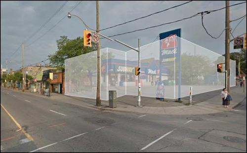
    Here’s how they have “blocked out” the primary entrance for Avenue station:

    image

    I have no idea what it’ll become. But if it ends up as single-storey and single-purpose building, then I think we will have missed an opportunity. And the same goes for many, if not all, of the other stations along the Eglinton Crosstown line. Fixed rail is such a massive driver of real estate value, and so it seems silly not to take advantage of that in some way.

    If anyone has any insights into how these stations will or will not be developed, I would love to hear from you in the comment section below.

  • Dimensioning pedestrian happiness

    The area that stretches between the property line on one side of a street and the property line on the other side of a street is called a public right-of-way here in Toronto. It may be called something different in other cities and countries.

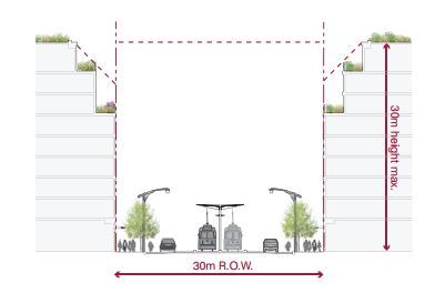
    In the example below (taken from Toronto’s Avenues & Mid-Rise Buildings Study), it includes the sidewalks, the car lanes, and the streetcar lanes. But it could also include other public elements. In this instance, the buildings on either side of the street are assumed to be built right up against their property lines.

    ROWs obviously serve an important public function. But their size also has important urban design implications. As a pedestrian, it feels different to walk on a narrow street than it does on a broad street.

    The width of a ROW can also be used to inform what the preferred height of the buildings along it should be. In the example above, they’re talking about a 1:1 relationship between the width of the ROW and the preferred height of the buildings.

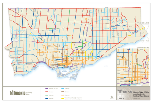
    Given their importance, I thought it would be interesting to share this map of Toronto (dated 2010) showing ROW sizing throughout the city. The mustard colored lines in the core of the city represent 20 metres, the red lines 36 metres, and the purple lines 45 metres or more. The rest of the colors fall somewhere in-between. For the most part, the purple lines represent highways, although there are a few other instances of purple.

    What’s interesting – but not surprising – to see is how we basically kept expanding the size of our ROWs as Toronto grew outwards. This was obviously to make more room for cars on the road.

    But the other, perhaps more interesting thing about this map, is that it could also serve as a guide to pedestrian happiness. The mustard/yellow lines are where it’s most enjoyable to walk. And the red and purple lines are where it’s least enjoyable to walk.

    If you’re from Toronto, give this framework a try and see if it holds true.

  • What use could driverless cars serve beyond just transport?

    image

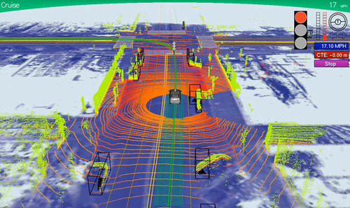
    Here’s further evidence that technology is starting to infiltrate into many other industries, including architecture. London-based architect and designer Pernilla Ohrstedt is currently working on an exhibition for Dezeen and MINI Frontiers that will architecturally visualize the 3D data that driverless cars collect in order to navigate around.

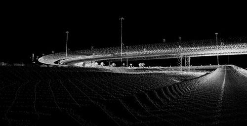
    I had never thought of this before, but as a byproduct of driverless cars, we’re about to start collecting detailed replicas of all of our cities – well beyond the static images we currently have with Google Streetview. In order to navigate by themselves, driverless cars are constantly scanning their surroundings to create a “point cloud” replica of the built environment. This point cloud basically tells the car where they are, where they should drive, and what obstacles might be around.

    It could look something like this:

    image

    Already there are firms like ScanLAB emerging to provide 3D scanning, publishing, and visualization services. But this is obviously just the tip of the iceberg. I can only imagine what innovation will emerge from the passive collection of all this data once driverless cars become commonplace in our cities.

    As one example, it could be a way for us to systematically measure the correlation between the qualities of a street and the vibrancy of its street life. Is there a perfect width? An ideal traffic volume? A right scale? All of this data could make city building more of a science (and perhaps less political).

    My hope though is that this data would be open and accessible to all, so that clever entrepreneurs could build on top of it.

    What are some of your ideas?

    Images: Dezeen