Daily insights for city builders, delivered every morning at 6 AM ET. I’m Brandon Donnelly — a Toronto-based real estate developer and founder of Globizen. I’ve been writing here since 2013.

Tag: research paper

  • Urbanization and its discontents

    Harvard economist Edward Glaeser has a new paper out talking about “urbanization and its discontents.” In it, he argues that while cities today are working remarkably well for highly skilled people, they don’t seem to be delivering the same upward mobility to lower skilled people. The “urban wage premium” for this segment of the population has seemingly disappeared.

    The posited causes of this discontent will likely resonate with many of you:

    Urban resurgence represents private sector success, and the public sector typically only catches up to urban change with a considerable lag. Moreover, as urban machines have been replaced by governments that are more accountable to empowered residents, urban governments do more to protect insiders and less to enable growth. The power of insiders can be seen in the regulatory limits on new construction and new businesses, the slow pace of school reform and the unwillingness to embrace congestion pricing.

    Unfortunately, this paper isn’t available for free online. If you’re interested, you’ll need to purchase a copy, here.

  • Floodplain homes in the US are overvalued by a total of $34 billion

    This recent paper by Miyuki Hino (University of North Carolina) and Marshall Burke (Stanford) makes the case that US homes situated within floodplains are currently overvalued by a total of $34 billion. And that’s because the associated risks are not being properly accounted for in the value of these homes.

    The problem, it would seem, comes down to information. Because the discount for flood risk was found to be higher (1) for commercial buyers (presumably because they’re more sophisticated and/or have better access to information) and (2) in states where sellers must disclose flood risk (Louisiana is probably the most stringent about this).

    This feels a bit like one of those realtor commercials that tries to scare you into using one. But it does appear to demonstrate just how opaque the market can be and how information asymmetries potentially distort asset prices. Perhaps most importantly, I wonder when climate risk will get fully valued.

  • Measuring street-network disconnectedness around the world

    Here is a recent research paper by Christopher Barrington-Leigh and Adam Millard-Ball that looks at the connectivity of local street networks across the world. They refer to this as “street-network sprawl” and they measure it using a Street-Network Disconnectedness index (SNDi).

    This is important for many reasons. Compact street networks with shorter blocks and fewer dead ends are far more conducive to different forms of mobility, including transit. Street networks are also incredibly sticky. Once laid, they rarely change. And if they do, it’s over very long periods of time.

    The study period in the paper is 1975 to 2013. What they found is that in 90% of the 134 most populous countries in the world, the street network has become less connected since 1975. What this means is that we have been making it harder to service our communities with transit.

    That said, there has been a reversal in “high income” countries, most notably in North America. If you take a look at the above graphs, you can see a fairly dramatic drop off, signalling a reduction in the construction of low-connectivity streets. Southeast Asia, on the other hand, is trending in the opposite direction. Note Bangkok in the upper righthand corner.

    For a copy of the full research paper, click here.

    Images: Global trends toward urban street-network sprawl

  • Social and physical segregation in Singapore

    A recent study by the MIT Senseable City Lab has used cellphone data to map both social and physical segregation within Singapore. To start, they used residential sale prices as a proxy for socioeconomic status. They then used call and text records (presumably it was all anonymous) from 1.8 million cellphone users in Singapore (2011) to map who interacted with who. Pictured above is one of those mappings.

    What they discovered was evidence of a “rich club effect.” In other words, the richer the person the less likely they were to interact with people outside of their socioeconomic band. The study calls this their communication segregation index.

    A similar phenomenon was noted as people moved around Singapore. (This is the study’s physical segregation index.) People tend to spend time in spaces alongside people with similar socioeconomic attributes. However, they did notice that this tends to wane during the day as people move around the city — presumably for work and other such things.

    I think it would be interesting to get a bit more granular about the findings in order to try and see, among other things, if certain public spaces are more successful than others at encouraging a broader socioeconomic mix. And it’s probably only a matter of time before we start using tools like this to plan our cities. For more on the study, click here.

    Image: MIT Senseable City Lab

  • Tasty data

    A recent study and research paper by the MIT Senseable City Lab — called, Tasty Data — has discovered that restaurant data alone can be used to accurately predict location-based factors such as daytime population, nighttime population, number of businesses, and overall consumer spending within a specific geography.

    They started by pulling restaurant data from Dianping (Chinese equivalent of Yelp) for 9 Chinese cities: Baoding, Beijing, Chengdu, Hengyang, Kunming, Shenyang, Shenzen, Yueyang, and Zhengzhou. They then paired their Dianping data with other available data (such as aggregated mobile phone data) and used machine learning to search for any correlations.

    Below is a diagram of “nighttime population” in Beijing. They are using a 3 km2 grid.

    If you’re a regular reader of this blog, you’ll know that I like these kinds of studies. By 2020, it is estimated that 1.7MB of data will be created every second by every person on earth. The numbers are staggering. And yet, “official” data sources, such as census data, remain slow and fairly limited. Studies like this one continue to show us what’s next.

    Image: MIT Senseable City Lab

  • Beautiful cities are growing faster than ugly ones

    People move to cities for a whole host of reasons, whether it be for more money, more affordable housing, and/or better weather. The fastest growing cities in the US, for example, tend to be in the south where it’s warmer and where housing supply is more elastic. However, we also know that “consumer leisure amenities” increasingly factor into this decision.

    A new research paper by Gerald A. Carlino (Federal Reserve Bank of Philadelphia) and Albert Saiz (MIT) has tried to quantify this relationship by looking at the perceived beauty of a place. To do this, they analyzed the number of tourist visits and the number of “crowdsourced picturesque locations” in a metro area. Read: Instagrammable moments.

    What they found was that beauty, not surprisingly, matters (much like it does in other facets of life). Between 1990-2010, metro areas that were perceived as being “twice as picturesque” experienced greater population growth — about 10 percentage points higher. These metro areas also attracted a higher percentage of educated individuals and experienced greater housing appreciation.

    If you’d like to download a copy of Beautiful city: Leisure amenities and urban growth, click here.

  • Impact of temperature on economic production

    In 2015, Marshall Burke, Sol Hsiang, and Ted Miguel published a paper in Nature that looked at the relationship between temperature (climate) and economic output. They examined the historical impact of temperature changes (1960-2010) on 166 countries and then used this data to try and predict the potential future impacts of climate change on GDP per capita.   

    What they discovered is that temperature has a non-linear impact on economic production. Put differently, there’s an optimal annual average temperature. And it turns out to be 13 degrees celsius. If a country sits below this average number, then warming increases productivity. But if a country sits above this number, then warming has a negative impact on productivity. And the impact gets worse (stronger negative correlation) at higher temperatures.

    Some of you are probably wondering whether the correlations they found should be interpreted as causation. For what it’s worth, the study tries to correct for non-temperature related economic changes (such as a recession or policy changes) and it also looks at how individual countries perform against themselves during temperature fluctuations. So the control and treatment groups are arguably pretty tight.

    All of this suggests that there are a number of countries that stand to benefit from climate change (at least from this perspective). They are the ones that are cold today. 

    For more on the study, click here.

  • The real reason people oppose new development

    image

    A good friend of mine just sent me this fascinating research paper called: Opposition to Development or Opposition to Developers? Survey Evidence from Los Angeles County on Attitudes towards New Housing. It is a study out of UCLA that was published earlier this year by Paavo Monkkonen and Michael Manville.

    For the paper, they conducted a survey-framing experiment with over 1,300 people in Los Angeles County to test how strongly they felt about a number of common anti-housing sentiments; arguments such as traffic congestion, neighborhood character, and strain on local services. 

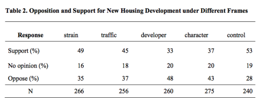
    However, they also introduced another argument: large developer profits. And interestingly enough, they discovered that respondents were 20 percentage points more likely to oppose a new hypothetical housing development when the survey was framed around the developer making a lot of money.

    Here is a table from the paper showing the various frames, as well as the percentage of people who supported, had no opinion, and who opposed. Note that under the “developer” frame, the opposition number is 48%.

    image

    So their “takeaway for practice” is as follows: “Housing opposition is often framed as a form of risk aversion. Our findings, however, suggest that at least some opposition to housing might be motivated not by residents’ fears of their own losses, but resentment of others’ gains.”

    Photo by Cameron Stow on Unsplash

  • How elevation impacts risk taking

    image

    There’s an old saying that we shape our buildings and environments and then they in turn shape us. 

    Here is a fascinating research report about “the influence of physical elevation in buildings on risk preferences.” I discovered it through this MarketWatch article, which my friend John forwarded me this afternoon. 

    Here is a quote from the article:

    We then examined the correlation between hedge-fund volatility and office location in terms of number of stories above ground. We found that as the elevation of hedge-fund managers’ offices increased, they were more willing to take risks that resulted in more volatility. This was true even when statistically controlling for factors such as total assets, fund strategy and several other variables that could have led more resourceful hedge funds to occupy expensive offices that are often found on higher levels of buildings.

    Does this mean taller cities are also more volatile cities? Assuming this is all true, it once again proves that we are maybe not the rational decision makers that many us probably think we are.

    Photo by Hala AlGhanim on Unsplash

  • Why east sides are often poorer than west sides

    In a recent Spacing article, called Pollution and the fall and rise of urbanism, Dylan Reid argues that one of the reasons why urbanism declined in the 20th century was because of industrial pollution. (There are, of course, other contributing factors beyond just pollution.)

    This article is the first time I have come across a study supporting the widely held belief that pollution and prevailing windows are the reasons for why the east sides of many former industrial cities are poorer than the west sides. Here is more on that from the article:

    People recognized and understood that pollution had an impact on them, and they tried to avoid it if they could afford to do so. Have you noticed, for example, how in so many cities (Toronto included), the east side is poorer than the west side? It’s because the prevailing winds in Europe and North America are west to east, and they blow pollution to the east side. A fascinating study by economists Stephan Heblich, Alex Trew and Yanos Zylbergerg quantified this effect, identifying how 19th century pollution was dispersed eastwards and showing that the most polluted areas were also the poorest. 

    What the authors discovered is that not only did pollution cause a geographic sorting based on wealth, but that there’s also a certain degree of persistence to it. This makes sense if you think about it. Pollution in our cities has waned significantly and yet here we are still remarking and talking about east vs. west.

    It goes to show you just how long lasting the impacts of our city building decisions can be.