Daily insights for city builders, delivered every morning at 6 AM ET. I’m Brandon Donnelly — a Toronto-based real estate developer and founder of Globizen. I’ve been writing here since 2013.

Tag: report

  • Where the world’s billionaires live

    The Martin Prosperity Institute here in Toronto recently published an interesting report called The Geography of the Global Super-Rich.

    What they did was use the Forbes 2015 Billionaire List to chart billionaires and billionaire wealth by location and by industry. They also looked at the wealth gap in each location and whether the wealth was self-made or inherited.

    A correlation analysis was also done to see what key variables – such as population, density, economic output, global city standing, VC investment, and so on – were positively correlated with a greater concentration of super rich people.

    There are 1,826 billionaires across the world according to Forbes. The researchers were able to match 99% of them to a specific metro area / primary residence.

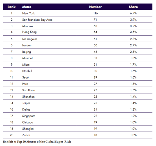
    Here are the top 20 metro areas in terms of the number of billionaires:
    image

    Look at Miami at #9. 

    I suspect that this may surprise some of you. But Miami has grown into a significant global city. As one of my friends from Miami likes to tell me: “The best thing about Miami is that it’s a Latin American city that’s so close to the United States.”

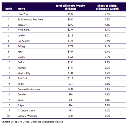
    Here are the top 20 metro areas in terms of total billionaire wealth: 
    image

    A bunch of changes on this list because of extremely wealthly people and families in places like Bentonville (Arkansas) and Omaha.

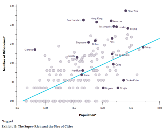
    One of the conclusions of the report is that the size of the city generally matters:

    “The geography of the super-rich is a function of larger cities. Both the number of billionaires and their net worth are positively associated with the population of global cities, with correlations of 0.56 for the number of billionaires and 0.44 to their net worth.”

    Here is a chart comparing population to the number of billionaires:
    image

    Cities such as New York, Moscow, and Hong kong, which sit far above the blue line, have more billionaires than their population size would predict.

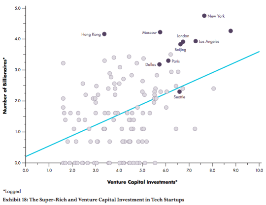
    Here is a similar chart comparing venture capital investment to the number of billionaires:
    image

    Once again, there is a positive association.

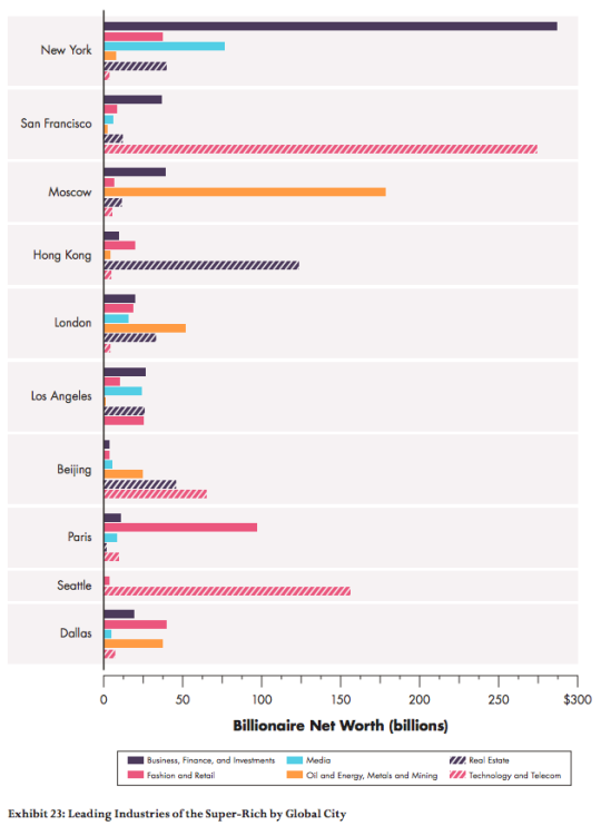
    Finally, here are a two charts that show which industries have produced the most billionaires:
    imageimage

    If you’re interested in this study, you can download the full report here. All of the charts were sourced from the report.

  • Journeys by walking

    Arup, the global consulting firm, has an interesting publication out called Cities Alive: Towards a walking world. The report highlights 50 benefits of walking and then 40 actions that city leaders can take today to transform their cities. The entire study was informed by examining 80 international case studies.

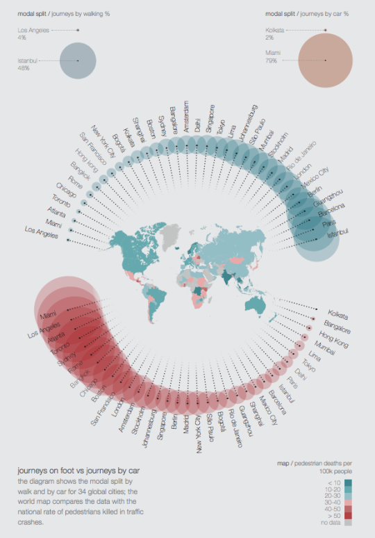
    As I was going through the report, the following diagram caught my attention. It compares journeys on foot vs. journeys by car for a collection of global cities.

    The turquoise circles represent % of journeys by walking. On the left is Los Angeles at 4%. And on the right is Istanbul at 48%.

    The red circles represent % of journeys by car. On the left is Miami at 79% (with Los Angeles right beside it). And on the right is Kolkata at 2%.

    The map in the middle of the circles represents pedestrians killed in traffic crashes per 100,000 people.

    I’m not sure where the data was drawn from, but it’s not all that surprising to see a few North American cities clustered towards the left (less walking; more driving). Still, I wonder how “journey” is defined.

    To view the full report, click here. Arup also produces a lot of other great content that you can download for free, here.

  • State of Center City, Philadelphia

    The Center City District and Central Philadelphia Development Corporation recently published a report called: State of Center City 2016. The objective was to measure the progress being made in Philadelphia’s downtown. 

    I moved out of Center City (Rittenhouse Square) in 2009, but I still like to follow what’s happening. I really enjoyed my time in Philly. In fact, I remember missing its immensely walkable downtown after I returned to Toronto and touched down in the suburbs briefly before moving back downtown.

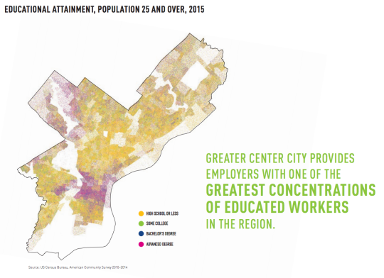
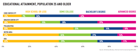
    If you take a look at the report, one of the first things you’ll probably notice is the concentration of jobs and the concentration of knowledge works (with advanced degrees) in the Center City area. We are seeing this shift in so many cities around the world.

    Here are a few graphics (all of which are from the report):

    imageimage

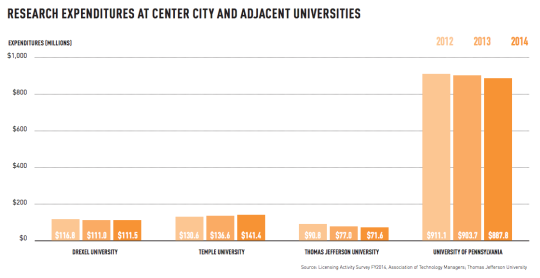
    Part of the reason for this is that Center City is anchored by a number of fantastic Universities. This is critical for cities, today.

    image

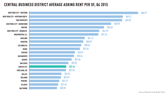
    To end this post, I thought I would post the below comparison of average office rents in major CBDs across the US. I always find these charts interesting, even though the usual suspects are up at the top.

    image

    I hope you’re all having a great holiday weekend.

  • Prime property appreciation around the world

    Every year for the last decade, Knight Frank has published something called The Wealth Report. I’ve written about it before, but it’s basically a look at “prime property” and global wealth.

    As part of the report, they have something called the PIRI 100. It’s their “Prime International Residential Index”, which looks at luxury residential property prices around the world. They generally define “prime property” as being the top 5% of each market according to value.

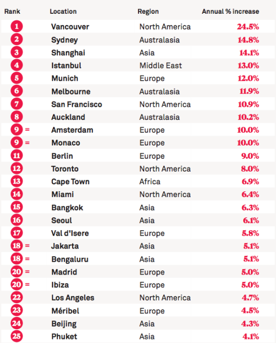
    This year, the top 25 locations in their PIRI 100 are as follows (for the most part, the data is up to December 2015):

    image

    Here in Canada, we like to talk about the insanity of the Vancouver and Toronto real estate markets. This list helps to put that into perspective. Even by global standards, Vancouver is at the top of the pack by quite a significant margin. 

    It’s worth noting that since this is a “prime property” index, it’s pretty safe to assume that the buyer profiles for these sorts of properties would have a significant international bias. So in a way, this list is really about global capital flows.

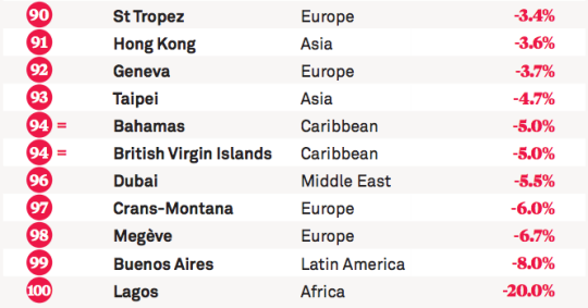
    Here are the bottom 10 locations on this year’s list:

    image

    If you’d like to see the full list, click here.

  • The Death and Life of Great Italian Cities

    image

    I am sure that a lot of you know where the title of this post comes from. It’s a riff on one of the most important and influential books in the world of city planning: The Death and Life of Great American Cities by Jane Jacobs (1961).

    But when Jane Jacobs first wrote this book, there was no such thing as smartphones and nobody was “checking-in” to hipster dive bars on Foursquare

    So instead of leveraging big data, her analyses and arguments were based on observation. She walked the streets of New York and Toronto and figured out what made cities thrive and what made cities die. That was her brilliance.

    Today, however, we have data – lots of it. And so recently, a group of researchers set out to test Jane Jacob’s theories using mobile phone data. The study was called, The Death and Life of Great Italian Cities:
    A Mobile Phone Data Perspective
    .

    More specifically, they set out to test the following 4 essential conditions:

    “She [Jane Jacobs] argued that, to promote urban life in large cities, the physical environment should be characterized by diversity at both the district and street level. Diversity, in turn, requires four essential conditions: (i) mixed land uses, that is, districts should serve more than two primary functions, and that would attract people who have different purposes; (ii) small blocks, which promote contact opportunities among people; (iii) buildings diverse in terms of age and form, which make it possible to mix high-rent and low-rent tenants; and (iv) sufficient dense concentration of people and buildings.”

    To accomplish this, the team assembled and studied data from the following sources:

    • Mobile phone activity (specifically internet activity)
    • OpenStreetsMap Data
    • Census Data
    • Land Use Information
    • Infrastructure Data
    • Foursquare Data (Venues API)

    Ultimately, they determined that Jane Jacobs knew what she was talking about. The above conditions are essential to urban vibrancy and they apply to Italian cities, just as they did and do to American cities. But this test was valuable, because the more that we can measure and quantify cities, the better I think we’ll get at creating and promoting urban vitality. 

    Now imagine if you overlaid the findings of their report with residential and commercial rents. I bet you’d also find that there’s a strong business case for urban vitality.

    I’ve heard a number of people say that, eventually, every company will be a software/technology company. And I don’t think we’re far off from that reality. To me, this study feels like an early example of what that might look like for city building.

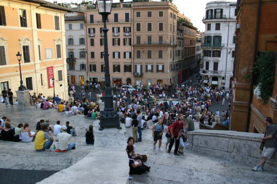
    On a side note, the picture at the top of this post is of the Spanish Steps in Rome. I took it on a weekend trip in 2007. I was living in Dublin at the time.

  • A new era of (digital) globalization

    McKinsey recently published a report called Digital globalization: The new era of global flows.

    The overarching thesis is that we are transitioning to a data-driven global economy:

    “Flows of physical goods and finance were the hallmarks of the 20th-century global economy, but today those flows have flattened or declined. Twenty-first-century globalization is increasingly defined by flows of data and information. This phenomenon now underpins virtually all cross-border transactions within traditional flows while simultaneously transmitting a valuable stream of ideas and innovation around the world.”

    One of the benefits of this shift is that it has become easier for emerging economies and individuals from all around the world to participate.

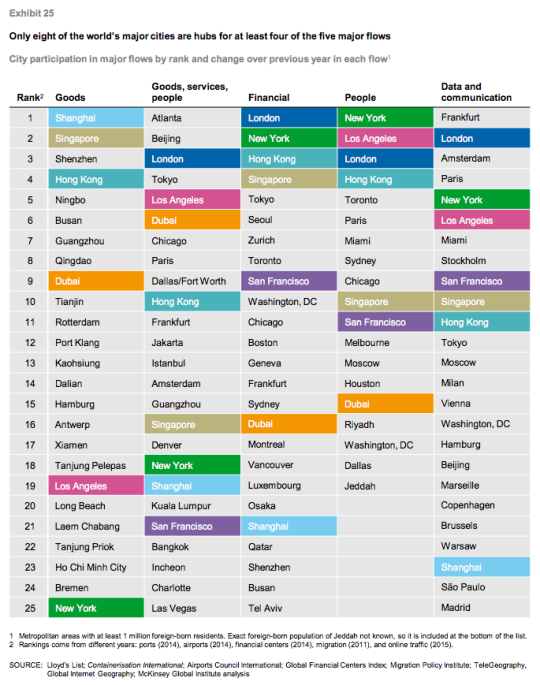
    Of course, not all countries and cities are participating equally. In their report, McKinsey ranks the top cities according to five global flows. In each case a proxy was used:

    “Unfortunately, data on global flows are not available at the city level. However, we have obtained data that serve as proxies for each of our five global flows. Container port volumes approximate goods flows; airport passenger volumes serve as a proxy for goods, service, and people flows; the ranking of cities in the Global Financial Centers Index by the Z/Yen Group provides an indication of financial flows; the number of foreign-born residents in a city measures people flows; and Internet bandwidth approximates data flows.” 

    Using this methodology, they believe that the world only has 8 truly global cities right now: New York, Los Angeles, San Francisco, London, Singapore, Shanghai, Hong Kong, and Dubai. They are the colored cities listed below:

    I always take these city rankings with a grain of salt. This stuff is not easy to quantify and a lot depends on the methodology that you use. 

    For instance, Atlanta sits on the top of “goods, services, and people” because it has the busiest airport in the world according to passenger volume. (It’s the primary hub of Delta Air Lines.) But is that enough to assert that Atlanta is #1? Maybe. Maybe not.

    In any case, the report is packed full of information. If you’d like to take a look, click here.

  • Top 20 cities for venture capital investment

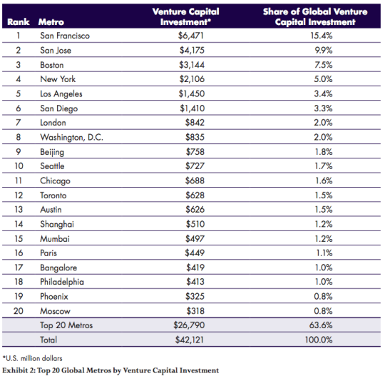
    The Martin Prosperity Institute here in Toronto recently published a new report that looks at worldwide venture capital investment by city. The report is called Rise of the Global Startup City.

    The data is from 2012, because that’s what was available from Thomson Reuters, so keep in mind that there might be some variation in the rankings if we were to look at more recent data. Some of the cities sit fairly close.

    Nonetheless, here are a few of the broader takeaways (from the report page):

    “The United States accounts for nearly 70 percent (68.6 percent) of total global venture capital, followed by Asia (14.4 percent) and Europe (13.5 percent).”

    “Just two broad regions — the San Francisco Bay Area and the Boston-New York-Washington Corridor — account for more than 40 percent of global venture investment.”

    “Global venture investment is highly uneven and spiky — it is concentrated in a small number of large cities and metros around the world.”

    Here are the top 20 cities by total venture capital investment (in USD millions):

    image

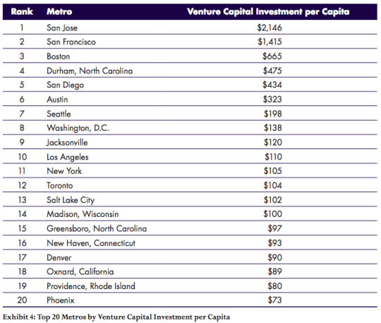
    And here are the top 20 cities according to venture capital investment per capita:

    image

    Given the variation in these two lists, you realize that some cities are largely benefitting from sheer size. London, for example, drops off the list when you look at venture capital investment per capita. 

    In fact, in this second list, 19 of the 20 cities are in the United States. The only non-American city that remains is Toronto.

  • The independent worker

    There’s a lot of discussion about what the “online gig economy” will mean for traditional forms of employment. And seeing how we’re on the topic of Uber right now, I thought it would make for an interesting discussion.

    Should Uber drivers, to use one example, be classified as independent contractors or should they be classified as traditional employees? There are arguments for both sides.

    Seth Harris and Alan Krueger recently published a discussion paper where they argue for a solution somewhere in between the two. They call it “the independent worker.”

    Here’s a snippet that illustrates the tension that currently exists for people working in this new emerging grey area:

    “Independent workers typically work with intermediaries who match workers to customers. The independent worker and the intermediary have some elements of the arms-length independent business relationships that characterize “independent contractor” status, and some elements of a traditional employee-employer relationship. On the one hand, independent workers have the ability to choose when to work, and whether to work at all. They may work with multiple intermediaries simultaneously, or conduct personal tasks while they are working with an intermediary. It is thus impossible in many circumstances to attribute independent workers’ work hours to any employer. In this critical respect, independent workers are similar to independent businesses. On the other hand, the intermediary retains some control over the way independent workers perform their work, such as by setting their fees or fee caps, and they may “fire” workers by prohibiting them from using their service. In these respects, independent workers are similar to traditional employees.”

    I haven’t read the full paper, but I like the idea of remaining adaptable in the face of innovation.

  • But what about employment?

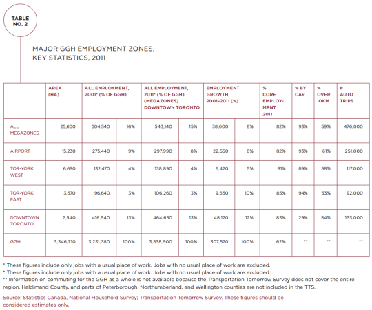
    The Neptis Foundation here in Toronto just recently published a fantastic report looking at the regional economic structure of the Greater Golden Horseshoe area. It’s called Planning for Prosperity.

    In it they identity the polycentric nature of employment in the Toronto region by way of downtown Toronto and three suburban “megazones.” Here’s one of their maps showing overall employment density and the megazones (light blue circles):

    Here’s a snippet to give you an idea of the scale of these megazones:

    “The Airport megazone, one of the three employment megazones outside Downtown Toronto, is the second largest concentration of employment in Canada, after Downtown Toronto. It represents almost 300,000 jobs, more than the central business districts of Montreal, Vancouver, or Calgary individually.”

    And here’s a chart showing the hard numbers:

    Downtown Toronto dominates in terms of employment. But it’s also fascinating to see how much more efficiently it provides that employment. It has the smallest physical area of all the employment zones (2,540 hectares or 6,276 acres) and the lowest percentage of car trips (29%).

    But the big takeaway from their report is that we have not been focused enough on employment in our planning. Instead, we seem to be thinking residentially. Here’s a final snippet:


    “This study shows that the Growth Plan and The Big Move, which are currently under review, do not address the challenges and opportunities of a globalizing regional economy or the reality of a transforming economic landscape.

    The Growth Plan’s focus has largely been on managing residential growth rather than non-residential and employment-related development. Indeed, the Growth Plan is based on shockingly little hard evidence on the evolving economy of the region. Plans for city-regions a fraction of the size of the GGH typically involve more economic research, analysis, and evidence.”

    Clearly we need to be looking at both the residential and non-residential sides of the equation as we grow the region. To read the full report, click here.

  • Balancing oil and ideas

    Colorado Sunset by Travis Bredehoft on 500px.com

    https://500px.com/embed.js

    Canada is a resource rich country. And one of the things that commonly happens to countries with a lot of resources is that they begin to myopically focus on the immediate gains from resources at the expense of long term innovation and economic development. 

    This is known as the “resource curse.”

    The Martin Prosperity Institute here in Toronto recently published a report that looks at this exact topic: Canada’s urban competitiveness through the lenses of its resource economy and its knowledge economy. In the end, Richard Florida and Greg Spencer conclude that two can and should work together, but that we need to stop neglecting our cities:

    “The oil and gas industry is not necessarily a constraint on the creative economy, but in the past decade or so it has come to dominate thinking around economic development policy-making. It is time to use the resources from the energy economy to build a more secure future as an urban knowledge economy. We can also use
    talent and technology to deepen and expand the resource economy.”

    And one of their key recommendation is something I have argued for many times here on Architect This City:

    “A New Federalism for Cities: It is time to give cities the taxing and spending powers they require. Cities must be given more control over their own destinies if they are to prosper
    in the 21st century.”

    Now, here are a few interesting charts from the report.

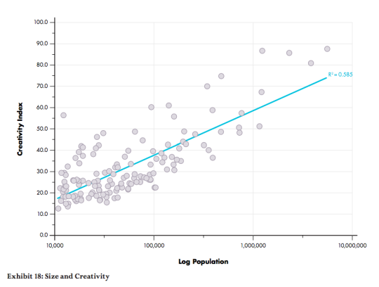
    This first one looks at the relationship between a city’s population and its creativity levels. The two are positively correlated, which means that, in this context, bigger is better.

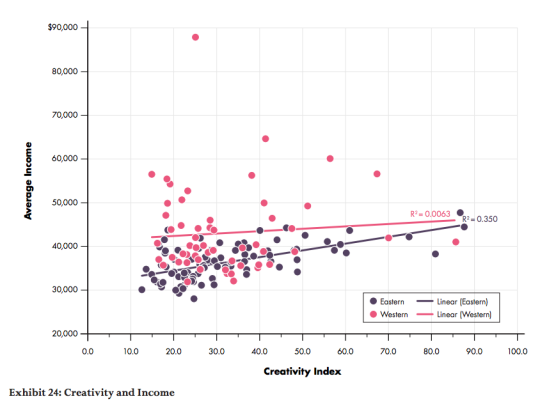
    This second one splits Canada in half – east and west – and then looks at how average income levels are affected by creativity levels (the knowledge economy). Here we see that in eastern cities, income levels are positively correlated with creativity levels. But in western cities, changing creativity levels have almost no impact on income levels. 

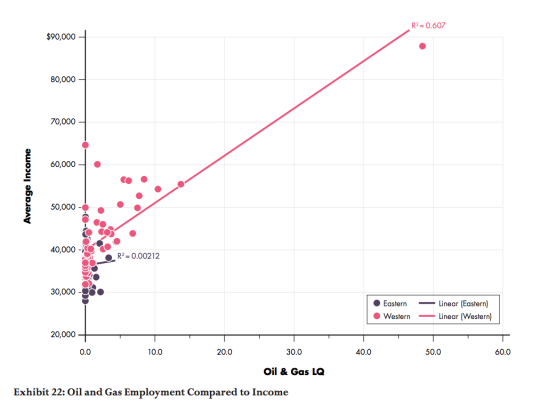
    Finally, this third chart compares the relationship between oil and gas employment (LQ = location quotient) and average income levels. What it finds is that income levels and oil and gas employment are positively correlated in the west, but there’s almost no relationship in eastern cities. 

    The way to read this chart is to think of the LQ as the employment multiple relative to the national average. So for example, a LQ = 10 means that the oil and gas employment levels are 10 times the national average. As you probably guessed, the pink dot way out on the right is Fort McMurray.

    If you’d like to read the entire report, you can do that here. I hope that our new Prime Minister, Justin Trudeau, will read reports like this and spend more of his efforts investing in our knowledge economy – which means investing in our cities.